Creating Keyframe Animations with CSS3
By Sue Smith


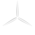
Keyframe animations are among the most hotly anticipated additions to CSS3. With these new declarations, you can define simple animations for web page elements using only a few lines of code. As is typically the case with CSS3 during the present adoption period, you do need to complicate things a little by adding vendor prefixes for specific browsers; but the basic code is straightforward. In this tutorial we will work through an introductory animation, rotating and translating (moving) images. The demo above shows what we are working towards – the final result is a spinning wind turbine set against a blue sky with clouds floating by in the background.
The effects we use in this tutorial will function in the most recent versions of all major browsers, including Firefox, Chrome, Opera, Safari and Internet Explorer. Please note that when we use vendor prefixes on various properties, it is usually for compatibility with older browers. Most recent versions have support for the standard CSS3 property names.
To test your page reliably and obtain optimal results, use IE 10 or the latest version of Chrome, Firefox or Safari. IE versions 9 and older don't support animation features.
You can play with the source code of this demo by clicking here.
Create a New Page
To get started, create an HTML5 page with the following code outline:
<!DOCTYPE HTML>
<html>
<head>
<style type="text/css">

</style>
</head>
<body>
<div id="scene">

</div>
</body>
</html>
We will add the images to animate inside the div element and the CSS code in the style section of the page's head.
Add Images
The animation is going to include three drifting clouds and a wind turbine. The turbine is made up of two images, one for the stand and one for the rotating blades. Here are all five of the image files – feel free to right-click to download and use them with the code in this tutorial:
The blade image has the same height and width, with the central point of the blades in the center of the image so that it will rotate on center.
Add the three clouds to your page, inside the div element:
<img class="cloud sml" src="images/cloud_sml.png" width="70" height="36"/>
<img class="cloud med" src="images/cloud_med.png" width="100" height="52"/>
<img class="cloud lrg" src="images/cloud_lrg.png" width="130" height="67"/>
In this case the images are in a subdirectory named images – adjust the code to suit the location of your own images if necessary. Notice the class attributes; we will use these to apply the positioning and animation. Now add the two turbine images, after the clouds:
<img class="blades" src="images/blades.png" width="120" height="120"/>
<img class="stand" src="images/stand.png" width="12" height="130"/>
We are going to use absolute positioning to place the images in the scene area. When absolutely-positioned images occupy the same space, whichever one was added last will display on top – this is why we start with the clouds and add the turbine elements later, so that the turbine appears in the foreground with the clouds in the background. (The blades will also appear behind the stand and the clouds with large on top, small at the bottom.) Note that we could also use the z-index CSS property to control stacking; that technique is covered in this tutorial.
Style the Container
Let's apply some general style properties before we begin defining our animations. Start with the container element – in the style section, add the following:
/* Container properties */
#scene {

   /* Positioning and dimensions */
   position: absolute;
   top: 200px;
   left: 10px;
   width: 400px;
   height: 300px;
   overflow: hidden;

   /* --- Gradient background --- */
   /* Solid fallback for old browsers */
   background: #0099ff;
   /* Firefox */
   background: -moz-linear-gradient(top, #0099ff, #00ccff);
   /* WebKit - Chrome and Safari */
   background: -webkit-linear-gradient(top, #0099ff, #00ccff);
   /* Internet Explorer 10 */
   background: -ms-linear-gradient(top, #0099ff, #00ccff);
   /* Opera */
   background: -o-linear-gradient(top, #0099ff, #00ccff);
   /* general syntax */
   background: linear-gradient(top, #0099ff, #00ccff);
}
We start with some general properties, including positioning the scene itself absolutely. (Using a position value of relative or absolute for this outer element allows us to place the images inside it with the precision of absolute positioning as well.) Next, for the background we first set a solid color to allow for browsers that don't support gradients. Then, we use some vendor prefixes to add a CSS3 gradient background. We are going to float the clouds inside and outside the visible area of the div element, so we set the overflow to be hidden so that they only appear when inside the bounds of the scene.
Position the Images
Let's add code to supply initial positions for the images. Starting with the stand part of the turbine, add the following to your style declarations:
.stand {
   /* image is 12 x 130 px */
   position: absolute;
   bottom: 0;
   left: 250px;
}
The stand will appear at the bottom of the container, to the right of the center horizontally (the mid-point of the div would be at 200px so we use 250px to place it off-center). Now position the blades:
.blades {
   /* image is 120 x 120 px */
   position: absolute;
   top: 116px;
   left: 196px;
   /* Animation properties to be added here */

}
The ball on top of the stand has a radius of 6px, so the central point of the ball is (top=176, left=256). In order to center the blades on top of this, we need to subtract half the width and half the height of the blade image – 60px in each direction. This yields a top value of 116px and a left value of 196px for the blade image. We will add animation declarations to this section later.
Now let's position the three clouds. We want them to begin to the left of the container, so that they only start to appear as the animation progresses. Style all of the cloud elements first:
.cloud {
   position: absolute;
   /* Animation properties to be added here */

}
This selector lets us add any properties we want all of the clouds to have in one section. Now position the large cloud by referring to its class attribute:
.lrg {
   /* image is 130 x 67 px */
   top: 40px;
   left: -140px;
}
This will place the image ten pixels to the left of the container. Now position the medium and small images using the same logic, so that each one starts ten pixels to the left of the div element:
.med {
   /* image is 100 x 52 px */
   top: 80px;
   left: -110px;
}
.sml {
   /* image is 70 x 36 px */
   top: 10px;
   left: -80px;
}
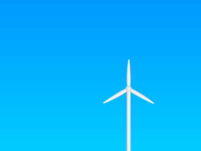
Before the animation starts, the turbine is visible but stationary and the clouds are not yet visible.
Spin the Blades
Let's define some animations now using the special keyframes declaration, starting with making the blade spin:
/* general syntax */
@keyframes bladeSpin {
   from { transform: rotate(0deg); }
   to { transform: rotate(1440deg); }
}
When you define a CSS3 keyframe animation, you first supply the @keyframes keyword (or one of the vendor-specific versions we will run through next) plus a name. We will use the name to refer to the animation later, in the CSS block for the blade image element. In the body of the keyframes section, you can use percentage values or from and to as above, representing 0% and 100% of the animation timeline. This code specifies that the element should rotate four times over the course of the animation, using the transform property. We will determine the duration of the animation and other properties when we apply it to the element. Since the keyframes declaration begins at zero degrees and rotates a number of times in a full circle (1440 degrees is 360 degrees multiplied by four), the animation will be able to iterate over and over again continuously.
Now for the slightly less fun part. Add the vendor-specific versions of the keyframes declaration, immediately before the general code above:
/* Firefox */
@-moz-keyframes bladeSpin {
   from { -moz-transform: rotate(0deg); }
   to { -moz-transform: rotate(1440deg); }
}
/* WebKit - Chrome and Safari */
@-webkit-keyframes bladeSpin {
   from { -webkit-transform: rotate(0deg); }
   to { -webkit-transform: rotate(1440deg); }
}
/* Opera */
@-o-keyframes bladeSpin {
   from { -o-transform: rotate(0deg); }
   to { -o-transform: rotate(1440deg); }
}
Note that we don't need the -ms- prefix for Internet Explorer. This is because IE versions 9 and prior don't support animation at all, and IE10 supports the standardized syntax.
Now that we've defined the animation, we can apply it to the blades image. Inside the .blades CSS section we already added, add the following code that incorporates both vendor-prefixed and general syntax:
   /* Firefox */
   -moz-animation: bladeSpin 10s ease-in-out infinite;
   /* WebKit - Chrome and Safari */
   -webkit-animation: bladeSpin 10s ease-in-out infinite;
   /* Opera */
   -o-animation: bladeSpin 10s ease-in-out infinite;
   /* general syntax */
   animation: bladeSpin 10s ease-in-out infinite;
Focus on the last line to see the general syntax involved. The animation is defined first using the name we indicated in the keyframes section (bladeSpin). Next is the duration, which we specify as ten seconds (10s). Next is the timing/easing function; in this case the transform will ease both in and out (ease-in-out). Finally, we specify that the animation should iterate infinitely (as long as the page is open). Save your code and open the page in a supporting browser to see the effect – the blade image should rotate continuously, speeding up and slowing down as it goes.
We are using the shorthand animation declaration to define our animations in a single line of code. However, you can alternatively target the various animation properties separately, using the animation-name, animation-duration, animation-timing-function, animation-delay, animation-iteration-count, animation-direction and animation-fill-mode declarations. But then you'd have to deal with browser-specific prefixes for each of those too!
You can see why I stick with the shorthand animation property.
Drift the Clouds
Now let's make the clouds drift across the container element. Define the drifting animation first using a new keyframes section:
/* general syntax */
@keyframes cloudDrift {
   from { transform: translateX(0px); }
   to { transform: translateX(540px); }
}
This is the standard version of the code. The declaration once again has a name and a transform property, this time a translation. This animation will move any elements it is applied to across the page to the right, along the X axis. Providing a total translation value of 540px means that the clouds will move across the container element and disappear off to the right, completely out of the div. Add the vendor-prefix versions above this general section:
/* Firefox */
@-moz-keyframes cloudDrift {
   from { -moz-transform: translateX(0px); }
   to { -moz-transform: translateX(540px); }
}
/* WebKit - Chrome and Safari */
@-webkit-keyframes cloudDrift {
   from { -webkit-transform: translateX(0px); }
   to { -webkit-transform: translateX(540px); }
}
/* Opera */
@-o-keyframes cloudDrift {
   from { -o-transform: translateX(0px); }
   to { -o-transform: translateX(540px); }
}
We want all three of the clouds to carry out this translate transform during the animation, but let's make things a little more interesting by having each cloud move at a different speed. Start by adding the general animation properties inside the .cloud CSS definition block:
   /* Firefox */
   -moz-animation: cloudDrift linear infinite;
   /* WebKit - Chrome and Safari */
   -webkit-animation: cloudDrift linear infinite;
   /* Opera */
   -o-animation: cloudDrift linear infinite;
   /* general syntax */
   animation: cloudDrift linear infinite;
We specify the name of the keyframes animation as before, but this time we do not specify a duration – we will do that next. We provide a timing/easing function value of linear in this case, meaning that the animation will elapse at the same speed throughout, with no easing. Again, the animation will iterate continuously. Each cloud is going to have the same animation properties except duration, so that they move at different speeds. To implement this, we add the duration property to the CSS blocks for each cloud type (.lrg and .med and .sml). First, for the largest cloud, add the following to the .lrg CSS definition block:
   /* Firefox */
   -moz-animation-duration: 40s;
   /* WebKit - Chrome and Safari */
   -webkit-animation-duration: 40s;
   /* Opera */
   -o-animation-duration: 40s;
   /* general syntax */
   animation-duration: 40s;
The largest cloud will be slowest, taking 40 seconds to traverse the sky. Now, add duration to the .med block for the medium sized cloud, which will be slightly faster:
   /* Firefox */
   -moz-animation-duration: 30s;
   /* WebKit - Chrome and Safari */
   -webkit-animation-duration: 30s;
   /* Opera */
   -o-animation-duration: 30s;
   /* general syntax */
   animation-duration: 30s;
Finally, add an animation duration to the .sml section for the smallest cloud, which will move fastest:
   /* Firefox */
   -moz-animation-duration: 20s;
   /* WebKit - Chrome and Safari */
   -webkit-animation-duration: 20s;
   /* Opera */
   -o-animation-duration: 20s;
   /* general syntax */
   animation-duration: 20s;
The clouds will spread out from one another as the animation elapses, each one starting again from the left after exiting from the right. Save your page and open it in the browser. You should see the clouds moving across the container element over and over again at different speeds. From this you can see how it is possible to use the same base keyframes animation to achieve different results, by supplying different animation properties to particular elements.
Conclusion
If you can get past the mess of vendor prefixes reqired in this interim period, CSS3 offers some promising options for creating animated web page elements within your markup – all without relying on third-party plugins. The basic syntax is actually very simple, as you have seen, and the possibilities are immense.
For now, try experimenting with keyframes in your own pages by all means, but leave it for "eye candy" effects since quite a few users still can't see the results. What's important is that you will be perfecting your skills for the soon-to-be-here day when CSS3 animations are the new standard.