Creating a Responsive Tiled Photo Gallery with Pure CSS
by Nathan Rohler
As we looked at in a recent article (Responsive Design: A Crash Course and Demo), responsive design is becoming the favored approach for making your site accessible on all devices. One of the main reasons that this approach is gathering significantly more steam than adaptive design (presenting an entirely separate mobile-optimized site) is the incredible diversity of devices popping up, each having a unique screen size and resolution. When we only had to worry about smartphones, there were two distinct classes of devices – phones and desktops/laptops. Now, however, we have phones, phablets, mini tablets, average tablets, giant tablets, netbooks, little desktops, big desktops, etc, on and on. Going responsive is relatively easy, and ensures forward compatibility with whatever next generation of devices comes down the pike. Also, let's not kid ourselves – part of the appeal of responsive design is that it's so knock-your-socks-off cool when done well. (In case you're looking for some great examples, check out mediaqueri.es.)
If you're new to responsive design and haven't seen the article I mentioned a moment ago, I recommend you review it now to get up to speed on media queries, the foundation on which responsive design is built. In that article, we focused on adjusting element widths and modifying the layout as the window resized. But what about adjusting heights along with the widths? And what about putting it together in a tiled layout? That's what we're going to look at today. We'll create a tiled photo gallery to learn these principles.
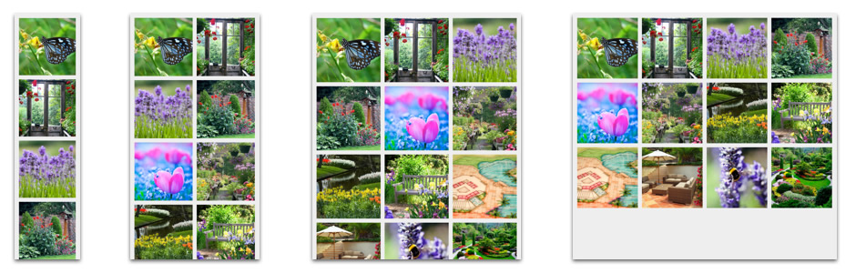
First, here's the demo of what we're going to create (source code here). Resize your browser window and watch the tile size grow and shrink to fit the available space. At certain points, you'll notice that the layout "snaps" to a new number of tiles per row. If you have a smartphone or tablet, try loading the page there too:

Psst! Looking for a ready-made solution to save time? Check out our new Hummingbird Photo Gallery plugin for WordPress.
Making Responsive Squares
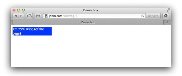
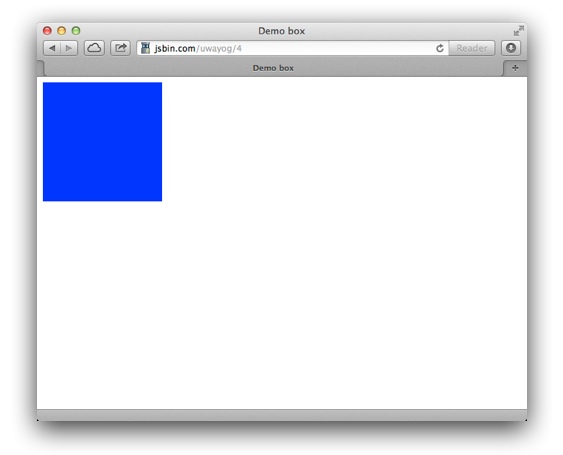
The foundation of our project is responsive squares – that is, squares that automatically resize, both horizontally and vertically, based on the layout. We start by using a percentage-based width for a div. For example, let's make a box with width: 25%. Twenty-five percent of what, you ask? The parent container's width. If we place that box directly in the <body> of a page, here's what we have (view source):
Now, suppose that we add height: 25%; to the CSS and preview again:
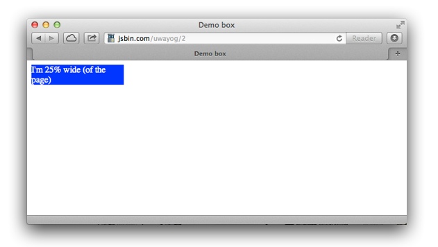
That's no mistake – it looks just the same as before. This is because height percentages are based on the vertical height of the container (in this case, the <body>). But because the box is the only content in its parent, the height is based on a percentage of itself (which doesn't make any sense). We can avoid this by adding the following special CSS that tells the <body> to base its height on the browser window's height:
html, body {
   height: 100%;
}
Adding that declaration yields the following (view source):
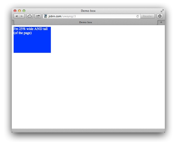
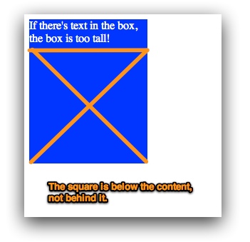
If you resize your browser window, you'll notice how the box's height is now tied to the window's height. That's nice, but we want our box to be square, with the height matching the width. The trick is to use the padding-bottom property instead of the height property. Padding values are based on the container's width, the same as the width property is. If we use
width: 25%
and padding-bottom: 25%, here's what we get (view source):
If you resize your browser window horizontally, you'll notice that the box remains a square, always adjusting both dimensions together. Perfect, right? But it's a little more complicated than that. (You knew I was going to say that, didn't you!) As you may notice, I removed the text from the box for this demo. That's because the actual height of the box is based on padding-bottom plus the height of any content in the box. If I had left the text, the box would have been too tall:
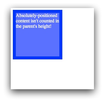
But if we place the content inside another div with position: absolute applied, it won't be counted when the box height is calculated. To use absolute positioning on the content div, we have to also apply position: relative to the parent. This makes the absolute positioning relative to the parent box instead of the entire page. Here's what we now have (view source):
To review, here's the HTML and CSS we now have:
<div id="box">
   <div id="innerContent">
       Absolutely-positioned content isn't counted in the parent's height!
   </div>
</div>
<style type="text/css">
#box {
   width: 25%;
   padding-bottom: 25%;
   background: #00F;
   color: #FFF;
   position: relative;
}
#innerContent {
   position: absolute;
   left: 10px;
   right: 10px;
   top: 10px;
   bottom: 10px;
   background: #66F;
}
</style>
I've added 10 pixels of spacing on each edge to help you see what's happening, but we could use 0 and there would be no way to tell that two boxes are actually in use. A side-benefit of using the absolute positioning is that we can also apply padding and borders to the inner box without affecting the outer box's size. (Note: There's a way to do this with the experimental box-sizing property, but our method is backward-compatible.)
Creating a Grid
We've successfully created a resizable square using nothing but CSS. The next step is to turn this into a grid. That's as simple as placing several boxes within a "wrapper" that has overflow: hidden, then setting float: left on each box:
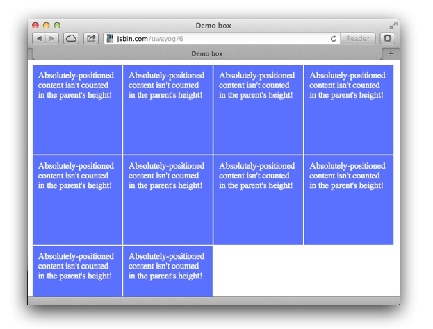
View the demo here and resize your window to see how the tiles expand and contract. (Full source here.)
Making the Grid Responsive
Now we have a grid; but on a small screen, the tiles are tiny and the contents are cut off, and on a large screen, the tiles are huge. We're ready to make the grid responsive with media queries. To modify the number of tiles per row, all we need to change is the width and padding-width of each box. The following CSS creates "breakpoints" at 480 pixels, 650 pixels, 1050 pixels and 1290 pixels (all representative of common screen sizes):
@media only screen and (max-width : 480px) {
   /* Smartphone view: 1 tile */
   .box {
      width: 100%;
      padding-bottom: 100%;
   }
}
@media only screen and (max-width : 650px) and (min-width : 481px) {
   /* Tablet view: 2 tiles */
   .box {
      width: 50%;
      padding-bottom: 50%;
   }
}
@media only screen and (max-width : 1050px) and (min-width : 651px) {
   /* Small desktop / ipad view: 3 tiles */
   .box {
      width: 33.3%;
      padding-bottom: 33.3%;
   }
}
@media only screen and (max-width : 1290px) and (min-width : 1051px) {
   /* Medium desktop: 4 tiles */
   .box {
      width: 25%;
      padding-bottom: 25%;
   }
}
These breakpoints ensure that the tiles' size always remains within a comfortable range. We'll also update the default width and padding-bottom properties for .box to be 20% (5 tiles); this is what will be shown for large screens.
To enable media query compatibility for IE8 and older, we have to add the following code after the CSS:
<!-- Enable media queries for old IE -->
<!--[if lt IE 9]>
   <script src="http://css3-mediaqueries-js.googlecode.com/svn/trunk/css3-mediaqueries.js"></script>
<![endif]-->
Note: Best practices dictate you should download the referenced file and save it to your site, then link to that local version. We're hotlinking just for the sake of simplicity in this demo.
View the final demo here; again, resize your browser window to see the grid snap. When your browser window is very narrow, there will be only 1 tile. As you expand the width, the number of tiles will grow until it reaches 5. The full source is here.
Putting It All Together
Now that you know how to create a responsive grid of square tiles, we'll apply those skills in a practical and fun way to create the photo gallery you saw at the beginning of the tutorial. Our photos are 460 pixels square, which ensures that they are scaled down slightly except on the largest of screens. This way, the photos always will look crisp.
Additionally, we have a title box that appears over each photo when it is hovered-over (or tapped on a touchscreen).
The HTML
Start with a basic HTML5 page:
<!DOCTYPE HTML>
<html lang="en-US">
<head>
  <meta http-equiv="content-type" content="text/html; charset=UTF-8">
  <title>Responsive Tiled Photo Gallery</title>

  <style type="text/css">

  </style>
</head>
<body>

</body>
</html>
First, add the following <meta> tag just inside the opening <head> tag:
<meta name="viewport" content="width=device-width, initial-scale=1.0" />
This line, which is very important, tells mobile browsers to not scale the page by default. This allows our media queries to be applied instead of the default "scale the page way down" behavior.
Next, let's add the markup that defines all of the tiles. Add the following HTML within the <body> of your page:
<div class="wrap">

  <!-- Define all of the tiles: -->
  <div class="box">
    <div class="boxInner">
      <img src="http://www.dwuser.com/education/content/creating-responsive-tiled-layout-with-pure-css/images/demo/7.jpg" />
      <div class="titleBox">Butterfly</div>
    </div>
  </div>
  <div class="box">
    <div class="boxInner">
      <img src="http://www.dwuser.com/education/content/creating-responsive-tiled-layout-with-pure-css/images/demo/1.jpg" />
      <div class="titleBox">An old greenhouse</div>
    </div>
  </div>
  <div class="box">
    <div class="boxInner">
      <img src="http://www.dwuser.com/education/content/creating-responsive-tiled-layout-with-pure-css/images/demo/2.jpg" />
      <div class="titleBox">Purple wildflowers</div>
    </div>
  </div>
  <div class="box">
    <div class="boxInner">
      <img src="http://www.dwuser.com/education/content/creating-responsive-tiled-layout-with-pure-css/images/demo/3.jpg" />
      <div class="titleBox">A birdfeeder</div>
    </div>
  </div>
  <div class="box">
    <div class="boxInner">
      <img src="http://www.dwuser.com/education/content/creating-responsive-tiled-layout-with-pure-css/images/demo/10.jpg" />
      <div class="titleBox">Crocus close-up</div>
    </div>
  </div>
  <div class="box">
    <div class="boxInner">
      <img src="http://www.dwuser.com/education/content/creating-responsive-tiled-layout-with-pure-css/images/demo/4.jpg" />
      <div class="titleBox">The garden shop</div>
    </div>
  </div>
  <div class="box">
    <div class="boxInner">
      <img src="http://www.dwuser.com/education/content/creating-responsive-tiled-layout-with-pure-css/images/demo/5.jpg" />
      <div class="titleBox">Spring daffodils</div>
    </div>
  </div>
  <div class="box">
    <div class="boxInner">
      <img src="http://www.dwuser.com/education/content/creating-responsive-tiled-layout-with-pure-css/images/demo/6.jpg" />
      <div class="titleBox">Iris along the path</div>
    </div>
  </div>
  <div class="box">
    <div class="boxInner">
      <img src="http://www.dwuser.com/education/content/creating-responsive-tiled-layout-with-pure-css/images/demo/8.jpg" />
      <div class="titleBox">The garden blueprint</div>
    </div>
  </div>
  <div class="box">
    <div class="boxInner">
      <img src="http://www.dwuser.com/education/content/creating-responsive-tiled-layout-with-pure-css/images/demo/9.jpg" />
      <div class="titleBox">The patio</div>
    </div>
  </div>
  <div class="box">
    <div class="boxInner">
      <img src="http://www.dwuser.com/education/content/creating-responsive-tiled-layout-with-pure-css/images/demo/11.jpg" />
      <div class="titleBox">Bumble bee collecting nectar</div>
    </div>
  </div>
  <div class="box">
    <div class="boxInner">
      <img src="http://www.dwuser.com/education/content/creating-responsive-tiled-layout-with-pure-css/images/demo/12.jpg" />
      <div class="titleBox">Winding garden path</div>
    </div>
  </div>

</div>
<!-- /#wrap -->
Note that we place all content within a wrapper, <div id="wrap">, and that each tile is defined with the following code:
<div class="box">
  <div class="boxInner">
    <img src="path/to/image.jpg" />
    <div class="titleBox">The image title text</div>
  </div>
</div>
The highlighted values specify the image and associated text to be displayed for that tile. You can use the sample HTML above, or add your own photos. For best results, the photos should have the same height and width.
The CSS
If you preview your page now, you'll see just a linear list of photos. Style the page by adding the following CSS inside the <style> tag:
body {
   margin: 0;
   padding: 0;
   background: #EEE;
   font: 10px/13px 'Lucida Sans',sans-serif;
}
.wrap {
   overflow: hidden;
   margin: 10px;
}
.box {
   float: left;
   position: relative;
   width: 20%;
   padding-bottom: 20%;
}
.boxInner {
   position: absolute;
   left: 10px;
   right: 10px;
   top: 10px;
   bottom: 10px;
   overflow: hidden;
}
.boxInner img {
   width: 100%;
}
.boxInner .titleBox {
   position: absolute;
   bottom: 0;
   left: 0;
   right: 0;
   margin-bottom: -50px;
   background: #000;
   background: rgba(0, 0, 0, 0.5);
   color: #FFF;
   padding: 10px;
   text-align: center;
   -webkit-transition: all 0.3s ease-out;
   -moz-transition: all 0.3s ease-out;
   -o-transition: all 0.3s ease-out;
   transition: all 0.3s ease-out;
}
body.no-touch .boxInner:hover .titleBox, body.touch .boxInner.touchFocus .titleBox {
   margin-bottom: 0;
}
@media only screen and (max-width : 480px) {
   /* Smartphone view: 1 tile */
   .box {
      width: 100%;
      padding-bottom: 100%;
   }
}
@media only screen and (max-width : 650px) and (min-width : 481px) {
   /* Tablet view: 2 tiles */
   .box {
      width: 50%;
      padding-bottom: 50%;
   }
}
@media only screen and (max-width : 1050px) and (min-width : 651px) {
   /* Small desktop / ipad view: 3 tiles */
   .box {
      width: 33.3%;
      padding-bottom: 33.3%;
   }
}
@media only screen and (max-width : 1290px) and (min-width : 1051px) {
   /* Medium desktop: 4 tiles */
   .box {
      width: 25%;
      padding-bottom: 25%;
   }
}
Here is a commented version of that code, to help you understand what each part does:
We have some default styles for the body: a background color, removing the padding/margin etc.
body {
   margin: 0;
   padding: 0;
   background: #EEE;
   font: 10px/13px 'Lucida Sans',sans-serif;
}
Here's the "wrapper" that will hold all of our tiles.
.wrap {
   overflow: hidden;   The use of overflow:hidden allows us to apply floats to the tiles within.
   margin: 10px;
}
Next up is the box (which corresponds to a tile).
.box {
   float: left;   The float creates the grid, by ensuring that tiles are automatically laid out in rows.
   position: relative;   The relative positioning, used in conjunction with position:absolute on boxInner, makes the boxes remain square regardless of content.
   width: 20%;   The width and padding-bottom are what determine the size of the box and make it square.
   padding-bottom: 20%;
}
This is the actual content area for each tile.  It is positioned with 10 pixels around each edge.
.boxInner {
   position: absolute;
   left: 10px;
   right: 10px;
   top: 10px;
   bottom: 10px;
   overflow: hidden;
}
We want our images (which are square) to fill the full tile width, so we use width:100%
.boxInner img {
   width: 100%;
}
This definition styles the title text box
.boxInner .titleBox {
   The text box goes at the bottom of each tile, initially hidden out of view via a negative margin-bottom value:
   position: absolute;
   bottom: 0;
   left: 0;
   right: 0;
   margin-bottom: -50px;
   We set a partially-transparent background along with some padding:
   background: #000;
   background: rgba(0, 0, 0, 0.5);
   color: #FFF;
   padding: 10px;
   text-align: center;
   We specify a CSS3 transition to use when showing/hiding the text box:
   -webkit-transition: all 0.3s ease-out;
   -moz-transition: all 0.3s ease-out;
   -o-transition: all 0.3s ease-out;
   transition: all 0.3s ease-out;
}
Here are the hover styles used to reveal the text box.  Note that we have separate styles for touch and non-touch environments; more on that in a moment.
body.no-touch .boxInner:hover .titleBox, body.touch .boxInner.touchFocus .titleBox {
   margin-bottom: 0;
}
Here are our media queries to "snap" the number of tiles per row:
@media only screen and (max-width : 480px) {
   /* Smartphone view: 1 tile */
   .box {
      width: 100%;
      padding-bottom: 100%;
   }
}
@media only screen and (max-width : 650px) and (min-width : 481px) {
   /* Tablet view: 2 tiles */
   .box {
      width: 50%;
      padding-bottom: 50%;
   }
}
@media only screen and (max-width : 1050px) and (min-width : 651px) {
   /* Small desktop / ipad view: 3 tiles */
   .box {
      width: 33.3%;
      padding-bottom: 33.3%;
   }
}
@media only screen and (max-width : 1290px) and (min-width : 1051px) {
   /* Medium desktop: 4 tiles */
   .box {
      width: 25%;
      padding-bottom: 25%;
   }
}
And a Little JavaScript...
As I mentioned earlier, media queries only function in Internet Explorer version 9 and higher by default. To work around this, we need to add the helpful css3-mediaqueries.js script immediately following the <style> tag in the page's <head>:
<!-- Enable media queries for old IE -->
<!--[if lt IE 9]>
   <script src="http://css3-mediaqueries-js.googlecode.com/svn/trunk/css3-mediaqueries.js"></script>
<![endif]-->
Again, you should download the referenced file and save it to your site, then link to that local version. Note that the code is wrapped in a conditional IE comment, which ensures that we don't waste loading time in browsers where native media query support is available.
The layout is now complete (as you'll see by previewing), but the title boxes aren't yet enabled. This is because we want to enable slightly different behaviors for traditional computers and touchscreens. On desktops/laptops, we want the title to appear when hovering over a photo. On touchscreens, we want to toggle the title on and off by tapping on a photo. To enable this, first add the no-touch class to the <body> tag:
<body class="no-touch">
If you preview now on a desktop/laptop, you'll see that the titles now appear when hovering over an image. To enable the touchscreen behavior, however, we need to add the following chunk of JavaScript at the end of the page, just before the closing </body> tag:
<script type="text/javascript" src="http://code.jquery.com/jquery-1.8.3.js"></script>
<script type="text/javascript">
$(function(){
   // See if this is a touch device
   if ('ontouchstart' in window)
   {
      // Set the correct [touchscreen] body class
      $('body').removeClass('no-touch').addClass('touch');

      // Add the touch toggle to show text when tapped
      $('div.boxInner img').click(function(){
         $(this).closest('.boxInner').toggleClass('touchFocus');
      });
   }
});
</script>
This JavaScript code (which uses the jQuery library) switches out the no-touch class with the touch class on the body tag when viewing on a touchscreen device. It also adds a listener for taps on the photos, toggling the touchFocus CSS class we defined earlier whenever a tap occurs.
Tip: If you're new to JavaScript and jQuery, check out Eloquent JavaScript and jQuery Fundamentals, two excellent and free eBooks linked in this article.
If you preview again now (full-window view), your tiled photo gallery should be fully functional on all devices and browsers.
Conclusion
In this article, you learned the necessary skills to create resizable square tiles and place them in a responsive tiled grid. To review, here are all of the techniques we've used along the way:
- Creating flexible-size CSS tiles (using
widthandpadding-bottomin combination with an inner absolutely-positioned content area) - Building a responsive layout by using CSS media queries
- Using the
css3-mediaqueries.jsscript to enable media query compatibility for old IE versions - Using CSS floats and relative+absolute positioning
- Enhancing our page with CSS3 transitions (to show/hide the title box)
- Enabling enhanced touchscreen functionality with JavaScript/jQuery
We used these techniques to create a photo gallery, but they are applicable to countless other types of projects too. How will you use them?
(And just a reminder – if you want to easily create tiled galleries with a fullscreen view too, check out our new Hummingbird Photo Gallery plugin for WordPress.)