7 Web Design Trends (That Won't Go Away)
by Keith Bryant

Web design is a field in a state of constant flux; the demands of the medium, along with the rapid pace of technological innovation have ensured that trends in this field are seldom permanent. What was innovative and inspiring two years back may not necessarily be so today. A quick example is the “Web 2.0” look that was popular prior to 2010, but finds few takers today.
At the same time, there are certain design trends that tend to stay the course and remain fashionable, even in the face of wide-spread changes across the industry. These 7 web design trends listed below won’t go away any time soon:
1. Simple Color Schemes
An overabundance of color on a webpage can make it look busier than usual and distract visitors. Not only will your site’s bounce rates suffer, but it will have an amateurish appearance.
A trend that has picked up speed of late is limiting the use of color to two or three colors, and revolving the entire design around these colors. Visually, this approach brings much-needed lucidity to the design and enhances readability, allowing the designer to highlight and draw the reader’s attention to particular areas of the page (say, a signup button).
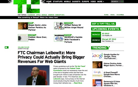
A good example is TechCrunch; the bright, neon green of the website is instantly recognizable and is paired up with two non-intrusive colors – black and white – to enhance readability:
So too is Bird Malaysia – the earthy browns and yellow-green text make us think of nature:

2. Large Fonts as a Centerpiece
The easy availability of a wide range of web fonts has liberated web typography from the Arial-Georgia-Verdana-Times New Roman stranglehold. Designers today have the option of working with a wide variety of fonts, which has spurred tremendous innovation in typography.
One typographical trend that has entrenched itself deeply in web design ethos is the use of large fonts. Many designers even eschew all other design elements for a quality large font that delivers the intended message. Often, the font is used as-is, with little or no tweaking. Some designers choose to add subtle shadows, grunge patterns, etc. to keep the font in sync with the rest of the site design.
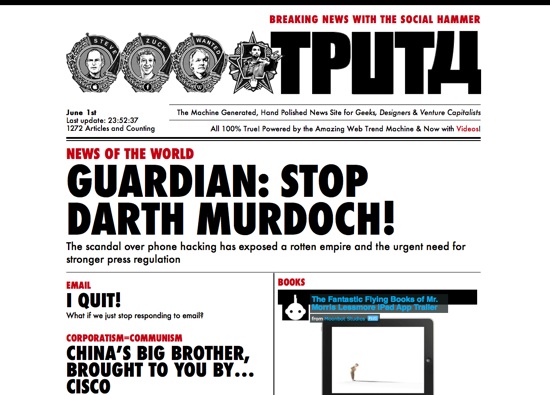
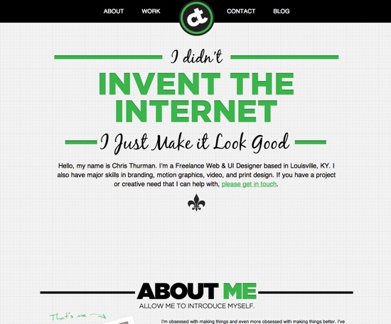
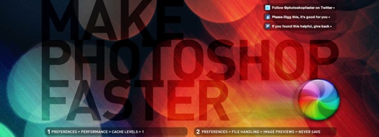
Tputh, Chris Thurman and Make Photoshop Faster provide three relevant examples:
In reality, this trend simply represents web technology catching up with print. We’re finally seeing on the web what we’ve seen for decades in print.
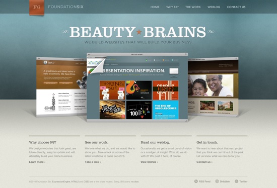
3. Subtlety
The in-your-face glossiness and drop shadows of the Web 2.0 era are, thankfully, behind us. Subtlety – a hallmark of good design – is once again fashionable. Drop shadows on fonts have been replaced by more subtle, soft, feathered shadows that blend into the text, adding a layer of texture and ‘physicality’ to the design. Similarly, the glossy, reflective logos and buttons of Web 2.0 have been replaced by gentler buttons with only a hint of a gradient and soft, rounded corners.
In other words: whatever you are doing, do a little bit less of it.
Shopify serves as a good example, especially the clean look of its signup buttons:

Similarly, consider the gentleness of Foundation Six's homepage:
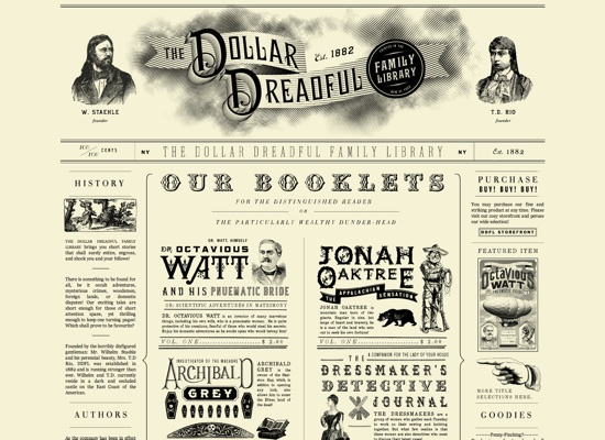
4. Going Retro
Retro has been the flavor of the design world – from fashion and industrial design to typography and web design – over the past few years. While Retro is difficult to pull off effectively, it is usually a very safe design choice because it strikes a chord with a fundamental human emotion: nostalgia.
If you do decide to go retro, it’s a safe bet to stay away from 80’s retro chic (represented by garish, over-the-top superfluity) and take up the bolder patterns and design elements of the 60s. Think Mad Men, not 80’s hair metal.
Consider as examples – EightyTwoDesign and TheDollarDreadful (which goes way retro):
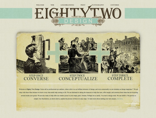
(Unfortunately, no link is available to EightyTwoDesign.)
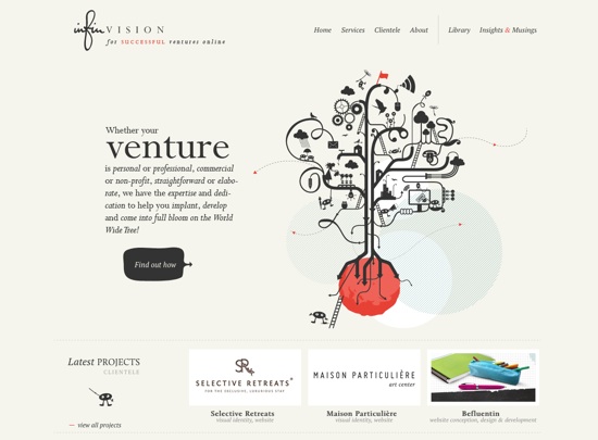
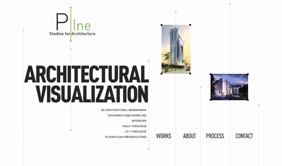
5. Minimalism
Browse through the design archives of the entire 20th century, and you’ll see minimalism as a constant through every upheaval in the design world. It was present during the kaleidoscopic color of the 70s, the neon-garishness of the 80s, and the grunge-dirt of the 90s. Minimalism, as a design ethos, is particularly relevant in web design because of its emphasis on function over form, readability over visual razzmatazz.
Examples – InfinVision and Pline Studios:
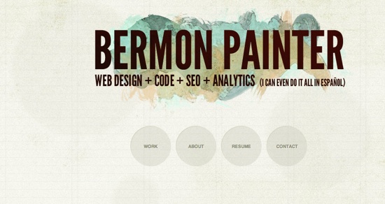
6. Textured Backgrounds
Browse through this striking collection of retro design from the 50s, 60s, and 70s, and you’ll see texture as an omnipresent feature, appearing in virtually every design. And for good reason: texture adds character and interest where none existed. A textured background can give off a layered, three dimensional effect, a certain warmth, and expanded room for creative play for designers.
Contemporary design trends dictate that the texture be not too obtrusive, nor excessively subtle. While the distressed grunge patterns of the Web 2.0 era are definitely out, a more subtle approach with softer patterns is recommended.
Examples – BermonPainter, GoGlamping (you'll want to click on each example to view the texture in more detail):
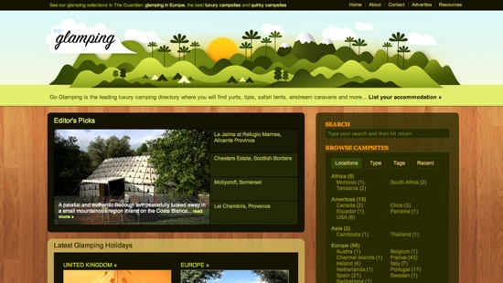
Admittedly, the wood background on this second example could be decried as being overly driven by the skeuomorphic trend sweeping the web and mobile apps. (Skeuomorphism refers to the use of "real world" objects in a digital environment; think of the Mac Calendar application or iOS Reminders.) For a camping-related site, one could argue bark or sand might be a bit more appropriate. Nevertheless, the luxurious wood floor suggests just that – luxury... and that's what "glamping" is supposed to be about.
If you're looking for subtle textures for your sites, Subtle Patterns should be your first stop.
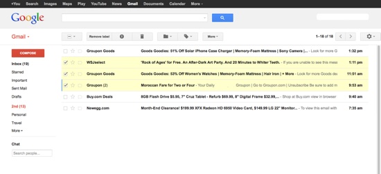
7. High Resolution Design Elements, Especially Icons
With 21-inch+ monitors and Retina displays becoming the norm, screen resolutions have never been higher. Anybody who has used Apple’s latest iPad 3 (ahem, iPad 4) can attest to the almost paper-like quality of the screen, thanks to its dense pixel count.
With more pixels available, designers now have the freedom of scaling up and using larger, pixel-perfect design elements. Elements such as pixel fonts are becoming a thing of the past. Instead, we see the generous use of large icons, buttons and typography. Larger screen sizes and the bifurcation of the desktop and mobile experience allow designers to create web pages with larger iconography for desktops, while reserving smaller, crisper layouts for mobile applications.
Icons are even replacing textual elements, the best example of which can be seen in the recent Gmail redesign that replaces text with easily-recognizable icons. This design would have been difficult to implement in the years of 1024×768 monitors.
In fact, the new Gmail design incorporates many of the design trend elucidated above, from minimalism and large fonts to big icons and limited color use:
Conclusion
Trends come and trends go, but underlying design principles remain. Advancements in hardware and software help to shape the expression of these principles. Keeping these pillars in mind when creating designs will help you push the limits and express yourself in a unique way without going too far and committing faux pas.
The real trend web designers should look at? History itself – its highlights and excesses, its mistakes and corrections. After all, the more things change, the more they stay the same.
Do you see other trends that seem to be sticking around because they represent underlying principles? Share in the comments!