 Download Help PDF (29MB) | Search:
To use Flash to create skin packages, you must be using Adobe Flash CS3 or CS4 or CS5+. Additionally, you should have basic familiarity with Flash. To get started learning the basics of Flash, see the Flash Support page.
Please note: If you just want to create customized buttons, it is much easier to use Easy Image Based Button Skinning.
To begin, download the skin file starter FLA, available here. Save it to an easy to find location so it can be easily re-used when creating additional skin files. Place a copy of the starter FLA in a folder in the site you're working on, giving it a meaningful name such as slideshow_skins.fla .
Important: It is highly recommended that you place the skin FLA in the v4flashslideshow/ supporting files folder. While not required, this can save the trouble of later adding the skin file's folder as trusted content to enable previewing the custom skins from within the wizard.
Open the new copy of the file in Flash, and switch to the Library panel (Window > Library). You will see two assets, the FlashComponentBase compiled clip (which provides necessary integration infrastructure) and the StarterSkin movieclip:
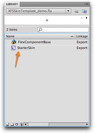
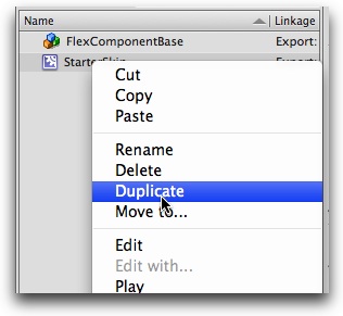
The StarterSkin movieclip is the base template for each of the skin(s) you create. It will never be used directly; instead, it will be duplicated for each skin you want to create. To start creating a new symbol, you will Cmd+click (right click) on the StarterSkin clip and select 'Duplicate':
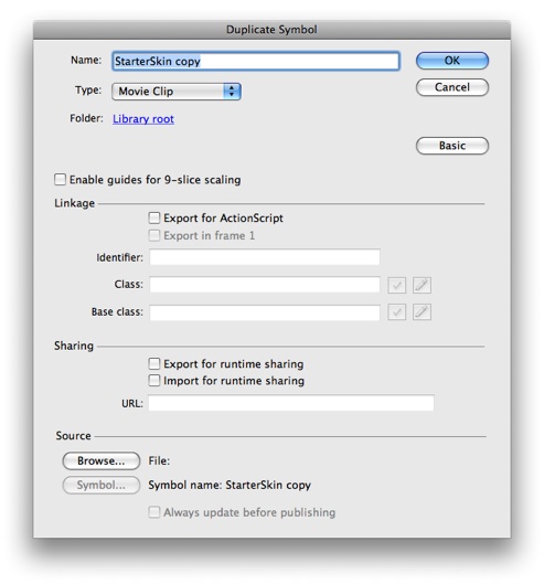
This will open the Duplicate Symbol dialog:
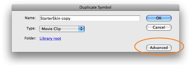
Note: If you don't see all of the options listed above, click the Advanced button to expand the dialog:
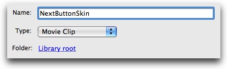
First, you must enter a name for the symbol. The names are very important, as they determine which element(s) the skin or icon is automatically applied to, if any. (Actually, the Class value does this, but this field is automatically filled when you enable Export for ActionScript, as described in a moment). To create a skin which is automatically applied, enter the element name (e.g. NextButton) followed by Skin . So, to create a skin which is automatically applied to all NextButton element instances, enter a name of NextButtonSkin . If you want to create an icon which is automatically applied, append Icon to the element name. So, to create an icon which is automatically applied to all NextButton instances, enter a name of NextButtonIcon . The following table summarizes the elements for which custom skins are commonly used:
| Element Name | Selected State Applies? |
Notes |
|---|---|---|
| PrintButton | No | |
| FirstButton | No | |
| LastButton | No | |
| PlayPauseButton | Yes | The standard (unselected) state is where the 'Play' button image will go. The selected state is where the 'Pause' button image will go. |
| PreviousButton | No | |
| NextButton | No | |
| LayoutJumpButton | No | |
| FullScreenButton | Yes | The standard (unselected) state is where the 'Go full screen' button image will go. The selected state is where the 'Return to normal screen' button image will go. |
| DynamicLinkButton | No | |
| LinkButton | No | |
| Button | Usually, no. | The selected state only applies if you are using the toggle feature on the button. |
| AutoplayToggleButton | Yes | The standard (unselected) state is where the 'Play' button image will go. The selected state is where the 'Pause' button image will go. |
| CaptionToggleButton | Yes | The standard (unselected) state is where the 'Caption currently visible' button image will go. The selected state is where the 'Caption currently hidden' button image will go. |
| AutoplayLoopToggleButton | Yes | The standard (unselected) state is where the 'Loop currently disabled' button image will go. The selected state is where the 'Loop currenty enabled' button image will go. |
| AudioMuteButton | No | |
| AudioVolumeToggleButton | Yes | The standard (unselected) state is where the 'Sound is on' button image will go. The selected state is where the 'Sound is muted' button image will go. |
| AudioPlayPauseButton | Yes | The standard (unselected) state is where the 'Play' button image will go. The selected state is where the 'Pause' button image will go. |
| AudioLoudButton | No |
For information on all elements in this table, see the Available Elements section of the manual.
Some buttons toggle, giving them two separate states (e.g. the PlayPauseButton element). On these elements, there are separate skins which are specified for the second state. Using the example of the PlayPauseButton, the standard state is where the Play button goes, and the selected state is where the Pause button goes. However, on elements which only have one state, no skins need be specified for the selected state.
Tip for Advanced Users: Instead of using an element's name as the base (the value which precedes Skin or Icon), you can also use some other generic name. In this case, the skin element will be applied to all elements which have a ... styleName="baseName" ... attribute on them. For example, if you created a skin symbol named specialButtonSkin (a base value of specialButton) it would be applied to any Button (or other type of) element which looked like this:
<Button ... styleName="specialButton" ... />
Or:
<SomeOtherElement ... styleName="specialButton" ... />
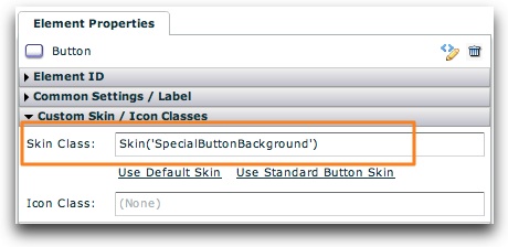
If you use a symbol name which doesn't end in Skin or Icon, the skin won't be automatically applied to any elements. Instead, you'll be able to reference it in the slideshow by using the Skin('MySymbolName') attribute format. For example, you might use multiple generic Button elements in your slideshow. If you wanted to apply a customized skin to just one of these instances, you could create a symbol named SpecialButtonBackground. Then, in the Properties Panel for the appropriate Button element, you would enter Skin('SpecialButtonBackground') in the Skin field:
While icons can be used on button elements, it is generally much better to use a full customized skin instead of an icon. Icons are overlaid on top of the skin, whereas a skin represents the entire button's appearance.
For this example, we will be creating a customized skin for the NextButton element by using NextButtonSkin as the name:
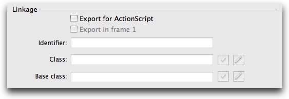
Once you have entered a symbol name in the Duplicate Symbol dialog, you must configure the Linkage section as well:
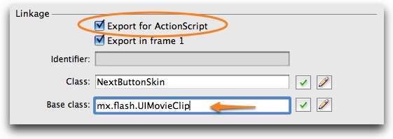
First, check the 'Export for ActionScript' option. This will enable and pre-populate the 'Export in Frame 1', Class and Base Class fields. Important: You must change the Base Class field to be mx.flash.UIMovieClip or the skins won't work. The Class box will be automatically filled with the symbol name you entered above; make sure that this exactly matches the symbol name, or the skins won't work. After updating the settings, the section should appear like this:
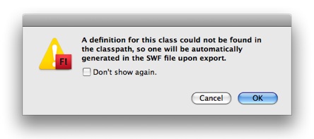
You can now click the OK button on the right of the Dupliate Symbol dialog to finish duplicating the symbol. You may receive the following warning message; if so, simply click OK:
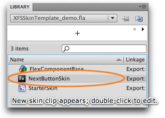
The newly created skin symbol will now appear in your Library panel:
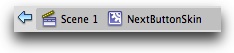
To begin editing the skin, double-click it. Above the stage, you should see that you're editing the NextButtonSkin movieclip symbol (for this demo):
With the symbol now selected for editing, switch to the Timeline (Window > Timeline):
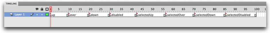
Each of the labeled keyframes will hold a different state of the button. To edit a state, click on its keyframe (the circle just below the red flag), then add the desired contents to the stage. (If the process of editing a movieclip if unfamiliar to you, you need to review the Flash help.) The following table summarizes what button state each of the frames represents:
| State | Info |
|---|---|
| States which apply to all buttons/elements: | |
| up | Represents the skin when there is no user interaction. This is its default/normal state. |
| over | Represents the skin when the user hovers over it. (E.g. when they roll over a button.) |
| down | Represents the skin when the user presses down the mouse on it. (E.g. when they click the button.) |
| disabled | Represents the skin when the element (button) is disabled. (E.g. the PreviousButton is disabled when the first image is being displayed.) |
| States which only apply to toggled (selectable) buttons/elements: | |
| selectedUp | Only applies to the elements listed in the table above which utilize the selected state. Represents the up state (as described above) when the button is selected. |
| selectedOver | Only applies to the elements listed in the table above which utilize the selected state. Represents the over state (as described above) when the button is selected. |
| selectedDown | Only applies to the elements listed in the table above which utilize the selected state. Represents the down state (as described above) when the button is selected. |
| selectedDisabled | Only applies to the elements listed in the table above which utilize the selected state. Represents the disabled state (as described above) when the button is selected. |
As noted in the table, elements with only a single state (e.g. the NextButton) need not have any content added to the final four keyframes. Additionally, note that all of the specific frame label names are important -- don't modify them, or the skins won't work properly.
Once you have added content to each of the frames, the skin symbol is complete. If you wish to create additional skins, follow the process of duplicating the StarterSkin template again.
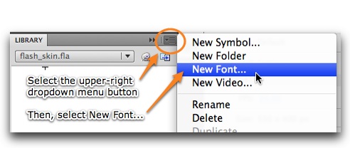
Skin files can also be used to hold embedded fonts for use in the slideshow. Open the Library panel and select the dropdown menu in the upper-right corner of the panel. On the menu, select 'New Font...':
This will open the New Font Symbol dialog:
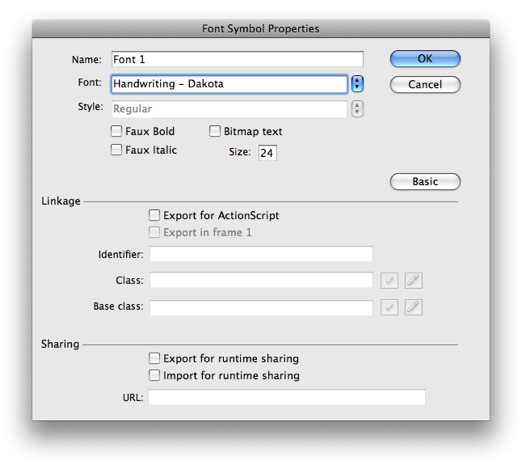
First, select a font from the Font menu. If the font has multiple styles, you will be able to select one from the Style menu. If you want to embed a bold, italic, or bold+italic version of the font, check the appropriate boxes. If you plan to use multiple styles of the font in your slideshow, you must embed each style of the font as a separate symbol. Next, enter a generic name in the Name field -- this name is only used to identify the font when working in Flash; it will not be referenced in the actual slideshow.
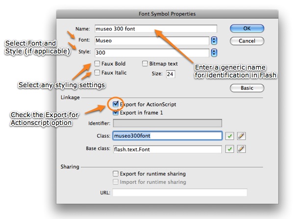
Next, you must check the Export for ActionScript checkbox. This step is very important! When you check the box, the Export in Frame 1 box will be automatically checked as well. The dialog should now appear similar to the following:
Once you've configured the settings, click the OK button to add the font symbol to the FLA's library. You may receive the following warning message; it can be ignored:
Once you have exported and applied the skin file to your slideshow, see the Using Custom Embedded Fonts topic for more information on utilizing the embedded font(s) in your slideshow.
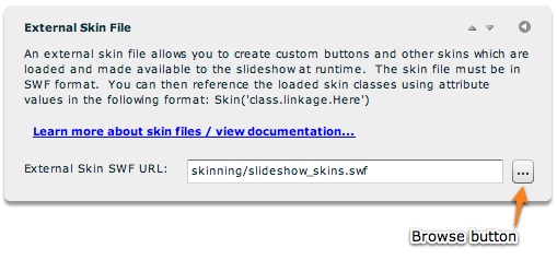
If you saved the skin FLA to a location within your site, the exporting process is very straightforward. Simply press Cntrl + Enter (Cmd + Return) to test the movie. (You can also select Control > Test Movie.) This will generate the SWF file skin package and place it in the same folder as the FLA. Now, switch to Dreamweaver and launch the slideshow wizard. In the External Skin File pod in the Appearance Settings tab, browse to and select the SWF file which was just generated:
When you save and preview the slideshow, all of your skins should be automatically applied:

IMPORTANT: If you didn't place the skin file in the already-trusted v4flashslideshow/ supporting files directory, you may receive the following error message when previewing the slideshow:
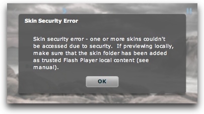
To address this issue, you must add the folder which holds the skin SWF as Flash Player trusted local content in the Flash Player security settings dialog. To learn more about doing this, see this topic.
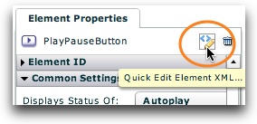
If you want any button (especially one with a custom skin) to display the hand cursor when moused over to help make its action more clear to users, you can enable this behavior by adding ...buttonMode="true" useHandCursor="true"... to the button's element code. In the wizard, select a button and click the Quick Edit Element XML button:
In the Quick Tag Editor dialog, add the code shown above (highlighted in the picture):
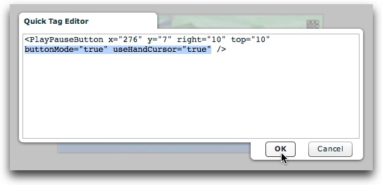
Click OK, and your button will now display a hand cursor when hovered over.