 Download Help PDF (29MB) | Search:
Easy image-based button skinning allows you to create and apply custom button images to your slideshow quickly and easily. First, it's important to understand the concept of buttons modes and states.
Most buttons in a slideshow only have one mode - they always show the same "icon" and always perform the same action when clicked. An example of a button with only one mode is the NextButton element. The NextButton always shows the same icon (usually a forward arrow), and always performs the same action (progressing the slideshow to the next image).
Other buttons, however, have two modes. These buttons can show two different "icons" and will perform two different actions depending on which mode they're in. An example of this type of button is the PlayPauseButton element. In the first of its modes, the PlayPauseButton shows a "play" icon and starts the slideshow playback when clicked. In the second of its two modes, it shows a "pause" icon and stops slideshow playback when clicked.
For buttons with two modes, the second mode is referred to as its selected mode. Thus, if a button is "selected", this means that it is currently in its second mode. (Note - If a button can be toggled, this is another way of saying that it has two modes.)
For each mode a button has, it has four corresponding states. These states are:
| State Name | Info |
|---|---|
| up | Represents the button when there is no user interaction. This its default/normal state. |
| over | Represents the button when the user hovers over it. (E.g. when they roll over a button.) |
| down | Represents the button when the user presses down the mouse on it. (E.g. when they click the button.) |
| disabled | Represents the button when it is disabled. (E.g. the PreviousButton is disabled when the first image is being displayed.) |
Thus, buttons with one mode have four states, and buttons with two modes have eight states. Buttons with one mode have the following states: up, over, down, disabled. Buttons with two modes have the following states: up, over, down, disabled, selectedUp, selectedOver, selectedDown, selectedDisabled. The first four of the eight represent the skins for the button's first mode; the last four represent the skins for the selected (second) mode of the button.
The following table summarizes the states:
| State | Info |
|---|---|
| States which apply to all buttons/elements: | |
| up | Represents the skin when there is no user interaction. This is its default/normal state. |
| over | Represents the skin when the user hovers over it. (E.g. when they roll over a button.) |
| down | Represents the skin when the user presses down the mouse on it. (E.g. when they click the button.) |
| disabled | Represents the skin when the element (button) is disabled. (E.g. the PreviousButton is disabled when the first image is being displayed.) |
| States which only apply to toggled (selectable) buttons/elements: | |
| selectedUp | Only applies to the elements listed in the table above which utilize the selected state. Represents the up state (as described above) when the button is selected. |
| selectedOver | Only applies to the elements listed in the table above which utilize the selected state. Represents the over state (as described above) when the button is selected. |
| selectedDown | Only applies to the elements listed in the table above which utilize the selected state. Represents the down state (as described above) when the button is selected. |
| selectedDisabled | Only applies to the elements listed in the table above which utilize the selected state. Represents the disabled state (as described above) when the button is selected. |
Simple button skinning uses an image technique called sprites to centralize all images for a skin in a single image file. Put simply, a sprite is one larger image that includes several smaller images positioned next to each other; each of the smaller images represents a single state for the skin. At runtime, the larger image is loaded and automatically split apart into its constituent states, simulating the use of separate image files for each state. Sprites make designing a skin much easier since all states are next to each other in a single design file. The technique also reduces bandwidth and server load at runtime because only one file must be transferred; this provides a faster and better user experience.
When creating an image-skinned custom button, the first step is to create one of these sprite images.
For slideshow button skins, the images for each state are stacked vertically in the sprite image. For one-mode buttons, the four state images are stacked like this:
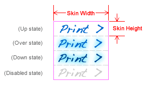
The pink border represents the outer border of the sprite image (the image that is used as the skin image). The dashed gray lines represent the imaginary edges of each of the invidual state images. Important! Note that all state images must be the exact same size. This size in the example image is denoted with the Skin Width and Skin Height markers. These dimensions are important, as they determine where the image will be sliced apart when the skin is created; they must be entered in the wizard when creating an image skin (more information below).
For two-mode buttons, the eight state images are stacked like this:
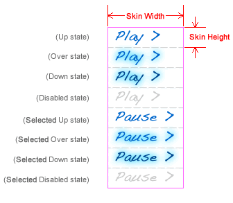
Again, note that all state images are exactly the same size. All state images for the selected-mode are placed at the bottom of the sprite image.
After you've created the sprite image in a graphics program of your choice (such as Photoshop or Fireworks), export the image as either a PNG, JPEG, GIF, or SWF file and save it within your site. It is generally best to use PNG 32 format, because it supports transparency and preserves high quality.
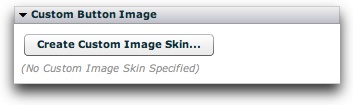
Once you have created your custom button sprite image, you're ready to apply it to your slideshow in the wizard. Launch the Insert or Edit Wizard and switch to the main Layout / Presentation tab. Locate and select the button element that you want to skin. In the Properties Panel, locate the Custom Button Image pod and click the Create Custom Image Skin button:
This will launch the following dialog:
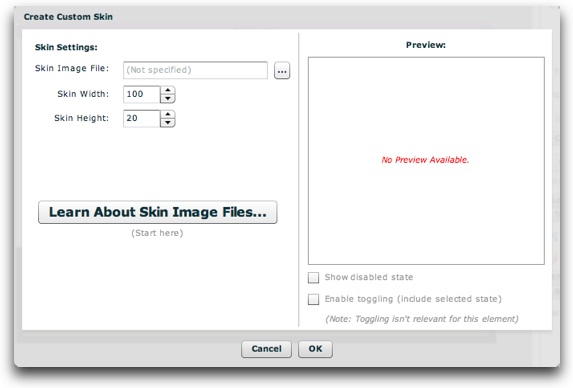
On the left you can specify the the skin information; on the right a preview will be shown. Use the browse button on the Skin URL field to select the sprite image you just exported. After selecting an image, the Skin Width and Skin Height fields will be automatically filled. Make sure that the values are correct, corresponding to the dimensions of each state image within the sprite image (as shown in the diagrams in the section above).
On the right, you'll be able to see a preview of the button skin:
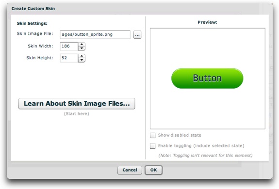
At the bottom of the preview, there are two options that allow you to fully preview the button. First, the Show Disabled State checkbox allows you to preview the button in its disabled state. For two-mode buttons, the bottom option (Enable Toggling) will be checked by default, allowing you to preview both the standard and selected modes of the button. When this checkbox is selected, the example button will toggle back and forth as you click on it, so that you can see both button modes. For one-mode buttons, a message is displayed to let you know that the toggling is irrelevant for that element.
Once you're finished specifying the information and have confirmed that the button behaves as expected, click OK to apply the skin. You'll now be able to see a preview of the skin in the Properties Panel:
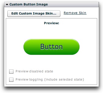
Click the Edit Custom Image Skin button to return to the previous dialog to make changes. Click the Remove Skin button to remove the custom button skin. When you now preview your slideshow, the button will use the custom image as its skin.