| Package | com.dwuser.ss4.ui |
| Class | public class IndividualSlide |
| Inheritance | IndividualSlide  VBox Box Container UIComponent FlexSprite flash.display.Sprite VBox Box Container UIComponent FlexSprite flash.display.Sprite |
IndividualSlide style values which can be applied in the <styles> section
of the XML configuration file. This element is never used to create standalone elements in the Layout XML; instead, it is automatically created internally
by the various image display elements (such as ImagesStandard).
Important note: The inherited border and background styles on this class are irrelevant because there is no border displayed on this element. Instead,
the borders/mattes on the actual images are defined by the IndividualSlideImage style settings; see that class for more information. To create a border/background
which is always visible behind/around the image display area, define a border on the main image display element (such as ImagesStandard).
The settings on this class / style selector control the appearance of each slide, most notably the following aspects: (1) Image scaling mode (through the scaleMode
style parameter), (2) Image alignment (through the horizontalAlign and verticalAlign parameters), (3) Image reflection (through the useReflection
parameter, and (4) Image watermark (through the useWatermark parameter).
Slide Events
There are several events which the slide dispatches, for which handlers can be defined in the XML. These handlers are created in the XML by adding them directly to the
<img ... /> node. Support event types:
event_sync - Dispatched when the slide finishes transitioning in (opening) and it is synced. Referencing 'event.someValue...' in the handler allows for access to
the original SlideshowEvent event properties (see SlideshowEvent.IMAGES_SYNCIMAGES for more info). Referencing 'event.currentTarget.someValue...
is the same as referencing slideshow.someValue... , since the SlideshowEvent is dispatched from the main slideshow.event_click - Dispatched when the slide is clicked. Referencing 'event.someValue...' in the handler allows for access to
the original MouseEvent event properties. Referencing 'event.currentTarget.someValue...
is the same as referencing currentSlideReference.someValue... , since the MouseEvent is dispatched from the slide in question. In other
words, the event's currentTarget property provides a reference to the dispatching IndividualSlide instance.event_rollOver - Dispatched when the slide is moused over. Referencing 'event.someValue...' in the handler allows for access to
the original MouseEvent event properties. Referencing 'event.currentTarget.someValue...
is the same as referencing currentSlideReference.someValue... , since the MouseEvent is dispatched from the slide in question. In other
words, the event's currentTarget property provides a reference to the dispatching IndividualSlide instance.event_rollOut - Dispatched when the user mouses off the slide. Referencing 'event.someValue...' in the handler allows for access to
the original MouseEvent event properties. Referencing 'event.currentTarget.someValue...
is the same as referencing currentSlideReference.someValue... , since the MouseEvent is dispatched from the slide in question. In other
words, the event's currentTarget property provides a reference to the dispatching IndividualSlide instance.Example handler 1 - The following listener starts autoplay when the image is opened / synced:
<img ... event_sync="event.currentTarget.startAutoplay();" />
Example handler 2 - The following listener calls the javascript alert function (which displays an alert box) when the slide is rolled over:
<img ... event_rollOver="navigateToURL(new URLRequest('javascript:alert(\'You just rolled over the slide!\')'));" />
Style XML Implementation Example:
The following example code goes in the <styles> section of the main <slideshow> holder node in a slideshow XML configuration file.
The IndividualSlide class inherits all of the style tag attributes of its superclass, EXCEPT those noted above!
   <styles>
   ...
      <IndividualSlide
         Styles
         scaleMode="scaleDown|showAvailable|scaleUpAndDown|fillArea"
         useWatermark="false"
         horizontalAlign="center"
         verticalAlign="middle"
         useReflection="false"
         reflectionAlpha="0.7"
         reflectionSize="0.3"
         reflectionBlur="0.4"
         startKBEffectEarly="false"
         disableAutoplayOnMouseKB="true"
         noteHideDelay="2300"
      />
   ...
   </styles>
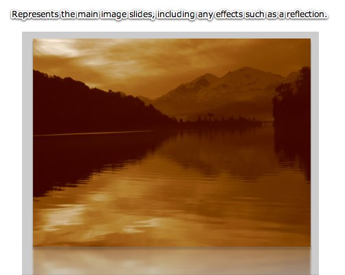
Element Pictorial Example:
See also
| Property | Defined by | ||
|---|---|---|---|
 | activeEffects : Array
The list of effects that are currently playing on the component,
as an Array of EffectInstance instances.
| UIComponent | |
| autoLayout : Boolean
If
true, measurement and layout are done
when the position or size of a child is changed. | Container | |
| automationDelegate : Object
The delegate object that handles the automation-related functionality.
| UIComponent | |
| automationName : String
Name that can be used as an identifier for this object.
| UIComponent | |
| automationTabularData : Object
An implementation of the
IAutomationTabularData interface, which
can be used to retrieve the data. | UIComponent | |
| automationValue : Array
This value generally corresponds to the rendered appearance of the
object and should be usable for correlating the identifier with
the object as it appears visually within the application.
| UIComponent | |
| baselinePosition : Number
The y-coordinate of the baseline
of the first line of text of the component.
| UIComponent | |
| borderMetrics : EdgeMetrics
Returns an EdgeMetrics object that has four properties:
left, top, right,
and bottom. | Container | |
| cacheHeuristic : Boolean
Used by Flex to suggest bitmap caching for the object.
| UIComponent | |
| cachePolicy : String
Specifies the bitmap caching policy for this object.
| UIComponent | |
| childDescriptors : Array
Array of UIComponentDescriptor objects produced by the MXML compiler.
| Container | |
| className : String
The name of this instance's class, such as
"Button". | UIComponent | |
| clipContent : Boolean
Whether to apply a clip mask if the positions and/or sizes
of this container's children extend outside the borders of
this container.
| Container | |
| contentMouseX : Number
Returns the x position of the mouse, in the content coordinate system.
| Container | |
| contentMouseY : Number
Returns the y position of the mouse, in the content coordinate system.
| Container | |
| creatingContentPane : Boolean
Containers use an internal content pane to control scrolling.
| Container | |
| creationIndex : int
Specifies the order to instantiate and draw the children
of the container.
| Container | |
| creationPolicy : String
The child creation policy for this Container.
| Container | |
| currentLooperData : Object
When using this component as the child of a DataLooper element, this holds the current element's corresponding looping data.
| UIComponent | |
| currentState : String
The current view state of the component.
| UIComponent | |
| cursorManager : ICursorManager
Gets the CursorManager that controls the cursor for this component
and its peers.
| UIComponent | |
| data : Object
The
data property lets you pass a value
to the component when you use it in an item renderer or item editor. | Container | |
| defaultButton : IFlexDisplayObject
The Button control designated as the default button
for the container.
| Container | |
| descriptor : UIComponentDescriptor
Reference to the UIComponentDescriptor, if any, that was used
by the
createComponentFromDescriptor() method to create this
UIComponent instance. | UIComponent | |
| document : Object
A reference to the document object associated with this UIComponent.
| UIComponent | |
| dominantColor : Number
Specifies the dominant color of the current image.
| IndividualSlide | ||
| dominantColorDark : Number
Specifies a darkened version of the dominant color of the current image.
| IndividualSlide | ||
| dominantColorLight : Number
Specifies a lightened version of the dominant color of the current image.
| IndividualSlide | ||
| doubleClickEnabled : Boolean
Specifies whether the UIComponent object receives
doubleClick events. | UIComponent | |
| enabled : Boolean
Whether the component can accept user interaction.
| UIComponent | |
| errorString : String
The text that will be displayed by a component's error tip when a
component is monitored by a Validator and validation fails.
| UIComponent | |
| explicitHeight : Number
Number that specifies the explicit height of the component,
in pixels, in the component's coordinates.
| UIComponent | |
| explicitMaxHeight : Number
Number that specifies the maximum height of the component,
in pixels, in the component's coordinates.
| UIComponent | |
| explicitMaxWidth : Number
Number that specifies the maximum width of the component,
in pixels, in the component's coordinates.
| UIComponent | |
| explicitMinHeight : Number
Number that specifies the minimum height of the component,
in pixels, in the component's coordinates.
| UIComponent | |
| explicitMinWidth : Number
Number that specifies the minimum width of the component,
in pixels, in the component's coordinates.
| UIComponent | |
| explicitWidth : Number
Number that specifies the explicit width of the component,
in pixels, in the component's coordinates.
| UIComponent | |
| flexContextMenu : IFlexContextMenu
The context menu for this UIComponent.
| UIComponent | |
| focusEnabled : Boolean
Indicates whether the component can receive focus when tabbed to.
| UIComponent | |
| focusManager : IFocusManager
Gets the FocusManager that controls focus for this component
and its peers.
| UIComponent | |
| focusPane : Sprite
The focus pane associated with this object.
| UIComponent | |
| globalX : Number | UIComponent | |
| globalY : Number | UIComponent | |
| height : Number
Number that specifies the height of the component, in pixels,
in the parent's coordinates.
| UIComponent | |
| horizontalLineScrollSize : Number
Number of pixels to move when the left- or right-arrow
button in the horizontal scroll bar is pressed.
| Container | |
| horizontalPageScrollSize : Number
Number of pixels to move when the track in the
horizontal scroll bar is pressed.
| Container | |
| horizontalScrollBar : ScrollBar
The horizontal scrollbar used in this container.
| Container | |
| horizontalScrollPolicy : String
Specifies whether the horizontal scroll bar is always present,
always absent, or automatically added when needed.
| Container | |
| horizontalScrollPosition : Number
The current position of the horizontal scroll bar.
| Container | |
| icon : Class
The Class of the icon displayed by some navigator
containers to represent this Container.
| Container | |
| id : String
ID of the component.
| UIComponent | |
| imgDescriptor : Object
The XML descriptor object for the image.
| IndividualSlide | ||
| includeInLayout : Boolean
Specifies whether this component is included in the layout of the
parent container.
| UIComponent | |
| inheritingStyles : Object
The beginning of this component's chain of inheriting styles.
| UIComponent | |
| initialized : Boolean
A flag that determines if an object has been through all three phases
of layout: commitment, measurement, and layout (provided that any were required).
| UIComponent | |
| innerImageGlobalPosition : Point
Specifies the global coordinate point of the actual image as currently displayed, INCLUDING any border and/or matte.
| IndividualSlide | ||
| innerImageHeight : Number
Specifies the actual height of the image as currently displayed.
| IndividualSlide | ||
| innerImageWidth : Number
Specifies the actual width of the image as currently displayed.
| IndividualSlide | ||
| innerImageX : Number
Specifies the internal x-coordinate of the actual left edge of the image.
| IndividualSlide | ||
| innerImageY : Number
Specifies the internal y-coordinate of the actual top edge of the image.
| IndividualSlide | ||
| instanceIndex : int
The index of a repeated component.
| UIComponent | |
| instanceIndices : Array
An Array containing the indices required to reference
this UIComponent object from its parent document.
| UIComponent | |
| isDocument : Boolean
Determines whether this UIComponent instance is a document object,
that is, whether it is at the top of the hierarchy of a Flex
application, MXML component, or ActionScript component.
| UIComponent | |
| isPopUp : Boolean
Set to
true by the PopUpManager to indicate
that component has been popped up. | UIComponent | |
| label : String
The text displayed by some navigator containers to represent
this Container.
| Container | |
| maxHeight : Number
Number that specifies the maximum height of the component,
in pixels, in the component's coordinates.
| UIComponent | |
| maxHorizontalScrollPosition : Number
The largest possible value for the
horizontalScrollPosition property. | Container | |
| maxVerticalScrollPosition : Number
The largest possible value for the
verticalScrollPosition property. | Container | |
| maxWidth : Number
Number that specifies the maximum width of the component,
in pixels, in the component's coordinates.
| UIComponent | |
| measuredHeight : Number
The default height of the component, in pixels.
| UIComponent | |
| measuredMinHeight : Number
The default minimum height of the component, in pixels.
| UIComponent | |
| measuredMinWidth : Number
The default minimum width of the component, in pixels.
| UIComponent | |
| measuredWidth : Number
The default width of the component, in pixels.
| UIComponent | |
| minHeight : Number
Number that specifies the minimum height of the component,
in pixels, in the component's coordinates.
| UIComponent | |
| minWidth : Number
Number that specifies the minimum width of the component,
in pixels, in the component's coordinates.
| UIComponent | |
| miscHolder : Object
A utility holder for any various properties
| UIComponent | |
| moduleFactory : IFlexModuleFactory
The moduleFactory that is used to create TextFields in the correct SWF context.
| UIComponent | |
| mouseFocusEnabled : Boolean
Whether you can receive focus when clicked on.
| UIComponent | |
| move_enableProtection : Boolean = false | UIComponent | |
| nestLevel : int
Depth of this object in the containment hierarchy.
| UIComponent | |
| nonInheritingStyles : Object
The beginning of this component's chain of non-inheriting styles.
| UIComponent | |
| numAutomationChildren : int
The number of automation children this container has.
| UIComponent | |
| numChildren : int
Number of child components in this container.
| Container | |
| outerImageGlobalPosition : Point
Specifies the global coordinate point of the actual image as currently displayed, NOT including any border and/or matte.
| IndividualSlide | ||
| outerImageHeight : Number
Specifies the actual height of the image as currently displayed, including any border and/or matte.
| IndividualSlide | ||
| outerImageWidth : Number
Specifies the actual width of the image as currently displayed, including any border and/or matte.
| IndividualSlide | ||
| outerImageX : Number
Specifies the internal x-coordinate of the actual left edge of the bordered and/or matted image.
| IndividualSlide | ||
| outerImageY : Number
Specifies the internal y-coordinate of the actual top edge of the bordered and/or matted image.
| IndividualSlide | ||
| owner : DisplayObjectContainer
The owner of this UIComponent.
| UIComponent | |
| parent : DisplayObjectContainer
The parent container or component for this component.
| UIComponent | |
| parentApplication : Object
A reference to the Application object that contains this UIComponent
instance.
| UIComponent | |
| parentDocument : Object
A reference to the parent document object for this UIComponent.
| UIComponent | |
| percentHeight : Number
Number that specifies the height of a component as a percentage
of its parent's size.
| UIComponent | |
| percentWidth : Number
Number that specifies the width of a component as a percentage
of its parent's size.
| UIComponent | |
| processedDescriptors : Boolean
Set to
true after immediate or deferred child creation,
depending on which one happens. | UIComponent | |
| rawChildren : IChildList
A container typically contains child components, which can be enumerated
using the
Container.getChildAt() method and
Container.numChildren property. | Container | |
| repeater : IRepeater
A reference to the Repeater object
in the parent document that produced this UIComponent.
| UIComponent | |
| repeaterIndex : int
The index of the item in the data provider
of the Repeater that produced this UIComponent.
| UIComponent | |
| repeaterIndices : Array
An Array containing the indices of the items in the data provider
of the Repeaters in the parent document that produced this UIComponent.
| UIComponent | |
| repeaters : Array
An Array containing references to the Repeater objects
in the parent document that produced this UIComponent.
| UIComponent | |
| scaleX : Number
Number that specifies the horizontal scaling factor.
| UIComponent | |
| scaleY : Number
Number that specifies the vertical scaling factor.
| UIComponent | |
| screen : Rectangle
Returns an object that contains the size and position of the base
drawing surface for this object.
| UIComponent | |
| setActualSize_enableProtection : Boolean = false | UIComponent | |
| setVisible_enableProtection : Boolean = true | UIComponent | |
| showInAutomationHierarchy : Boolean
A flag that determines if an automation object
shows in the automation hierarchy.
| UIComponent | |
| slideshow : FlashSlideshow
A reference to the main slideshow
| IndividualSlide | ||
| states : Array
The view states that are defined for this component.
| UIComponent | |
| styleClassOverridesInline : Boolean = true
Specifies if class-specific styles (as defined by the
styleName property) override inline styles. | UIComponent | |
| styleDeclaration : CSSStyleDeclaration
Storage for the inline inheriting styles on this object.
| UIComponent | |
| styleName : Object
The class style used by this component.
| UIComponent | |
| systemManager : ISystemManager
Returns the SystemManager object used by this component.
| UIComponent | |
| toolTip : String
Text to display in the ToolTip.
| UIComponent | |
| transitions : Array
An Array of Transition objects, where each Transition object defines a
set of effects to play when a view state change occurs.
| UIComponent | |
| tweeningProperties : Array
Array of properties that are currently being tweened on this object.
| UIComponent | |
| uid : String
A unique identifier for the object.
| UIComponent | |
| updateCompletePendingFlag : Boolean
A flag that determines if an object has been through all three phases
of layout validation (provided that any were required).
| UIComponent | |
| validationSubField : String
Used by a validator to associate a subfield with this component.
| UIComponent | |
| verticalLineScrollSize : Number
Number of pixels to scroll when the up- or down-arrow
button in the vertical scroll bar is pressed,
or when you scroll by using the mouse wheel.
| Container | |
| verticalPageScrollSize : Number
Number of pixels to scroll when the track
in the vertical scroll bar is pressed.
| Container | |
| verticalScrollBar : ScrollBar
The vertical scrollbar used in this container.
| Container | |
| verticalScrollPolicy : String
Specifies whether the vertical scroll bar is always present,
always absent, or automatically added when needed.
| Container | |
| verticalScrollPosition : Number
The current position of the vertical scroll bar.
| Container | |
| viewMetrics : EdgeMetrics
Returns an object that has four properties:
left,
top, right, and bottom. | Container | |
| viewMetricsAndPadding : EdgeMetrics
Returns an object that has four properties:
left,
top, right, and bottom. | Container | |
| visible : Boolean
Controls the visibility of this UIComponent.
| UIComponent | |
| visible_unprotected : Boolean
If setVisible_enableProtection is enabled, this allows access to determine what the pseudo-state is -- that is, what's been requested, regardless of any prevention of default behavior.
| UIComponent | |
| width : Number
Number that specifies the width of the component, in pixels,
in the parent's coordinates.
| UIComponent | |
| x : Number
Number that specifies the component's horizontal position,
in pixels, within its parent container.
| UIComponent | |
| xmlDescriptor : XML
For certain dynamically created elements, this represents the XML node used to create that element.
| UIComponent | |
| y : Number
Number that specifies the component's vertical position,
in pixels, within its parent container.
| UIComponent | |
| Method | Defined by | ||
|---|---|---|---|
| IndividualSlide | |||
|
addChild(child:DisplayObject):DisplayObject
Adds a child DisplayObject to this Container.
| Container | |
|
addChildAt(child:DisplayObject, index:int):DisplayObject
Adds a child DisplayObject to this Container.
| Container | |
|
callLater(method:Function, args:Array = null):void
Queues a function to be called later.
| UIComponent | |
|
clearStyle(styleProp:String):void
Deletes a style property from this component instance.
| UIComponent | |
|
contentToGlobal(point:Point):Point
Converts a
Point object from content coordinates to global coordinates. | Container | |
|
contentToLocal(point:Point):Point
Converts a
Point object from content to local coordinates. | Container | |
|
createAutomationIDPart(child:IAutomationObject):Object
Returns a set of properties that identify the child within
this container.
| UIComponent | |
|
Given a single UIComponentDescriptor, create the corresponding
component and add the component as a child of this Container.
| Container | |
|
createComponentsFromDescriptors(recurse:Boolean = true):void
Iterate through the Array of
childDescriptors,
and call the createComponentFromDescriptor() method for each one. | Container | |
|
createReferenceOnParentDocument(parentDocument:IFlexDisplayObject):void
Creates an
id reference to this IUIComponent object
on its parent document object. | UIComponent | |
|
deleteReferenceOnParentDocument(parentDocument:IFlexDisplayObject):void
Deletes the
id reference to this IUIComponent object
on its parent document object. | UIComponent | |
|
Returns a UITextFormat object corresponding to the text styles
for this UIComponent.
| UIComponent | |
|
dispatchEvent(event:Event):Boolean
Dispatches an event into the event flow.
| UIComponent | |
|
drawFocus(isFocused:Boolean):void
Shows or hides the focus indicator around this component.
| UIComponent | |
|
drawRoundRect(x:Number, y:Number, w:Number, h:Number, r:Object = null, c:Object = null, alpha:Object = null, rot:Object = null, gradient:String = null, ratios:Array = null, hole:Object = null):void
Programatically draws a rectangle into this skin's Graphics object.
| UIComponent | |
|
effectFinished(effectInst:IEffectInstance):void
Called by the effect instance when it stops playing on the component.
| UIComponent | |
|
effectStarted(effectInst:IEffectInstance):void
Called by the effect instance when it starts playing on the component.
| UIComponent | |
|
endEffectsStarted():void
Ends all currently playing effects on the component.
| UIComponent | |
|
executeBindings(recurse:Boolean = false):void
Executes all the data bindings on this Container.
| Container | |
|
executeChildBindings(recurse:Boolean):void
Executes the bindings into this Container's child UIComponent objects.
| Container | |
|
finishPrint(obj:Object, target:IFlexDisplayObject):void
Called after printing is complete.
| UIComponent | |
|
getAutomationChildAt(index:int):IAutomationObject
Provides the automation object at the specified index.
| UIComponent | |
|
getChildAt(index:int):DisplayObject
Gets the nth child component object.
| Container | |
|
getChildByName(name:String):DisplayObject
Returns the child whose
name property is the specified String. | Container | |
|
getChildIndex(child:DisplayObject):int
Gets the zero-based index of a specific child.
| Container | |
|
getChildren():Array
Returns an Array of DisplayObject objects consisting of the content children
of the container.
| Container | |
|
getClassStyleDeclarations():Array
Finds the type selectors for this UIComponent instance.
| UIComponent | |
|
getConstraintValue(constraintName:String):*
Returns a layout constraint value, which is the same as
getting the constraint style for this component.
| UIComponent | |
|
getDescendantByName(name:String):DisplayObject
Searches all children for the first child named with the passed value; returns that child, or null if not found.
| UIComponent | |
|
getDescendantsByName(name:String):Array
Searches all children for all children named with the passed value; returns an array with those children, or an empty array if none found.
| UIComponent | |
|
getExplicitOrMeasuredHeight():Number
A convenience method for determining whether to use the
explicit or measured height
| UIComponent | |
|
getExplicitOrMeasuredWidth():Number
A convenience method for determining whether to use the
explicit or measured width
| UIComponent | |
|
getFocus():InteractiveObject
Gets the object that currently has focus.
| UIComponent | |
|
getRepeaterItem(whichRepeater:int = -1):Object
Returns the item in the
dataProvider that was used
by the specified Repeater to produce this Repeater, or
null if this Repeater isn't repeated. | UIComponent | |
|
getStyle(styleProp:String):*
Gets a style property that has been set anywhere in this
component's style lookup chain.
| UIComponent | |
|
getVisibleRect(targetParent:DisplayObject = null):Rectangle
MOVED OVER FROM SDK 3.2 UIComponent - Allows for popped-up alerts to be displayed correctly - NGR MOVED 11-20-08
| UIComponent | |
|
globalToContent(point:Point):Point
Converts a
Point object from global to content coordinates. | Container | |
|
horizontalGradientMatrix(x:Number, y:Number, width:Number, height:Number):Matrix
Returns a box Matrix which can be passed to the
drawRoundRect() method
as the rot parameter when drawing a horizontal gradient. | UIComponent | |
|
initialize():void
Initializes the internal structure of this component.
| UIComponent | |
|
initializeRepeaterArrays(parent:IRepeaterClient):void
Initializes various properties which keep track of repeated instances
of this component.
| UIComponent | |
|
invalidateDisplayList():void
Marks a component so that its
updateDisplayList()
method gets called during a later screen update. | UIComponent | |
|
invalidateProperties():void
Marks a component so that its
commitProperties()
method gets called during a later screen update. | UIComponent | |
|
invalidateSize():void
Marks a component so that its
measure()
method gets called during a later screen update. | UIComponent | |
|
localToContent(point:Point):Point
Converts a
Point object from local to content coordinates. | Container | |
|
measureHTMLText(htmlText:String):TextLineMetrics
Measures the specified HTML text, which may contain HTML tags such
as
<font> and <b>,
assuming that it is displayed
in a single-line UITextField using a UITextFormat
determined by the styles of this UIComponent. | UIComponent | |
|
measureText(text:String):TextLineMetrics
Measures the specified text, assuming that it is displayed
in a single-line UITextField using a UITextFormat
determined by the styles of this UIComponent.
| UIComponent | |
|
move(x:Number, y:Number):void
Moves the component to a specified position within its parent.
| UIComponent | |
|
move_unprotected(x:Number, y:Number):void
Same as move, but cannot be prevented via the protection_move event.
| UIComponent | |
|
notifyStyleChangeInChildren(styleProp:String, recursive:Boolean):void
Propagates style changes to the children.
| UIComponent | |
|
owns(child:DisplayObject):Boolean
Returns
true if the chain of owner properties
points from child to this UIComponent. | UIComponent | |
|
parentChanged(p:DisplayObjectContainer):void
Called by Flex when a UIComponent object is added to or removed from a parent.
| UIComponent | |
|
pixelsToPercent(pxl:Number):Number
Method used to convert number of pixels to a
percentage relative to the contents of this container.
| Box | |
|
prepareToPrint(target:IFlexDisplayObject):Object
Prepares an IFlexDisplayObject for printing.
| UIComponent | |
|
regenerateStyleCache(recursive:Boolean):void
Builds or rebuilds the CSS style cache for this component
and, if the
recursive parameter is true,
for all descendants of this component as well. | UIComponent | |
|
registerEffects(effects:Array):void
For each effect event, registers the EffectManager
as one of the event listeners.
| UIComponent | |
|
removeAllChildren():void
Removes all children from the child list of this container.
| Container | |
|
removeChild(child:DisplayObject):DisplayObject
Removes a child DisplayObject from the child list of this Container.
| Container | |
|
removeChildAt(index:int):DisplayObject
Removes a child DisplayObject from the child list of this Container
at the specified index.
| Container | |
|
replayAutomatableEvent(event:Event):Boolean
Replays the specified event.
| UIComponent | |
|
resolveAutomationIDPart(criteria:Object):Array
Resolves a child by using the id provided.
| UIComponent | |
|
resumeBackgroundProcessing():void
[static]
Resumes the background processing of methods
queued by
callLater(), after a call to
suspendBackgroundProcessing(). | UIComponent | |
|
setActualSize(w:Number, h:Number):void
Sizes the object.
| UIComponent | |
|
setActualSize_unprotected(w:Number, h:Number):void
Same as setActualSize, but is not cancelable via the protection_size event.
| UIComponent | |
|
setChildIndex(child:DisplayObject, newIndex:int):void
Sets the index of a particular child.
| Container | |
|
setConstraintValue(constraintName:String, value:*):void
Sets a layout constraint value, which is the same as
setting the constraint style for this component.
| UIComponent | |
|
setCurrentState(stateName:String, playTransition:Boolean = true):void
Set the current state.
| UIComponent | |
|
setFocus():void
Sets the focus to this component.
| UIComponent | |
|
setStyle(styleProp:String, newValue:*):void
Sets a style property on this component instance.
| UIComponent | |
|
setVisible(value:Boolean, noEvent:Boolean = false):void
Called when the
visible property changes. | UIComponent | |
|
setVisible_unprotected(value:Boolean, noEvent:Boolean = false):void
Same as setVisible, but cannot be prevented.
| UIComponent | |
|
styleChanged(styleProp:String):void
Detects changes to style properties.
| UIComponent | |
|
stylesInitialized():void
Flex calls the
stylesInitialized() method when
the styles for a component are first initialized. | UIComponent | |
|
suspendBackgroundProcessing():void
[static]
Blocks the background processing of methods
queued by
callLater(),
until resumeBackgroundProcessing() is called. | UIComponent | |
|
toString():String
Returns a string indicating the location of this object
within the hierarchy of DisplayObjects in the Application.
| FlexSprite | |
|
validateDisplayList():void
Validates the position and size of children and draws other
visuals.
| UIComponent | |
|
validateNow():void
Validate and update the properties and layout of this object
and redraw it, if necessary.
| UIComponent | |
|
validateProperties():void
Used by layout logic to validate the properties of a component
by calling the
commitProperties() method. | UIComponent | |
|
validateSize(recursive:Boolean = false):void
Validates the measured size of the component
If the
LayoutManager.invalidateSize() method is called with
this ILayoutManagerClient, then the validateSize() method
is called when it's time to do measurements. | UIComponent | |
|
validationResultHandler(event:ValidationResultEvent):void
Handles both the
valid and invalid events from a
validator assigned to this component. | UIComponent | |
|
verticalGradientMatrix(x:Number, y:Number, width:Number, height:Number):Matrix
Returns a box Matrix which can be passed to
drawRoundRect()
as the rot parameter when drawing a vertical gradient. | UIComponent | |
| Method | Defined by | ||
|---|---|---|---|
|
adjustFocusRect(obj:DisplayObject = null):void
Adjust the focus rectangle.
| UIComponent | |
|
attachOverlay():void
Used internally by the Dissolve Effect to add the overlay to the chrome of a container.
| Container | |
|
childrenCreated():void
Performs any final processing after child objects are created.
| UIComponent | |
|
commitProperties():void
| IndividualSlide | ||
|
createBorder():void
Creates the container's border skin
if it is needed and does not already exist.
| Container | |
|
createChildren():void
| IndividualSlide | ||
|
createInFontContext(classObj:Class):Object
Creates a new object using a context
based on the embedded font being used.
| UIComponent | |
|
createInModuleContext(moduleFactory:IFlexModuleFactory, className:String):Object
Creates the object using a given moduleFactory.
| UIComponent | |
|
focusInHandler(event:FocusEvent):void
The event handler called when a UIComponent object gets focus.
| UIComponent | |
|
focusOutHandler(event:FocusEvent):void
The event handler called when a UIComponent object loses focus.
| UIComponent | |
|
initializationComplete():void
Finalizes the initialization of this component.
| UIComponent | |
|
initializeAccessibility():void
Initializes this component's accessibility code.
| UIComponent | |
|
isOurFocus(target:DisplayObject):Boolean
Typically overridden by components containing UITextField objects,
where the UITextField object gets focus.
| UIComponent | |
|
keyDownHandler(event:KeyboardEvent):void
The event handler called for a
keyDown event. | UIComponent | |
|
keyUpHandler(event:KeyboardEvent):void
The event handler called for a
keyUp event. | UIComponent | |
|
layoutChrome(unscaledWidth:Number, unscaledHeight:Number):void
Respond to size changes by setting the positions and sizes
of this container's borders.
| Container | |
|
measure():void
Calculates the default sizes and minimum and maximum values of the Box
container.
| Box | |
|
resourcesChanged():void
This method is called when a UIComponent is constructed,
and again whenever the ResourceManager dispatches
a
"change" Event to indicate
that the localized resources have changed in some way. | UIComponent | |
|
scrollChildren():void
Positions the container's content area relative to the viewable area
based on the horizontalScrollPosition and verticalScrollPosition properties.
| Container | |
|
updateDisplayList(unscaledWidth:Number, unscaledHeight:Number):void
| IndividualSlide | ||
| Style | Description | Defined by | ||
|---|---|---|---|---|
| Type: Number CSS Inheritance: no Alpha level of the color defined by the backgroundColor
property, of the image or SWF file defined by the backgroundImage
style. | Container | ||
| Type: String CSS Inheritance: no If a background image is specified, this style specifies whether it is fixed with regard to the viewport ( "fixed")
or scrolls along with the content ("scroll"). | Container | ||
| Type: uint Format: Color CSS Inheritance: no Background color of a component. | Container | ||
| Type: uint Format: Color CSS Inheritance: yes Background color of the component when it is disabled. | Container | ||
| Type: Object Format: File CSS Inheritance: no Background image of a component. | Container | ||
| Type: String CSS Inheritance: no Scales the image specified by backgroundImage
to different percentage sizes. | Container | ||
| Type: uint Format: Color CSS Inheritance: yes Determines the color of a ProgressBar. | Container | ||
| Type: String CSS Inheritance: no The vertical distance in pixels from the top edge of the content area to the control's baseline position. | UIComponent | ||
| Type: uint Format: Color CSS Inheritance: no Color of the border. | Container | ||
| Type: String CSS Inheritance: no Bounding box sides. | Container | ||
| Type: Class CSS Inheritance: no The border skin class of the component. | Container | ||
| Type: String CSS Inheritance: no Bounding box style. | Container | ||
| Type: Number Format: Length CSS Inheritance: no Bounding box thickness. | Container | ||
| Type: String CSS Inheritance: no The vertical distance in pixels from the lower edge of the component to the lower edge of its content area. | UIComponent | ||
| Type: Number CSS Inheritance: no The color brightness of the component. | UIComponent | ||
| Type: uint Format: Color CSS Inheritance: yes Color of text in the component, including the component label. | Container | ||
| Type: Number CSS Inheritance: no The color contrast of the component. | UIComponent | ||
| Type: Number Format: Length CSS Inheritance: no Radius of component corners. | Container | ||
|
disableAutoplayOnMouseKB
| Type: Boolean CSS Inheritance: no When mouse-based control over the Ken Burns (KB) effect is enabled, specifies whether autoplay should be paused when the user begins controlling the effect with their mouse. When a KB effect is specified for a slide and mouse-based control is enabled (via the true. | IndividualSlide | ||
| Type: uint Format: Color CSS Inheritance: yes Color of text in the component if it is disabled. | Container | ||
| Type: Number CSS Inheritance: no The alpha value for the overlay that is placed on top of the container when it is disabled. | Container | ||
| Type: uint Format: Color CSS Inheritance: yes Color of the drop shadow. | Container | ||
| Type: Boolean CSS Inheritance: no Boolean property that specifies whether the component has a visible drop shadow. | Container | ||
| Type: uint Format: Color CSS Inheritance: yes Color of the component highlight when validation fails. | UIComponent | ||
| Type: String CSS Inheritance: yes Sets the antiAliasType property of internal TextFields. | Container | ||
| Type: String CSS Inheritance: yes Name of the font to use. | Container | ||
| Type: String CSS Inheritance: yes Sets the gridFitType property of internal TextFields that represent text in Flex controls. | Container | ||
| Type: Number CSS Inheritance: yes Sets the sharpness property of internal TextFields that represent text in Flex controls. | Container | ||
| Type: Number Format: Length CSS Inheritance: yes Height of the text, in pixels. | Container | ||
| Type: String CSS Inheritance: yes Determines whether the text is italic font. | Container | ||
| Type: Number CSS Inheritance: yes Sets the thickness property of internal TextFields that represent text in Flex controls. | Container | ||
| Type: String CSS Inheritance: yes Determines whether the text is boldface. | Container | ||
|
horizontalAlign
| Type: String Format: Enumerated CSS Inheritance: no Specifies the horizontal alignment of the image if the dimensions of the available display area differ from those of the image (as determined by the scaleMode parameter).
This property controls the horizontal image alignment for all slides. The following horizontal alignments are supported:
This property can be overridden on a per-slide basis by setting the "center". | IndividualSlide | ||
| Type: String CSS Inheritance: no The horizontal distance in pixels from the center of the component's content area to the center of the component. | UIComponent | ||
| Type: Number Format: Length CSS Inheritance: no Number of pixels between children in the horizontal direction. | Box | ||
| Type: String CSS Inheritance: no The name of the horizontal scrollbar style. | Container | ||
| Type: Number CSS Inheritance: no The color hue of the component. | UIComponent | ||
| Type: Boolean CSS Inheritance: yes A Boolean value that indicates whether kerning is enabled ( true) or disabled (false). | Container | ||
| Type: String CSS Inheritance: no The horizontal distance in pixels from the left edge of the component's content area to the left edge of the component. | UIComponent | ||
| Type: Number CSS Inheritance: yes The number of additional pixels to appear between each character. | Container | ||
|
noteHideDelay
| Type: Number Format: Time CSS Inheritance: no Specifies the required duration of inactivity, in milliseconds, which must occur before any image note boxes automatically hide. If you wish for the note boxes to never automatically hide, set this delay to a very large value (such as 6000000 = ten minutes). To learn more about image notes, see the NoteBox class referenced below. | IndividualSlide | ||
| Type: Number CSS Inheritance: no The opacity of the component. | UIComponent | ||
| Type: Number Format: Length CSS Inheritance: no Number of pixels between the container's bottom border and the bottom of its content area. | Box | ||
| Type: Number Format: Length CSS Inheritance: no Number of pixels between the component's left border and the left edge of its content area. | Container | ||
| Type: Number Format: Length CSS Inheritance: no Number of pixels between the component's right border and the right edge of its content area. | Container | ||
| Type: Number Format: Length CSS Inheritance: no Number of pixels between the container's top border and the top of its content area. | Box | ||
|
reflectionAlpha
| Type: Number Format: Alpha CSS Inheritance: no Specifies the alpha (opacity) of the image reflection effect if it is enabled. A more transparent reflection provides a subtler effect, while a more opaque reflection provides a stronger effect. Valid values range from 0.0 (fully transparent) to 1.0 (fully opaque). The default value is0.7. | IndividualSlide | ||
|
reflectionBlur
| Type: Number CSS Inheritance: no Specifies the strength of the blur applied to the image reflection (if enabled). Generally, you'll want to use values between 0 and 2. The default value is 0.4, which equates to a mild blur to soften the reflection. The default value is 0.4. | IndividualSlide | ||
|
reflectionSize
| Type: Number CSS Inheritance: no Specifies the relative height of the reflection effect (if enabled) as a percentage of the main image height. Valid values range from 0.0 (no height at all; essentially disables the effect) to 1.0 (the reflection is as tall as the actual image). The default value is 0.3. | IndividualSlide | ||
| Type: String CSS Inheritance: no The horizontal distance in pixels from the right edge of the component to the right edge of its content area. | UIComponent | ||
| Type: Number CSS Inheritance: no The color saturation of the component. | UIComponent | ||
|
scaleMode
| Type: String Format: Enumerated CSS Inheritance: no Specifies the scaling mode used on the image. This property controls the image scaling mode for all slides. The following scaling modes are available:
The default value depends on the class. The default value for the This property can be overridden on a per-slide basis by setting the | IndividualSlide | ||
| Type: String CSS Inheritance: no Direction of the drop shadow. | Container | ||
| Type: Number Format: Length CSS Inheritance: no Distance of the drop shadow. | Container | ||
|
startKBEffectEarly
| Type: Boolean CSS Inheritance: no Specifies whether any Ken Burns (KB) effect (the panning and zooming) which has been applied to the image should begin early, before the slide has finished transitioning in. Normally, a slide's KB effect begins once the slide has finished transitioning in. This behavior is compatible with all image transitions. However, if you are using, for example, the FadeStandard transition, this means that the slide will finish fading in before the KB (panning / zooming) effect begins. By setting this parameter to false. | IndividualSlide | ||
| Type: String CSS Inheritance: yes Alignment of text within a container. | Container | ||
| Type: String CSS Inheritance: yes Determines whether the text is underlined. | Container | ||
| Type: Number Format: Length CSS Inheritance: yes Offset of first line of text from the left side of the container, in pixels. | Container | ||
| Type: uint Format: Color CSS Inheritance: yes Theme color of a component. | UIComponent | ||
| Type: String CSS Inheritance: no The vertical distance in pixels from the top edge of the control's content area to the top edge of the component. | UIComponent | ||
|
useReflection
| Type: Boolean CSS Inheritance: no Specifies if an image reflection effect should be displayed on the slide. To control the appearance of the reflection, see the reflectionAlpha, reflectionSize, and reflectionBlur
style parameters.
This property controls reflections for all slides. Reflections may not work properly when used in conjunction with some transitions if the images are being scaled; just be aware of this if you have trouble ("caveat developer"). The default value isfalse. | IndividualSlide | ||
|
useWatermark
| Type: Boolean CSS Inheritance: no Specifies whether or not to display a watermark (as implemented by the WatermarkImage class) on top of the image.
This property controls whether watermarks are enabled for all slides. To enable a watermark, set this property to This property can be overridden on a per-slide basis by setting the false. | IndividualSlide | ||
|
verticalAlign
| Type: String Format: Enumerated CSS Inheritance: no Specifies the vertical alignment of the image if the dimensions of the available display area differ from those of the image (as determined by the scaleMode parameter).
This property controls the vertical image alignment for all slides. The following vertical alignments are supported:
This property can be overridden on a per-slide basis by setting the "middle". | IndividualSlide | ||
| Type: String CSS Inheritance: no The vertical distance in pixels from the center of the component's content area to the center of the component. | UIComponent | ||
| Type: Number Format: Length CSS Inheritance: no Number of pixels between children in the vertical direction. | Box | ||
| Type: String CSS Inheritance: no The name of the vertical scrollbar style. | Container | ||
| dominantColor | property |
public var dominantColor:NumberSpecifies the dominant color of the current image.
This property's value is NaN until the real value is calculated and set.
This property is referenced on the current slide reference, accessible by using slideshow.current[Pre|Delayed|Post]SyncSlide .
To learn more about the current slide references, see the FlashSlideshow.
This property can be used as the source for data binding.
See also
| dominantColorDark | property |
public var dominantColorDark:NumberSpecifies a darkened version of the dominant color of the current image.
This property's value is NaN until the real value is calculated and set.
This value is the same as dominantColor except that it is calculated to be roughly 40 percent darker.
This property is referenced on the current slide reference, accessible by using slideshow.current[Pre|Delayed|Post]SyncSlide .
To learn more about the current slide references, see the FlashSlideshow.
This property can be used as the source for data binding.
See also
| dominantColorLight | property |
public var dominantColorLight:NumberSpecifies a lightened version of the dominant color of the current image.
This property's value is NaN until the real value is calculated and set.
This value is the same as dominantColor except that it is calculated to be roughly 40 percent lighter.
This property is referenced on the current slide reference, accessible by using slideshow.current[Pre|Delayed|Post]SyncSlide .
To learn more about the current slide references, see the FlashSlideshow.
This property can be used as the source for data binding.
See also
| imgDescriptor | property |
public var imgDescriptor:Object
The XML descriptor object for the image.
It is an object with two properties - id (this is the 0-base index of the image), and image (this is the
actual XML <img ... /> node). Thus, to reference properties on the XML object, use a format of: slideReference.imgDescriptor.image.@attributeName .
For an example format class (which demonstrates the structure of the object), see the ImageDescriptor class.
This property is automatically set, and is essentially read-only. It should only be used to access XML information about the image.
See also
| innerImageGlobalPosition | property |
public var innerImageGlobalPosition:PointSpecifies the global coordinate point of the actual image as currently displayed, INCLUDING any border and/or matte. This value reflects any scaling or cropping which has been applied.
This value differs from outerImageGlobalPosition in that innerImageGlobalPosition refers to the actual position of the
image, whereas outerImageGlobalPosition refers to the position of the image plus any border and/or matte around the image.
This property is usually used in conjunction with the UIComponent.globalX and UIComponent.globalY properties on some other element, in order
to make that element always track the current image's exact position.
This property is referenced on the current slide reference, accessible by using slideshow.current[Pre|Delayed|Post]SyncSlide .
To learn more about the current slide references, see the FlashSlideshow.
This property can be used as the source for data binding.
See also
| innerImageHeight | property |
public var innerImageHeight:NumberSpecifies the actual height of the image as currently displayed. This value reflects any scaling or cropping which has been applied.
This value differs from outerImageHeight in that innerImageHeight refers to the actual height of the
image, whereas outerImageHeight refers to the height of the image plus any border and/or matte around the image.
This property is referenced on the current slide reference, accessible by using slideshow.current[Pre|Delayed|Post]SyncSlide .
To learn more about the current slide references, see the FlashSlideshow.
This property can be used as the source for data binding.
See also
| innerImageWidth | property |
public var innerImageWidth:NumberSpecifies the actual width of the image as currently displayed. This value reflects any scaling or cropping which has been applied.
This value differs from outerImageWidth in that innerImageWidth refers to the actual width of the
image, whereas outerImageWidth refers to the width of the image plus any border and/or matte around the image.
This property is referenced on the current slide reference, accessible by using slideshow.current[Pre|Delayed|Post]SyncSlide .
To learn more about the current slide references, see the FlashSlideshow.
This property can be used as the source for data binding.
See also
| innerImageX | property |
public var innerImageX:Number
Specifies the internal x-coordinate of the actual left edge of the image.
This value is relative to the edge of the overall image display element (such as ImagesStandard).
This value differs from outerImageX in that innerImageX refers to the actual edge of the
image, whereas outerImageX refers to the edge of the border and matte around the image (if there is any).
This property is referenced on the current slide reference, accessible by using slideshow.current[Pre|Delayed|Post]SyncSlide .
To learn more about the current slide references, see the FlashSlideshow.
This property can be used as the source for data binding.
See also
| innerImageY | property |
public var innerImageY:Number
Specifies the internal y-coordinate of the actual top edge of the image.
This value is relative to the edge of the overall image display element (such as ImagesStandard).
This value differs from outerImageY in that innerImageY refers to the actual edge of the
image, whereas outerImageY refers to the edge of the border and matte around the image (if there is any).
This property is referenced on the current slide reference, accessible by using slideshow.current[Pre|Delayed|Post]SyncSlide .
To learn more about the current slide references, see the FlashSlideshow.
This property can be used as the source for data binding.
See also
| outerImageGlobalPosition | property |
public var outerImageGlobalPosition:PointSpecifies the global coordinate point of the actual image as currently displayed, NOT including any border and/or matte. This value reflects any scaling or cropping which has been applied.
This value differs from innerImageGlobalPosition in that innerImageGlobalPosition refers to the actual position of the
image, whereas outerImageGlobalPosition refers to the position of the image plus any border and/or matte around the image.
This property is usually used in conjunction with the UIComponent.globalX and UIComponent.globalY properties on some other element, in order
to make that element always track the current image's exact position.
This property is referenced on the current slide reference, accessible by using slideshow.current[Pre|Delayed|Post]SyncSlide .
To learn more about the current slide references, see the FlashSlideshow.
This property can be used as the source for data binding.
See also
| outerImageHeight | property |
public var outerImageHeight:NumberSpecifies the actual height of the image as currently displayed, including any border and/or matte. This value reflects any scaling or cropping which has been applied.
This value differs from innerImageHeight in that innerImageHeight refers to the actual height of the
image, whereas outerImageHeight refers to the height of the image plus any border and/or matte around the image.
This property is referenced on the current slide reference, accessible by using slideshow.current[Pre|Delayed|Post]SyncSlide .
To learn more about the current slide references, see the FlashSlideshow.
This property can be used as the source for data binding.
See also
| outerImageWidth | property |
public var outerImageWidth:NumberSpecifies the actual width of the image as currently displayed, including any border and/or matte. This value reflects any scaling or cropping which has been applied.
This value differs from innerImageWidth in that innerImageWidth refers to the actual width of the
image, whereas outerImageWidth refers to the width of the image plus any border and/or matte around the image.
This property is referenced on the current slide reference, accessible by using slideshow.current[Pre|Delayed|Post]SyncSlide .
To learn more about the current slide references, see the FlashSlideshow.
This property can be used as the source for data binding.
See also
| outerImageX | property |
public var outerImageX:Number
Specifies the internal x-coordinate of the actual left edge of the bordered and/or matted image.
This value is relative to the edge of the overall image display element (such as ImagesStandard).
This value differs from innerImageX in that innerImageX refers to the actual edge of the
image, whereas outerImageX refers to the edge of the border and matte around the image (if there is any).
This property is referenced on the current slide reference, accessible by using slideshow.current[Pre|Delayed|Post]SyncSlide .
To learn more about the current slide references, see the FlashSlideshow.
This property can be used as the source for data binding.
See also
| outerImageY | property |
public var outerImageY:Number
Specifies the internal y-coordinate of the actual top edge of the bordered and/or matted image.
This value is relative to the edge of the overall image display element (such as ImagesStandard).
This value differs from innerImageY in that innerImageY refers to the actual edge of the
image, whereas outerImageY refers to the edge of the border and matte around the image (if there is any).
This property is referenced on the current slide reference, accessible by using slideshow.current[Pre|Delayed|Post]SyncSlide .
To learn more about the current slide references, see the FlashSlideshow.
This property can be used as the source for data binding.
See also
| slideshow | property |
public var slideshow:FlashSlideshowA reference to the main slideshow
| IndividualSlide | () | constructor |
public function IndividualSlide()
| commitProperties | () | method |
protected override function commitProperties():void
| createChildren | () | method |
protected override function createChildren():void
| updateDisplayList | () | method |
protected override function updateDisplayList(unscaledWidth:Number, unscaledHeight:Number):voidParameters
unscaledWidth:Number |
|
unscaledHeight:Number |
 Hide Inherited Public Properties
 Show Inherited Public Properties