 Download Help PDF (29MB) | Search:
Some generic configuration options for touch-screen presentations are passed through definitions in the <styles> section of the main XML configuration file. These parameters are summarized below. They are specified in the <styles> section in the following manner:
<styles>
...
<SelectorName propertyName="value" anotherProperty="value" />
...
</style>
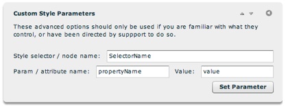
Styles may also be set via the Custom Style Parameters pod in the main Global Config. and Playback Settings tab:

| Selector | Property | Values | Description |
|---|---|---|---|
| TouchFullScreen | imageMode | swipe (default) or fade | Only applies when using the fullscreen touch display mode. Specifies the type of image display that is used. The swipe mode (the default) displays all photos in a continuous row that may be swiped through on the touchscreen. The fade mode only displays one photo at a time, with a fade transition between each. Generally, the default value provides the best user experience. However, for slideshows whose galleries contain many photos (e.g. > 30), performance will likely be better if using the fade mode. If loading or transition performance is lagging, fade should be considered. |
| controlHideTimeout | Numeric value (in milliseconds). Default is 3500 (3.5 seconds) | Only applies when using the fullscreen touch display mode. Specifies after what period of inactivity the controls will automatically hide. Using a very large value ensures that controls will only toggle when the user taps the screen. | |
| ThumbnailsTouch | show | true (default) or false | Only applies when using the fullscreen touch display mode. Specifies whether the thumbnail bar should be included in the layout at the bottom of the screen. |
| initiallyVisible | true (default) or false | Only applies when using the fullscreen touch display mode and the above parameter is true. Specifies whether the thumbnail bar at the bottom of the screen is initially visible or not. | |
| CaptionTouch | show | true (default) or false | Only applies when using the fullscreen touch display mode. Specifies whether the title and caption bar should be included in the layout at the bottom of the screen. |
| initiallyVisible | true or false (default) | Only applies when using the fullscreen touch display mode and the above parameter is true. Specifies whether the title and caption bar at the bottom of the screen is initially visible or not. | |
| GallerySelectorTouch | type | text (default) or image | Applies to the built-in gallery selector that overlays the entire layout. Controls whether the gallery selector should display a gallery thumbnail on the left and gallery title and description on the right (text), or just a large version of the gallery thumbnail image (image). If the latter value is used, it's important to specify images for the gallery thumbnails that are roughly the same width as the slideshow size. |
| initiallyOpen | true or false (default) | Specifies if the gallery selection screen should be the initial screen when the touch-optimized slideshow launches. If this parameter is set to true a selection will have to be made for the actual presentation to begin; otherwise, the first gallery will be opened as soon as the presentation is loaded. | |
| restartAutoplay | true (default) or false | Specifies if autoplay should automatically be restarted each time after a gallery selection is made. | |
| PreviousButtonTouch | disableAutoplayOnClick | true (default) or false | Specifies if autoplay should be disabled when the previous-image button is tapped. |
| enableGalleryJumping | true or false (default) | Specifies if the previous-image button should allow jumping from gallery to gallery. | |
| enableLooping | true or false (default) | Only applies when the above parameter is true. Specifies if the previous-image button will allow for jumping from the very first slide to the very last slide. | |
| NextButtonTouch | disableAutoplayOnClick | true (default) or false | Specifies if autoplay should be disabled when the next-image button is tapped. |
| enableGalleryJumping | true or false (default) | Specifies if the next-image button should allow jumping from gallery to gallery. | |
| enableLooping | true or false (default) | Only applies when using the above parameter is true. Specifies if the next-image button will allow for jumping from the very last slide to the very first slide. | |
| ImagesStandardTouch | *** For information about supported parameters, see the "available attributes" for the ImagesStandardTouch element here *** | ||
| ImagesSwipeTouch | *** For information about supported parameters, see the "available attributes" for the ImagesSwipeTouch element here *** | ||
| IndividualSlideTouch | scaleMode | showAvailable, scaleDown, scaleUpAndDown or fillArea | Specifies the scaling mode used on all photos in the touch-optimized slideshow. This parameter corresponds to the same on the IndividualSlide selector in the Flash-based player. Using showAvailable means no scaling will take place; scaleDown only scales the image if it's larger than the visible area; scaleUpAndDown scales the photo up and down as needed to fit the visible area; fillArea scales the photo so it always fully fills the available area. Defaults to scaleUpAndDown |
| horizontalAlign | left, center (default) or right | If the specified scaleMode causes the image to be smaller than the available area, this parameter specifies how the image will be horizontally aligned in the available area. | |
| verticalAlign | top, middle (default) or bottom | If the specified scaleMode causes the image to be smaller than the available area, this parameter specifies how the image will be vertically aligned in the available area. |