 Download Help PDF (29MB) | Search:
The Effect Editor is where you define all user interface (UI) effects which are used within the slideshow. The editor is accessed through various 'Edit Effects...' buttons, located next to effect selectors throughout the wizard. The dialog appears as follows:
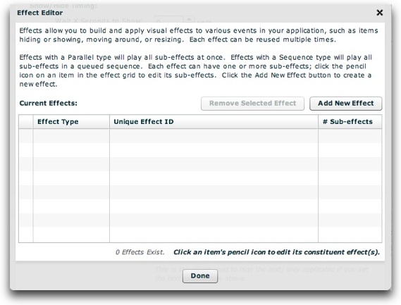
Effects allow you to build and apply visual effects to various events in your application, such as items hiding or showing, moving around, or resizing. Each effect is a reusable "package" with a unique ID, and can be referenced by this ID multiple times throughout your slideshow. For example, you could define a simple fade-in effect and a simple fade-out effect. Then, whenever you wanted a fade-in or fade-out, you would reference one of these effects. By centrally defining all effects, unnecessary duplication is avoided.
Effects are made up of one or more constituent sub-effects, though most effects contain only one sub-effect. Two different types of effects exist. They only differ if there is more than one sub-effect defined for the effect: Effects with a Parallel type will play all sub-effects at once; effects with a Sequence type will play all sub-effects in a queued sequence.
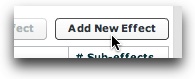
To create a new effect, click the Add New Effect button:
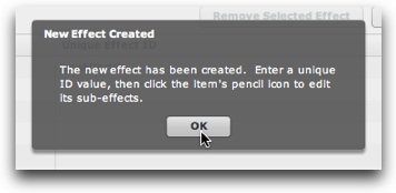
You will be notified that the effect has been created:
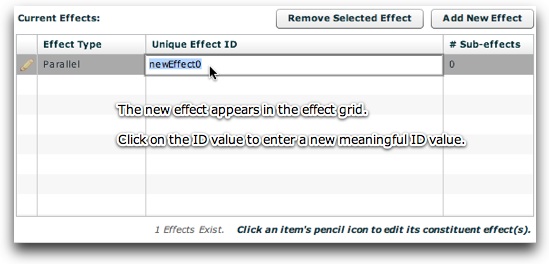
The new effect will appear in the effect grid. First, enter a unique and meaningful ID value. You will use this value to reference the effect elsewhere in the slideshow, so use a value which will help you identify it later:
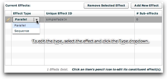
As mentioned above, there are two different types of effects - Parallel and Sequence (see above for the description of each). You can modify the type of a given effect by selecting it and then using the dropdown on the left:
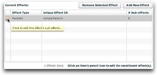
Once the effect has been created, you must defined at least one constituent sub-effect. This happens in the Edit Sub-effects dialog, which is accessed by clicking an effect's pencil icon in the Effect Editor:
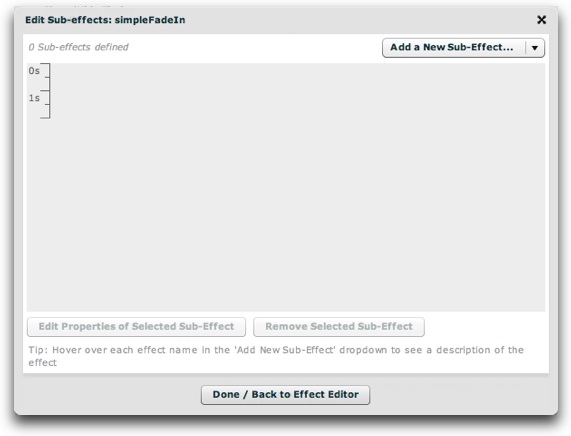
The appearance of the Edit Sub-effects window varies slightly based on whether the effect's type is Parallel or Sequence. In both instances, the large gray area in the center of the window is where the graphical representations of sub-effects appear.
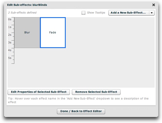
For a Parallel effect, the time axis is oriented vertically. The graphical representation box for each sub-effect has a fixed width, and its height represents its individual duration:
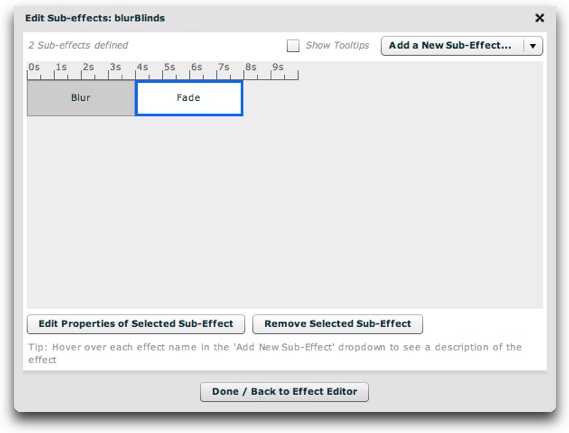
For a Sequence effect, the time axis is oriented horizontally. The graphical representation box for each sub-effect has a fixed height, and its width represents its individual duration:

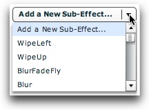
To get started, you need to add the first sub-effect. To do so, click the 'Add a New Sub-Effect...' dropdown and select an item:
To see a tooltip description of each effect within the wizard, hover over its name. A detailed summary is shown in the table below. If you prefer to not have the tooltips, you can disable them by unchecking the 'Show Tooltips' checkbox just to the left of the dropdown:
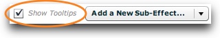
Note: Only some screenshots show the tooltip-toggle checkbox, as this feature was added in a later build.
| Sub-effect Type | Description |
|---|---|
| SoundEffect | The SoundEffect class plays an MP3 audio file. For example, you could play a sound when a user clicks a Button control. This effect lets you repeat the sound, select the source file, and control the volume and pan. You specify the URL of the MP3 file using the source property. |
| AnimateProperty | The AnimateProperty effect animates a property or style of a component. You specify the property name, start value, and end value of the property to animate. The effect sets the property to the start value, and then updates the property value over the duration of the effect until it reaches the end value. For example, to change the width of a Button control, you can specify width as the property to animate, and starting and ending width values to the effect. |
| Blur | The Blur effect lets you apply a blur visual effect to a component. A Blur effect softens the details of an image. You can produce blurs that range from a softly unfocused look to a Gaussian blur, a hazy appearance like viewing an image through semi-opaque glass. The Blur effect uses the Flash BlurFilter class as part of its implementation. For more information, see flash.filters.BlurFilter. If you apply a Blur effect to a component, you cannot apply a BlurFilter or a second Blur effect to the component. |
| Fade | The Fade effect animates the alpha property of a component, either from transparent to opaque, or from opaque to transparent. If you specify the Fade effect for the showEffect or hideEffect trigger, and if you omit values for the alphaFrom and alphaTo properties, the effect automatically transitions alpha from 0 to the target's current alpha value on a showEffect trigger, and from the target's current alpha value to 0 on a hideEffect trigger. If you use the Fade effect with non-embedded text, you must set the treatAsBitmap parameter to true on the target component. |
| Glow | The Glow effect lets you apply a visual glow effect to a component. The Glow effect uses the Flash GlowFilter class as part of its implementation. For more information, see the flash.filters.GlowFilter class. If you apply a Glow effect to a component, you cannot apply a GlowFilter or a second Glow effect to the component. |
| Iris | The Iris effect animates the effect target by expanding or contracting a rectangular mask centered on the target. The effect can either enlarge the mask from the center of the target to expose the target, or contract the mask toward the center to obscure the target. |
| Move | The Move effect changes the position of a component over a specified time interval. You can specify the initial position with the xFrom and yFrom values, the destination position with xTo and yTo, or the number of pixels to move the component with xBy and yBy. If you specify any two of the values (initial position, destination, or amount to move), the slideshow automatically calculates the third. If you specify all three, the slideshow ignores the xBy and yBy values. If you specify only the xTo and yTo values or the xBy and yBy values, the slideshow automatically sets xFrom and yFrom to be the object's current position. If you specify a Move effect for a moveEffect trigger, and if you do not set the six From, To, and By properties, the slideshow automatically sets them to create a smooth transition between the object's old position and its new position. You typically apply this effect to a target in a container that uses absolute positioning, such as Canvas, or one with "layout=absolute", such as Application or Panel. If you apply it to a target in a container that performs automatic layout, such as a VBox or Grid container, the move occurs, but the next time the container updates its layout, it moves the target back to its original position. You can set the container's autoLayout property to false to disable the move back, but that disables layout for all controls in the container. |
| Pause | The Pause effect is useful when sequencing effects. It does nothing for a specified period of time. If you add a Pause effect as a child of a sequenced effect, you can create a pause between the two other effects. |
| Resize | The Resize effect changes the width, height, or both dimensions of a component over a specified time interval. If you specify only two of the three values of the widthFrom, widthTo, and widthBy properties, the slideshow automatically calculates the third. If you specify all three, the slideshow ignores the widthBy value. If you specify only the widthBy or the widthTo value, the widthFrom property is set to be the object's current width. The same is true for heightFrom, heightTo, and heightBy property values. If you specify a Resize effect for a resize trigger, and if you do not set the six From, To, and By properties, the slideshow automatically sets them to create a smooth transition between the object's old size and its new size. |
| Rotate | The Rotate effect rotates a component around a specified point. You can specify the coordinates of the center of the rotation, and the starting and ending angles of rotation. You can specify positive or negative values for the angles. To use the Rotate effect with non-embedded text, you must set the treatAsBitmap property to true on the target component. |
| WipeDown | The WipeDown class defines a bar wipe down effect. The before or after state of the component must be invisible. You often use this effect with the showEffect and hideEffect triggers. The showEffect trigger occurs when a component becomes visible by changing its visible property from false to true. The hideEffect trigger occurs when the component becomes invisible by changing its visible property from true to false. This effect inherits the MaskEffect.showTarget property. If you set the value to true, the component appears. If you set the value to false, the component disappears. The default value is true. If you specify this effect for a showEffect or hideEffect trigger, the slideshow automatically sets the showTarget property for you, either to true if the component becomes invisible, or false if the component becomes visible. |
| WipeLeft | The WipeLeft class defines a bar wipe left effect. The before or after state of the component must be invisible. You often use this effect with the showEffect and hideEffect triggers. The showEffect trigger occurs when a component becomes visible by changing its visible property from false to true. The hideEffect trigger occurs when the component becomes invisible by changing its visible property from true to false. This effect inherits the MaskEffect.showTarget property. If you set the value to true, the component appears. If you set the value to false, the component disappears. The default value is true. If you specify this effect for a showEffect or hideEffect trigger, the slideshow automatically sets the showTarget property for you, either to true if the component becomes invisible, or false if the component becomes visible. |
| WipeRight | The WipeRight class defines a bar wipe right effect. The before or after state of the component must be invisible. You often use this effect with the showEffect and hideEffect triggers. The showEffect trigger occurs when a component becomes visible by changing its visible property from false to true. The hideEffect trigger occurs when the component becomes invisible by changing its visible property from true to false. This effect inherits the MaskEffect.showTarget property. If you set the value to true, the component appears. If you set the value to false, the component disappears. The default value is true. If you specify this effect for a showEffect or hideEffect trigger, the slideshow automatically sets the showTarget property for you, either to true if the component becomes invisible, or false if the component becomes visible. |
| WipeUp | The WipeUp class defines a bar wipe up effect. The before or after state of the component must be invisible. You often use this effect with the showEffect and hideEffect triggers. The showEffect trigger occurs when a component becomes visible by changing its visible property from false to true. The hideEffect trigger occurs when the component becomes invisible by changing its visible property from true to false. This effect inherits the MaskEffect.showTarget property. If you set the value to true, the component appears. If you set the value to false, the component disappears. The default value is true. If you specify this effect for a showEffect or hideEffect trigger, the slideshow automatically sets the showTarget property for you, either to true if the component becomes invisible, or false if the component becomes visible. |
| Zoom | The Zoom effect zooms the object in or out on a center point. When you apply a Zoom effect to text rendered using a system font, Flex scales the text between whole point sizes. While you do not have to use embedded fonts when you apply a Zoom effect to text, the Zoom will appear smoother when you apply it to embedded fonts. Note: The Zoom effect does not work when the Container.autoLayout property is false. |
| Blinds | The Blinds effect looks like a set of venetian blinds being opened or closed over the target. The direction parameter controls the vertical/horizontal orientation as well as which side the blinds grow from or shrink to. |
| BlurFade | The BlurFade effect blurs and fades the target at the same time. If isShowEffect is set to true, then the beginning alpha and beginning blur strength will be determined by the maxBlur and minAlpha properties. If isShowEffect is set to false, then the ending alpha and ending blur will be determined by these properties. |
| BlurFadeFly | The BlurFadeFly effect blurs, fades, and flys-out the target at the same time. |
| IsolatedCube | The IsolatedCube effect transitions between two views using the effect of a cube rotating. |
| Pixelate | The Pixelate effect pixelates the target to hide it. |
| PixelDissolve | The PixelDissolve effects hides or reveals the target by masking the image with hundreds or thousands of tiny little blocks. |
| Popper | The Popper effect either zooms the target in while fading it in (if isShowEffect is true), or zooms the target out while fading it out (if isShowEffect is false). The end result is that the target appears to pop in or pop out. |
| Slide | The Slide effect slides the target in or out from the specifed direction. |
| SoftIris | The SoftIris effect creates a circle with a softened edge which either grows to hide the target (if isShowEffect is false), or shrinks to reveal the target (if isShowEffect is true). |
| SoftWipe | The SoftWipe effect creates a wipe effect with a softened edge on the mask, giving a more 'polished' look. |
| SuperBlinds | The SuperBlinds effect creates a flip effect, flipping in the target or flipping it out. |
Tip for Advanced Users: To learn in more detail about all of the available attributes (properties) for each sub-effect, see the various effect pages which are referenced in the com.dwuser.ss4.managers.EffectLibrary class documentation.
Tip: Some of the most commonly-used subeffects include Fade, Blur, and Move.
Once you've added the effect, you will be transitioned to the edit-subeffect-properties view. This view is different for every effect, based on its various parameters. In this example, a Fade effect was added:
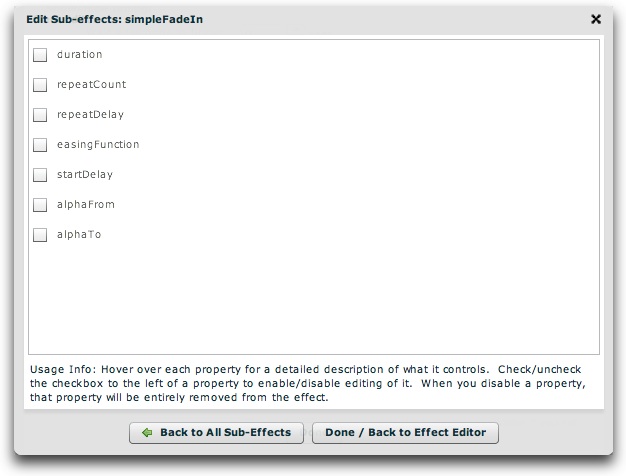
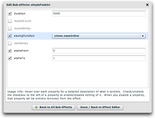
In this screen, you'll see all of the available parameters which can be set for the specific sub-effect. Note for developers or advanced users: All of the available sub-effect properties are detailed in the reference for the various classes in the com.dwuser.ss4.pseudoStyleClasses.subEffectReferenceClasses package (in the API reference). While in the wizard, hover over each property's name for a detailed description of what it controls:
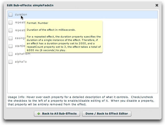
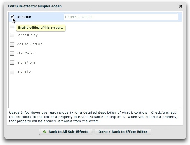
By default, none of the properties are enabled for editing; if you wish to specify a value for a property, check the checkbox to the left of the property name. Disabling the checkbox will remove that property from the sub-effect. The more commonly used properties are placed at the top of the list. For example, the duration specifies how long the effect lasts, and is the most important property.
For this example (a fade-in effect based on the Fade subeffect), the duration, alphaFrom, alphaTo, and easingFunction properties have been configured as follows:
Note: If you're setting a dropdown value but want to use the value which initially appears, it's a good idea to select two values to ensure that the property "sticks". In other words, in the screen above, you might select 'Linear.easeIn', then revert back to 'Linear.easeNone'. Otherwise, the wizard may not be able to know that you really wanted to set the value.
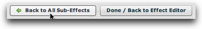
When you're done setting any properties, click the 'Back to All Sub-Effects' button to return to the sub-effect overview:
The newly added sub-effect will appear, represented by a selectable box:
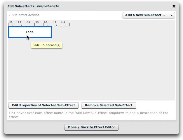
Hovering over the box will display the name of the effect along with its duration. If you add other sub-effects, each sub-effect will have its own selectable box (examples of multiple sub-effects are below). To change any properties of a sub-effect, click on it to select it (its color will go from gray to white and blue), then click the 'Edit Properties of Selected Sub-Effect' button:
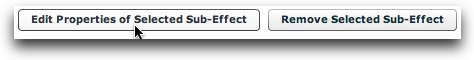
To remove the selected sub-effect, click the 'Remove Selected Sub-Effect' button.
When you're done specifying the sub-effects for the effect, click the 'Done / Back to Effect Editor' to return to the main Effect Editor dialog:
If you want to add another subeffect, follow the same process of using the 'Add a New Sub-Effect' menu again. Most effects only need one sub-effect, but sometimes you'll want to combine effects. For example, you might want to create an effect which both fades-out and blurs the target. To do this, you would add a Fade sub-effect and a Blur sub-effect.
Suppose that you wanted the blur effect to finish before the fade-out began. In this case, you would need to set the effect type to Sequence. The sub-effect representation would appear as follows:
On the other hand, suppose that you wanted both effects to happen at the same time. In this case, you would need to set the effect type to Parallel. The sub-effect representation would appear as follows:
In both of these examples, the duration of both sub-effects was set to 4 seconds. This was done by setting the 'duration' property on both sub-effects to 4000 (since duration is specified in milliseconds, as noted in the property description).
Note: At this time, there is no built-in facility for re-ordering existing sub-effects. You can manually reorder them in the XML file (usually easiest), or recreate new sub-effects and remove the old ones which aren't in the desired order.
If you wish to remove an effect, select it in the grid then click the 'Remove Selected Effect' button:
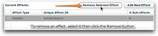
Important: If you have referenced an effect anywhere else in your slideshow, removing it will cause those linkages to fail. Remove effects with care.