Download Help PDF (29MB) | Search:
Armed with a knowledge of all the available elements, you're ready to start fleshing out the various layout views. The Design Area and Components Panel are the home-base for doing this.
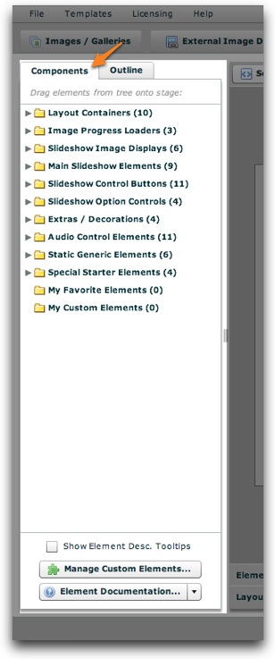
The Components Panel holds all of the available elements. The panel, located on the left side of the Layout / Presentation section, appears as follows:
To resize the panel, use the draggable resizer on the right edge of the box:

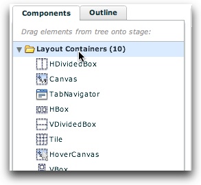
There are a number of folders, each representing a different type of elements. All of the elements are described in detail in the Available Elements section. The Favorite elements and Custom Elements folders are described below in more detail. To expand a certain type of element, click on its header:
When you close and later re-open the panel, the folders will be expanded or collapsed as appropriate to restore their previous state.
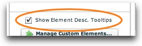
If you want a quick description of each element which in the wizard, enable the 'Show Element Description Tooltips' option at the bottom:
Then, a description tooltip will be shown when you hover over an item in the tree.
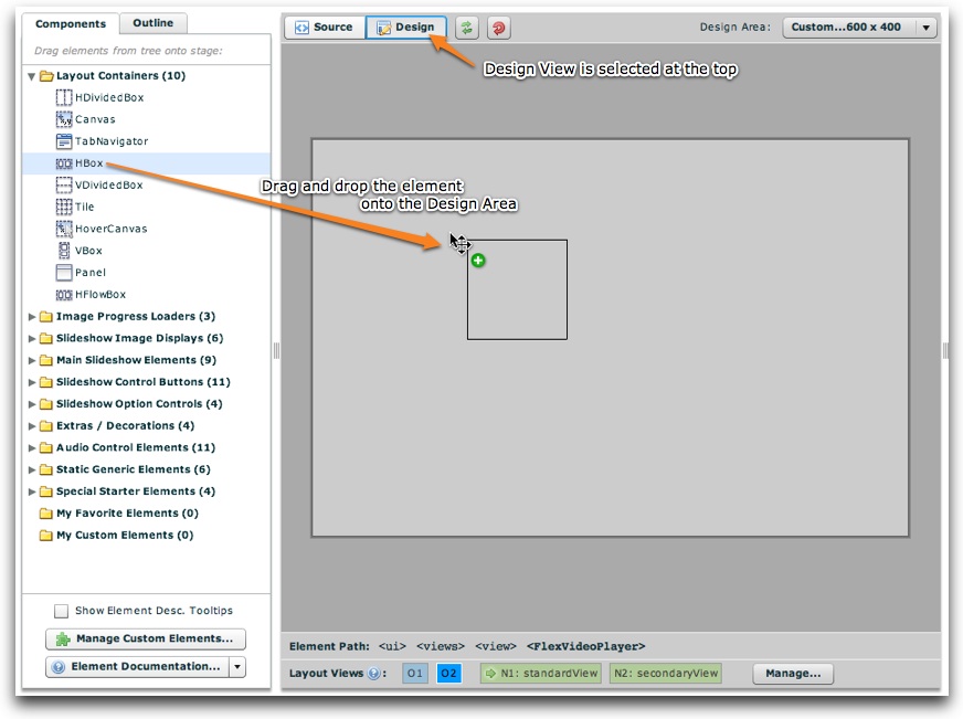
To add an element in the Components Panel in your slideshow, simply drag it onto the Design Area (see below for more information using the Design Area):
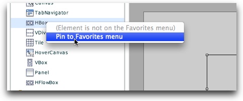
Instead of navigating from section to section in the Components Panel, you can pin selected elements to the My Favorite Elements menu. This allows one-click access to your most commonly used elements. To designate an element as a favorite, right-click (Cmd+click) it and select 'Pin to Favorites Menu':
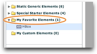
This will add it to the favorites section, which is accessed through the My Favorite Elements folder:
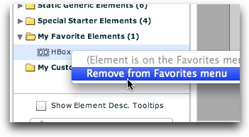
To remove an item from the favorites menu, right-click on it (Cmd+click) and select 'Remove from Favorites Menu':
Custom Elements allow you to store small snippets of code which represent commonly used elements (or groups of elements). They can also be used to store different common configurations of the same element. To get started using custom elements, click the Manage Custom Elements button at the bottom of the Components Panel:
This will open the Custom Element Management dialog:
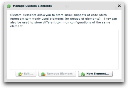
To begin, click the New Element... button:
This launches the New Custom Element dialog:
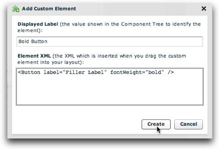
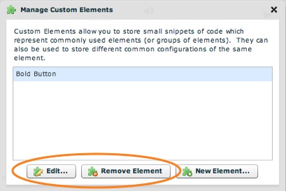
Enter the Displayed Label (the value shown in the Component Tree to identify the element) and the Element XML (the XML which is inserted when you drag the custom element into your layout). Click the Create button to add the new element. It will created and appear in the Custom Element Management dialog. If you want to edit or remove an existing custom element, select it in the grid and click 'Edit' or 'Remove Element' at the bottom:
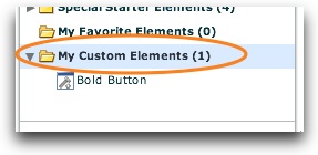
When you're done adding and managing custom elements, click the 'X' in the upper-right corner of the dialog to return to the main wizard. All of your custom elements will be accessible through the 'My Custom Elements' section of the Components Panel tree:
Custom elements can be used like any other built-in element; just drag and drop them into your layouts.
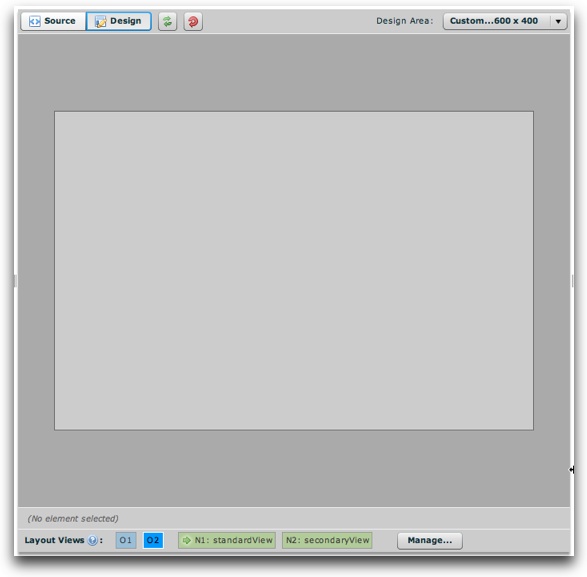
The design area is the main area in the center. It appears like this:
At the top-left are a number of control buttons:
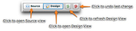
The 'Source' button opens Source View, where you can edit all of the Layout XML directly. Note -- the other XML code from the configuration file is not shown in this view; only the Layout XML is shown (from the <ui> section of the configuration file). The 'Design' view button activates the standard WYSIWYG design view. The Refresh button allows you to refresh the layout rendering if something doesn't seem to be updating properly. The final button allows you to undo the last change you made to the layout.
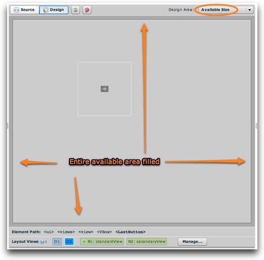
On the top-right are the controls for the design area's size:
Note that these dimensions only control the appearance of design view in the wizard. They are separate from the actual slideshow dimensions (specified in the Appearance Settings section). You can either set the design area to fill the available size:
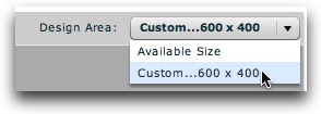
Or, you can use custom dimensions (which by default match the slideshow's dimensions, giving a realistic preview) by selecting the 'Custom...' option. This will open a dialog where you can specify the precise desired dimensions:
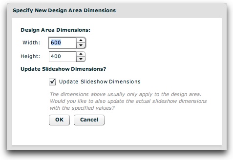
If you want this to be the size of the actual slideshow (in addition to the design view preview), you can specify that the main dimensions should be updated. Note that these custom dimensions are in pixels. As much as possible, you should use a preview size which matches the size of the actual slideshow; this helps to ensure that your layout will appear properly when previewed.
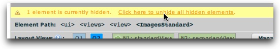
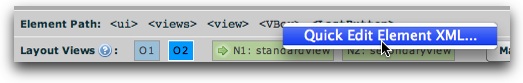
At the bottom of the design area, there are two bars. The first lists the XML path of the currently selected element:
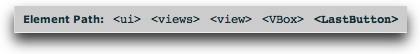
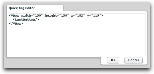
You can select any of the elements in the hierarchy by clicking on its tag name (e.g. click on 'VBox' above to select the LastButton's parent container). You can also edit any element's XML code by right-clicking (Cmd+clicking) on its tag name and selecting 'Quick Edit Element XML':
This allows you to edit the XML of that element directly:
The second bar at the bottom is the Layout Management Bar (be sure to review this topic). In Design View, only one layout view is shown at a given time. Depending on which view is selected in the Layout Management Bar, only that view will be visible on the stage above. As mentioned above, you drag and drop elements from the Components Panel onto the stage to add them to that layout view.
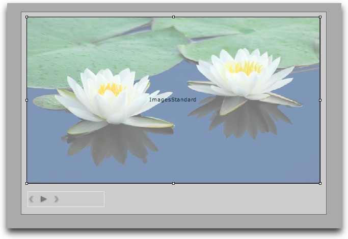
Once you've added elements using design view, your layout view might appear something like this:
To make changes and customizations to an element, you'll use the Properties Panel. However, you must first select the element. There are three methods to select an element:
In the design area, you can perform several element-related tasks by right-clicking (Cmd+clicking) on an element:
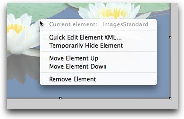
The menu will clarify which element is selected (so there is no confusion) and provide the following choices: