 Download Help PDF (29MB) | Search:
Audio Control Elements are a group of elements which can be used to add audio controls. This allows the user to control any audio which has been added to the slideshow.
Elements in this section:
*Important Note: It is important to note that the individual audio control elements with an asterisk should be placed within the AudioControlCanvas element. The reference below for this item should be reviewed first.
Advanced Users / Developers: For more detailed developer-oriented information about every element in this section, be sure to see the API reference for each element's corresponding class.
Usage Tip: When in the wizard, hover over any property name in the Properties Panel for a detailed description of what the option controls.
Advanced Users / Developers: Button Skinning
All of the buttons in this section can be skinned through the use of Custom Skin Files. See Custom Skin Files / Custom Buttons for more information. If you wish to only change the color of the button, change the Theme Color setting in the Properties Panel.
The AudioPlayPauseButton plays or pauses the currently playing audio. Important: To function properly, this element should be within an AudioControlCanvas or AudioControlBar. This tells it which level of audio to control (intro/background, gallery, and/or image).
Note that this element only controls audio; it doesn't affect Autoplay. Use the PlayPauseButton element if you wish to play/pause everything (audio, video, autoplay).
The color of the button can be customized through the Theme Color setting in the Properties Panel.
Example element in use within a slideshow:
Equivalement Class File
For detailed reference on this element, see the com.dwuser.ss4.ui.audiocontrols.AudioPlayPauseButton class in the API Reference.
The AudioControlBar class provides a default audio control component when a simple audio controller is needed. It incorporates both an AudioVolumeToggleButton and an AudioInfoText element, and has a nice fade effect when showing/hiding. The element can also be used to hold other custom audio control elements for an audio controller. It is special because, like its parent AudioControlCanvas, it automatically assigns the proper level setting to all child elements based on its own Control Level setting. This is important because it ensures that only the applicable type(s) of audio are controlled by a given controller.
This element, as a Canvas and subclass of AudioControlCanvas, is usually best used by adding a layout container (such as an HBox) which holds the actual audio control elements. The AudioControlCanvas (or it's child containers) can contain the following audio-control child elements:
AudioInfoText, AudioLoadBar, AudioLoudButton, AudioMuteButton, AudioPlayPauseButton, AudioScrubBar, AudioVolumeControl, AudioVolumeSlider, AudioVolumeToggleButton.
Important! Be sure to review the value for the Control Level attribute (pictured below). If you don't specify the correct and applicable level value, the audio controller won't be visible when it should be. The default value means that this controller will be visible all types of audio is playing. If you want only certain audio to be controlled, select only some boxes.
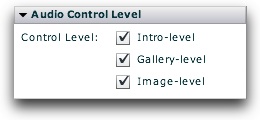
As a review: Intro-level audio is the slideshow background audio (specified in the Global Configuration & Playback Settings section); Gallery-level audio is audio associated with a single specific gallery; Image-level audio is audio associated with a single specific image.
Equivalement Class File
For detailed reference on this element, see the com.dwuser.ss4.ui.audiocontrols.AudioControlBar class in the API Reference.
The AudioControlCanvas element is used to hold all audio control elements for an audio controller. It is special because it automatically assigns the proper level setting to all child elements based on its own Control Level setting. This is important because it ensures that only the applicable type(s) of audio are controlled by a given controller.
This element, as a Canvas, is usually best used by adding a layout container (such as an HBox) which holds the actual audio control elements. The AudioControlCanvas (or it's child containers) can contain the following audio-control child elements:
AudioInfoText, AudioLoadBar, AudioLoudButton, AudioMuteButton, AudioPlayPauseButton, AudioScrubBar, AudioVolumeControl, AudioVolumeSlider, AudioVolumeToggleButton.
Important! Be sure to review the value for the Control Level attribute (pictured below). If you don't specify the correct and applicable level value, the audio controller won't be visible when it should be. The default value means that this controller will be visible all types of audio is playing. If you want only certain audio to be controlled, select only some boxes.
As a review: Intro-level audio is the slideshow background audio (specified in the Global Configuration & Playback Settings section); Gallery-level audio is audio associated with a single specific gallery; Image-level audio is audio associated with a single specific image.
Equivalement Class File
For detailed reference on this element, see the com.dwuser.ss4.ui.audiocontrols.AudioControlCanvas class in the API Reference.
The AudioScrubBar element allows the user to scrub to a specific point in the currently playing audio, while displaying the current progress. Important: To function properly, this element should be within an AudioControlCanvas or AudioControlBar. This tells it which level of audio to control (intro/background, gallery, and/or image).
The appearance / theme color of the element can be customized through the Theme Color setting in the Properties Panel.
Equivalement Class File
For detailed reference on this element, see the com.dwuser.ss4.ui.audiocontrols.AudioPlayPauseButton class in the API Reference.
The AudioMuteButton element is a button which, when clicked, mutes the audio volume. This element will control the volume of all audio on the slideshow; it is a "global" volume setting. If you would rather have a toggled button which functions as both a "loud" and "soft" button, use the AudioVolumeToggleButton element.
The color of the button can be customized through the Theme Color setting in the Properties Panel.
Example:
Equivalement Class File
For detailed reference on this element, see the com.dwuser.ss4.ui.audiocontrols.AudioMuteButton class in the API Reference.
The AudioLoudButton element is a button which, when clicked, sets the volume to full strength. This element will control the volume of all audio on the slideshow; it is a "global" volume setting. If you would rather have a toggled button which functions as both a "loud" and "soft" button, use the AudioVolumeToggleButton element.
The color of the button can be customized through the Theme Color setting in the Properties Panel.
Example:
Equivalement Class File
For detailed reference on this element, see the com.dwuser.ss4.ui.audiocontrols.AudioLoudButton class in the API Reference.
The AudioVolumeSlider element allows the user to control the audio volume level by dragging a slider. This element will control the volume of all audio on the slideshow; it is a "global" volume setting.
The appearance / theme color of the element can be customized through the Theme Color setting in the Properties Panel.
Example:
Equivalement Class File
For detailed reference on this element, see the com.dwuser.ss4.ui.audiocontrols.AudioVolumeSlider class in the API Reference.
The AudioVolumeToggleButton element allows the user to toggle the volume back and forth from full-level to muted. This element will control the volume of all audio on the slideshow; it is a "global" volume setting.
In the Properties Panel, you can set the initial state as well as the full volume level. As with all components, hover over the settings in the Properties Panel for a detailed description of that parameter.
The color of the button can be customized through the Theme Color setting in the Properties Panel.
Example (in full-level state):
Equivalement Class File
For detailed reference on this element, see the com.dwuser.ss4.ui.audiocontrols.AudioVolumeToggleButton class in the API Reference.
The AudioVolumeControl element allows the user to control the audio volume, incorporating three separate elements: AudioMuteButton, AudioVolumeSlider, and AudioLoudButton. There is a "mute" button, a volume slider, and a "loud" button. This element will control the volume of all audio on the slideshow; it is a "global" volume setting.
The appearance / theme color of the element can be customized through the Theme Color setting in the Properties Panel.
Example:
Equivalement Class File
For detailed reference on this element, see the com.dwuser.ss4.ui.audiocontrols.AudioVolumeControl class in the API Reference.
The AudioLoadBar element shows a loading-progress bar for the currently streaming audio. A solid track is drawn using the specified background color, then it is overlaid with the fill color as the audio loads. When the loading is fully complete, the fill color fully overlays the background color. Important: To function properly, this element should be within an AudioControlCanvas or AudioControlBar. This tells it which level of audio to control (intro/background, gallery, and/or image).
The Background Color and Fill Color parameters in the Properties Panel control the appearance of the bar.
Example:
Equivalement Class File
For detailed reference on this element, see the com.dwuser.ss4.ui.audiocontrols.AudioLoadBar class in the API Reference.
The AudioInfoText element displays information about the currently playing audio. Important: To function properly, this element should be within an AudioControlCanvas or AudioControlBar. This tells it which level of audio to control (intro/background, gallery, and/or image).
The Label Text property in the Properties Panel controls the text displayed. There are a set of special replacement values which can be included in the label to specify information relating to the currently playing audio file:
The default label value is {label} - {time} / {totaltime} which becomes, for example, "Audio File - 0:16 / 1:22" after 16 seconds of a 1:22 audio file labeled 'Audio File'.
The appearance of the text can be controlled through the Text Formatting section of the Properties Panel.
Example:
Equivalement Class File
For detailed reference on this element, see the com.dwuser.ss4.ui.audiocontrols.AudioInfoText class in the API Reference.