| Package | com.dwuser.ss4.ui |
| Class | public class ImagesScrollList |
| Inheritance | ImagesScrollList  Canvas Container UIComponent FlexSprite flash.display.Sprite Canvas Container UIComponent FlexSprite flash.display.Sprite |
This element is an Image Display element. This means that it displays the actual slideshow images, as specified by the various image galleries.
The ImagesScrollList creates a row, column, or grid of all slides in the gallery, displaying them at their full size. Each slide takes up a chunk of
space equal to the size of the actual ImagesScrollList element. The layout type is determined by the layoutDirection style parameter. When
an image becomes the selected image, it comes into central focus. The user can navigate in several different ways:
useMouseScroll is enabled, the grid will automatically scroll as the user moves their mouse in one direction or the other. If enabled,
the maxScrollSpeed style parameter controls the maximum speed of mouse-position-triggered scrolling.useScrollbars is enabled, scrollbars which allow scrolling of the grid will be shown.useScrollWheel is enabled, the user can use the scroll wheel to zoom in and out of the grid to get a wider or narrower perspective.
In some cases, this feature can be confusing, so it is disabled by default. If enabled, the minScale and maxScale style
properties determine the scaling limits when scaling in this manner.See each of the referenced style properties for more information. Because all slides are displayed at once, this image-display element is best used when your image galleries are not huge (e.g. around 50 images or less).
This image display can be used in conjunction with any preloading mode setting (as set by ImageManager.preloadMode), but generally either
smart or preloadAll should be used. You can also use either preloadThumbs or 3d. For the very best performance,
you should use low-quality version of the images for the main image source, and the regular high-quality images as the High Quality Image source. This will
allow the low-quality images to quickly load, and when a user clicks on a specific slide in the layout and focuses on it, a higher-quality version will then be
loaded and displayed.
To control the appearance of each of the slides, see the IndividualSlide class.
Layout XML Syntax Example:
The ImagesScrollList class inherits all of the tag attributes of its superclass.
   <ImagesScrollList
      Styles
      lockImages="false"
      layoutDirection="horizontal|vertical|grid"
      useMouseScroll="false"
      useScrollbars="false"
      useScrollWheel="false"
      inactiveOpacity="0.8"
      inactiveBlur="0"
      maxScrollSpeed="20"
      minScale="0.1
      maxScale="1"
      duration="1500"
      disableAutoplayOnClick="true"
   />
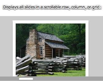
Element Pictorial Example:
See also
| Property | Defined by | ||
|---|---|---|---|
 | activeEffects : Array
The list of effects that are currently playing on the component,
as an Array of EffectInstance instances.
| UIComponent | |
| autoLayout : Boolean
If
true, measurement and layout are done
when the position or size of a child is changed. | Container | |
| automationDelegate : Object
The delegate object that handles the automation-related functionality.
| UIComponent | |
| automationName : String
Name that can be used as an identifier for this object.
| UIComponent | |
| automationTabularData : Object
An implementation of the
IAutomationTabularData interface, which
can be used to retrieve the data. | UIComponent | |
| automationValue : Array
This value generally corresponds to the rendered appearance of the
object and should be usable for correlating the identifier with
the object as it appears visually within the application.
| UIComponent | |
| baselinePosition : Number
The y-coordinate of the baseline
of the first line of text of the component.
| UIComponent | |
| borderMetrics : EdgeMetrics
Returns an EdgeMetrics object that has four properties:
left, top, right,
and bottom. | Container | |
| cacheHeuristic : Boolean
Used by Flex to suggest bitmap caching for the object.
| UIComponent | |
| cachePolicy : String
Specifies the bitmap caching policy for this object.
| UIComponent | |
| childDescriptors : Array
Array of UIComponentDescriptor objects produced by the MXML compiler.
| Container | |
| className : String
The name of this instance's class, such as
"Button". | UIComponent | |
| clipContent : Boolean
Whether to apply a clip mask if the positions and/or sizes
of this container's children extend outside the borders of
this container.
| Container | |
| constraintColumns : Array
An Array of ConstraintColumn instances that partition this container.
| Canvas | |
| constraintRows : Array
An Array of ConstraintRow instances that partition this container.
| Canvas | |
| contentMouseX : Number
Returns the x position of the mouse, in the content coordinate system.
| Container | |
| contentMouseY : Number
Returns the y position of the mouse, in the content coordinate system.
| Container | |
| creatingContentPane : Boolean
Containers use an internal content pane to control scrolling.
| Container | |
| creationIndex : int
Specifies the order to instantiate and draw the children
of the container.
| Container | |
| creationPolicy : String
The child creation policy for this Container.
| Container | |
| currentLooperData : Object
When using this component as the child of a DataLooper element, this holds the current element's corresponding looping data.
| UIComponent | |
| currentState : String
The current view state of the component.
| UIComponent | |
| cursorManager : ICursorManager
Gets the CursorManager that controls the cursor for this component
and its peers.
| UIComponent | |
| data : Object
The
data property lets you pass a value
to the component when you use it in an item renderer or item editor. | Container | |
| defaultButton : IFlexDisplayObject
The Button control designated as the default button
for the container.
| Container | |
| descriptor : UIComponentDescriptor
Reference to the UIComponentDescriptor, if any, that was used
by the
createComponentFromDescriptor() method to create this
UIComponent instance. | UIComponent | |
| document : Object
A reference to the document object associated with this UIComponent.
| UIComponent | |
| doubleClickEnabled : Boolean
Specifies whether the UIComponent object receives
doubleClick events. | UIComponent | |
| enabled : Boolean
Whether the component can accept user interaction.
| UIComponent | |
| errorString : String
The text that will be displayed by a component's error tip when a
component is monitored by a Validator and validation fails.
| UIComponent | |
| explicitHeight : Number
Number that specifies the explicit height of the component,
in pixels, in the component's coordinates.
| UIComponent | |
| explicitMaxHeight : Number
Number that specifies the maximum height of the component,
in pixels, in the component's coordinates.
| UIComponent | |
| explicitMaxWidth : Number
Number that specifies the maximum width of the component,
in pixels, in the component's coordinates.
| UIComponent | |
| explicitMinHeight : Number
Number that specifies the minimum height of the component,
in pixels, in the component's coordinates.
| UIComponent | |
| explicitMinWidth : Number
Number that specifies the minimum width of the component,
in pixels, in the component's coordinates.
| UIComponent | |
| explicitWidth : Number
Number that specifies the explicit width of the component,
in pixels, in the component's coordinates.
| UIComponent | |
| flexContextMenu : IFlexContextMenu
The context menu for this UIComponent.
| UIComponent | |
| focusEnabled : Boolean
Indicates whether the component can receive focus when tabbed to.
| UIComponent | |
| focusManager : IFocusManager
Gets the FocusManager that controls focus for this component
and its peers.
| UIComponent | |
| focusPane : Sprite
The focus pane associated with this object.
| UIComponent | |
| globalX : Number | UIComponent | |
| globalY : Number | UIComponent | |
| height : Number
Number that specifies the height of the component, in pixels,
in the parent's coordinates.
| UIComponent | |
| horizontalLineScrollSize : Number
Number of pixels to move when the left- or right-arrow
button in the horizontal scroll bar is pressed.
| Container | |
| horizontalPageScrollSize : Number
Number of pixels to move when the track in the
horizontal scroll bar is pressed.
| Container | |
| horizontalScrollBar : ScrollBar
The horizontal scrollbar used in this container.
| Container | |
| horizontalScrollPolicy : String
Specifies whether the horizontal scroll bar is always present,
always absent, or automatically added when needed.
| Container | |
| horizontalScrollPosition : Number
The current position of the horizontal scroll bar.
| Container | |
| icon : Class
The Class of the icon displayed by some navigator
containers to represent this Container.
| Container | |
| id : String
ID of the component.
| UIComponent | |
| includeInLayout : Boolean
Specifies whether this component is included in the layout of the
parent container.
| UIComponent | |
| inheritingStyles : Object
The beginning of this component's chain of inheriting styles.
| UIComponent | |
| initialized : Boolean
A flag that determines if an object has been through all three phases
of layout: commitment, measurement, and layout (provided that any were required).
| UIComponent | |
| instanceIndex : int
The index of a repeated component.
| UIComponent | |
| instanceIndices : Array
An Array containing the indices required to reference
this UIComponent object from its parent document.
| UIComponent | |
| isDocument : Boolean
Determines whether this UIComponent instance is a document object,
that is, whether it is at the top of the hierarchy of a Flex
application, MXML component, or ActionScript component.
| UIComponent | |
| isPopUp : Boolean
Set to
true by the PopUpManager to indicate
that component has been popped up. | UIComponent | |
| label : String
The text displayed by some navigator containers to represent
this Container.
| Container | |
| maxHeight : Number
Number that specifies the maximum height of the component,
in pixels, in the component's coordinates.
| UIComponent | |
| maxHorizontalScrollPosition : Number
The largest possible value for the
horizontalScrollPosition property. | Container | |
| maxVerticalScrollPosition : Number
The largest possible value for the
verticalScrollPosition property. | Container | |
| maxWidth : Number
Number that specifies the maximum width of the component,
in pixels, in the component's coordinates.
| UIComponent | |
| measuredHeight : Number
The default height of the component, in pixels.
| UIComponent | |
| measuredMinHeight : Number
The default minimum height of the component, in pixels.
| UIComponent | |
| measuredMinWidth : Number
The default minimum width of the component, in pixels.
| UIComponent | |
| measuredWidth : Number
The default width of the component, in pixels.
| UIComponent | |
| minHeight : Number
Number that specifies the minimum height of the component,
in pixels, in the component's coordinates.
| UIComponent | |
| minWidth : Number
Number that specifies the minimum width of the component,
in pixels, in the component's coordinates.
| UIComponent | |
| miscHolder : Object
A utility holder for any various properties
| UIComponent | |
| moduleFactory : IFlexModuleFactory
The moduleFactory that is used to create TextFields in the correct SWF context.
| UIComponent | |
| mouseFocusEnabled : Boolean
Whether you can receive focus when clicked on.
| UIComponent | |
| move_enableProtection : Boolean = false | UIComponent | |
| nestLevel : int
Depth of this object in the containment hierarchy.
| UIComponent | |
| nonInheritingStyles : Object
The beginning of this component's chain of non-inheriting styles.
| UIComponent | |
| numAutomationChildren : int
The number of automation children this container has.
| UIComponent | |
| numChildren : int
Number of child components in this container.
| Container | |
| owner : DisplayObjectContainer
The owner of this UIComponent.
| UIComponent | |
| parent : DisplayObjectContainer
The parent container or component for this component.
| UIComponent | |
| parentApplication : Object
A reference to the Application object that contains this UIComponent
instance.
| UIComponent | |
| parentDocument : Object
A reference to the parent document object for this UIComponent.
| UIComponent | |
| percentHeight : Number
Number that specifies the height of a component as a percentage
of its parent's size.
| UIComponent | |
| percentWidth : Number
Number that specifies the width of a component as a percentage
of its parent's size.
| UIComponent | |
| processedDescriptors : Boolean
Set to
true after immediate or deferred child creation,
depending on which one happens. | UIComponent | |
| rawChildren : IChildList
A container typically contains child components, which can be enumerated
using the
Container.getChildAt() method and
Container.numChildren property. | Container | |
| repeater : IRepeater
A reference to the Repeater object
in the parent document that produced this UIComponent.
| UIComponent | |
| repeaterIndex : int
The index of the item in the data provider
of the Repeater that produced this UIComponent.
| UIComponent | |
| repeaterIndices : Array
An Array containing the indices of the items in the data provider
of the Repeaters in the parent document that produced this UIComponent.
| UIComponent | |
| repeaters : Array
An Array containing references to the Repeater objects
in the parent document that produced this UIComponent.
| UIComponent | |
| scaleX : Number
Number that specifies the horizontal scaling factor.
| UIComponent | |
| scaleY : Number
Number that specifies the vertical scaling factor.
| UIComponent | |
| screen : Rectangle
Returns an object that contains the size and position of the base
drawing surface for this object.
| UIComponent | |
| setActualSize_enableProtection : Boolean = false | UIComponent | |
| setVisible_enableProtection : Boolean = true | UIComponent | |
| showInAutomationHierarchy : Boolean
A flag that determines if an automation object
shows in the automation hierarchy.
| UIComponent | |
| slideshow : FlashSlideshow
A read-only reference to the main slideshow.
| ImagesScrollList | ||
| states : Array
The view states that are defined for this component.
| UIComponent | |
| styleClassOverridesInline : Boolean = true
Specifies if class-specific styles (as defined by the
styleName property) override inline styles. | UIComponent | |
| styleDeclaration : CSSStyleDeclaration
Storage for the inline inheriting styles on this object.
| UIComponent | |
| styleName : Object
The class style used by this component.
| UIComponent | |
| systemManager : ISystemManager
Returns the SystemManager object used by this component.
| UIComponent | |
| toolTip : String
Text to display in the ToolTip.
| UIComponent | |
| transitions : Array
An Array of Transition objects, where each Transition object defines a
set of effects to play when a view state change occurs.
| UIComponent | |
| tweeningProperties : Array
Array of properties that are currently being tweened on this object.
| UIComponent | |
| uid : String
A unique identifier for the object.
| UIComponent | |
| updateCompletePendingFlag : Boolean
A flag that determines if an object has been through all three phases
of layout validation (provided that any were required).
| UIComponent | |
| validationSubField : String
Used by a validator to associate a subfield with this component.
| UIComponent | |
| verticalLineScrollSize : Number
Number of pixels to scroll when the up- or down-arrow
button in the vertical scroll bar is pressed,
or when you scroll by using the mouse wheel.
| Container | |
| verticalPageScrollSize : Number
Number of pixels to scroll when the track
in the vertical scroll bar is pressed.
| Container | |
| verticalScrollBar : ScrollBar
The vertical scrollbar used in this container.
| Container | |
| verticalScrollPolicy : String
Specifies whether the vertical scroll bar is always present,
always absent, or automatically added when needed.
| Container | |
| verticalScrollPosition : Number
The current position of the vertical scroll bar.
| Container | |
| viewMetrics : EdgeMetrics
Returns an object that has four properties:
left,
top, right, and bottom. | Container | |
| viewMetricsAndPadding : EdgeMetrics
Returns an object that has four properties:
left,
top, right, and bottom. | Container | |
| visible : Boolean
Controls the visibility of this UIComponent.
| UIComponent | |
| visible_unprotected : Boolean
If setVisible_enableProtection is enabled, this allows access to determine what the pseudo-state is -- that is, what's been requested, regardless of any prevention of default behavior.
| UIComponent | |
| width : Number
Number that specifies the width of the component, in pixels,
in the parent's coordinates.
| UIComponent | |
| x : Number
Number that specifies the component's horizontal position,
in pixels, within its parent container.
| UIComponent | |
| xmlDescriptor : XML
For certain dynamically created elements, this represents the XML node used to create that element.
| UIComponent | |
| y : Number
Number that specifies the component's vertical position,
in pixels, within its parent container.
| UIComponent | |
| Method | Defined by | ||
|---|---|---|---|
| ImagesScrollList | |||
|
addChild(child:DisplayObject):DisplayObject
Adds a child DisplayObject to this Container.
| Container | |
|
addChildAt(child:DisplayObject, index:int):DisplayObject
Adds a child DisplayObject to this Container.
| Container | |
|
callLater(method:Function, args:Array = null):void
Queues a function to be called later.
| UIComponent | |
|
clearStyle(styleProp:String):void
Deletes a style property from this component instance.
| UIComponent | |
|
contentToGlobal(point:Point):Point
Converts a
Point object from content coordinates to global coordinates. | Container | |
|
contentToLocal(point:Point):Point
Converts a
Point object from content to local coordinates. | Container | |
|
createAutomationIDPart(child:IAutomationObject):Object
Returns a set of properties that identify the child within
this container.
| UIComponent | |
|
Given a single UIComponentDescriptor, create the corresponding
component and add the component as a child of this Container.
| Container | |
|
createComponentsFromDescriptors(recurse:Boolean = true):void
Iterate through the Array of
childDescriptors,
and call the createComponentFromDescriptor() method for each one. | Container | |
|
createReferenceOnParentDocument(parentDocument:IFlexDisplayObject):void
Creates an
id reference to this IUIComponent object
on its parent document object. | UIComponent | |
|
deleteReferenceOnParentDocument(parentDocument:IFlexDisplayObject):void
Deletes the
id reference to this IUIComponent object
on its parent document object. | UIComponent | |
|
Returns a UITextFormat object corresponding to the text styles
for this UIComponent.
| UIComponent | |
|
dispatchEvent(event:Event):Boolean
Dispatches an event into the event flow.
| UIComponent | |
|
drawFocus(isFocused:Boolean):void
Shows or hides the focus indicator around this component.
| UIComponent | |
|
drawRoundRect(x:Number, y:Number, w:Number, h:Number, r:Object = null, c:Object = null, alpha:Object = null, rot:Object = null, gradient:String = null, ratios:Array = null, hole:Object = null):void
Programatically draws a rectangle into this skin's Graphics object.
| UIComponent | |
|
effectFinished(effectInst:IEffectInstance):void
Called by the effect instance when it stops playing on the component.
| UIComponent | |
|
effectStarted(effectInst:IEffectInstance):void
Called by the effect instance when it starts playing on the component.
| UIComponent | |
|
endEffectsStarted():void
Ends all currently playing effects on the component.
| UIComponent | |
|
executeBindings(recurse:Boolean = false):void
Executes all the data bindings on this Container.
| Container | |
|
executeChildBindings(recurse:Boolean):void
Executes the bindings into this Container's child UIComponent objects.
| Container | |
|
finishPrint(obj:Object, target:IFlexDisplayObject):void
Called after printing is complete.
| UIComponent | |
|
getAutomationChildAt(index:int):IAutomationObject
Provides the automation object at the specified index.
| UIComponent | |
|
getChildAt(index:int):DisplayObject
Gets the nth child component object.
| Container | |
|
getChildByName(name:String):DisplayObject
Returns the child whose
name property is the specified String. | Container | |
|
getChildIndex(child:DisplayObject):int
Gets the zero-based index of a specific child.
| Container | |
|
getChildren():Array
Returns an Array of DisplayObject objects consisting of the content children
of the container.
| Container | |
|
getClassStyleDeclarations():Array
Finds the type selectors for this UIComponent instance.
| UIComponent | |
|
getConstraintValue(constraintName:String):*
Returns a layout constraint value, which is the same as
getting the constraint style for this component.
| UIComponent | |
|
getDescendantByName(name:String):DisplayObject
Searches all children for the first child named with the passed value; returns that child, or null if not found.
| UIComponent | |
|
getDescendantsByName(name:String):Array
Searches all children for all children named with the passed value; returns an array with those children, or an empty array if none found.
| UIComponent | |
|
getExplicitOrMeasuredHeight():Number
A convenience method for determining whether to use the
explicit or measured height
| UIComponent | |
|
getExplicitOrMeasuredWidth():Number
A convenience method for determining whether to use the
explicit or measured width
| UIComponent | |
|
getFocus():InteractiveObject
Gets the object that currently has focus.
| UIComponent | |
|
getRepeaterItem(whichRepeater:int = -1):Object
Returns the item in the
dataProvider that was used
by the specified Repeater to produce this Repeater, or
null if this Repeater isn't repeated. | UIComponent | |
|
getStyle(styleProp:String):*
Gets a style property that has been set anywhere in this
component's style lookup chain.
| UIComponent | |
|
getVisibleRect(targetParent:DisplayObject = null):Rectangle
MOVED OVER FROM SDK 3.2 UIComponent - Allows for popped-up alerts to be displayed correctly - NGR MOVED 11-20-08
| UIComponent | |
|
globalToContent(point:Point):Point
Converts a
Point object from global to content coordinates. | Container | |
|
horizontalGradientMatrix(x:Number, y:Number, width:Number, height:Number):Matrix
Returns a box Matrix which can be passed to the
drawRoundRect() method
as the rot parameter when drawing a horizontal gradient. | UIComponent | |
|
initialize():void
Initializes the internal structure of this component.
| UIComponent | |
|
initializeRepeaterArrays(parent:IRepeaterClient):void
Initializes various properties which keep track of repeated instances
of this component.
| UIComponent | |
|
invalidateDisplayList():void
Marks a component so that its
updateDisplayList()
method gets called during a later screen update. | UIComponent | |
|
invalidateProperties():void
Marks a component so that its
commitProperties()
method gets called during a later screen update. | UIComponent | |
|
invalidateSize():void
Marks a component so that its
measure()
method gets called during a later screen update. | UIComponent | |
|
localToContent(point:Point):Point
Converts a
Point object from local to content coordinates. | Container | |
|
measureHTMLText(htmlText:String):TextLineMetrics
Measures the specified HTML text, which may contain HTML tags such
as
<font> and <b>,
assuming that it is displayed
in a single-line UITextField using a UITextFormat
determined by the styles of this UIComponent. | UIComponent | |
|
measureText(text:String):TextLineMetrics
Measures the specified text, assuming that it is displayed
in a single-line UITextField using a UITextFormat
determined by the styles of this UIComponent.
| UIComponent | |
|
move(x:Number, y:Number):void
Moves the component to a specified position within its parent.
| UIComponent | |
|
move_unprotected(x:Number, y:Number):void
Same as move, but cannot be prevented via the protection_move event.
| UIComponent | |
|
notifyStyleChangeInChildren(styleProp:String, recursive:Boolean):void
Propagates style changes to the children.
| UIComponent | |
|
owns(child:DisplayObject):Boolean
Returns
true if the chain of owner properties
points from child to this UIComponent. | UIComponent | |
|
parentChanged(p:DisplayObjectContainer):void
Called by Flex when a UIComponent object is added to or removed from a parent.
| UIComponent | |
|
prepareToPrint(target:IFlexDisplayObject):Object
Prepares an IFlexDisplayObject for printing.
| UIComponent | |
|
regenerateStyleCache(recursive:Boolean):void
Builds or rebuilds the CSS style cache for this component
and, if the
recursive parameter is true,
for all descendants of this component as well. | UIComponent | |
|
registerEffects(effects:Array):void
For each effect event, registers the EffectManager
as one of the event listeners.
| UIComponent | |
|
removeAllChildren():void
Removes all children from the child list of this container.
| Container | |
|
removeChild(child:DisplayObject):DisplayObject
Removes a child DisplayObject from the child list of this Container.
| Container | |
|
removeChildAt(index:int):DisplayObject
Removes a child DisplayObject from the child list of this Container
at the specified index.
| Container | |
|
replayAutomatableEvent(event:Event):Boolean
Replays the specified event.
| UIComponent | |
|
resolveAutomationIDPart(criteria:Object):Array
Resolves a child by using the id provided.
| UIComponent | |
|
resumeBackgroundProcessing():void
[static]
Resumes the background processing of methods
queued by
callLater(), after a call to
suspendBackgroundProcessing(). | UIComponent | |
|
setActualSize(w:Number, h:Number):void
Sizes the object.
| UIComponent | |
|
setActualSize_unprotected(w:Number, h:Number):void
Same as setActualSize, but is not cancelable via the protection_size event.
| UIComponent | |
|
setChildIndex(child:DisplayObject, newIndex:int):void
Sets the index of a particular child.
| Container | |
|
setConstraintValue(constraintName:String, value:*):void
Sets a layout constraint value, which is the same as
setting the constraint style for this component.
| UIComponent | |
|
setCurrentState(stateName:String, playTransition:Boolean = true):void
Set the current state.
| UIComponent | |
|
setFocus():void
Sets the focus to this component.
| UIComponent | |
|
setStyle(styleProp:String, newValue:*):void
Sets a style property on this component instance.
| UIComponent | |
|
setVisible(value:Boolean, noEvent:Boolean = false):void
Called when the
visible property changes. | UIComponent | |
|
setVisible_unprotected(value:Boolean, noEvent:Boolean = false):void
Same as setVisible, but cannot be prevented.
| UIComponent | |
|
styleChanged(styleProp:String):void
Detects changes to style properties.
| UIComponent | |
|
stylesInitialized():void
Flex calls the
stylesInitialized() method when
the styles for a component are first initialized. | UIComponent | |
|
suspendBackgroundProcessing():void
[static]
Blocks the background processing of methods
queued by
callLater(),
until resumeBackgroundProcessing() is called. | UIComponent | |
|
toString():String
Returns a string indicating the location of this object
within the hierarchy of DisplayObjects in the Application.
| FlexSprite | |
|
validateDisplayList():void
Validates the position and size of children and draws other
visuals.
| UIComponent | |
|
validateNow():void
Validate and update the properties and layout of this object
and redraw it, if necessary.
| UIComponent | |
|
validateProperties():void
Used by layout logic to validate the properties of a component
by calling the
commitProperties() method. | UIComponent | |
|
validateSize(recursive:Boolean = false):void
Validates the measured size of the component
If the
LayoutManager.invalidateSize() method is called with
this ILayoutManagerClient, then the validateSize() method
is called when it's time to do measurements. | UIComponent | |
|
validationResultHandler(event:ValidationResultEvent):void
Handles both the
valid and invalid events from a
validator assigned to this component. | UIComponent | |
|
verticalGradientMatrix(x:Number, y:Number, width:Number, height:Number):Matrix
Returns a box Matrix which can be passed to
drawRoundRect()
as the rot parameter when drawing a vertical gradient. | UIComponent | |
| Method | Defined by | ||
|---|---|---|---|
|
adjustFocusRect(obj:DisplayObject = null):void
Adjust the focus rectangle.
| UIComponent | |
|
attachOverlay():void
Used internally by the Dissolve Effect to add the overlay to the chrome of a container.
| Container | |
|
childrenCreated():void
Performs any final processing after child objects are created.
| UIComponent | |
|
commitProperties():void
Processes the properties set on the component.
| UIComponent | |
|
createBorder():void
Creates the container's border skin
if it is needed and does not already exist.
| Container | |
|
createChildren():void
| ImagesScrollList | ||
|
createInFontContext(classObj:Class):Object
Creates a new object using a context
based on the embedded font being used.
| UIComponent | |
|
createInModuleContext(moduleFactory:IFlexModuleFactory, className:String):Object
Creates the object using a given moduleFactory.
| UIComponent | |
|
focusInHandler(event:FocusEvent):void
The event handler called when a UIComponent object gets focus.
| UIComponent | |
|
focusOutHandler(event:FocusEvent):void
The event handler called when a UIComponent object loses focus.
| UIComponent | |
|
initializationComplete():void
Finalizes the initialization of this component.
| UIComponent | |
|
initializeAccessibility():void
Initializes this component's accessibility code.
| UIComponent | |
|
isOurFocus(target:DisplayObject):Boolean
Typically overridden by components containing UITextField objects,
where the UITextField object gets focus.
| UIComponent | |
|
keyDownHandler(event:KeyboardEvent):void
The event handler called for a
keyDown event. | UIComponent | |
|
keyUpHandler(event:KeyboardEvent):void
The event handler called for a
keyUp event. | UIComponent | |
|
layoutChrome(unscaledWidth:Number, unscaledHeight:Number):void
Respond to size changes by setting the positions and sizes
of this container's borders.
| Container | |
|
measure():void
Calculates the preferred minimum and preferred maximum sizes
of the Canvas.
| Canvas | |
|
resourcesChanged():void
This method is called when a UIComponent is constructed,
and again whenever the ResourceManager dispatches
a
"change" Event to indicate
that the localized resources have changed in some way. | UIComponent | |
|
scrollChildren():void
Positions the container's content area relative to the viewable area
based on the horizontalScrollPosition and verticalScrollPosition properties.
| Container | |
|
updateDisplayList(unscaledWidth:Number, unscaledHeight:Number):void
| ImagesScrollList | ||
| Style | Description | Defined by | ||
|---|---|---|---|---|
| Type: Number CSS Inheritance: no Alpha level of the color defined by the backgroundColor
property, of the image or SWF file defined by the backgroundImage
style. | Container | ||
| Type: String CSS Inheritance: no If a background image is specified, this style specifies whether it is fixed with regard to the viewport ( "fixed")
or scrolls along with the content ("scroll"). | Container | ||
| Type: uint Format: Color CSS Inheritance: no Background color of a component. | Container | ||
| Type: uint Format: Color CSS Inheritance: yes Background color of the component when it is disabled. | Container | ||
| Type: Object Format: File CSS Inheritance: no Background image of a component. | Container | ||
| Type: String CSS Inheritance: no Scales the image specified by backgroundImage
to different percentage sizes. | Container | ||
| Type: uint Format: Color CSS Inheritance: yes Determines the color of a ProgressBar. | Container | ||
| Type: String CSS Inheritance: no The vertical distance in pixels from the top edge of the content area to the control's baseline position. | UIComponent | ||
| Type: uint Format: Color CSS Inheritance: no Color of the border. | Container | ||
| Type: String CSS Inheritance: no Bounding box sides. | Container | ||
| Type: Class CSS Inheritance: no The border skin class of the component. | Container | ||
| Type: String CSS Inheritance: no Bounding box style. | Container | ||
| Type: Number Format: Length CSS Inheritance: no Bounding box thickness. | Container | ||
| Type: String CSS Inheritance: no The vertical distance in pixels from the lower edge of the component to the lower edge of its content area. | UIComponent | ||
| Type: Number CSS Inheritance: no The color brightness of the component. | UIComponent | ||
| Type: uint Format: Color CSS Inheritance: yes Color of text in the component, including the component label. | Container | ||
| Type: Number CSS Inheritance: no The color contrast of the component. | UIComponent | ||
| Type: Number Format: Length CSS Inheritance: no Radius of component corners. | Container | ||
|
disableAutoplayOnClick
| Type: Boolean CSS Inheritance: no Specifies if autoplay should automatically be disabled/paused when the user manually selects a slide by clicking it. The default value is true. | ImagesScrollList | ||
| Type: uint Format: Color CSS Inheritance: yes Color of text in the component if it is disabled. | Container | ||
| Type: Number CSS Inheritance: no The alpha value for the overlay that is placed on top of the container when it is disabled. | Container | ||
| Type: uint Format: Color CSS Inheritance: yes Color of the drop shadow. | Container | ||
| Type: Boolean CSS Inheritance: no Boolean property that specifies whether the component has a visible drop shadow. | Container | ||
|
duration
| Type: Number Format: Time CSS Inheritance: no Specifies the duration, in milliseconds, of the automated transition between each slide. The default value is 1500. | ImagesScrollList | ||
| Type: uint Format: Color CSS Inheritance: yes Color of the component highlight when validation fails. | UIComponent | ||
| Type: String CSS Inheritance: yes Sets the antiAliasType property of internal TextFields. | Container | ||
| Type: String CSS Inheritance: yes Name of the font to use. | Container | ||
| Type: String CSS Inheritance: yes Sets the gridFitType property of internal TextFields that represent text in Flex controls. | Container | ||
| Type: Number CSS Inheritance: yes Sets the sharpness property of internal TextFields that represent text in Flex controls. | Container | ||
| Type: Number Format: Length CSS Inheritance: yes Height of the text, in pixels. | Container | ||
| Type: String CSS Inheritance: yes Determines whether the text is italic font. | Container | ||
| Type: Number CSS Inheritance: yes Sets the thickness property of internal TextFields that represent text in Flex controls. | Container | ||
| Type: String CSS Inheritance: yes Determines whether the text is boldface. | Container | ||
| Type: String CSS Inheritance: no The horizontal distance in pixels from the center of the component's content area to the center of the component. | UIComponent | ||
| Type: String CSS Inheritance: no The name of the horizontal scrollbar style. | Container | ||
| Type: Number CSS Inheritance: no The color hue of the component. | UIComponent | ||
|
inactiveBlur
| Type: Number Format: Length CSS Inheritance: no Specifies the strength of the blur applied to all slides which are not currently focused upon. This setting allows you to put all focus on the main slide by reducing the visual distraction of any other visible slides. Leaving this value at its default, 0. | ImagesScrollList | ||
|
inactiveOpacity
| Type: Number Format: Alpha CSS Inheritance: no Specifies the opacity (alpha) of all slides which are not currently focused upon. This setting allows you to put all focus on the main slide by reducing the visual distraction of any other visible slides. Valid values range from 0.0 (fully transparent) to 1.0 (fully opaque). The default value is0.8. | ImagesScrollList | ||
| Type: Boolean CSS Inheritance: yes A Boolean value that indicates whether kerning is enabled ( true) or disabled (false). | Container | ||
|
layoutDirection
| Type: String Format: Enumerated CSS Inheritance: no Specifies the type of layout grid to create. The following values are supported:
| ImagesScrollList | ||
| Type: String CSS Inheritance: no The horizontal distance in pixels from the left edge of the component's content area to the left edge of the component. | UIComponent | ||
| Type: Number CSS Inheritance: yes The number of additional pixels to appear between each character. | Container | ||
|
lockImages
| Type: Boolean CSS Inheritance: no Specifies if the images should be "locked" while a transition is taking place. When enabled, the user will not be able to select a different image until any currently-occuring transition has completed. The default value is false. | ImagesScrollList | ||
|
maxScale
| Type: Number CSS Inheritance: no Specifies the maximum zoom/scale factor when manually zooming with the scroll wheel; only applicable when useScrollWheel is enabled.
Any numeric value equal to or greater than 1 is supported. A factor of 1.0 represents the original size. The default maximum only allows the user to zoom to the original size, and not magnify the slide. The default value is1. | ImagesScrollList | ||
|
maxScrollSpeed
| Type: Number Format: Length CSS Inheritance: no Specifies the maximum auto-scrolling speed when using mouse-based scrolling as enabled through the useMouseScroll style property.
This is the maximum distance the layout grid can move per update.
The default value is 20. | ImagesScrollList | ||
|
minScale
| Type: Number CSS Inheritance: no Specifies the minimum zoom/scale factor when manually zooming with the scroll wheel; only applicable when useScrollWheel is enabled.
Any numeric value less than or equal to 1 is supported. A factor of 1.0 represents the original size. The default value is0.1. | ImagesScrollList | ||
| Type: Number CSS Inheritance: no The opacity of the component. | UIComponent | ||
| Type: String CSS Inheritance: no The horizontal distance in pixels from the right edge of the component to the right edge of its content area. | UIComponent | ||
| Type: Number CSS Inheritance: no The color saturation of the component. | UIComponent | ||
| Type: String CSS Inheritance: no Direction of the drop shadow. | Container | ||
| Type: Number Format: Length CSS Inheritance: no Distance of the drop shadow. | Container | ||
| Type: String CSS Inheritance: yes Alignment of text within a container. | Container | ||
| Type: String CSS Inheritance: yes Determines whether the text is underlined. | Container | ||
| Type: Number Format: Length CSS Inheritance: yes Offset of first line of text from the left side of the container, in pixels. | Container | ||
| Type: uint Format: Color CSS Inheritance: yes Theme color of a component. | UIComponent | ||
| Type: String CSS Inheritance: no The vertical distance in pixels from the top edge of the control's content area to the top edge of the component. | UIComponent | ||
|
useMouseScroll
| Type: Boolean CSS Inheritance: no Specifies if the user can scroll the entire layout grid by simply moving his/her mouse away from the center of the display. The downside to this scrolling method is that the user must actually click a slide to activate it. When this scrolling method is enabled, you generally will want to set inactiveOpacity to 1.0 and inactiveBlur to 0.
If this setting is enabled, you can control the maximum scrolling speed through the false. | ImagesScrollList | ||
|
useScrollbars
| Type: Boolean CSS Inheritance: no Specifies if scrollbars should be shown, allowing the user to navigate the grid with scrollbars. The default value is false. | ImagesScrollList | ||
|
useScrollWheel
| Type: Boolean CSS Inheritance: no Specifies if the user can zoom in and out of the grid by using the mouse scroll wheel in order to gain a wider or narrower perspective. If enabled, the maximum and minimum zoom levels are specifed by the false. | ImagesScrollList | ||
| Type: String CSS Inheritance: no The vertical distance in pixels from the center of the component's content area to the center of the component. | UIComponent | ||
| Type: String CSS Inheritance: no The name of the vertical scrollbar style. | Container | ||
| slideshow | property |
public var slideshow:FlashSlideshowA read-only reference to the main slideshow.
| ImagesScrollList | () | constructor |
public function ImagesScrollList()
| createChildren | () | method |
protected override function createChildren():void
| updateDisplayList | () | method |
protected override function updateDisplayList(unscaledWidth:Number, unscaledHeight:Number):voidParameters
unscaledWidth:Number |
|
unscaledHeight:Number |
 Hide Inherited Public Properties
 Show Inherited Public Properties