| Package | com.dwuser.ss4.ui.extras |
| Class | public class PopupToolTip |
| Inheritance | PopupToolTip  VBox Box Container UIComponent FlexSprite flash.display.Sprite VBox Box Container UIComponent FlexSprite flash.display.Sprite |
PopupToolTipBorder skin class is used as the border/background skin. Because of this, all of the style properties here (on PopupToolTip)
are actually "inherited" from the PopupToolTipBorder skin class.
The maxWidth, maxHeight, minWidth, and minHeight properties establish the maximum and minimum popup
dimensions allowed. The default minimum size is 20 x 30, and the default maximum size is 300 x 300. You can override these properties to change
the dimension limits.
Layout XML Syntax Example:
The PopupToolTip class is never used directly as a standalone element in the Layout XML. Instead, it can be defined through the ToolTipDescriptor psuedo-property
on a PagingControlHolder subclass element (such as NumberBar or Thumbnails). See the PagingControlHolder.ToolTipDescriptor psuedo-property documentation to learn
more about how to create the customized tooltip descriptor subnode on a NumberBar or Thumbnails element. The settings on this descriptor node will be applied to the PopupToolTip
instances which are created and shown for that element.
The PopupToolTip class inherits all of the tag attributes of its superclass.
   <PopupToolTip
      Styles
      backgroundAlpha="1"
      borderColor="#FFFFFF"
      cornerRadius="0"
      dropShadowEnabled="true"
      dropShadowColor="#000000"
   />
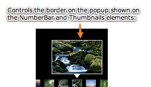
Element Pictorial Example:
See also
| Method | Defined by | ||
|---|---|---|---|
 |
adjustFocusRect(obj:DisplayObject = null):void
Adjust the focus rectangle.
| UIComponent | |
|
attachOverlay():void
Used internally by the Dissolve Effect to add the overlay to the chrome of a container.
| Container | |
|
childrenCreated():void
Performs any final processing after child objects are created.
| UIComponent | |
|
commitProperties():void
Processes the properties set on the component.
| UIComponent | |
|
createBorder():void
Creates the container's border skin
if it is needed and does not already exist.
| Container | |
|
createChildren():void
Create child objects of the component.
| UIComponent | |
|
createInFontContext(classObj:Class):Object
Creates a new object using a context
based on the embedded font being used.
| UIComponent | |
|
createInModuleContext(moduleFactory:IFlexModuleFactory, className:String):Object
Creates the object using a given moduleFactory.
| UIComponent | |
|
focusInHandler(event:FocusEvent):void
The event handler called when a UIComponent object gets focus.
| UIComponent | |
|
focusOutHandler(event:FocusEvent):void
The event handler called when a UIComponent object loses focus.
| UIComponent | |
|
initializationComplete():void
Finalizes the initialization of this component.
| UIComponent | |
|
initializeAccessibility():void
Initializes this component's accessibility code.
| UIComponent | |
|
isOurFocus(target:DisplayObject):Boolean
Typically overridden by components containing UITextField objects,
where the UITextField object gets focus.
| UIComponent | |
|
keyDownHandler(event:KeyboardEvent):void
The event handler called for a
keyDown event. | UIComponent | |
|
keyUpHandler(event:KeyboardEvent):void
The event handler called for a
keyUp event. | UIComponent | |
|
layoutChrome(unscaledWidth:Number, unscaledHeight:Number):void
Respond to size changes by setting the positions and sizes
of this container's borders.
| Container | |
|
measure():void
| PopupToolTip | ||
|
resourcesChanged():void
This method is called when a UIComponent is constructed,
and again whenever the ResourceManager dispatches
a
"change" Event to indicate
that the localized resources have changed in some way. | UIComponent | |
|
scrollChildren():void
Positions the container's content area relative to the viewable area
based on the horizontalScrollPosition and verticalScrollPosition properties.
| Container | |
|
updateDisplayList(unscaledWidth:Number, unscaledHeight:Number):void
Sets the size and position of each child of the Box container.
| Box | |
| Style | Description | Defined by | ||
|---|---|---|---|---|
|
backgroundAlpha
| Type: Number Format: Alpha CSS Inheritance: no Specifies the alpha (opacity) of the tooltip background/border. Valid values range from 0.0 (fully transparent) to 1.0 (fully opaque). The default value is 1. | PopupToolTip | ||
| Type: String CSS Inheritance: no If a background image is specified, this style specifies whether it is fixed with regard to the viewport ( "fixed")
or scrolls along with the content ("scroll"). | Container | ||
| Type: uint Format: Color CSS Inheritance: no Background color of a component. | Container | ||
| Type: uint Format: Color CSS Inheritance: yes Background color of the component when it is disabled. | Container | ||
| Type: Object Format: File CSS Inheritance: no Background image of a component. | Container | ||
| Type: String CSS Inheritance: no Scales the image specified by backgroundImage
to different percentage sizes. | Container | ||
| Type: uint Format: Color CSS Inheritance: yes Determines the color of a ProgressBar. | Container | ||
| Type: String CSS Inheritance: no The vertical distance in pixels from the top edge of the content area to the control's baseline position. | UIComponent | ||
|
borderColor
| Type: Number Format: Color CSS Inheritance: no Specifies the color of the tooltip background/border. The default value is #FFFFFF. | PopupToolTip | ||
| Type: String CSS Inheritance: no Bounding box sides. | Container | ||
| Type: Class CSS Inheritance: no The border skin class of the component. | Container | ||
| Type: String CSS Inheritance: no Bounding box style. | Container | ||
| Type: Number Format: Length CSS Inheritance: no Bounding box thickness. | Container | ||
| Type: String CSS Inheritance: no The vertical distance in pixels from the lower edge of the component to the lower edge of its content area. | UIComponent | ||
| Type: Number CSS Inheritance: no The color brightness of the component. | UIComponent | ||
| Type: uint Format: Color CSS Inheritance: yes Color of text in the component, including the component label. | Container | ||
| Type: Number CSS Inheritance: no The color contrast of the component. | UIComponent | ||
|
cornerRadius
| Type: Number Format: Length CSS Inheritance: no Specifies the rounding radius, in pixels, of the corners of the tooltip border. The default value is 0. | PopupToolTip | ||
| Type: uint Format: Color CSS Inheritance: yes Color of text in the component if it is disabled. | Container | ||
| Type: Number CSS Inheritance: no The alpha value for the overlay that is placed on top of the container when it is disabled. | Container | ||
|
dropShadowColor
| Type: Number Format: Color CSS Inheritance: yes Specifies the color of the tooltip's drop shadow if the shadow is enabled. The default value is #000000. | PopupToolTip | ||
|
dropShadowEnabled
| Type: Boolean CSS Inheritance: no Specifies if a drop shadow should be added to the tooltip. The default value is true. | PopupToolTip | ||
| Type: uint Format: Color CSS Inheritance: yes Color of the component highlight when validation fails. | UIComponent | ||
| Type: String CSS Inheritance: yes Sets the antiAliasType property of internal TextFields. | Container | ||
| Type: String CSS Inheritance: yes Name of the font to use. | Container | ||
| Type: String CSS Inheritance: yes Sets the gridFitType property of internal TextFields that represent text in Flex controls. | Container | ||
| Type: Number CSS Inheritance: yes Sets the sharpness property of internal TextFields that represent text in Flex controls. | Container | ||
| Type: Number Format: Length CSS Inheritance: yes Height of the text, in pixels. | Container | ||
| Type: String CSS Inheritance: yes Determines whether the text is italic font. | Container | ||
| Type: Number CSS Inheritance: yes Sets the thickness property of internal TextFields that represent text in Flex controls. | Container | ||
| Type: String CSS Inheritance: yes Determines whether the text is boldface. | Container | ||
| Type: String CSS Inheritance: no Horizontal alignment of children in the container. | Box | ||
| Type: String CSS Inheritance: no The horizontal distance in pixels from the center of the component's content area to the center of the component. | UIComponent | ||
| Type: Number Format: Length CSS Inheritance: no Number of pixels between children in the horizontal direction. | Box | ||
| Type: String CSS Inheritance: no The name of the horizontal scrollbar style. | Container | ||
| Type: Number CSS Inheritance: no The color hue of the component. | UIComponent | ||
| Type: Boolean CSS Inheritance: yes A Boolean value that indicates whether kerning is enabled ( true) or disabled (false). | Container | ||
| Type: String CSS Inheritance: no The horizontal distance in pixels from the left edge of the component's content area to the left edge of the component. | UIComponent | ||
| Type: Number CSS Inheritance: yes The number of additional pixels to appear between each character. | Container | ||
| Type: Number CSS Inheritance: no The opacity of the component. | UIComponent | ||
| Type: Number Format: Length CSS Inheritance: no Number of pixels between the container's bottom border and the bottom of its content area. | Box | ||
| Type: Number Format: Length CSS Inheritance: no Number of pixels between the component's left border and the left edge of its content area. | Container | ||
| Type: Number Format: Length CSS Inheritance: no Number of pixels between the component's right border and the right edge of its content area. | Container | ||
| Type: Number Format: Length CSS Inheritance: no Number of pixels between the container's top border and the top of its content area. | Box | ||
| Type: String CSS Inheritance: no The horizontal distance in pixels from the right edge of the component to the right edge of its content area. | UIComponent | ||
| Type: Number CSS Inheritance: no The color saturation of the component. | UIComponent | ||
| Type: String CSS Inheritance: no Direction of the drop shadow. | Container | ||
| Type: Number Format: Length CSS Inheritance: no Distance of the drop shadow. | Container | ||
| Type: String CSS Inheritance: yes Alignment of text within a container. | Container | ||
| Type: String CSS Inheritance: yes Determines whether the text is underlined. | Container | ||
| Type: Number Format: Length CSS Inheritance: yes Offset of first line of text from the left side of the container, in pixels. | Container | ||
| Type: uint Format: Color CSS Inheritance: yes Theme color of a component. | UIComponent | ||
| Type: String CSS Inheritance: no The vertical distance in pixels from the top edge of the control's content area to the top edge of the component. | UIComponent | ||
| Type: String CSS Inheritance: no Vertical alignment of children in the container. | Box | ||
| Type: String CSS Inheritance: no The vertical distance in pixels from the center of the component's content area to the center of the component. | UIComponent | ||
| Type: Number Format: Length CSS Inheritance: no Number of pixels between children in the vertical direction. | Box | ||
| Type: String CSS Inheritance: no The name of the vertical scrollbar style. | Container | ||
 Hide Inherited Public Properties
 Show Inherited Public Properties