| Package | com.dwuser.ss4.ui.extras |
| Class | public class BorderBox |
| Inheritance | BorderBox  UIComponent FlexSprite flash.display.Sprite UIComponent FlexSprite flash.display.Sprite |
Default element size is 100 x 100.
Layout XML Syntax Example:
The BorderBox class inherits all of the tag attributes of its superclass.
   <BorderBox
      Properties
      backgroundColor="#000000"
      overrideBackgroundColor="undefined"

      Styles
      backgroundChangeEffect="true"
      backgroundChangeEffectDuration="500"
      backgroundAlpha="1"
      backgroundDisabledColor="undefined"
      backgroundImage="undefined"
      backgroundSize="auto"
      borderColor="#B7BABC"
      borderSides="left right top bottom"
      borderStyle="solid"
      borderThickness="1"
      cornerRadius="0"
      dropShadowEnabled="false"
      dropShadowColor="#000000"
      shadowDirection="center"
      shadowDistance="2"
   />
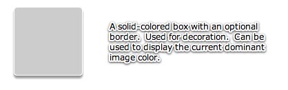
Element Pictorial Example:
See also
| Property | Defined by | ||
|---|---|---|---|
 | activeEffects : Array
The list of effects that are currently playing on the component,
as an Array of EffectInstance instances.
| UIComponent | |
| automationDelegate : Object
The delegate object that handles the automation-related functionality.
| UIComponent | |
| automationName : String
Name that can be used as an identifier for this object.
| UIComponent | |
| automationTabularData : Object
An implementation of the
IAutomationTabularData interface, which
can be used to retrieve the data. | UIComponent | |
| automationValue : Array
This value generally corresponds to the rendered appearance of the
object and should be usable for correlating the identifier with
the object as it appears visually within the application.
| UIComponent | |
| backgroundColor : Number | BorderBox | ||
| baselinePosition : Number
The y-coordinate of the baseline
of the first line of text of the component.
| UIComponent | |
| cacheHeuristic : Boolean
Used by Flex to suggest bitmap caching for the object.
| UIComponent | |
| cachePolicy : String
Specifies the bitmap caching policy for this object.
| UIComponent | |
| className : String
The name of this instance's class, such as
"Button". | UIComponent | |
| contentMouseX : Number
Returns the x position of the mouse, in the content coordinate system.
| UIComponent | |
| contentMouseY : Number
Returns the y position of the mouse, in the content coordinate system.
| UIComponent | |
| currentLooperData : Object
When using this component as the child of a DataLooper element, this holds the current element's corresponding looping data.
| UIComponent | |
| currentState : String
The current view state of the component.
| UIComponent | |
| cursorManager : ICursorManager
Gets the CursorManager that controls the cursor for this component
and its peers.
| UIComponent | |
| descriptor : UIComponentDescriptor
Reference to the UIComponentDescriptor, if any, that was used
by the
createComponentFromDescriptor() method to create this
UIComponent instance. | UIComponent | |
| document : Object
A reference to the document object associated with this UIComponent.
| UIComponent | |
| doubleClickEnabled : Boolean
Specifies whether the UIComponent object receives
doubleClick events. | UIComponent | |
| enabled : Boolean
Whether the component can accept user interaction.
| UIComponent | |
| errorString : String
The text that will be displayed by a component's error tip when a
component is monitored by a Validator and validation fails.
| UIComponent | |
| explicitHeight : Number
Number that specifies the explicit height of the component,
in pixels, in the component's coordinates.
| UIComponent | |
| explicitMaxHeight : Number
Number that specifies the maximum height of the component,
in pixels, in the component's coordinates.
| UIComponent | |
| explicitMaxWidth : Number
Number that specifies the maximum width of the component,
in pixels, in the component's coordinates.
| UIComponent | |
| explicitMinHeight : Number
Number that specifies the minimum height of the component,
in pixels, in the component's coordinates.
| UIComponent | |
| explicitMinWidth : Number
Number that specifies the minimum width of the component,
in pixels, in the component's coordinates.
| UIComponent | |
| explicitWidth : Number
Number that specifies the explicit width of the component,
in pixels, in the component's coordinates.
| UIComponent | |
| flexContextMenu : IFlexContextMenu
The context menu for this UIComponent.
| UIComponent | |
| focusEnabled : Boolean
Indicates whether the component can receive focus when tabbed to.
| UIComponent | |
| focusManager : IFocusManager
Gets the FocusManager that controls focus for this component
and its peers.
| UIComponent | |
| focusPane : Sprite
The focus pane associated with this object.
| UIComponent | |
| globalX : Number | UIComponent | |
| globalY : Number | UIComponent | |
| height : Number
Number that specifies the height of the component, in pixels,
in the parent's coordinates.
| UIComponent | |
| id : String
ID of the component.
| UIComponent | |
| includeInLayout : Boolean
Specifies whether this component is included in the layout of the
parent container.
| UIComponent | |
| inheritingStyles : Object
The beginning of this component's chain of inheriting styles.
| UIComponent | |
| initialized : Boolean
A flag that determines if an object has been through all three phases
of layout: commitment, measurement, and layout (provided that any were required).
| UIComponent | |
| instanceIndex : int
The index of a repeated component.
| UIComponent | |
| instanceIndices : Array
An Array containing the indices required to reference
this UIComponent object from its parent document.
| UIComponent | |
| isDocument : Boolean
Determines whether this UIComponent instance is a document object,
that is, whether it is at the top of the hierarchy of a Flex
application, MXML component, or ActionScript component.
| UIComponent | |
| isPopUp : Boolean
Set to
true by the PopUpManager to indicate
that component has been popped up. | UIComponent | |
| maxHeight : Number
Number that specifies the maximum height of the component,
in pixels, in the component's coordinates.
| UIComponent | |
| maxWidth : Number
Number that specifies the maximum width of the component,
in pixels, in the component's coordinates.
| UIComponent | |
| measuredHeight : Number
The default height of the component, in pixels.
| UIComponent | |
| measuredMinHeight : Number
The default minimum height of the component, in pixels.
| UIComponent | |
| measuredMinWidth : Number
The default minimum width of the component, in pixels.
| UIComponent | |
| measuredWidth : Number
The default width of the component, in pixels.
| UIComponent | |
| minHeight : Number
Number that specifies the minimum height of the component,
in pixels, in the component's coordinates.
| UIComponent | |
| minWidth : Number
Number that specifies the minimum width of the component,
in pixels, in the component's coordinates.
| UIComponent | |
| miscHolder : Object
A utility holder for any various properties
| UIComponent | |
| moduleFactory : IFlexModuleFactory
The moduleFactory that is used to create TextFields in the correct SWF context.
| UIComponent | |
| mouseFocusEnabled : Boolean
Whether you can receive focus when clicked on.
| UIComponent | |
| move_enableProtection : Boolean = false | UIComponent | |
| nestLevel : int
Depth of this object in the containment hierarchy.
| UIComponent | |
| nonInheritingStyles : Object
The beginning of this component's chain of non-inheriting styles.
| UIComponent | |
| numAutomationChildren : int
The number of automation children this container has.
| UIComponent | |
| overrideBackgroundColor : Number
Setting the
overrideBackgroundColor property immediately updates the background color without any transition effect. | BorderBox | ||
| owner : DisplayObjectContainer
The owner of this UIComponent.
| UIComponent | |
| parent : DisplayObjectContainer
The parent container or component for this component.
| UIComponent | |
| parentApplication : Object
A reference to the Application object that contains this UIComponent
instance.
| UIComponent | |
| parentDocument : Object
A reference to the parent document object for this UIComponent.
| UIComponent | |
| percentHeight : Number
Number that specifies the height of a component as a percentage
of its parent's size.
| UIComponent | |
| percentWidth : Number
Number that specifies the width of a component as a percentage
of its parent's size.
| UIComponent | |
| processedDescriptors : Boolean
Set to
true after immediate or deferred child creation,
depending on which one happens. | UIComponent | |
| repeater : IRepeater
A reference to the Repeater object
in the parent document that produced this UIComponent.
| UIComponent | |
| repeaterIndex : int
The index of the item in the data provider
of the Repeater that produced this UIComponent.
| UIComponent | |
| repeaterIndices : Array
An Array containing the indices of the items in the data provider
of the Repeaters in the parent document that produced this UIComponent.
| UIComponent | |
| repeaters : Array
An Array containing references to the Repeater objects
in the parent document that produced this UIComponent.
| UIComponent | |
| scaleX : Number
Number that specifies the horizontal scaling factor.
| UIComponent | |
| scaleY : Number
Number that specifies the vertical scaling factor.
| UIComponent | |
| screen : Rectangle
Returns an object that contains the size and position of the base
drawing surface for this object.
| UIComponent | |
| setActualSize_enableProtection : Boolean = false | UIComponent | |
| setVisible_enableProtection : Boolean = true | UIComponent | |
| showInAutomationHierarchy : Boolean
A flag that determines if an automation object
shows in the automation hierarchy.
| UIComponent | |
| states : Array
The view states that are defined for this component.
| UIComponent | |
| styleClassOverridesInline : Boolean = true
Specifies if class-specific styles (as defined by the
styleName property) override inline styles. | UIComponent | |
| styleDeclaration : CSSStyleDeclaration
Storage for the inline inheriting styles on this object.
| UIComponent | |
| styleName : Object
The class style used by this component.
| UIComponent | |
| systemManager : ISystemManager
Returns the SystemManager object used by this component.
| UIComponent | |
| toolTip : String
Text to display in the ToolTip.
| UIComponent | |
| transitions : Array
An Array of Transition objects, where each Transition object defines a
set of effects to play when a view state change occurs.
| UIComponent | |
| tweeningProperties : Array
Array of properties that are currently being tweened on this object.
| UIComponent | |
| uid : String
A unique identifier for the object.
| UIComponent | |
| updateCompletePendingFlag : Boolean
A flag that determines if an object has been through all three phases
of layout validation (provided that any were required).
| UIComponent | |
| validationSubField : String
Used by a validator to associate a subfield with this component.
| UIComponent | |
| visible : Boolean
Controls the visibility of this UIComponent.
| UIComponent | |
| visible_unprotected : Boolean
If setVisible_enableProtection is enabled, this allows access to determine what the pseudo-state is -- that is, what's been requested, regardless of any prevention of default behavior.
| UIComponent | |
| width : Number
Number that specifies the width of the component, in pixels,
in the parent's coordinates.
| UIComponent | |
| x : Number
Number that specifies the component's horizontal position,
in pixels, within its parent container.
| UIComponent | |
| xmlDescriptor : XML
For certain dynamically created elements, this represents the XML node used to create that element.
| UIComponent | |
| y : Number
Number that specifies the component's vertical position,
in pixels, within its parent container.
| UIComponent | |
| Method | Defined by | ||
|---|---|---|---|
| BorderBox | |||
|
callLater(method:Function, args:Array = null):void
Queues a function to be called later.
| UIComponent | |
|
clearStyle(styleProp:String):void
Deletes a style property from this component instance.
| UIComponent | |
|
contentToGlobal(point:Point):Point
Converts a
Point object from content coordinates to global coordinates. | UIComponent | |
|
contentToLocal(point:Point):Point
Converts a
Point object from content to local coordinates. | UIComponent | |
|
createAutomationIDPart(child:IAutomationObject):Object
Returns a set of properties that identify the child within
this container.
| UIComponent | |
|
createReferenceOnParentDocument(parentDocument:IFlexDisplayObject):void
Creates an
id reference to this IUIComponent object
on its parent document object. | UIComponent | |
|
deleteReferenceOnParentDocument(parentDocument:IFlexDisplayObject):void
Deletes the
id reference to this IUIComponent object
on its parent document object. | UIComponent | |
|
Returns a UITextFormat object corresponding to the text styles
for this UIComponent.
| UIComponent | |
|
dispatchEvent(event:Event):Boolean
Dispatches an event into the event flow.
| UIComponent | |
|
drawFocus(isFocused:Boolean):void
Shows or hides the focus indicator around this component.
| UIComponent | |
|
drawRoundRect(x:Number, y:Number, w:Number, h:Number, r:Object = null, c:Object = null, alpha:Object = null, rot:Object = null, gradient:String = null, ratios:Array = null, hole:Object = null):void
Programatically draws a rectangle into this skin's Graphics object.
| UIComponent | |
|
effectFinished(effectInst:IEffectInstance):void
Called by the effect instance when it stops playing on the component.
| UIComponent | |
|
effectStarted(effectInst:IEffectInstance):void
Called by the effect instance when it starts playing on the component.
| UIComponent | |
|
endEffectsStarted():void
Ends all currently playing effects on the component.
| UIComponent | |
|
executeBindings(recurse:Boolean = false):void
Executes the data bindings into this UIComponent object.
| UIComponent | |
|
finishPrint(obj:Object, target:IFlexDisplayObject):void
Called after printing is complete.
| UIComponent | |
|
getAutomationChildAt(index:int):IAutomationObject
Provides the automation object at the specified index.
| UIComponent | |
|
getClassStyleDeclarations():Array
Finds the type selectors for this UIComponent instance.
| UIComponent | |
|
getConstraintValue(constraintName:String):*
Returns a layout constraint value, which is the same as
getting the constraint style for this component.
| UIComponent | |
|
getDescendantByName(name:String):DisplayObject
Searches all children for the first child named with the passed value; returns that child, or null if not found.
| UIComponent | |
|
getDescendantsByName(name:String):Array
Searches all children for all children named with the passed value; returns an array with those children, or an empty array if none found.
| UIComponent | |
|
getExplicitOrMeasuredHeight():Number
A convenience method for determining whether to use the
explicit or measured height
| UIComponent | |
|
getExplicitOrMeasuredWidth():Number
A convenience method for determining whether to use the
explicit or measured width
| UIComponent | |
|
getFocus():InteractiveObject
Gets the object that currently has focus.
| UIComponent | |
|
getRepeaterItem(whichRepeater:int = -1):Object
Returns the item in the
dataProvider that was used
by the specified Repeater to produce this Repeater, or
null if this Repeater isn't repeated. | UIComponent | |
|
getStyle(styleProp:String):*
Gets a style property that has been set anywhere in this
component's style lookup chain.
| UIComponent | |
|
getVisibleRect(targetParent:DisplayObject = null):Rectangle
MOVED OVER FROM SDK 3.2 UIComponent - Allows for popped-up alerts to be displayed correctly - NGR MOVED 11-20-08
| UIComponent | |
|
globalToContent(point:Point):Point
Converts a
Point object from global to content coordinates. | UIComponent | |
|
horizontalGradientMatrix(x:Number, y:Number, width:Number, height:Number):Matrix
Returns a box Matrix which can be passed to the
drawRoundRect() method
as the rot parameter when drawing a horizontal gradient. | UIComponent | |
|
initialize():void
Initializes the internal structure of this component.
| UIComponent | |
|
initializeRepeaterArrays(parent:IRepeaterClient):void
Initializes various properties which keep track of repeated instances
of this component.
| UIComponent | |
|
invalidateDisplayList():void
Marks a component so that its
updateDisplayList()
method gets called during a later screen update. | UIComponent | |
|
invalidateProperties():void
Marks a component so that its
commitProperties()
method gets called during a later screen update. | UIComponent | |
|
invalidateSize():void
Marks a component so that its
measure()
method gets called during a later screen update. | UIComponent | |
|
localToContent(point:Point):Point
Converts a
Point object from local to content coordinates. | UIComponent | |
|
measureHTMLText(htmlText:String):TextLineMetrics
Measures the specified HTML text, which may contain HTML tags such
as
<font> and <b>,
assuming that it is displayed
in a single-line UITextField using a UITextFormat
determined by the styles of this UIComponent. | UIComponent | |
|
measureText(text:String):TextLineMetrics
Measures the specified text, assuming that it is displayed
in a single-line UITextField using a UITextFormat
determined by the styles of this UIComponent.
| UIComponent | |
|
move(x:Number, y:Number):void
Moves the component to a specified position within its parent.
| UIComponent | |
|
move_unprotected(x:Number, y:Number):void
Same as move, but cannot be prevented via the protection_move event.
| UIComponent | |
|
notifyStyleChangeInChildren(styleProp:String, recursive:Boolean):void
Propagates style changes to the children.
| UIComponent | |
|
owns(child:DisplayObject):Boolean
Returns
true if the chain of owner properties
points from child to this UIComponent. | UIComponent | |
|
parentChanged(p:DisplayObjectContainer):void
Called by Flex when a UIComponent object is added to or removed from a parent.
| UIComponent | |
|
prepareToPrint(target:IFlexDisplayObject):Object
Prepares an IFlexDisplayObject for printing.
| UIComponent | |
|
regenerateStyleCache(recursive:Boolean):void
Builds or rebuilds the CSS style cache for this component
and, if the
recursive parameter is true,
for all descendants of this component as well. | UIComponent | |
|
registerEffects(effects:Array):void
For each effect event, registers the EffectManager
as one of the event listeners.
| UIComponent | |
|
replayAutomatableEvent(event:Event):Boolean
Replays the specified event.
| UIComponent | |
|
resolveAutomationIDPart(criteria:Object):Array
Resolves a child by using the id provided.
| UIComponent | |
|
resumeBackgroundProcessing():void
[static]
Resumes the background processing of methods
queued by
callLater(), after a call to
suspendBackgroundProcessing(). | UIComponent | |
|
setActualSize(w:Number, h:Number):void
Sizes the object.
| UIComponent | |
|
setActualSize_unprotected(w:Number, h:Number):void
Same as setActualSize, but is not cancelable via the protection_size event.
| UIComponent | |
|
setConstraintValue(constraintName:String, value:*):void
Sets a layout constraint value, which is the same as
setting the constraint style for this component.
| UIComponent | |
|
setCurrentState(stateName:String, playTransition:Boolean = true):void
Set the current state.
| UIComponent | |
|
setFocus():void
Sets the focus to this component.
| UIComponent | |
|
setStyle(styleProp:String, newValue:*):void
Sets a style property on this component instance.
| UIComponent | |
|
setVisible(value:Boolean, noEvent:Boolean = false):void
Called when the
visible property changes. | UIComponent | |
|
setVisible_unprotected(value:Boolean, noEvent:Boolean = false):void
Same as setVisible, but cannot be prevented.
| UIComponent | |
|
styleChanged(styleProp:String):void
Detects changes to style properties.
| UIComponent | |
|
stylesInitialized():void
Flex calls the
stylesInitialized() method when
the styles for a component are first initialized. | UIComponent | |
|
suspendBackgroundProcessing():void
[static]
Blocks the background processing of methods
queued by
callLater(),
until resumeBackgroundProcessing() is called. | UIComponent | |
|
toString():String
Returns a string indicating the location of this object
within the hierarchy of DisplayObjects in the Application.
| FlexSprite | |
|
validateDisplayList():void
Validates the position and size of children and draws other
visuals.
| UIComponent | |
|
validateNow():void
Validate and update the properties and layout of this object
and redraw it, if necessary.
| UIComponent | |
|
validateProperties():void
Used by layout logic to validate the properties of a component
by calling the
commitProperties() method. | UIComponent | |
|
validateSize(recursive:Boolean = false):void
Validates the measured size of the component
If the
LayoutManager.invalidateSize() method is called with
this ILayoutManagerClient, then the validateSize() method
is called when it's time to do measurements. | UIComponent | |
|
validationResultHandler(event:ValidationResultEvent):void
Handles both the
valid and invalid events from a
validator assigned to this component. | UIComponent | |
|
verticalGradientMatrix(x:Number, y:Number, width:Number, height:Number):Matrix
Returns a box Matrix which can be passed to
drawRoundRect()
as the rot parameter when drawing a vertical gradient. | UIComponent | |
| Method | Defined by | ||
|---|---|---|---|
|
adjustFocusRect(obj:DisplayObject = null):void
Adjust the focus rectangle.
| UIComponent | |
|
attachOverlay():void
This is an internal method used by the Flex framework
to support the Dissolve effect.
| UIComponent | |
|
childrenCreated():void
Performs any final processing after child objects are created.
| UIComponent | |
|
commitProperties():void
Processes the properties set on the component.
| UIComponent | |
|
createChildren():void
| BorderBox | ||
|
createInFontContext(classObj:Class):Object
Creates a new object using a context
based on the embedded font being used.
| UIComponent | |
|
createInModuleContext(moduleFactory:IFlexModuleFactory, className:String):Object
Creates the object using a given moduleFactory.
| UIComponent | |
|
focusInHandler(event:FocusEvent):void
The event handler called when a UIComponent object gets focus.
| UIComponent | |
|
focusOutHandler(event:FocusEvent):void
The event handler called when a UIComponent object loses focus.
| UIComponent | |
|
initializationComplete():void
Finalizes the initialization of this component.
| UIComponent | |
|
initializeAccessibility():void
Initializes this component's accessibility code.
| UIComponent | |
|
isOurFocus(target:DisplayObject):Boolean
Typically overridden by components containing UITextField objects,
where the UITextField object gets focus.
| UIComponent | |
|
keyDownHandler(event:KeyboardEvent):void
The event handler called for a
keyDown event. | UIComponent | |
|
keyUpHandler(event:KeyboardEvent):void
The event handler called for a
keyUp event. | UIComponent | |
|
measure():void
| BorderBox | ||
|
resourcesChanged():void
This method is called when a UIComponent is constructed,
and again whenever the ResourceManager dispatches
a
"change" Event to indicate
that the localized resources have changed in some way. | UIComponent | |
|
updateDisplayList(unscaledWidth:Number, unscaledHeight:Number):void
| BorderBox | ||
| Style | Description | Defined by | ||
|---|---|---|---|---|
|
backgroundAlpha
| Type: Number Format: Alpha CSS Inheritance: no Alpha (opacity) level of the color defined by the backgroundColor
property, of the image or SWF file defined by the backgroundImage
style.
Valid values range from 0.0 to 1.0. For most controls, the default value is 1.0,
but for ToolTip controls, the default value is 0.95 and for Alert controls, the default value is 0.9.
The default value is 1.0. | BorderBox | ||
|
backgroundChangeEffect
| Type: Boolean CSS Inheritance: no Specifies if a "fade" transition effect should be used to transition from color to color when the backgroundColor is changed.
The default value is true. | BorderBox | ||
|
backgroundChangeEffectDuration
| Type: Number Format: Time CSS Inheritance: no Specifies the duration, in milliseconds, of the "fade" transition effect between background colors if the backgroundChangeEffect setting is enabled.
This setting is only applicable if backgroundChangeEffect is set to true.
The default value is 500. | BorderBox | ||
|
backgroundDisabledColor
| Type: uint Format: Color CSS Inheritance: yes Background color of the component when it is disabled. The global default value is undefined.
| BorderBox | ||
|
backgroundImage
| Type: Object Format: File CSS Inheritance: no Background image of a component. This can be an absolute or relative URL or class. You can either have both a backgroundColor and a
backgroundImage set at the same time. The background image is displayed
on top of the background color.
The default value is undefined, meaning "not set".
If this style and the backgroundColor style are undefined,
the component has a transparent background.
| BorderBox | ||
|
backgroundSize
| Type: String CSS Inheritance: no Scales the image specified by backgroundImage
to different percentage sizes.
A value of "100%" stretches the image
to fit the entire component.
To specify a percentage value, you must include the percent sign (%).
The default value is auto, which maintains
the original size of the image.
| BorderBox | ||
| Type: String CSS Inheritance: no The vertical distance in pixels from the top edge of the content area to the control's baseline position. | UIComponent | ||
|
borderColor
| Type: uint Format: Color CSS Inheritance: no Color of the border. The default value depends on the component class; if not overridden for the class, the default value is #B7BABC.
The default value is #B7BABC. | BorderBox | ||
|
borderSides
| Type: String CSS Inheritance: no Bounding box sides. A space-delimited String that specifies the sides of the border to show. The String can contain "left", "top",
"right", and "bottom" in any order.
The default value is "left top right bottom",
which shows all four sides.
This style is only used when borderStyle is "solid".
| BorderBox | ||
|
borderStyle
| Type: String CSS Inheritance: no Bounding box style. The possible values are "none", "solid",
"inset", and "outset".
The default value is "solid".
The default value is solid. | BorderBox | ||
|
borderThickness
| Type: Number Format: Length CSS Inheritance: no Bounding box thickness. Only used when borderStyle is set to "solid".
The default value is 1. | BorderBox | ||
| Type: String CSS Inheritance: no The vertical distance in pixels from the lower edge of the component to the lower edge of its content area. | UIComponent | ||
| Type: Number CSS Inheritance: no The color brightness of the component. | UIComponent | ||
| Type: Number CSS Inheritance: no The color contrast of the component. | UIComponent | ||
|
cornerRadius
| Type: Number Format: Length CSS Inheritance: no Radius of the border corners. The default value is 0. | BorderBox | ||
|
dropShadowColor
| Type: uint Format: Color CSS Inheritance: yes Color of the drop shadow. The default value is #000000. | BorderBox | ||
|
dropShadowEnabled
| Type: Boolean CSS Inheritance: no Boolean property that specifies whether the component has a visible drop shadow. This style is used with borderStyle="solid".
The default value is false.
Note: For drop shadows to appear on containers, set
false. | BorderBox | ||
| Type: uint Format: Color CSS Inheritance: yes Color of the component highlight when validation fails. | UIComponent | ||
| Type: String CSS Inheritance: no Blend mode used by the focus rectangle. | UIComponent | ||
| Type: Class CSS Inheritance: no Skin used to draw the focus rectangle. | UIComponent | ||
| Type: Number Format: Length CSS Inheritance: no Thickness, in pixels, of the focus rectangle outline. | UIComponent | ||
| Type: String CSS Inheritance: no The horizontal distance in pixels from the center of the component's content area to the center of the component. | UIComponent | ||
| Type: Number CSS Inheritance: no The color hue of the component. | UIComponent | ||
| Type: String CSS Inheritance: no The horizontal distance in pixels from the left edge of the component's content area to the left edge of the component. | UIComponent | ||
| Type: Number CSS Inheritance: no The opacity of the component. | UIComponent | ||
| Type: String CSS Inheritance: no The horizontal distance in pixels from the right edge of the component to the right edge of its content area. | UIComponent | ||
| Type: Number CSS Inheritance: no The color saturation of the component. | UIComponent | ||
|
shadowDirection
| Type: String CSS Inheritance: no Direction of the drop shadow. Possible values are "left", "center",
and "right".
The default value is "center". | BorderBox | ||
|
shadowDistance
| Type: Number Format: Length CSS Inheritance: no Distance of the drop shadow. If the property is set to a negative value, the shadow appears above the component. The default value is 2. | BorderBox | ||
| Type: uint Format: Color CSS Inheritance: yes Theme color of a component. | UIComponent | ||
| Type: String CSS Inheritance: no The vertical distance in pixels from the top edge of the control's content area to the top edge of the component. | UIComponent | ||
| Type: String CSS Inheritance: no The vertical distance in pixels from the center of the component's content area to the center of the component. | UIComponent | ||
| backgroundColor | property |
backgroundColor:Number [read-write]Implementation
public function get backgroundColor():Number
public function set backgroundColor(value:Number):void
| overrideBackgroundColor | property |
overrideBackgroundColor:Number [read-write]
Setting the overrideBackgroundColor property immediately updates the background color without any transition effect.
public function get overrideBackgroundColor():Number
public function set overrideBackgroundColor(value:Number):void
| BorderBox | () | constructor |
public function BorderBox()
| createChildren | () | method |
protected override function createChildren():void
| measure | () | method |
protected override function measure():void
| updateDisplayList | () | method |
protected override function updateDisplayList(unscaledWidth:Number, unscaledHeight:Number):voidParameters
unscaledWidth:Number |
|
unscaledHeight:Number |
 Hide Inherited Public Properties
 Show Inherited Public Properties