| Package | com.dwuser.ss4.ui.controls |
| Class | public class PagingControlSizer |
| Inheritance | PagingControlSizer  HSlider mx.controls.sliderClasses.Slider HSlider mx.controls.sliderClasses.Slider |
<PagingControls>...</PagingControls> child element of the NumberBar or Thumbnails element as shown below in
the example. For more on this use, see the PagingControls pseudo-property on the PagingControlHolder class. However, it can be used independently as
long as the pagingOwner property has been set.
Set the toolTip property on the element if you wish to display a tooltip on the sizer, such as 'Drag to Resize Thumbnails'.
Layout XML Syntax Example:
The PagingControlSizer class inherits all of the tag attributes of its superclass.
PagingControls implementation example:
   <Thumbnails|NumberBar ... >
      ...
      <PagingControls>
         ...
         <PagingControlSizer
            Properties
            pagingOwner="Reference to Thumbnails or NumberBar element"

            Styles
            smallIconSkin="Default embedded icon"
            largeIconSkin="Default embedded icon"
            minTileWidth="20"
            minTileHeight="20"
            maxTileWidth="100"
            maxTileHeight="100"
         />
         ...
      </PagingControls>
      ...
   </Thumbnails|NumberBar>
The following example shows how a standalone implementation is created:
   Assumes prior existence of an element such as the following:
   <Thumbnails ... id="thumbDisplay" ... />

   <PagingControlSizer pagingOwner="Eval{thumbDisplay}" />
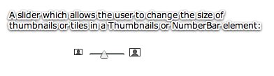
Element Pictorial Example:
See also
| Property | Defined by | ||
|---|---|---|---|
| pagingOwner : PagingControlHolder
This provides an optional reference to the PagingControlHolder subclass element which should be controlled by this slider; specifically, a reference to a Thumbnails or NumberBar element.
| PagingControlSizer | ||
| Method | Defined by | ||
|---|---|---|---|
| PagingControlSizer | |||
| Method | Defined by | ||
|---|---|---|---|
|
createChildren():void
| PagingControlSizer | ||
|
updateDisplayList(w:Number, h:Number):void
| PagingControlSizer | ||
| Style | Description | Defined by | ||
|---|---|---|---|---|
 | Type: String CSS Inheritance: no The location of the data tip relative to the thumb. | HSlider | ||
|
largeIconSkin
| Type: Class CSS Inheritance: no Specifies the large-tile icon which is displayed on the right edge of the slider. By default, the embedded default icon is used. The default value is Embedded default icon. | PagingControlSizer | ||
|
maxTileHeight
| Type: Number Format: Length CSS Inheritance: no Specifies the maximum tile height, in pixels, which the slider can apply to the associated PagingControlHolder element. The default value is 100. | PagingControlSizer | ||
|
maxTileWidth
| Type: Number Format: Length CSS Inheritance: no Specifies the maximum tile width, in pixels, which the slider can apply to the associated PagingControlHolder element. The default value is 100. | PagingControlSizer | ||
|
minTileHeight
| Type: Number Format: Length CSS Inheritance: no Specifies the minimum tile height, in pixels, which the slider can apply to the associated PagingControlHolder element. The default value is 20. | PagingControlSizer | ||
|
minTileWidth
| Type: Number Format: Length CSS Inheritance: no Specifies the minimum tile width, in pixels, which the slider can apply to the associated PagingControlHolder element. The default value is 20. | PagingControlSizer | ||
|
smallIconSkin
| Type: Class CSS Inheritance: no Specifies the small-tile icon which is displayed on the left edge of the slider. By default, the embedded default icon is used. The default value is Embedded default icon. | PagingControlSizer | ||
| pagingOwner | property |
pagingOwner:PagingControlHolder [read-write]
This provides an optional reference to the PagingControlHolder subclass element which should be controlled by this slider; specifically, a reference to a Thumbnails or NumberBar element.
If not specified, then this element must be used within the <PagingControls>...</PagingControls> child node in a NumberBar or Thumbnails element.
Layout XML Example of Standalone Usage (assumes that a <Thumbnails ... id="thumbDisplay" ... /> element already exists):
<PagingControl pagingOwner="Eval{thumbDisplay}" />
For an example of the PagingControls child node implementation, see the class description above.
public function get pagingOwner():PagingControlHolder
public function set pagingOwner(value:PagingControlHolder):void
| PagingControlSizer | () | constructor |
public function PagingControlSizer()
| createChildren | () | method |
protected override function createChildren():void
| updateDisplayList | () | method |
protected override function updateDisplayList(w:Number, h:Number):voidParameters
w:Number |
|
h:Number |
 Hide Inherited Styles
 Show Inherited Styles