| Package | com.dwuser.ss4.ui.controls |
| Class | public class LastButton |
| Inheritance | LastButton  DWU_Button Button UIComponent FlexSprite flash.display.Sprite DWU_Button Button UIComponent FlexSprite flash.display.Sprite |
By default, the LastButton can be triggered with the keyboard shortcut of 'End'. Keyboard shortcuts can be disabled through the useKeyboardShortcuts property on the FlashSlideshowConfigurationParameters object.
Layout XML Syntax Example:
The LastButton class inherits all of the tag attributes of its superclass.
   <LastButton
      Styles
      disableAutoplayOnClick="true"
      themeColor="Inherited themeColor"
      disabledColor="Inherited disabledColor"
      iconShadow="true"
   />
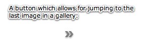
Element Pictorial Example:
See also
| Method | Defined by | ||
|---|---|---|---|
| LastButton | |||
 |
callLater(method:Function, args:Array = null):void
| DWU_Button | |
|
clearStyle(styleProp:String):void
Deletes a style property from this component instance.
| UIComponent | |
|
contentToGlobal(point:Point):Point
Converts a
Point object from content coordinates to global coordinates. | UIComponent | |
|
contentToLocal(point:Point):Point
Converts a
Point object from content to local coordinates. | UIComponent | |
|
createAutomationIDPart(child:IAutomationObject):Object
Returns a set of properties that identify the child within
this container.
| UIComponent | |
|
createReferenceOnParentDocument(parentDocument:IFlexDisplayObject):void
Creates an
id reference to this IUIComponent object
on its parent document object. | UIComponent | |
|
deleteReferenceOnParentDocument(parentDocument:IFlexDisplayObject):void
Deletes the
id reference to this IUIComponent object
on its parent document object. | UIComponent | |
|
Returns a UITextFormat object corresponding to the text styles
for this UIComponent.
| UIComponent | |
|
dispatchEvent(event:Event):Boolean
Dispatches an event into the event flow.
| UIComponent | |
|
drawFocus(isFocused:Boolean):void
Get the stinkin' compiler to shut up...
| DWU_Button | |
|
drawRoundRect(x:Number, y:Number, w:Number, h:Number, r:Object = null, c:Object = null, alpha:Object = null, rot:Object = null, gradient:String = null, ratios:Array = null, hole:Object = null):void
Programatically draws a rectangle into this skin's Graphics object.
| UIComponent | |
|
effectFinished(effectInst:IEffectInstance):void
Called by the effect instance when it stops playing on the component.
| UIComponent | |
|
effectStarted(effectInst:IEffectInstance):void
Called by the effect instance when it starts playing on the component.
| UIComponent | |
|
endEffectsStarted():void
Ends all currently playing effects on the component.
| UIComponent | |
|
executeBindings(recurse:Boolean = false):void
Executes the data bindings into this UIComponent object.
| UIComponent | |
|
finishPrint(obj:Object, target:IFlexDisplayObject):void
Called after printing is complete.
| UIComponent | |
|
getAutomationChildAt(index:int):IAutomationObject
Provides the automation object at the specified index.
| UIComponent | |
|
getClassStyleDeclarations():Array
Finds the type selectors for this UIComponent instance.
| UIComponent | |
|
getConstraintValue(constraintName:String):*
Returns a layout constraint value, which is the same as
getting the constraint style for this component.
| UIComponent | |
|
getDescendantByName(name:String):DisplayObject
Searches all children for the first child named with the passed value; returns that child, or null if not found.
| UIComponent | |
|
getDescendantsByName(name:String):Array
Searches all children for all children named with the passed value; returns an array with those children, or an empty array if none found.
| UIComponent | |
|
getExplicitOrMeasuredHeight():Number
A convenience method for determining whether to use the
explicit or measured height
| UIComponent | |
|
getExplicitOrMeasuredWidth():Number
A convenience method for determining whether to use the
explicit or measured width
| UIComponent | |
|
getFocus():InteractiveObject
Gets the object that currently has focus.
| UIComponent | |
|
getRepeaterItem(whichRepeater:int = -1):Object
Returns the item in the
dataProvider that was used
by the specified Repeater to produce this Repeater, or
null if this Repeater isn't repeated. | UIComponent | |
|
getStyle(styleProp:String):*
Gets a style property that has been set anywhere in this
component's style lookup chain.
| UIComponent | |
|
getVisibleRect(targetParent:DisplayObject = null):Rectangle
MOVED OVER FROM SDK 3.2 UIComponent - Allows for popped-up alerts to be displayed correctly - NGR MOVED 11-20-08
| UIComponent | |
|
globalToContent(point:Point):Point
Converts a
Point object from global to content coordinates. | UIComponent | |
|
horizontalGradientMatrix(x:Number, y:Number, width:Number, height:Number):Matrix
Returns a box Matrix which can be passed to the
drawRoundRect() method
as the rot parameter when drawing a horizontal gradient. | UIComponent | |
|
initialize():void
Initializes the internal structure of this component.
| UIComponent | |
|
initializeRepeaterArrays(parent:IRepeaterClient):void
Initializes various properties which keep track of repeated instances
of this component.
| UIComponent | |
|
invalidateDisplayList():void
Marks a component so that its
updateDisplayList()
method gets called during a later screen update. | UIComponent | |
|
invalidateProperties():void
Marks a component so that its
commitProperties()
method gets called during a later screen update. | UIComponent | |
|
invalidateSize():void
Marks a component so that its
measure()
method gets called during a later screen update. | UIComponent | |
|
localToContent(point:Point):Point
Converts a
Point object from local to content coordinates. | UIComponent | |
|
measureHTMLText(htmlText:String):TextLineMetrics
Measures the specified HTML text, which may contain HTML tags such
as
<font> and <b>,
assuming that it is displayed
in a single-line UITextField using a UITextFormat
determined by the styles of this UIComponent. | UIComponent | |
|
measureText(text:String):TextLineMetrics
Measures the specified text, assuming that it is displayed
in a single-line UITextField using a UITextFormat
determined by the styles of this UIComponent.
| UIComponent | |
|
move(x:Number, y:Number):void
Moves the component to a specified position within its parent.
| UIComponent | |
|
move_unprotected(x:Number, y:Number):void
Same as move, but cannot be prevented via the protection_move event.
| UIComponent | |
|
notifyStyleChangeInChildren(styleProp:String, recursive:Boolean):void
Propagates style changes to the children.
| UIComponent | |
|
openLast():void
| LastButton | ||
|
owns(child:DisplayObject):Boolean
Returns
true if the chain of owner properties
points from child to this UIComponent. | UIComponent | |
|
parentChanged(p:DisplayObjectContainer):void
Called by Flex when a UIComponent object is added to or removed from a parent.
| UIComponent | |
|
prepareToPrint(target:IFlexDisplayObject):Object
Prepares an IFlexDisplayObject for printing.
| UIComponent | |
|
regenerateStyleCache(recursive:Boolean):void
Builds or rebuilds the CSS style cache for this component
and, if the
recursive parameter is true,
for all descendants of this component as well. | UIComponent | |
|
registerEffects(effects:Array):void
For each effect event, registers the EffectManager
as one of the event listeners.
| UIComponent | |
|
replayAutomatableEvent(event:Event):Boolean
Replays the specified event.
| UIComponent | |
|
resolveAutomationIDPart(criteria:Object):Array
Resolves a child by using the id provided.
| UIComponent | |
|
resumeBackgroundProcessing():void
[static]
Resumes the background processing of methods
queued by
callLater(), after a call to
suspendBackgroundProcessing(). | UIComponent | |
|
setActualSize(w:Number, h:Number):void
Sizes the object.
| UIComponent | |
|
setActualSize_unprotected(w:Number, h:Number):void
Same as setActualSize, but is not cancelable via the protection_size event.
| UIComponent | |
|
setConstraintValue(constraintName:String, value:*):void
Sets a layout constraint value, which is the same as
setting the constraint style for this component.
| UIComponent | |
|
setCurrentState(stateName:String, playTransition:Boolean = true):void
Set the current state.
| UIComponent | |
|
setFocus():void
| DWU_Button | |
|
setStyle(styleProp:String, newValue:*):void
Sets a style property on this component instance.
| UIComponent | |
|
setVisible(value:Boolean, noEvent:Boolean = false):void
Called when the
visible property changes. | UIComponent | |
|
setVisible_unprotected(value:Boolean, noEvent:Boolean = false):void
Same as setVisible, but cannot be prevented.
| UIComponent | |
|
styleChanged(styleProp:String):void
Detects changes to style properties.
| UIComponent | |
|
stylesInitialized():void
Flex calls the
stylesInitialized() method when
the styles for a component are first initialized. | UIComponent | |
|
suspendBackgroundProcessing():void
[static]
Blocks the background processing of methods
queued by
callLater(),
until resumeBackgroundProcessing() is called. | UIComponent | |
|
toString():String
Returns a string indicating the location of this object
within the hierarchy of DisplayObjects in the Application.
| FlexSprite | |
|
validateDisplayList():void
Validates the position and size of children and draws other
visuals.
| UIComponent | |
|
validateNow():void
Validate and update the properties and layout of this object
and redraw it, if necessary.
| UIComponent | |
|
validateProperties():void
Used by layout logic to validate the properties of a component
by calling the
commitProperties() method. | UIComponent | |
|
validateSize(recursive:Boolean = false):void
Validates the measured size of the component
If the
LayoutManager.invalidateSize() method is called with
this ILayoutManagerClient, then the validateSize() method
is called when it's time to do measurements. | UIComponent | |
|
validationResultHandler(event:ValidationResultEvent):void
Handles both the
valid and invalid events from a
validator assigned to this component. | UIComponent | |
|
verticalGradientMatrix(x:Number, y:Number, width:Number, height:Number):Matrix
Returns a box Matrix which can be passed to
drawRoundRect()
as the rot parameter when drawing a vertical gradient. | UIComponent | |
| Method | Defined by | ||
|---|---|---|---|
|
adjustFocusRect(obj:DisplayObject = null):void
Adjust the focus rectangle.
| UIComponent | |
|
attachOverlay():void
This is an internal method used by the Flex framework
to support the Dissolve effect.
| UIComponent | |
|
childrenCreated():void
Performs any final processing after child objects are created.
| UIComponent | |
|
clickHandler(event:MouseEvent):void
The default handler for the
MouseEvent.CLICK event. | Button | |
|
commitProperties():void
Processes the properties set on the component.
| UIComponent | |
|
createChildren():void
| LastButton | ||
|
createInFontContext(classObj:Class):Object
Creates a new object using a context
based on the embedded font being used.
| UIComponent | |
|
createInModuleContext(moduleFactory:IFlexModuleFactory, className:String):Object
Creates the object using a given moduleFactory.
| UIComponent | |
|
focusInHandler(event:FocusEvent):void
The event handler called when a UIComponent object gets focus.
| UIComponent | |
|
focusOutHandler(event:FocusEvent):void
The event handler called when a UIComponent object loses focus.
| UIComponent | |
|
initializationComplete():void
Finalizes the initialization of this component.
| UIComponent | |
|
initializeAccessibility():void
Initializes this component's accessibility code.
| UIComponent | |
|
isOurFocus(target:DisplayObject):Boolean
Typically overridden by components containing UITextField objects,
where the UITextField object gets focus.
| UIComponent | |
|
keyDownHandler(event:KeyboardEvent):void
The event handler called for a
keyDown event. | UIComponent | |
|
keyUpHandler(event:KeyboardEvent):void
The event handler called for a
keyUp event. | UIComponent | |
|
measure():void
Calculates the default size, and optionally the default minimum size,
of the component.
| UIComponent | |
|
mouseDownHandler(event:MouseEvent):void
The default handler for the
MouseEvent.MOUSE_DOWN event. | Button | |
|
mouseUpHandler(event:MouseEvent):void
The default handler for the
MouseEvent.MOUSE_UP event. | Button | |
|
resourcesChanged():void
This method is called when a UIComponent is constructed,
and again whenever the ResourceManager dispatches
a
"change" Event to indicate
that the localized resources have changed in some way. | UIComponent | |
|
rollOutHandler(event:MouseEvent):void
The default handler for the
MouseEvent.ROLL_OUT event. | Button | |
|
rollOverHandler(event:MouseEvent):void
The default handler for the
MouseEvent.ROLL_OVER event. | Button | |
|
updateDisplayList(unscaledWidth:Number, unscaledHeight:Number):void
Draws the object and/or sizes and positions its children.
| UIComponent | |
| Style | Description | Defined by | ||
|---|---|---|---|---|
| Type: String CSS Inheritance: no The vertical distance in pixels from the top edge of the content area to the control's baseline position. | UIComponent | ||
| Type: uint Format: Color CSS Inheritance: no Color of the border. | Button | ||
| Type: String CSS Inheritance: no The vertical distance in pixels from the lower edge of the component to the lower edge of its content area. | UIComponent | ||
| Type: Number CSS Inheritance: no The color brightness of the component. | UIComponent | ||
| Type: uint Format: Color CSS Inheritance: yes Color of text in the component, including the component label. | Button | ||
| Type: Number CSS Inheritance: no The color contrast of the component. | UIComponent | ||
| Type: Number Format: Length CSS Inheritance: no Radius of component corners. | Button | ||
|
disableAutoplayOnClick
| Type: Boolean CSS Inheritance: no Specifies if autoplay should be automatically disabled when the user clicks the button. The default value is true. | LastButton | ||
|
disabledColor
| Type: Number Format: Color CSS Inheritance: yes Specifies the theme color used on the button skin when the button is disabled (usually because the last image in the gallery is selected). The default value is Inherited disabledColor. | LastButton | ||
| Type: Class CSS Inheritance: no Name of the class to use as the icon when the button is disabled and not selected. | Button | ||
| Type: Class CSS Inheritance: no Name of the class to use as the skin for the background and border when the button is not selected and is disabled. | Button | ||
| Type: Class CSS Inheritance: no Name of the class to use as the icon when the button is not selected and the mouse button is down. | Button | ||
| Type: Class CSS Inheritance: no Name of the class to use as the skin for the background and border when the button is not selected and the mouse button is down. | Button | ||
| Type: uint Format: Color CSS Inheritance: yes Color of the component highlight when validation fails. | UIComponent | ||
| Type: Array CSS Inheritance: no Alphas used for the background fill of controls. | Button | ||
| Type: Array Format: Color CSS Inheritance: no Colors used to tint the background of the control. | Button | ||
| Type: Number CSS Inheritance: no Specifies the alpha transparency value of the focus skin. | Button | ||
| Type: String CSS Inheritance: no Blend mode used by the focus rectangle. | UIComponent | ||
| Type: String CSS Inheritance: no Specifies which corners of the focus rectangle should be rounded. | Button | ||
| Type: Class CSS Inheritance: no Skin used to draw the focus rectangle. | UIComponent | ||
| Type: Number Format: Length CSS Inheritance: no Thickness, in pixels, of the focus rectangle outline. | UIComponent | ||
| Type: String CSS Inheritance: yes Sets the antiAliasType property of internal TextFields. | Button | ||
| Type: String CSS Inheritance: yes Name of the font to use. | Button | ||
| Type: String CSS Inheritance: yes Sets the gridFitType property of internal TextFields that represent text in Flex controls. | Button | ||
| Type: Number CSS Inheritance: yes Sets the sharpness property of internal TextFields that represent text in Flex controls. | Button | ||
| Type: Number Format: Length CSS Inheritance: yes Height of the text, in pixels. | Button | ||
| Type: String CSS Inheritance: yes Determines whether the text is italic font. | Button | ||
| Type: Number CSS Inheritance: yes Sets the thickness property of internal TextFields that represent text in Flex controls. | Button | ||
| Type: String CSS Inheritance: yes Determines whether the text is boldface. | Button | ||
| Type: Array CSS Inheritance: no Alpha transparencies used for the highlight fill of controls. | Button | ||
| Type: String CSS Inheritance: no The horizontal distance in pixels from the center of the component's content area to the center of the component. | UIComponent | ||
| Type: Number Format: Length CSS Inheritance: no Gap between the label and icon, when the labelPlacement property
is set to left or right. | Button | ||
| Type: Number CSS Inheritance: no The color hue of the component. | UIComponent | ||
| Type: Class CSS Inheritance: no Name of the class to use as the default icon. | Button | ||
|
iconShadow
| Type: Boolean CSS Inheritance: no Specifies if a drop shadow should be displayed on the button skin / icons. The default value is true. | LastButton | ||
| Type: Boolean CSS Inheritance: yes A Boolean value that indicates whether kerning is enabled ( true) or disabled (false). | Button | ||
| Type: Number Format: Length CSS Inheritance: yes Additional vertical space between lines of text. | Button | ||
| Type: String CSS Inheritance: no The horizontal distance in pixels from the left edge of the component's content area to the left edge of the component. | UIComponent | ||
| Type: Number CSS Inheritance: yes The number of additional pixels to appear between each character. | Button | ||
| Type: Number CSS Inheritance: no The opacity of the component. | UIComponent | ||
| Type: Class CSS Inheritance: no Name of the class to use as the icon when the button is not selected and the mouse is over the control. | Button | ||
| Type: Class CSS Inheritance: no Name of the class to use as the skin for the background and border when the button is not selected and the mouse is over the control. | Button | ||
| Type: Number Format: Length CSS Inheritance: no Number of pixels between the component's bottom border and the bottom of its content area. | Button | ||
| Type: Number Format: Length CSS Inheritance: no Number of pixels between the component's left border and the left edge of its content area. | Button | ||
| Type: Number Format: Length CSS Inheritance: no Number of pixels between the component's right border and the right edge of its content area. | Button | ||
| Type: Number Format: Length CSS Inheritance: no Number of pixels between the component's top border and the top of its content area. | Button | ||
| Type: Number Format: Time CSS Inheritance: no Number of milliseconds to wait after the first buttonDown
event before repeating buttonDown events at each
repeatInterval. | Button | ||
| Type: Number Format: Time CSS Inheritance: no Number of milliseconds between buttonDown events
if the user presses and holds the mouse on a button. | Button | ||
| Type: String CSS Inheritance: no The horizontal distance in pixels from the right edge of the component to the right edge of its content area. | UIComponent | ||
| Type: Number CSS Inheritance: no The color saturation of the component. | UIComponent | ||
| Type: Class CSS Inheritance: no Name of the class to use as the icon when the button is selected and disabled. | Button | ||
| Type: Class CSS Inheritance: no Name of the class to use as the skin for the background and border when a toggle button is selected and disabled. | Button | ||
| Type: Class CSS Inheritance: no Name of the class to use as the icon when the button is selected and the mouse button is down. | Button | ||
| Type: Class CSS Inheritance: no Name of the class to use as the skin for the background and border when a toggle button is selected and the mouse button is down. | Button | ||
| Type: Class CSS Inheritance: no Name of the class to use as the icon when the button is selected and the mouse is over the control. | Button | ||
| Type: Class CSS Inheritance: no Name of the class to use as the skin for the background and border when a toggle button is selected and the mouse is over the control. | Button | ||
| Type: Class CSS Inheritance: no Name of the class to use as the icon when the button is selected and the mouse button is up. | Button | ||
| Type: Class CSS Inheritance: no Name of the class to use as the skin for the background and border when a toggle button is selected and the mouse is not over the control. | Button | ||
| Type: Class CSS Inheritance: no Name of the class to use as the default skin for the background and border. | Button | ||
| Type: String CSS Inheritance: yes Alignment of text within a container. | Button | ||
| Type: String CSS Inheritance: yes Determines whether the text is underlined. | Button | ||
| Type: Number Format: Length CSS Inheritance: yes Offset of first line of text from the left side of the container, in pixels. | Button | ||
| Type: uint Format: Color CSS Inheritance: yes Text color of the label as the user moves the mouse pointer over the button. | Button | ||
| Type: uint Format: Color CSS Inheritance: yes Text color of the label as the user presses it. | Button | ||
|
themeColor
| Type: Number Format: Color CSS Inheritance: yes Specifies the theme color used on the button skin. The default value is Inherited themeColor. | LastButton | ||
| Type: String CSS Inheritance: no The vertical distance in pixels from the top edge of the control's content area to the top edge of the component. | UIComponent | ||
| Type: Class CSS Inheritance: no Name of the class to use as the icon when a toggle button is not selected and the mouse is not over the button. | Button | ||
| Type: Class CSS Inheritance: no Name of the class to use as the skin for the background and border when the button is not selected and the mouse is not over the control. | Button | ||
| Type: String CSS Inheritance: no The vertical distance in pixels from the center of the component's content area to the center of the component. | UIComponent | ||
| Type: Number Format: Length CSS Inheritance: no Gap between the button's label and icon when the labelPlacement
property is set to "top" or "bottom". | Button | ||
 Hide Inherited Public Properties
 Show Inherited Public Properties