| Package | com.dwuser.ss4.ui |
| Class | public class GalleryPasswordAlert |
| Inheritance | GalleryPasswordAlert  SlideshowAlert Alert Panel Container UIComponent FlexSprite flash.display.Sprite SlideshowAlert Alert Panel Container UIComponent FlexSprite flash.display.Sprite |
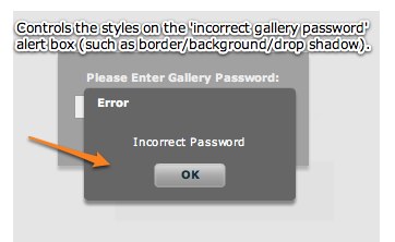
GalleryPasswordAlert style values which can be applied in the <styles> section
of the XML configuration file to customize the alert (including the displayed notification text).
Style XML Implementation Example:
The following example code goes in the <styles> section of the main <slideshow> holder node in a slideshow XML configuration file.
Some of the inherited style values have different default values on this class; the defaults for this class are listed below.
The GalleryPasswordAlert class inherits all of the style tag attributes of its superclass.
   <styles>
   ...
      <GalleryPasswordAlert
         Styles
         baseTitle="Error"
         baseLabel="Incorrect Password"

         Inherited Styles with Overridden Default Values
         backgroundAlpha="1"
         borderAlpha="1"
      />
   ...
   </styles>
Element Pictorial Example:
See also
| Method | Defined by | ||
|---|---|---|---|
| GalleryPasswordAlert | |||
 |
addChild(child:DisplayObject):DisplayObject
Adds a child DisplayObject to this Container.
| Container | |
|
addChildAt(child:DisplayObject, index:int):DisplayObject
Adds a child DisplayObject to this Container.
| Container | |
|
callLater(method:Function, args:Array = null):void
Queues a function to be called later.
| UIComponent | |
|
clearStyle(styleProp:String):void
Deletes a style property from this component instance.
| UIComponent | |
|
contentToGlobal(point:Point):Point
Converts a
Point object from content coordinates to global coordinates. | Container | |
|
contentToLocal(point:Point):Point
Converts a
Point object from content to local coordinates. | Container | |
|
createAutomationIDPart(child:IAutomationObject):Object
Returns a set of properties that identify the child within
this container.
| UIComponent | |
|
Given a single UIComponentDescriptor, create the corresponding
component and add the component as a child of this Container.
| Container | |
|
createComponentsFromDescriptors(recurse:Boolean = true):void
Iterate through the Array of
childDescriptors,
and call the createComponentFromDescriptor() method for each one. | Container | |
|
createReferenceOnParentDocument(parentDocument:IFlexDisplayObject):void
Creates an
id reference to this IUIComponent object
on its parent document object. | UIComponent | |
|
deleteReferenceOnParentDocument(parentDocument:IFlexDisplayObject):void
Deletes the
id reference to this IUIComponent object
on its parent document object. | UIComponent | |
|
Returns a UITextFormat object corresponding to the text styles
for this UIComponent.
| UIComponent | |
|
dispatchEvent(event:Event):Boolean
Dispatches an event into the event flow.
| UIComponent | |
|
drawFocus(isFocused:Boolean):void
Shows or hides the focus indicator around this component.
| UIComponent | |
|
drawRoundRect(x:Number, y:Number, w:Number, h:Number, r:Object = null, c:Object = null, alpha:Object = null, rot:Object = null, gradient:String = null, ratios:Array = null, hole:Object = null):void
Programatically draws a rectangle into this skin's Graphics object.
| UIComponent | |
|
effectFinished(effectInst:IEffectInstance):void
Called by the effect instance when it stops playing on the component.
| UIComponent | |
|
effectStarted(effectInst:IEffectInstance):void
Called by the effect instance when it starts playing on the component.
| UIComponent | |
|
endEffectsStarted():void
Ends all currently playing effects on the component.
| UIComponent | |
|
executeBindings(recurse:Boolean = false):void
Executes all the data bindings on this Container.
| Container | |
|
executeChildBindings(recurse:Boolean):void
Executes the bindings into this Container's child UIComponent objects.
| Container | |
|
finishPrint(obj:Object, target:IFlexDisplayObject):void
Called after printing is complete.
| UIComponent | |
|
getAutomationChildAt(index:int):IAutomationObject
Provides the automation object at the specified index.
| UIComponent | |
|
getChildAt(index:int):DisplayObject
Gets the nth child component object.
| Container | |
|
getChildByName(name:String):DisplayObject
Returns the child whose
name property is the specified String. | Container | |
|
getChildIndex(child:DisplayObject):int
Gets the zero-based index of a specific child.
| Container | |
|
getChildren():Array
Returns an Array of DisplayObject objects consisting of the content children
of the container.
| Container | |
|
getClassStyleDeclarations():Array
Finds the type selectors for this UIComponent instance.
| UIComponent | |
|
getConstraintValue(constraintName:String):*
Returns a layout constraint value, which is the same as
getting the constraint style for this component.
| UIComponent | |
|
getDescendantByName(name:String):DisplayObject
Searches all children for the first child named with the passed value; returns that child, or null if not found.
| UIComponent | |
|
getDescendantsByName(name:String):Array
Searches all children for all children named with the passed value; returns an array with those children, or an empty array if none found.
| UIComponent | |
|
getExplicitOrMeasuredHeight():Number
A convenience method for determining whether to use the
explicit or measured height
| UIComponent | |
|
getExplicitOrMeasuredWidth():Number
A convenience method for determining whether to use the
explicit or measured width
| UIComponent | |
|
getFocus():InteractiveObject
Gets the object that currently has focus.
| UIComponent | |
|
getRepeaterItem(whichRepeater:int = -1):Object
Returns the item in the
dataProvider that was used
by the specified Repeater to produce this Repeater, or
null if this Repeater isn't repeated. | UIComponent | |
|
getStyle(styleProp:String):*
Gets a style property that has been set anywhere in this
component's style lookup chain.
| UIComponent | |
|
getVisibleRect(targetParent:DisplayObject = null):Rectangle
MOVED OVER FROM SDK 3.2 UIComponent - Allows for popped-up alerts to be displayed correctly - NGR MOVED 11-20-08
| UIComponent | |
|
globalToContent(point:Point):Point
Converts a
Point object from global to content coordinates. | Container | |
|
horizontalGradientMatrix(x:Number, y:Number, width:Number, height:Number):Matrix
Returns a box Matrix which can be passed to the
drawRoundRect() method
as the rot parameter when drawing a horizontal gradient. | UIComponent | |
|
initialize():void
Initializes the internal structure of this component.
| UIComponent | |
|
initializeRepeaterArrays(parent:IRepeaterClient):void
Initializes various properties which keep track of repeated instances
of this component.
| UIComponent | |
|
invalidateDisplayList():void
Marks a component so that its
updateDisplayList()
method gets called during a later screen update. | UIComponent | |
|
invalidateProperties():void
Marks a component so that its
commitProperties()
method gets called during a later screen update. | UIComponent | |
|
invalidateSize():void
Marks a component so that its
measure()
method gets called during a later screen update. | UIComponent | |
|
localToContent(point:Point):Point
Converts a
Point object from local to content coordinates. | Container | |
|
measureHTMLText(htmlText:String):TextLineMetrics
Measures the specified HTML text, which may contain HTML tags such
as
<font> and <b>,
assuming that it is displayed
in a single-line UITextField using a UITextFormat
determined by the styles of this UIComponent. | UIComponent | |
|
measureText(text:String):TextLineMetrics
Measures the specified text, assuming that it is displayed
in a single-line UITextField using a UITextFormat
determined by the styles of this UIComponent.
| UIComponent | |
|
move(x:Number, y:Number):void
Moves the component to a specified position within its parent.
| UIComponent | |
|
move_unprotected(x:Number, y:Number):void
Same as move, but cannot be prevented via the protection_move event.
| UIComponent | |
|
notifyStyleChangeInChildren(styleProp:String, recursive:Boolean):void
Propagates style changes to the children.
| UIComponent | |
|
owns(child:DisplayObject):Boolean
Returns
true if the chain of owner properties
points from child to this UIComponent. | UIComponent | |
|
parentChanged(p:DisplayObjectContainer):void
Called by Flex when a UIComponent object is added to or removed from a parent.
| UIComponent | |
|
prepareToPrint(target:IFlexDisplayObject):Object
Prepares an IFlexDisplayObject for printing.
| UIComponent | |
|
regenerateStyleCache(recursive:Boolean):void
Builds or rebuilds the CSS style cache for this component
and, if the
recursive parameter is true,
for all descendants of this component as well. | UIComponent | |
|
registerEffects(effects:Array):void
For each effect event, registers the EffectManager
as one of the event listeners.
| UIComponent | |
|
removeAllChildren():void
Removes all children from the child list of this container.
| Container | |
|
removeChild(child:DisplayObject):DisplayObject
Removes a child DisplayObject from the child list of this Container.
| Container | |
|
removeChildAt(index:int):DisplayObject
Removes a child DisplayObject from the child list of this Container
at the specified index.
| Container | |
|
replayAutomatableEvent(event:Event):Boolean
Replays the specified event.
| UIComponent | |
|
resolveAutomationIDPart(criteria:Object):Array
Resolves a child by using the id provided.
| UIComponent | |
|
resumeBackgroundProcessing():void
[static]
Resumes the background processing of methods
queued by
callLater(), after a call to
suspendBackgroundProcessing(). | UIComponent | |
|
setActualSize(w:Number, h:Number):void
Sizes the object.
| UIComponent | |
|
setActualSize_unprotected(w:Number, h:Number):void
Same as setActualSize, but is not cancelable via the protection_size event.
| UIComponent | |
|
setChildIndex(child:DisplayObject, newIndex:int):void
Sets the index of a particular child.
| Container | |
|
setConstraintValue(constraintName:String, value:*):void
Sets a layout constraint value, which is the same as
setting the constraint style for this component.
| UIComponent | |
|
setCurrentState(stateName:String, playTransition:Boolean = true):void
Set the current state.
| UIComponent | |
|
setFocus():void
Sets the focus to this component.
| UIComponent | |
|
setStyle(styleProp:String, newValue:*):void
Sets a style property on this component instance.
| UIComponent | |
|
setVisible(value:Boolean, noEvent:Boolean = false):void
Called when the
visible property changes. | UIComponent | |
|
setVisible_unprotected(value:Boolean, noEvent:Boolean = false):void
Same as setVisible, but cannot be prevented.
| UIComponent | |
|
show(text:String = "", title:String = "", flags:uint = 0x4, parent:Sprite = null, closeHandler:Function = null, iconClass:Class = null, defaultButtonFlag:uint = 0x4):Alert
[static]
Static method that pops up the Alert control.
| Alert | |
|
styleChanged(styleProp:String):void
Detects changes to style properties.
| UIComponent | |
|
stylesInitialized():void
Flex calls the
stylesInitialized() method when
the styles for a component are first initialized. | UIComponent | |
|
suspendBackgroundProcessing():void
[static]
Blocks the background processing of methods
queued by
callLater(),
until resumeBackgroundProcessing() is called. | UIComponent | |
|
toString():String
Returns a string indicating the location of this object
within the hierarchy of DisplayObjects in the Application.
| FlexSprite | |
|
validateDisplayList():void
Validates the position and size of children and draws other
visuals.
| UIComponent | |
|
validateNow():void
Validate and update the properties and layout of this object
and redraw it, if necessary.
| UIComponent | |
|
validateProperties():void
Used by layout logic to validate the properties of a component
by calling the
commitProperties() method. | UIComponent | |
|
validateSize(recursive:Boolean = false):void
Validates the measured size of the component
If the
LayoutManager.invalidateSize() method is called with
this ILayoutManagerClient, then the validateSize() method
is called when it's time to do measurements. | UIComponent | |
|
validationResultHandler(event:ValidationResultEvent):void
Handles both the
valid and invalid events from a
validator assigned to this component. | UIComponent | |
|
verticalGradientMatrix(x:Number, y:Number, width:Number, height:Number):Matrix
Returns a box Matrix which can be passed to
drawRoundRect()
as the rot parameter when drawing a vertical gradient. | UIComponent | |
| Style | Description | Defined by | ||
|---|---|---|---|---|
| Type: Number CSS Inheritance: no Alpha level of the color defined by the backgroundColor
property, of the image or SWF file defined by the backgroundImage
style. | Container | ||
| Type: String CSS Inheritance: no If a background image is specified, this style specifies whether it is fixed with regard to the viewport ( "fixed")
or scrolls along with the content ("scroll"). | Container | ||
| Type: uint Format: Color CSS Inheritance: no Background color of a component. | Container | ||
| Type: uint Format: Color CSS Inheritance: yes Background color of the component when it is disabled. | Container | ||
| Type: Object Format: File CSS Inheritance: no Background image of a component. | Container | ||
| Type: String CSS Inheritance: no Scales the image specified by backgroundImage
to different percentage sizes. | Container | ||
| Type: uint Format: Color CSS Inheritance: yes Determines the color of a ProgressBar. | Container | ||
|
baseLabel
| Type: String CSS Inheritance: no Specifies the message text displayed on the alert. This is part of the notification the user will receive when they incorrectly enter a gallery password. The default value is "Incorrect Password". | GalleryPasswordAlert | ||
| Type: String CSS Inheritance: no The vertical distance in pixels from the top edge of the content area to the control's baseline position. | UIComponent | ||
|
baseTitle
| Type: String CSS Inheritance: no Specifies the title displayed on the alert. This is part of the notification the user will receive when they incorrectly enter a gallery password. The default value is "Error". | GalleryPasswordAlert | ||
| Type: Number CSS Inheritance: no Alpha of the title bar, control bar and sides of the Panel. | Panel | ||
| Type: uint Format: Color CSS Inheritance: no Color of the border. | Container | ||
| Type: String CSS Inheritance: no Bounding box sides. | Container | ||
| Type: Class CSS Inheritance: no The border skin class of the component. | Container | ||
| Type: String CSS Inheritance: no Bounding box style. | Container | ||
| Type: Number Format: Length CSS Inheritance: no Bounding box thickness. | Container | ||
| Type: Number Format: Length CSS Inheritance: no Thickness of the bottom border of the Panel control. | Panel | ||
| Type: Number Format: Length CSS Inheritance: no Thickness of the left border of the Panel. | Panel | ||
| Type: Number Format: Length CSS Inheritance: no Thickness of the right border of the Panel. | Panel | ||
| Type: Number Format: Length CSS Inheritance: no Thickness of the top border of the Panel. | Panel | ||
| Type: String CSS Inheritance: no The vertical distance in pixels from the lower edge of the component to the lower edge of its content area. | UIComponent | ||
| Type: Number CSS Inheritance: no The color brightness of the component. | UIComponent | ||
| Type: String CSS Inheritance: no Name of the CSS style declaration that specifies styles for the Alert buttons. | Alert | ||
| Type: uint Format: Color CSS Inheritance: yes Color of text in the component, including the component label. | Container | ||
| Type: Number CSS Inheritance: no The color contrast of the component. | UIComponent | ||
| Type: String CSS Inheritance: no Name of the CSS style declaration that specifies styles to apply to any control bar child subcontrol. | Panel | ||
| Type: Number Format: Length CSS Inheritance: no Radius of corners of the window frame. | Panel | ||
| Type: uint Format: Color CSS Inheritance: yes Color of text in the component if it is disabled. | Container | ||
| Type: Number CSS Inheritance: no The alpha value for the overlay that is placed on top of the container when it is disabled. | Container | ||
| Type: uint Format: Color CSS Inheritance: yes Color of the drop shadow. | Container | ||
| Type: Boolean CSS Inheritance: no Boolean property that controls the visibility of the Panel container's drop shadow. | Panel | ||
| Type: uint Format: Color CSS Inheritance: yes Color of the component highlight when validation fails. | UIComponent | ||
| Type: String CSS Inheritance: yes Sets the antiAliasType property of internal TextFields. | Container | ||
| Type: String CSS Inheritance: yes Name of the font to use. | Container | ||
| Type: String CSS Inheritance: yes Sets the gridFitType property of internal TextFields that represent text in Flex controls. | Container | ||
| Type: Number CSS Inheritance: yes Sets the sharpness property of internal TextFields that represent text in Flex controls. | Container | ||
| Type: Number Format: Length CSS Inheritance: yes Height of the text, in pixels. | Container | ||
| Type: String CSS Inheritance: yes Determines whether the text is italic font. | Container | ||
| Type: Number CSS Inheritance: yes Sets the thickness property of internal TextFields that represent text in Flex controls. | Container | ||
| Type: String CSS Inheritance: yes Determines whether the text is boldface. | Container | ||
| Type: Array Format: Color CSS Inheritance: yes Array of two colors used to draw the footer (area for the ControlBar container) background. | Panel | ||
| Type: Array Format: Color CSS Inheritance: yes Array of two colors used to draw the header. | Panel | ||
| Type: Number Format: Length CSS Inheritance: no Height of the header. | Panel | ||
| Type: Array CSS Inheritance: no Alphas used for the highlight fill of the header. | Panel | ||
| Type: String CSS Inheritance: no Horizontal alignment of children in the container. | Panel | ||
| Type: String CSS Inheritance: no The horizontal distance in pixels from the center of the component's content area to the center of the component. | UIComponent | ||
| Type: Number Format: Length CSS Inheritance: no Number of pixels between children in the horizontal direction. | Panel | ||
| Type: String CSS Inheritance: no The name of the horizontal scrollbar style. | Container | ||
| Type: Number CSS Inheritance: no The color hue of the component. | UIComponent | ||
| Type: Boolean CSS Inheritance: yes A Boolean value that indicates whether kerning is enabled ( true) or disabled (false). | Container | ||
| Type: String CSS Inheritance: no The horizontal distance in pixels from the left edge of the component's content area to the left edge of the component. | UIComponent | ||
| Type: Number CSS Inheritance: yes The number of additional pixels to appear between each character. | Container | ||
| Type: String CSS Inheritance: no Name of the CSS style declaration that specifies styles for the Alert message text. | Alert | ||
| Type: Number CSS Inheritance: yes Modality of components launched by the PopUp Manager is simulated by creating a large translucent overlay underneath the component. | Panel | ||
| Type: Number CSS Inheritance: yes The blur applied to the application while a modal window is open. | Panel | ||
| Type: uint Format: Color CSS Inheritance: yes Color of the modal overlay layer. | Panel | ||
| Type: Number Format: Time CSS Inheritance: yes Duration, in milliseconds, of the modal transparency effect that plays when a modal window opens or closes. | Panel | ||
| Type: Number CSS Inheritance: no The opacity of the component. | UIComponent | ||
| Type: Number Format: Length CSS Inheritance: no Number of pixels between the container's lower border and its content area. | Panel | ||
| Type: Number Format: Length CSS Inheritance: no Number of pixels between the component's left border and the left edge of its content area. | Container | ||
| Type: Number Format: Length CSS Inheritance: no Number of pixels between the component's right border and the right edge of its content area. | Container | ||
| Type: Number Format: Length CSS Inheritance: no Number of pixels between the container's top border and its content area. | Panel | ||
| Type: String CSS Inheritance: no The horizontal distance in pixels from the right edge of the component to the right edge of its content area. | UIComponent | ||
| Type: Boolean CSS Inheritance: no Flag to enable rounding for the bottom two corners of the container. | Panel | ||
| Type: Number CSS Inheritance: no The color saturation of the component. | UIComponent | ||
| Type: String CSS Inheritance: no Direction of drop shadow. | Panel | ||
| Type: Number Format: Length CSS Inheritance: no Distance of drop shadow. | Panel | ||
| Type: String CSS Inheritance: no Style declaration name for the status in the title bar. | Panel | ||
| Type: String CSS Inheritance: yes Alignment of text within a container. | Container | ||
| Type: String CSS Inheritance: yes Determines whether the text is underlined. | Container | ||
| Type: Number Format: Length CSS Inheritance: yes Offset of first line of text from the left side of the container, in pixels. | Container | ||
| Type: uint Format: Color CSS Inheritance: yes Theme color of a component. | UIComponent | ||
| Type: Class CSS Inheritance: no The title background skin. | Panel | ||
| Type: String CSS Inheritance: no Name of the CSS style declaration that specifies styles for the Alert title text. | Alert | ||
| Type: String CSS Inheritance: no The vertical distance in pixels from the top edge of the control's content area to the top edge of the component. | UIComponent | ||
| Type: String CSS Inheritance: no Vertical alignment of children in the container. | Panel | ||
| Type: String CSS Inheritance: no The vertical distance in pixels from the center of the component's content area to the center of the component. | UIComponent | ||
| Type: Number Format: Length CSS Inheritance: no Number of pixels between children in the vertical direction. | Panel | ||
| Type: String CSS Inheritance: no The name of the vertical scrollbar style. | Container | ||
 Hide Inherited Public Properties
 Show Inherited Public Properties