| Package | com.dwuser.ss4.ui |
| Class | public class DynamicScrollableText |
| Inheritance | DynamicScrollableText  TextArea ScrollControlBase UIComponent FlexSprite flash.display.Sprite TextArea ScrollControlBase UIComponent FlexSprite flash.display.Sprite |
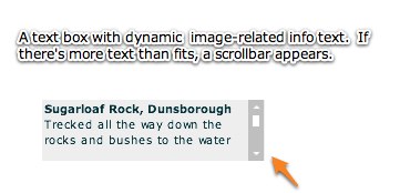
The DynamicScrollableText element is identical to the DynamicText element except that, if the text doesn't fit in the available area, the extra text can be scrolled into view on this element whereas it is hidden on the other element.
Two of the special features of the DynamicScrollableText element are its built-in fade transition and auto-hiding support. The built-in fade transition makes for a much more polished transition between different text
values. The auto-hiding support allows for the element to automatically hide itself when the parsed dynamic text results in an empty string. You can also listen for the textUpdate event to detect
when updates occur which result in auto-hiding. The Caption element uses this feature to hide itself when no caption/description is specified for an image.
The most important property on this element is the text property, which controls the text displayed. The maxHeight property is also important if you don't explicitly specify a
height value. If you don't specify a height value, the element will automatically expand until all of the text is visible or the maxHeight value is reached, at which time
the scrollbar appears. Note - you can use the htmlText property instead of text if you wish to display HTML text.
By default, the scrolling on the DynamicScrollableText element can be triggered with the keyboard shortcut of '<' (up) or '>' (down). Keyboard shortcuts can be disabled through the useKeyboardShortcuts property on the FlashSlideshowConfigurationParameters object.
Another special property of the DynamicScrollableText element is its support of replacement values in the label and link. These are values which dynamically change based on the current gallery and image.
About Replacement Values:
Replacement values are special string values which are automatically replaced based on the current gallery and image's information. The following gallery-related replacement values are available:
id attribute defined on the actual gallery node; this is the value set in the wizard in the Gallery ID field. This is generally a property only used by advanced users.<gallery title="Flowers and Sunshine" ... >. You can use the standard attributes (such as title and
description), or any custom attribute which has been defined.The following image-related replacement values are available:
id attribute defined on the actual image node; this is the value set in the wizard in the Image ID field. This is generally a property only used by advanced users.src value. This usually represents just the file name of the image; if you want to get the entire image path, use the
{image.srcFull} replacement value.{image.thumb} for just the shorter path / file name).link value (if one has been defined). For example, "Purchase from: {image.link}" would become "Purchase from:
http://www.mysite.com/" if the image's link was defined like this: <img link="http://www.mysite.com/" ... >.title value (if one has been defined). For example, "Current image: {image.title}" would become "Current image:
Daffodil" if the image's title was defined like this: <img ... title="Daffodil" ... >.caption value (if one has been defined). For example, "About: {image.caption}" would become "About: Taken two weeks ago
on holiday in South Africa" if the image's caption was defined like this: <img ... caption="Taken two weeks ago on holiday in South Africa" ... >.<img title="Blue Orchid" ... >. You can use the standard attributes (such as title and
caption), or any custom attribute which has been defined. In other words, {image.someValue} would be replaced with <img ... someValue="Special attribute value!" ... > .
If a requested property doesn't exist for a given image, a default value can be specified using the following format: {image.someOtherAtt|Default Value Here} After the someOtherAtt
value, a pipe character denotes the start of the default string.
creator
(corresponds to the Creator metadata property), title (corresponds to the Title metadata property), and description (corresponds to the Description metadata property).
If a requested metadata property doesn't exist on an image, or if the metadata isn't available because the image hasn't fully loaded yet, a default value can be specified using the
following format: {metadata.property|Default Value Here} . After the property value, a pipe character denotes the start of the default string. For example,
the following value would display "Loading..." until the metadata title became available: {metadata.title|Loading...}
Note that you can use multiple replacement values in the same string.
Layout XML Syntax Example:
The DynamicScrollableText class inherits all of the tag attributes of its superclass.
   <DynamicScrollableText
      Properties
      text="The displayed text"

      Styles
      fadeTime="1500"
      hideWhenEmpty="true"
      verticalScrollBarStyleName="DynamicTextScrollBar"

      Events
      textUpdate="No default"
   />
Element Pictorial Example:
See also
| Property | Defined by | ||
|---|---|---|---|
 | activeEffects : Array
The list of effects that are currently playing on the component,
as an Array of EffectInstance instances.
| UIComponent | |
| automationDelegate : Object
The delegate object that handles the automation-related functionality.
| UIComponent | |
| automationName : String
Name that can be used as an identifier for this object.
| UIComponent | |
| automationTabularData : Object
An implementation of the
IAutomationTabularData interface, which
can be used to retrieve the data. | UIComponent | |
| automationValue : Array
This value generally corresponds to the rendered appearance of the
object and should be usable for correlating the identifier with
the object as it appears visually within the application.
| UIComponent | |
| baselinePosition : Number
The y-coordinate of the baseline
of the first line of text of the component.
| UIComponent | |
| borderMetrics : EdgeMetrics
Returns an EdgeMetrics object that has four properties:
left, top, right,
and bottom. | ScrollControlBase | |
| cacheHeuristic : Boolean
Used by Flex to suggest bitmap caching for the object.
| UIComponent | |
| cachePolicy : String
Specifies the bitmap caching policy for this object.
| UIComponent | |
| className : String
The name of this instance's class, such as
"Button". | UIComponent | |
| condenseWhite : Boolean
Specifies whether extra white space (spaces, line breaks,
and so on) should be removed in a TextArea control with HTML text.
| TextArea | |
| contentMouseX : Number
Returns the x position of the mouse, in the content coordinate system.
| UIComponent | |
| contentMouseY : Number
Returns the y position of the mouse, in the content coordinate system.
| UIComponent | |
| currentLooperData : Object
When using this component as the child of a DataLooper element, this holds the current element's corresponding looping data.
| UIComponent | |
| currentState : String
The current view state of the component.
| UIComponent | |
| cursorManager : ICursorManager
Gets the CursorManager that controls the cursor for this component
and its peers.
| UIComponent | |
| data : Object
Lets you pass a value to the component
when you use it in an item renderer or item editor.
| TextArea | |
| descriptor : UIComponentDescriptor
Reference to the UIComponentDescriptor, if any, that was used
by the
createComponentFromDescriptor() method to create this
UIComponent instance. | UIComponent | |
| displayAsPassword : Boolean
Indicates whether this control is used for entering passwords.
| TextArea | |
| document : Object
A reference to the document object associated with this UIComponent.
| UIComponent | |
| doubleClickEnabled : Boolean
Specifies whether the UIComponent object receives
doubleClick events. | UIComponent | |
| editable : Boolean
Indicates whether the user is allowed to edit the text in this control.
| TextArea | |
| enabled : Boolean
Whether the component can accept user interaction.
| UIComponent | |
| errorString : String
The text that will be displayed by a component's error tip when a
component is monitored by a Validator and validation fails.
| UIComponent | |
| explicitHeight : Number
Number that specifies the explicit height of the component,
in pixels, in the component's coordinates.
| UIComponent | |
| explicitMaxHeight : Number
Number that specifies the maximum height of the component,
in pixels, in the component's coordinates.
| UIComponent | |
| explicitMaxWidth : Number
Number that specifies the maximum width of the component,
in pixels, in the component's coordinates.
| UIComponent | |
| explicitMinHeight : Number
Number that specifies the minimum height of the component,
in pixels, in the component's coordinates.
| UIComponent | |
| explicitMinWidth : Number
Number that specifies the minimum width of the component,
in pixels, in the component's coordinates.
| UIComponent | |
| explicitWidth : Number
Number that specifies the explicit width of the component,
in pixels, in the component's coordinates.
| UIComponent | |
| flexContextMenu : IFlexContextMenu
The context menu for this UIComponent.
| UIComponent | |
| focusEnabled : Boolean
Indicates whether the component can receive focus when tabbed to.
| UIComponent | |
| focusManager : IFocusManager
Gets the FocusManager that controls focus for this component
and its peers.
| UIComponent | |
| focusPane : Sprite
The focus pane associated with this object.
| UIComponent | |
| globalX : Number | UIComponent | |
| globalY : Number | UIComponent | |
| height : Number
Number that specifies the height of the component, in pixels,
in the parent's coordinates.
| UIComponent | |
| horizontalScrollPolicy : String
Specifies whether the horizontal scroll bar is
always on (
ScrollPolicy.ON),
always off (ScrollPolicy.OFF),
or turns on when needed (ScrollPolicy.AUTO). | TextArea | |
| horizontalScrollPosition : Number
Pixel position in the content area of the leftmost pixel
that is currently displayed.
| TextArea | |
| htmlText : String
Specifies the text displayed by the TextArea control, including HTML markup that
expresses the styles of that text.
| TextArea | |
| id : String
ID of the component.
| UIComponent | |
| imeMode : String
Specifies the IME (input method editor) mode.
| TextArea | |
| includeInLayout : Boolean
Specifies whether this component is included in the layout of the
parent container.
| UIComponent | |
| inheritingStyles : Object
The beginning of this component's chain of inheriting styles.
| UIComponent | |
| initialized : Boolean
A flag that determines if an object has been through all three phases
of layout: commitment, measurement, and layout (provided that any were required).
| UIComponent | |
| instanceIndex : int
The index of a repeated component.
| UIComponent | |
| instanceIndices : Array
An Array containing the indices required to reference
this UIComponent object from its parent document.
| UIComponent | |
| isDocument : Boolean
Determines whether this UIComponent instance is a document object,
that is, whether it is at the top of the hierarchy of a Flex
application, MXML component, or ActionScript component.
| UIComponent | |
| isPopUp : Boolean
Set to
true by the PopUpManager to indicate
that component has been popped up. | UIComponent | |
| length : int
The number of characters of text displayed in the TextArea.
| TextArea | |
| listData : BaseListData
When a component is used as a drop-in item renderer or drop-in
item editor, Flex initializes the
listData property
of the component with the appropriate data from the list control. | TextArea | |
| liveScrolling : Boolean = true
A flag that indicates whether scrolling is live as the
scrollbar thumb is moved
or the view is not updated until the thumb is released.
| ScrollControlBase | |
| maxChars : int
Maximum number of characters that users can enter in the text field.
| TextArea | |
| maxHeight : Number
Number that specifies the maximum height of the component,
in pixels, in the component's coordinates.
| UIComponent | |
| maxWidth : Number
Number that specifies the maximum width of the component,
in pixels, in the component's coordinates.
| UIComponent | |
| measuredHeight : Number
The default height of the component, in pixels.
| UIComponent | |
| measuredMinHeight : Number
The default minimum height of the component, in pixels.
| UIComponent | |
| measuredMinWidth : Number
The default minimum width of the component, in pixels.
| UIComponent | |
| measuredWidth : Number
The default width of the component, in pixels.
| UIComponent | |
| minHeight : Number
Number that specifies the minimum height of the component,
in pixels, in the component's coordinates.
| UIComponent | |
| minWidth : Number
Number that specifies the minimum width of the component,
in pixels, in the component's coordinates.
| UIComponent | |
| miscHolder : Object
A utility holder for any various properties
| UIComponent | |
| moduleFactory : IFlexModuleFactory
The moduleFactory that is used to create TextFields in the correct SWF context.
| UIComponent | |
| mouseFocusEnabled : Boolean
Whether you can receive focus when clicked on.
| UIComponent | |
| move_enableProtection : Boolean = false | UIComponent | |
| nestLevel : int
Depth of this object in the containment hierarchy.
| UIComponent | |
| nonInheritingStyles : Object
The beginning of this component's chain of non-inheriting styles.
| UIComponent | |
| numAutomationChildren : int
The number of automation children this container has.
| UIComponent | |
| owner : DisplayObjectContainer
The owner of this UIComponent.
| UIComponent | |
| parent : DisplayObjectContainer
The parent container or component for this component.
| UIComponent | |
| parentApplication : Object
A reference to the Application object that contains this UIComponent
instance.
| UIComponent | |
| parentDocument : Object
A reference to the parent document object for this UIComponent.
| UIComponent | |
| percentHeight : Number
Number that specifies the height of a component as a percentage
of its parent's size.
| UIComponent | |
| percentWidth : Number
Number that specifies the width of a component as a percentage
of its parent's size.
| UIComponent | |
| processedDescriptors : Boolean
Set to
true after immediate or deferred child creation,
depending on which one happens. | UIComponent | |
| repeater : IRepeater
A reference to the Repeater object
in the parent document that produced this UIComponent.
| UIComponent | |
| repeaterIndex : int
The index of the item in the data provider
of the Repeater that produced this UIComponent.
| UIComponent | |
| repeaterIndices : Array
An Array containing the indices of the items in the data provider
of the Repeaters in the parent document that produced this UIComponent.
| UIComponent | |
| repeaters : Array
An Array containing references to the Repeater objects
in the parent document that produced this UIComponent.
| UIComponent | |
| restrict : String
Indicates the set of characters that a user can enter into the control.
| TextArea | |
| scaleX : Number
Number that specifies the horizontal scaling factor.
| UIComponent | |
| scaleY : Number
Number that specifies the vertical scaling factor.
| UIComponent | |
| screen : Rectangle
Returns an object that contains the size and position of the base
drawing surface for this object.
| UIComponent | |
| scrollTipFunction : Function
A function that computes the string to be displayed as the ScrollTip.
| ScrollControlBase | |
| selectable : Boolean
Specifies whether the text can be selected.
| TextArea | |
| selectionBeginIndex : int
The zero-based character index value of the first character
in the current selection.
| TextArea | |
| selectionEndIndex : int
The zero-based index of the position afterthe last character
in the current selection (equivalent to the one-based index of the last
character).
| TextArea | |
| setActualSize_enableProtection : Boolean = false | UIComponent | |
| setVisible_enableProtection : Boolean = true | UIComponent | |
| showInAutomationHierarchy : Boolean
A flag that determines if an automation object
shows in the automation hierarchy.
| UIComponent | |
| showScrollTips : Boolean = false
A flag that indicates whether a tooltip should appear
near the scroll thumb when it is being dragged.
| ScrollControlBase | |
| slideshow : FlashSlideshow
A reference to the main slideshow
| DynamicScrollableText | ||
| states : Array
The view states that are defined for this component.
| UIComponent | |
| styleClassOverridesInline : Boolean = true
Specifies if class-specific styles (as defined by the
styleName property) override inline styles. | UIComponent | |
| styleDeclaration : CSSStyleDeclaration
Storage for the inline inheriting styles on this object.
| UIComponent | |
| styleName : Object
The class style used by this component.
| UIComponent | |
| styleSheet : StyleSheet
A flash.text.StyleSheet object that can perform rendering
on the TextArea control's text.
| TextArea | |
| systemManager : ISystemManager
Returns the SystemManager object used by this component.
| UIComponent | |
| text : String
Plain text that appears in the control.
| TextArea | |
| textHeight : Number
The height of the text.
| TextArea | |
| textWidth : Number
The width of the text.
| TextArea | |
| toolTip : String
Text to display in the ToolTip.
| UIComponent | |
| transitions : Array
An Array of Transition objects, where each Transition object defines a
set of effects to play when a view state change occurs.
| UIComponent | |
| tweeningProperties : Array
Array of properties that are currently being tweened on this object.
| UIComponent | |
| uid : String
A unique identifier for the object.
| UIComponent | |
| updateCompletePendingFlag : Boolean
A flag that determines if an object has been through all three phases
of layout validation (provided that any were required).
| UIComponent | |
| validationSubField : String
Used by a validator to associate a subfield with this component.
| UIComponent | |
| verticalScrollPolicy : String
Whether the vertical scroll bar is
always on (
ScrollPolicy.ON),
always off (ScrollPolicy.OFF),
or turns on when needed (ScrollPolicy.AUTO). | TextArea | |
| verticalScrollPosition : Number
Line number of the top row of characters that is currently displayed.
| TextArea | |
| viewMetrics : EdgeMetrics
An EdgeMetrics object taking into account the scroll bars,
if visible.
| ScrollControlBase | |
| visible : Boolean
Controls the visibility of this UIComponent.
| UIComponent | |
| visible_unprotected : Boolean
If setVisible_enableProtection is enabled, this allows access to determine what the pseudo-state is -- that is, what's been requested, regardless of any prevention of default behavior.
| UIComponent | |
| width : Number
Number that specifies the width of the component, in pixels,
in the parent's coordinates.
| UIComponent | |
| wordWrap : Boolean
Indicates whether the text automatically wraps at the end of a line.
| TextArea | |
| x : Number
Number that specifies the component's horizontal position,
in pixels, within its parent container.
| UIComponent | |
| xmlDescriptor : XML
For certain dynamically created elements, this represents the XML node used to create that element.
| UIComponent | |
| y : Number
Number that specifies the component's vertical position,
in pixels, within its parent container.
| UIComponent | |
| Method | Defined by | ||
|---|---|---|---|
| DynamicScrollableText | |||
|
callLater(method:Function, args:Array = null):void
Queues a function to be called later.
| UIComponent | |
|
clearStyle(styleProp:String):void
Deletes a style property from this component instance.
| UIComponent | |
|
contentToGlobal(point:Point):Point
Converts a
Point object from content coordinates to global coordinates. | UIComponent | |
|
contentToLocal(point:Point):Point
Converts a
Point object from content to local coordinates. | UIComponent | |
|
createAutomationIDPart(child:IAutomationObject):Object
Returns a set of properties that identify the child within
this container.
| UIComponent | |
|
createReferenceOnParentDocument(parentDocument:IFlexDisplayObject):void
Creates an
id reference to this IUIComponent object
on its parent document object. | UIComponent | |
|
deleteReferenceOnParentDocument(parentDocument:IFlexDisplayObject):void
Deletes the
id reference to this IUIComponent object
on its parent document object. | UIComponent | |
|
Returns a UITextFormat object corresponding to the text styles
for this UIComponent.
| UIComponent | |
|
dispatchEvent(event:Event):Boolean
Dispatches an event into the event flow.
| UIComponent | |
|
drawFocus(isFocused:Boolean):void
Shows or hides the focus indicator around this component.
| UIComponent | |
|
drawRoundRect(x:Number, y:Number, w:Number, h:Number, r:Object = null, c:Object = null, alpha:Object = null, rot:Object = null, gradient:String = null, ratios:Array = null, hole:Object = null):void
Programatically draws a rectangle into this skin's Graphics object.
| UIComponent | |
|
effectFinished(effectInst:IEffectInstance):void
Called by the effect instance when it stops playing on the component.
| UIComponent | |
|
effectStarted(effectInst:IEffectInstance):void
Called by the effect instance when it starts playing on the component.
| UIComponent | |
|
endEffectsStarted():void
Ends all currently playing effects on the component.
| UIComponent | |
|
executeBindings(recurse:Boolean = false):void
Executes the data bindings into this UIComponent object.
| UIComponent | |
|
finishPrint(obj:Object, target:IFlexDisplayObject):void
Called after printing is complete.
| UIComponent | |
|
getAutomationChildAt(index:int):IAutomationObject
Provides the automation object at the specified index.
| UIComponent | |
|
getClassStyleDeclarations():Array
Finds the type selectors for this UIComponent instance.
| UIComponent | |
|
getConstraintValue(constraintName:String):*
Returns a layout constraint value, which is the same as
getting the constraint style for this component.
| UIComponent | |
|
getDescendantByName(name:String):DisplayObject
Searches all children for the first child named with the passed value; returns that child, or null if not found.
| UIComponent | |
|
getDescendantsByName(name:String):Array
Searches all children for all children named with the passed value; returns an array with those children, or an empty array if none found.
| UIComponent | |
|
getExplicitOrMeasuredHeight():Number
A convenience method for determining whether to use the
explicit or measured height
| UIComponent | |
|
getExplicitOrMeasuredWidth():Number
A convenience method for determining whether to use the
explicit or measured width
| UIComponent | |
|
getFocus():InteractiveObject
Gets the object that currently has focus.
| UIComponent | |
|
getLineMetrics(lineIndex:int):TextLineMetrics
Returns a TextLineMetrics object with information about the text
position and measurements for a line of text in the control.
| TextArea | |
|
getRepeaterItem(whichRepeater:int = -1):Object
Returns the item in the
dataProvider that was used
by the specified Repeater to produce this Repeater, or
null if this Repeater isn't repeated. | UIComponent | |
|
getStyle(styleProp:String):*
Gets a style property that has been set anywhere in this
component's style lookup chain.
| UIComponent | |
|
getVisibleRect(targetParent:DisplayObject = null):Rectangle
MOVED OVER FROM SDK 3.2 UIComponent - Allows for popped-up alerts to be displayed correctly - NGR MOVED 11-20-08
| UIComponent | |
|
globalToContent(point:Point):Point
Converts a
Point object from global to content coordinates. | UIComponent | |
|
horizontalGradientMatrix(x:Number, y:Number, width:Number, height:Number):Matrix
Returns a box Matrix which can be passed to the
drawRoundRect() method
as the rot parameter when drawing a horizontal gradient. | UIComponent | |
|
initialize():void
Initializes the internal structure of this component.
| UIComponent | |
|
initializeRepeaterArrays(parent:IRepeaterClient):void
Initializes various properties which keep track of repeated instances
of this component.
| UIComponent | |
|
invalidateDisplayList():void
Marks a component so that its
updateDisplayList()
method gets called during a later screen update. | UIComponent | |
|
invalidateProperties():void
Marks a component so that its
commitProperties()
method gets called during a later screen update. | UIComponent | |
|
invalidateSize():void
Marks a component so that its
measure()
method gets called during a later screen update. | UIComponent | |
|
localToContent(point:Point):Point
Converts a
Point object from local to content coordinates. | UIComponent | |
|
measureHTMLText(htmlText:String):TextLineMetrics
Measures the specified HTML text, which may contain HTML tags such
as
<font> and <b>,
assuming that it is displayed
in a single-line UITextField using a UITextFormat
determined by the styles of this UIComponent. | UIComponent | |
|
measureText(text:String):TextLineMetrics
Measures the specified text, assuming that it is displayed
in a single-line UITextField using a UITextFormat
determined by the styles of this UIComponent.
| UIComponent | |
|
move(x:Number, y:Number):void
Moves the component to a specified position within its parent.
| UIComponent | |
|
move_unprotected(x:Number, y:Number):void
Same as move, but cannot be prevented via the protection_move event.
| UIComponent | |
|
notifyStyleChangeInChildren(styleProp:String, recursive:Boolean):void
Propagates style changes to the children.
| UIComponent | |
|
owns(child:DisplayObject):Boolean
Returns
true if the chain of owner properties
points from child to this UIComponent. | UIComponent | |
|
parentChanged(p:DisplayObjectContainer):void
Called by Flex when a UIComponent object is added to or removed from a parent.
| UIComponent | |
|
prepareToPrint(target:IFlexDisplayObject):Object
Prepares an IFlexDisplayObject for printing.
| UIComponent | |
|
regenerateStyleCache(recursive:Boolean):void
Builds or rebuilds the CSS style cache for this component
and, if the
recursive parameter is true,
for all descendants of this component as well. | UIComponent | |
|
registerEffects(effects:Array):void
For each effect event, registers the EffectManager
as one of the event listeners.
| UIComponent | |
|
replayAutomatableEvent(event:Event):Boolean
Replays the specified event.
| UIComponent | |
|
resolveAutomationIDPart(criteria:Object):Array
Resolves a child by using the id provided.
| UIComponent | |
|
resumeBackgroundProcessing():void
[static]
Resumes the background processing of methods
queued by
callLater(), after a call to
suspendBackgroundProcessing(). | UIComponent | |
|
setActualSize(w:Number, h:Number):void
Sizes the object.
| UIComponent | |
|
setActualSize_unprotected(w:Number, h:Number):void
Same as setActualSize, but is not cancelable via the protection_size event.
| UIComponent | |
|
setConstraintValue(constraintName:String, value:*):void
Sets a layout constraint value, which is the same as
setting the constraint style for this component.
| UIComponent | |
|
setCurrentState(stateName:String, playTransition:Boolean = true):void
Set the current state.
| UIComponent | |
|
setFocus():void
Sets the focus to this component.
| UIComponent | |
|
setSelection(beginIndex:int, endIndex:int):void
Selects the text in the range specified by the parameters.
| TextArea | |
|
setStyle(styleProp:String, newValue:*):void
Sets a style property on this component instance.
| UIComponent | |
|
setVisible(value:Boolean, noEvent:Boolean = false):void
Called when the
visible property changes. | UIComponent | |
|
setVisible_unprotected(value:Boolean, noEvent:Boolean = false):void
Same as setVisible, but cannot be prevented.
| UIComponent | |
|
styleChanged(styleProp:String):void
Detects changes to style properties.
| UIComponent | |
|
stylesInitialized():void
Flex calls the
stylesInitialized() method when
the styles for a component are first initialized. | UIComponent | |
|
suspendBackgroundProcessing():void
[static]
Blocks the background processing of methods
queued by
callLater(),
until resumeBackgroundProcessing() is called. | UIComponent | |
|
toString():String
Returns a string indicating the location of this object
within the hierarchy of DisplayObjects in the Application.
| FlexSprite | |
|
validateDisplayList():void
Validates the position and size of children and draws other
visuals.
| UIComponent | |
|
validateNow():void
Validate and update the properties and layout of this object
and redraw it, if necessary.
| UIComponent | |
|
validateProperties():void
Used by layout logic to validate the properties of a component
by calling the
commitProperties() method. | UIComponent | |
|
validateSize(recursive:Boolean = false):void
Validates the measured size of the component
If the
LayoutManager.invalidateSize() method is called with
this ILayoutManagerClient, then the validateSize() method
is called when it's time to do measurements. | UIComponent | |
|
validationResultHandler(event:ValidationResultEvent):void
Handles both the
valid and invalid events from a
validator assigned to this component. | UIComponent | |
|
verticalGradientMatrix(x:Number, y:Number, width:Number, height:Number):Matrix
Returns a box Matrix which can be passed to
drawRoundRect()
as the rot parameter when drawing a vertical gradient. | UIComponent | |
| Method | Defined by | ||
|---|---|---|---|
|
adjustFocusRect(obj:DisplayObject = null):void
Adjust the focus rectangle.
| UIComponent | |
|
attachOverlay():void
This is an internal method used by the Flex framework
to support the Dissolve effect.
| UIComponent | |
|
childrenCreated():void
Performs any final processing after child objects are created.
| UIComponent | |
|
commitProperties():void
Processes the properties set on the component.
| UIComponent | |
|
createBorder():void
Creates the border for this component.
| ScrollControlBase | |
|
createChildren():void
| DynamicScrollableText | ||
|
createInFontContext(classObj:Class):Object
Creates a new object using a context
based on the embedded font being used.
| UIComponent | |
|
createInModuleContext(moduleFactory:IFlexModuleFactory, className:String):Object
Creates the object using a given moduleFactory.
| UIComponent | |
|
focusInHandler(event:FocusEvent):void
The event handler called when a UIComponent object gets focus.
| UIComponent | |
|
focusOutHandler(event:FocusEvent):void
The event handler called when a UIComponent object loses focus.
| UIComponent | |
|
initializationComplete():void
Finalizes the initialization of this component.
| UIComponent | |
|
initializeAccessibility():void
Initializes this component's accessibility code.
| UIComponent | |
|
isOurFocus(target:DisplayObject):Boolean
Typically overridden by components containing UITextField objects,
where the UITextField object gets focus.
| UIComponent | |
|
keyDownHandler(event:KeyboardEvent):void
The event handler called for a
keyDown event. | UIComponent | |
|
keyUpHandler(event:KeyboardEvent):void
The event handler called for a
keyUp event. | UIComponent | |
|
layoutChrome(unscaledWidth:Number, unscaledHeight:Number):void
Responds to size changes by setting the positions and sizes
of this control's borders.
| ScrollControlBase | |
|
measure():void
Calculates the default size, and optionally the default minimum size,
of the component.
| UIComponent | |
|
mouseWheelHandler(event:MouseEvent):void
Event handler for the mouse wheel scroll event.
| ScrollControlBase | |
|
resourcesChanged():void
This method is called when a UIComponent is constructed,
and again whenever the ResourceManager dispatches
a
"change" Event to indicate
that the localized resources have changed in some way. | UIComponent | |
|
roomForScrollBar(bar:ScrollBar, unscaledWidth:Number, unscaledHeight:Number):Boolean
Determines if there is enough space in this component to display
a given scrollbar.
| ScrollControlBase | |
|
scrollHandler(event:Event):void
Default event handler for the
scroll event. | ScrollControlBase | |
|
setScrollBarProperties(totalColumns:int, visibleColumns:int, totalRows:int, visibleRows:int):void
Causes the ScrollControlBase to show or hide scrollbars based
on the parameters passed in.
| ScrollControlBase | |
|
updateDisplayList(unscaledWidth:Number, unscaledHeight:Number):void
Draws the object and/or sizes and positions its children.
| UIComponent | |
| Event | Summary | Defined by | ||
|---|---|---|---|---|
|
Dispatched when the component is added to a container as a content child
by using the addChild() or addChildAt() method. | UIComponent | ||
| Dispatched when text in the TextArea control changes through user input. | TextArea | ||
| Dispatched when the component has finished its construction, property processing, measuring, layout, and drawing. | UIComponent | ||
| Dispatched after the view state has changed. | UIComponent | ||
|
Dispatched after the currentState property changes,
but before the view state changes. | UIComponent | ||
|
Dispatched when the data property changes. | TextArea | ||
| Dispatched by the drag initiator (the component that is the source of the data being dragged) when the drag operation completes, either when you drop the dragged data onto a drop target or when you end the drag-and-drop operation without performing a drop. | UIComponent | ||
| Dispatched by the drop target when the user releases the mouse over it. | UIComponent | ||
| Dispatched by a component when the user moves the mouse over the component during a drag operation. | UIComponent | ||
| Dispatched by the component when the user drags outside the component, but does not drop the data onto the target. | UIComponent | ||
| Dispatched by a component when the user moves the mouse while over the component during a drag operation. | UIComponent | ||
| Dispatched by the drag initiator when starting a drag operation. | UIComponent | ||
| Dispatched after an effect ends. | UIComponent | ||
| Dispatched just before an effect starts. | UIComponent | ||
| Dispatched after the component has returned to the root view state. | UIComponent | ||
| Dispatched before the component exits from the root view state. | UIComponent | ||
| Dispatched when an object's state changes from visible to invisible. | UIComponent | ||
| Dispatched when the component has finished its construction and has all initialization properties set. | UIComponent | ||
| Dispatched when a component is monitored by a Validator and the validation failed. | UIComponent | ||
|
Dispatched when a user clicks a hyperlink in text defined by the
htmlText property, where the URL begins with "event:". | TextArea | ||
| Dispatched from a component opened using the PopUpManager when the user clicks outside it. | UIComponent | ||
| Dispatched from a component opened using the PopUpManager when the user scrolls the mouse wheel outside it. | UIComponent | ||
| Dispatched when the object has moved. | UIComponent | ||
| Dispatched at the beginning of the component initialization sequence. | UIComponent | ||
| Dispatched when the component is about to be hidden (visible = false); calling event.preventDefault() will stop the action from occuring. | UIComponent | ||
| Dispatched when the component is about to be moved via move(); calling event.preventDefault() will stop the action from occuring. | UIComponent | ||
| Dispatched when the component is about to be shown (visible = true); calling event.preventDefault() will stop the action from occuring. | UIComponent | ||
| Dispatched when the component is about to be sized via setActualSize(); calling event.preventDefault() will stop the action from occuring. | UIComponent | ||
|
Dispatched when the component is removed from a container as a content child
by using the removeChild() or removeChildAt() method. | UIComponent | ||
| Dispatched when the component is resized. | UIComponent | ||
| Dispatched when the content is scrolled. | ScrollControlBase | ||
| Dispatched when an object's state changes from invisible to visible. | UIComponent | ||
| Dispatched when the user types, deletes, or pastes text into the control. | TextArea | ||
| Dispatched when the text is changed dynamically. | DynamicScrollableText | |||
| Dispatched by the component when it is time to create a ToolTip. | UIComponent | ||
| Dispatched by the component when its ToolTip has been hidden and will be discarded soon. | UIComponent | ||
| Dispatched by the component when its ToolTip is about to be hidden. | UIComponent | ||
| Dispatched by the component when its ToolTip is about to be shown. | UIComponent | ||
| Dispatched by the component when its ToolTip has been shown. | UIComponent | ||
|
Dispatched by a component whose toolTip property is set,
as soon as the user moves the mouse over it. | UIComponent | ||
|
Dispatched when an object has had its commitProperties(),
measure(), and
updateDisplayList() methods called (if needed). | UIComponent | ||
| Dispatched when a component is monitored by a Validator and the validation succeeded. | UIComponent | ||
| Dispatched when values are changed programmatically or by user interaction. | UIComponent | ||
| Style | Description | Defined by | ||
|---|---|---|---|---|
| Type: Number CSS Inheritance: no Alpha level of the color defined by the backgroundColor
property, of the image or SWF file defined by the backgroundImage
style. | ScrollControlBase | ||
| Type: uint Format: Color CSS Inheritance: no Background color of a component. | ScrollControlBase | ||
| Type: uint Format: Color CSS Inheritance: yes Background color of the component when it is disabled. | ScrollControlBase | ||
| Type: Object Format: File CSS Inheritance: no Background image of a component. | ScrollControlBase | ||
| Type: String CSS Inheritance: no Scales the image specified by backgroundImage
to different percentage sizes. | ScrollControlBase | ||
| Type: String CSS Inheritance: no The vertical distance in pixels from the top edge of the content area to the control's baseline position. | UIComponent | ||
| Type: uint Format: Color CSS Inheritance: no Color of the border. | ScrollControlBase | ||
| Type: String CSS Inheritance: no Bounding box sides. | ScrollControlBase | ||
| Type: Class CSS Inheritance: no The border skin class of the component. | ScrollControlBase | ||
| Type: String CSS Inheritance: no Bounding box style. | ScrollControlBase | ||
| Type: Number Format: Length CSS Inheritance: no Bounding box thickness. | ScrollControlBase | ||
| Type: String CSS Inheritance: no The vertical distance in pixels from the lower edge of the component to the lower edge of its content area. | UIComponent | ||
| Type: Number CSS Inheritance: no The color brightness of the component. | UIComponent | ||
| Type: uint Format: Color CSS Inheritance: yes Color of text in the component, including the component label. | ScrollControlBase | ||
| Type: Number CSS Inheritance: no The color contrast of the component. | UIComponent | ||
| Type: Number Format: Length CSS Inheritance: no Radius of component corners. | ScrollControlBase | ||
| Type: uint Format: Color CSS Inheritance: yes Color of the component if it is disabled. | TextArea | ||
| Type: uint Format: Color CSS Inheritance: yes Color of the drop shadow. | ScrollControlBase | ||
| Type: Boolean CSS Inheritance: no Boolean property that specifies whether the component has a visible drop shadow. | ScrollControlBase | ||
| Type: uint Format: Color CSS Inheritance: yes Color of the component highlight when validation fails. | UIComponent | ||
|
fadeTime
| Type: Number Format: Time CSS Inheritance: no Specifies the duration, in milliseconds, of the fade transition between old and new text values when a text update occurs. To effectively disable the fade, set this parameter to a very small value, such as 1. The default value is 1500. | DynamicScrollableText | ||
| Type: Number CSS Inheritance: no Specifies the alpha transparency value of the focus skin. | TextArea | ||
| Type: String CSS Inheritance: no Blend mode used by the focus rectangle. | UIComponent | ||
| Type: String CSS Inheritance: no Specifies which corners of the focus rectangle should be rounded. | TextArea | ||
| Type: Class CSS Inheritance: no Skin used to draw the focus rectangle. | UIComponent | ||
| Type: Number Format: Length CSS Inheritance: no Thickness, in pixels, of the focus rectangle outline. | UIComponent | ||
| Type: String CSS Inheritance: yes Sets the antiAliasType property of internal TextFields. | ScrollControlBase | ||
| Type: String CSS Inheritance: yes Name of the font to use. | ScrollControlBase | ||
| Type: String CSS Inheritance: yes Sets the gridFitType property of internal TextFields that represent text in Flex controls. | ScrollControlBase | ||
| Type: Number CSS Inheritance: yes Sets the sharpness property of internal TextFields that represent text in Flex controls. | ScrollControlBase | ||
| Type: Number Format: Length CSS Inheritance: yes Height of the text, in pixels. | ScrollControlBase | ||
| Type: String CSS Inheritance: yes Determines whether the text is italic font. | ScrollControlBase | ||
| Type: Number CSS Inheritance: yes Sets the thickness property of internal TextFields that represent text in Flex controls. | ScrollControlBase | ||
| Type: String CSS Inheritance: yes Determines whether the text is boldface. | ScrollControlBase | ||
|
hideWhenEmpty
| Type: Boolean CSS Inheritance: no Specifies whether the DynamicScrollableText element should automatically hide itself when the dynamic text evaluates to an empty string. The default value is true. | DynamicScrollableText | ||
| Type: String CSS Inheritance: no The horizontal distance in pixels from the center of the component's content area to the center of the component. | UIComponent | ||
| Type: String CSS Inheritance: no Style name for horizontal scrollbar. | ScrollControlBase | ||
| Type: Number CSS Inheritance: no The color hue of the component. | UIComponent | ||
| Type: Boolean CSS Inheritance: yes A Boolean value that indicates whether kerning is enabled ( true) or disabled (false). | ScrollControlBase | ||
| Type: Number Format: Length CSS Inheritance: yes Additional vertical space between lines of text. | ScrollControlBase | ||
| Type: String CSS Inheritance: no The horizontal distance in pixels from the left edge of the component's content area to the left edge of the component. | UIComponent | ||
| Type: Number CSS Inheritance: yes The number of additional pixels to appear between each character. | ScrollControlBase | ||
| Type: Number CSS Inheritance: no The opacity of the component. | UIComponent | ||
| Type: Number Format: Length CSS Inheritance: no Number of pixels between the component's bottom border and the bottom edge of its content area. | TextArea | ||
| Type: Number Format: Length CSS Inheritance: no Number of pixels between the component's left border and the left edge of its content area. | TextArea | ||
| Type: Number Format: Length CSS Inheritance: no Number of pixels between the component's right border and the right edge of its content area. | TextArea | ||
| Type: Number Format: Length CSS Inheritance: no Number of pixels between the component's top border and the top edge of its content area. | TextArea | ||
| Type: String CSS Inheritance: no The horizontal distance in pixels from the right edge of the component to the right edge of its content area. | UIComponent | ||
| Type: Number CSS Inheritance: no The color saturation of the component. | UIComponent | ||
| Type: String CSS Inheritance: no Direction of the drop shadow. | ScrollControlBase | ||
| Type: Number Format: Length CSS Inheritance: no Distance of the drop shadow. | ScrollControlBase | ||
| Type: String CSS Inheritance: yes Alignment of text within a container. | ScrollControlBase | ||
| Type: String CSS Inheritance: yes Determines whether the text is underlined. | ScrollControlBase | ||
| Type: Number Format: Length CSS Inheritance: yes Offset of first line of text from the left side of the container, in pixels. | ScrollControlBase | ||
| Type: uint Format: Color CSS Inheritance: yes Theme color of a component. | UIComponent | ||
| Type: String CSS Inheritance: no The vertical distance in pixels from the top edge of the control's content area to the top edge of the component. | UIComponent | ||
| Type: String CSS Inheritance: no The vertical distance in pixels from the center of the component's content area to the center of the component. | UIComponent | ||
|
verticalScrollBarStyleName
| Type: String Format: StyleName CSS Inheritance: no Specifies the style name (style class declaration) to use for the vertical scrollbar which is displayed on the element. The custom default value used here is "DynamicTextScrollBar". | DynamicScrollableText | ||
| slideshow | property |
public var slideshow:FlashSlideshowA reference to the main slideshow
| DynamicScrollableText | () | constructor |
public function DynamicScrollableText()
| createChildren | () | method |
protected override function createChildren():void
| textUpdate | event |
flash.events.Event
Dispatched when the text is changed dynamically.
Handlers for this event can read the text or htmlText properties to determine
what the new dynamic text value is.
 Hide Inherited Public Properties
 Show Inherited Public Properties