 Download Help PDF (29MB) | Search:
Layout containers are a class of elements which are used when building layouts to hold and arrange one or more child elements.
Elements in this section:
Noteworthy Special Element for Developers
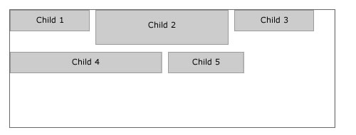
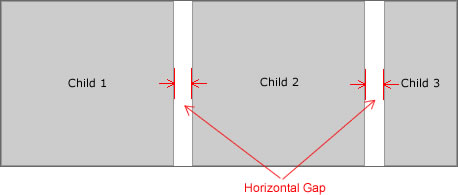
While it has no visual representation, it is important to note the DataLooper element, which is used to create multiple copies of a component based on a list of data. This component, implemented by the com.dwuser.ss4.ui.DataLooper class (see the API Reference), can be helpful for developers who are making code-based customizations.The HFloxBox element lays out its child elements in a horizontal row until the available width has been consumed. If more children still need to be laid out, it wraps to a new row and continues laying out the child elements. The following diagram illustrates the way its child elements are laid out:
Important Usage Notes
Usually the HBox container is a better choice than this one. Due to the small initial design-view height rendering, it can be difficult to drag elements into it. To work around this, it is easiest to switch to Source view and move the other element(s) so that they are HFlowBox child nodes (within <HFlowBox ... > ... </HFlowBox>).
Noteworthy Parameters
| Parameter name in Properties Panel | XML Property Name | Notes |
|---|---|---|
| Horizontal Gap | horizontalGap | This specifies, in pixels, the horizontal spacing between each of the child elements. |
| Vertical Gap | verticalGap | This specifies, in pixels, the vertical spacing between each row of child elements. |
Equivalement Class File
For detailed reference on this element, see the com.dwuser.ss4.containers.HFlowBox class in the API Reference.
The HDividedBox is essentially the same as the HBox except that each child can be resized by the user. Between each child element, a draggable divider is shown:
Important Usage Notes
The HBox container is often a better choice than this one; the benefit of this container is that it allows the user to make size adjustments on-the-fly.
Noteworthy Parameters
(No noteworthy specific parameters)
Equivalement Class File
For detailed reference on this element, see the mx.containers.HDividedBox class in the API Reference.
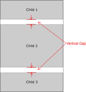
The VBox container arranges its children adjacent to each other in a vertical column. This container is often used to build layouts where the child elements need to be next to each other. The following diagram illustrates how the layout works:
Important Usage Notes
After adding the first child element, you can remove the default dimensions (width / height values) from the box in the Properties Panel. This will allow the VBox to expand as needed to accomodate its child elements.
As with all containers, you can add a background, border and/or drop shadow to this container using the Border / Fill and Drop Shadow sections of the Properties Panel.
Noteworthy Parameters
| Parameter name in Properties Panel | XML Property Name | Notes |
|---|---|---|
| Vertical Gap | verticalGap | This specifies, in pixels, the vertical spacing between the child elements. |
| Horizontal Align | horizontalAlign | When the widths of the child elements vary, this specifies the horizontal alignment of the narrower elements within the container. |
| Vertical Align | verticalAlign | If you have specified an explicit height for the VBox and the content does not fill the full height, this specifies the vertical alignment of all elements within the container. |
Equivalement Class File
For detailed reference on this element, see the mx.containers.VBox class in the API Reference.
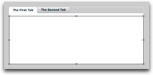
The TabNavigator allows you to create a tabbed interface within the slideshow. Below is an example of a TabNavigator in Design View; two empty sub-containers have been added to it:
Important Usage Notes
To make a TabNavigator function, you must add a sub-container to it for each tab you wish to create. Usually, this will be a Canvas, HBox, or VBox element. To add a sub-container to a TabNavigator, drag and drop it onto the top of the container (where the tabs appear). For each sub-container, the Label property in the Properties Panel (the label attribute in the XML) is used by the TabNavigator as that tab's label.
Each sub-container which is added should have its width and height values set to 100% to ensure that it fully fills the TabNavigator.
In the example above, two VBox elements were dragged-and-dropped onto the TabNavigator. Both had their Width and Height settings set to 100%. The Label property on the first VBox was set to 'The First Tab', and the Label property on the second VBox was set to 'The Second Tab.'
Noteworthy Parameters
(No noteworthy specific parameters)
Equivalement Class File
For detailed reference on this element, see the mx.containers.TabNavigator class in the API Reference.
The HBox container arranges its children adjacent to each other in a horizontal column. This container is often used to build layouts where the child elements need to be next to each other, especially horizontal control bars. The following diagram illustrates how the layout works:
Important Usage Notes
After adding the first child element, you can remove the default dimensions (width / height values) from the box in the Properties Panel. This will allow the HBox to expand as needed to accomodate its child elements.
As with all containers, you can add a background, border and/or drop shadow to this container using the Border / Fill and Drop Shadow sections of the Properties Panel.
Noteworthy Parameters
| Parameter name in Properties Panel | XML Property Name | Notes |
|---|---|---|
| Horizontal Gap | horizontalGap | This specifies, in pixels, the horizontal spacing between the child elements. |
| Horizontal Align | horizontalAlign | If you have specified an explicit width for the HBox and the content does not fill the full width, this specifies the horizontal alignment of all elements within the container. |
| Vertical Align | verticalAlign | When the heights of the child elements vary, this specifies the vertical alignment of the shorter elements within the container. |
Equivalement Class File
For detailed reference on this element, see the mx.containers.HBox class in the API Reference.
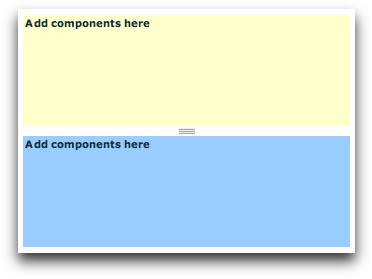
The VDividedBox is essentially the same as the VBox except that each child can be resized by the user. Between each child element, a draggable divider is shown:
Important Usage Notes
The VBox container is often a better choice than this one; the benefit of this container is that it allows the user to make size adjustments on-the-fly.
Noteworthy Parameters
(No noteworthy specific parameters)
Equivalement Class File
For detailed reference on this element, see the mx.containers.VDividedBox class in the API Reference.
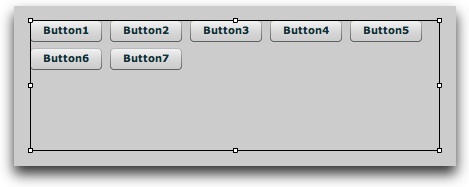
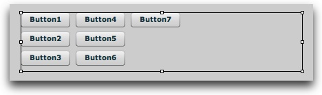
The Tile container lays out its children in a grid of commonly-sized tiles. The grid can be horizontally or vertically oriented, based on the Direction setting. If a Horizontal layout is used, children are placed in rows until that row is filled, at which point a new row is started. If a Vertical layout is used, children are placed in columns until that column is filled, at which point a new column is started. The following examples illustrate both vertical and horizontal layouts respectively. In each case, several buttons are used as child elements.
By default, the tile size is determined by the largest width and height values among all children. However, explicit Tile Width and Tile Height values can be specified to override the default calculated value. If an explicitly-defined Tile Width or Tile Height value is less than the default dimension of a child element, that element will be forced to conform to the smaller dimensions; this may result in content clipping. On the other hand, if the size of a given tile is smaller than the automatically calculated or explicitly defined tile dimensions, the Horizontal Align and Vertical Align properties specify how that child is aligned within its designated tile space.
If you explicitly specify percentage-based dimensions on a child element, the percentage is relative to the size of each tile in the Tile container. For example, specifying a width of 100% for every child will ensure that every child expands to fill the full tile width, regardless of what its default size would have been.
Important Usage Notes
After adding the first child element, you can optionally remove the default dimensions (width / height values) from the box in the Properties Panel. In this case, the Tile container will automatically size so that a square grid is used.
If you change the Direction parameter to Horizontal (the default) to Vertical and then revert later to Horizontal, you may need to explicitly add <Tile ... direction="horizontal"> in the code for the update to be reflected in Design View.
Noteworthy Parameters
| Parameter name in Properties Panel | XML Property Name | Notes |
|---|---|---|
| Tile Width | tileWidth | Can be used to explicitly specify (in pixels) the width of each tile in the container. If omitted, this value is automatically calculated to be the same as the width of the widest child element. |
| Tile Height | tileHeight | Can be used to explicitly specify (in pixels) the height of each tile in the container. If omitted, this value is automatically calculated to be the same as the height of the tallest child element. |
| Horizontal Gap | horizontalGap | Specifies, in pixels, the spacing between each column in the grid of tiles. |
| Vertical Gap | verticalGap | Specifies, in pixels, the spacing between each row in the grid of tiles. |
| Horizontal Align | horizontalAlign | If a given child is narrower than than the tile which is holding it, this setting determines its horizontal alignment within that designated tile area. |
| Vertical Align | verticalAlign | If a given child is shorter than the tile which is holding it, this setting determins its vertical alignment within that designated tile area. |
Equivalement Class File
For detailed reference on this element, see the mx.containers.Tile class in the API Reference.
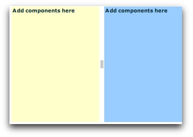
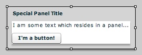
The Panel container is essentially a VBox (see above) which is wrapped in a chrome box with a title. It can be used to clearly segmentize your slideshow user interface. The following example shows a panel with two example components:
Important Usage Notes
You can remove the default dimensions (width / height values) from the box in the Properties Panel. This will allow the Panel to expand as needed to accomodate its child elements. As mentioned below in the Noteworthy Parameters, the spacing between each internal edge of the Panel and the content is controlled by the paddingLeft, paddingRight, paddingTop and paddingBottom parameters, which can be specified in the XML.
Noteworthy Parameters
| Parameter name in Properties Panel | XML Property Name | Notes |
|---|---|---|
| Title | title | Specifies the title text displayed on the panel. |
| Vertical Gap | verticalGap | This specifies, in pixels, the vertical spacing between the child elements. |
| Horizontal Align | horizontalAlign | When the widths of the child elements vary, this specifies the horizontal alignment of the narrower elements within the container. |
| Vertical Align | verticalAlign | If you have specified an explicit height for the VBox and the content does not fill the full height, this specifies the vertical alignment of all elements within the container. |
| (Not in Properties Panel) | paddingLeft | Specifies, in pixels, the spacing between the inner left edge of the panel and the left edge of the content. |
| paddingRight | Specifies, in pixels, the spacing between the inner right edge of the panel and the right edge of the content. | |
| paddingTop | Specifies, in pixels, the spacing between the inner top edge of the panel and the top edge of the content. | |
| paddingBottom | Specifies, in pixels, the spacing between the inner bottom edge of the panel and the bottom edge of the content. |
Equivalement Class File
For detailed reference on this element, see the mx.containers.Panel class in the API Reference.
The HoverCanvas container is a special type of Canvas container (detailed below). Instead of always being visible, it automatically hides itself after a period of inactivity. Another supported behavior allows for the HoverCanvas to only be visible when the mouse is in a certain target location (regardless of activity). The latter behavior is enabled by setting the Test Type property to Mouse Location (see the noteworthy parameters table below).
This HoverCanvas is commonly used to have hover-only controls which automatically hide when not in use. A common use of the Location-based behavior allows for the Caption to only be visible when the slideshow (or a particular area thereof) is hovered over. When creating control bars, it is often best to use other relative-position containers inside the Canvas (e.g. the HBox or VBox containers); this makes control-bar layout easier, as all elements are automatically placed adjacent to each other.
Two different types of hover targets can be specified through the Properties Panel: Entire Slideshow (default) or Self. If the Entire Slideshow option is used, the HoverCanvas will automatically re-appear whenever the user moves the mouse anywhere in the slideshow. If the Self option is used, the HoverCanvas will only re-appear when the user moves the mouse over the area where the container is located when visible.
Important Usage Notes
By default, a fade-in and fade-out effect are used to show and hide the HoverCanvas. These default effects can be overridden in the Effects section of the Properties Panel.
Noteworthy Parameters
| Parameter name in Properties Panel | XML Property Name | Notes |
|---|---|---|
| Test Type | testType | Specifies what triggers the HoverCanvas to hide/show itself. If Mouse Movement is used, the user must move their mouse in the specified target area to trigger visibility . On the other hand, if Mouse Location is used, the user must simply place their mouse in a target area to trigger visibility (regardless of movement). |
| Hover Target | hoverTarget | Specifies where the user must move the mouse to cause the container to automatically re-appear when hidden. If 'Entire Slideshow' is used, movement anywhere on the slideshow will trigger a re-appearance. If 'Self' is used, movement must be over the area where the container is located when visible to trigger a re-appearance. |
| Hide Delay | hideDelay | Specifies the period of inactivity required before the HoverCanvas automatically hides itself. |
| Initially Visible | visible | Specifies whether the HoverCanvas should be visible when the slideshow initially loads; usually, it is best to make the container initially visible so the user knows the controls are there. |
Equivalement Class File
For detailed reference on this element, see the com.dwuser.ss4.ui.HoverCanvas class in the API Reference.
The HoverCanvas container is a special type of HoverCanvas container (detailed above). It has a special built-in hide/show effect where the element hides itself by sliding out to one side of its designated area. It inherits all of the HoverCanvas's settings, plus adds two new settings detailed below.
Noteworthy Parameters
| Parameter name in Properties Panel | XML Property Name | Notes |
|---|---|---|
| Hide Effect Side | hideSide | Controls the hide/show effect; specifies on which side the element hides itself in when it slides out of view. |
| Effect Speed | hideEffectSpeed | Specifies the duration of the hide/show effect. |
| Hide Delay | hideDelay | Specifies the period of inactivity required before the HoverCanvas automatically hides itself. |
| Initially Visible | visible | Specifies whether the HoverCanvas should be visible when the slideshow initially loads; usually, it is best to make the container initially visible so the user knows the controls are there. |
Equivalement Class File
For detailed reference on this element, see the com.dwuser.ss4.ui.HoverSlideCanvas class in the API Reference.
The Canvas element is the main absolute-position layout container. This is useful in some cases because all child elements are laid out in isolation; they can even overlap each other. X and Y positioning coordinates can be used to specify the location of each child element. Additionally, size and positioning constraints can be used to anchor the child component(s) to the edges or centers of the container, regardless of any resizing which occurs. To learn more about absolute-position containers vs. relative-position containers, see the Element Positioning and Sizing topic.
Often you will want to use a combination of absolute- and relative-position containers. This can be done by adding relative-position containers (such as the HBox or VBox) to a Canvas, then adding child components to the HBox or VBox.
Important Usage Notes
If you use X and Y positioning coordinates to position child elements, note that the coordinates are relative to the top-left corner of the container.
As with all containers, you can add a background, border and/or drop shadow to this container using the Border / Fill and Drop Shadow sections of the Properties Panel.
Noteworthy Parameters
(No noteworthy specific parameters)
Equivalement Class File
For detailed reference on this element, see the mx.containers.Canvas class in the API Reference.