 Download Help PDF (29MB) | Search:
The Extras / Decorations include several elements which can be used to enhance or tweak the visual appearance of a slideshow.
Elements in this section:
Advanced Users / Developers: For more detailed developer-oriented information about every element in this section, be sure to see the API reference for each element's corresponding class.
Usage Tip: When in the wizard, hover over any property name in the Properties Panel for a detailed description of what the option controls.
This element is a horizontal separator line which can be used to provide visual delineation between separate parts of a layout. For instance, it might be used between two children in a VBox container.
By default, it has a width of 100%. This can be changed as needed.
Equivalement Class File
For detailed reference on this element, see the mx.controls.HRule class in the API Reference.
This element is a vertical separator line which can be used to provide visual delineation between separate parts of a layout. For instance, it might be used between two children in an HBox container.
By default, it has a height of 100%. This can be changed as needed.
Equivalement Class File
For detailed reference on this element, see the mx.controls.VRule class in the API Reference.
The BorderBox element displays a solid background / border. When its backgroundColor is changed, the transition is made with a smooth fade transition.
The element is designed to be used as a decoration which only displays a border, background, and/or drop shadow.
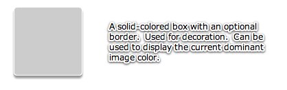
The element can also be used to display the current image's dominant color. For more information, see the Dominant-slide-color BorderBox special starter element.
Equivalement Class File
For detailed reference on this element, see the com.dwuser.ss4.ui.extras.BorderBox class in the API Reference.
This element makes a spacer appear between child elements in a box-layout container such as HBox or VBox. It is essentially an empty box which can be used to adjust the position of other elements.
For example, you might have an HBox with a width of 100% and add a PreviousButton and NextButton to it. If you wanted to force the PreviousButton to be on the left edge and the NextButton on the right edge, you could add a Spacer element between the two buttons and set its width to 100% as well. This would make it fill the entire box, forcing the NextButton to the far right edge.
Equivalement Class File
For detailed reference on this element, see the mx.controls.Spacer class in the API Reference.