| Package | com.dwuser.ss4.ui |
| Class | public class LayoutManager |
| Inheritance | LayoutManager  Canvas Container UIComponent FlexSprite flash.display.Sprite Canvas Container UIComponent FlexSprite flash.display.Sprite |
The LayoutManager takes the Layout XML which is defined in the <ui> section of the XML configuration file and transforms it into a fully functioning
user interface. (It is an internally created and used class; it is never used directly.) The Layout XML has the following format:
   <slideshow ... >

   ... Other areas of the XML configuration file ...

   <!-- The Layout XML starts here: -->
   <ui>
      <views>

         <!-- All layout views are defined here by using 'view' nodes; there must be at least one view: -->

         <view ...All view attribute here... >
            <!-- This is the first view -->
            <ElementName ... All element attribute here... />
            <AnotherElementName ... All element attribute here... />
            ... Any additional elements would be added here ...
         </view>

         <view ...All view attribute here... >
            <!-- This is the second view -->
            <ElementName ... All element attribute here... />
            <AnotherElementName ... All element attribute here... />
            ... Any additional elements would be added here ...
         </view>

         ... Any additional views would be defined here ...

      </views>
   </ui>

   </slideshow>
Within the main <ui> holder node, there is a <views> holder node which holds all views. Each view is defined with a <view> node.
The most imporant attributes on a <view> tag are the type value (which specifies the type of the view), and the id value (which is the view's
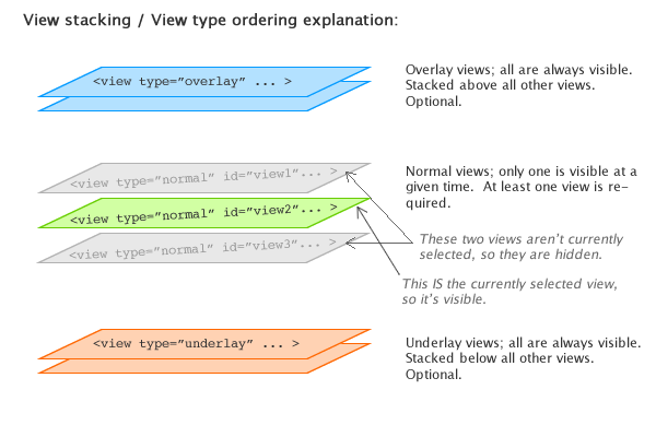
unique identifier). There are three different types of views:
normal - The default type if none is specified. This type of view is used to hold most UI elements. Only one normal view can be visible at
a given time. You must define at least one normal view, but no more than one is required. When you change to a different view (as described below
in the Relevant Events section), you'll be changing between normal
views. The LayoutTransition pseudo-class provides control over the transition used when changing between normal views; you can use simple cut effects
or advanced visual effects like views 'popping' in and out, or a cube rotation. See the com.dwuser.ss4.pseudoStyleClasses.LayoutTransition class for more
information about layout transition effects.overlay - Overlay views are always visible. They are outside of the normal changeable views, resting at the very top of the visual stack, always overlaying all the other
views. You can have one or more overlay views. They provide a way to float elements on top of all other layout elements. For example, you will usually place the
SingleLoader and GroupLoader elements (which display [pre]loading progress) in an overlay view, so that no matter what the current layout
state is, the user will be notified of the loading status.underlay - Underlay views are always visible. They are outside of the normal changeable views, resting at the very bottom of the visual stack, always below all the other
views. You can have one or more underlay views. They provide a way to display constant background elements which should always be visible, regardless of which
normal view is currently visible.The different view types can be visualized with the following diagram:
Constructing a <view> node
First, you must create the actual <view> holder node. A <view> tag has the following attributes:
type - Required (see note at end of description); Specifies the view type as described above. The value can be "normal", "overlay" or "underlay" . Note -- this attribute can
actually be omitted. In this case, the type will default to normal.id - Required if type is normal; Specifies the unique identifier string for the view. This ID value is the way
that the layout manager identifies each view. It is used when requesting that a different view be opened (see Relevant Events section below for more information about switching between views).
This value must be something with only letters (no spaces) such as "galleryView" or "mainImagesView" or "view1".initial - A value of true must be applied to one normal view; For normal views, specifies the initially visible view. Must be "true" or "false". See the
'Specifying which view is initially opened' section below for more information.label - Optional; Specifies a string label value to associate with the view. This value is generally only specified for internal notation of what the view controls.stopsAutoplay - Optional; On normal views, specifies if autoplay should automatically be stopped/paused when this view is opened. The default value is "false". The value can be
true or false .startsAutoplay - Optional; On normal views, specifies if autoplay should automatically be started/enabled when this view is opened. The default value is "false". The value can be
true or false .stopsAudio - Optional; On normal views, specifies if any audio should automatically be stopped/paused when this view is opened. If specified, the value must be string containing one or more
of the following values, separated by commas: intro (stops intro/background level audio), gallery (stops gallery-level audio), or image (stops image-level audio).
Here are two example values: <view ... stopsAudio="gallery"> or <view ... stopsAudio="intro,gallery,image"> . For more information, see the
AudioIntro, AudioGallery, and AudioImage classes.startsAudio - Optional; On normal views, specifies if any audio should automatically be started/played when this view is opened. If specified, the value must be string containing one or more
of the following values, separated by commas: intro (starts intro/background level audio), gallery (starts gallery-level audio), or image (starts image-level audio).
Here are two example values: <view ... startsAudio="gallery"> or <view ... startsAudio="intro,gallery,image"> . For more information, see the
AudioIntro, AudioGallery, and AudioImage classes.treatAsBitmap - Options; Specifies if all elements in the view should be treated as bitmap elements. This means that any non-embedded text will still be able to be faded. Generally, for performance reasons, it is
much better to add treatAsBitmap directly to individual elements, and not apply it to an entire view. Possible values are false (the default if no value is specified), and
true .After creating the actual <view> holder node, you must specify the UI elements to be used within the view. This is done by adding child nodes in the following format:
   <view ... All the view tag attributes are here ...>
      <ElementName attributeOne="someValue" attributeTwo="someValue2" />
   </view>
For each element, you will use the format listed in the 'Layout XML Syntax Example' on the element's class. The attributes passed on the node determine the element's properties and styles (as detailed in the class). There are a number
of different supported formats for attribute values. These formats are all detailed in the com.dwuser.ss4.pseudoStyleClasses.XMLAttributeFormats class; see that class for more information.
Some elements dispatch events. Additionally, the main slideshow dispatches many events which notify of the slideshow status (see the FlashSlideshow class for a full listing). You can define handlers for these events by
specifying an attribute on the element of this format: event_eventNameHere="...handler code..." . To add a handler which is triggered when the global slideshow event is dispatched, use the following format:
ssevent_eventNameHere="...handler code..." . The following example shows a button whose label changes when it is clicked, and a label which displays a notification when the global SlideshowEvent
LAYOUT_MANAGERREADY event is dispatched:
   <Button label="Not clicked yet..." event_click="event.target.label = 'Has been clicked!';" />
   <Label id="sampleLabel" text="Waiting for the event to happen..." ssevent_layoutManagerReady="sampleLabel.text += 'DONE!';" />
Some elements support child elements. In these cases, you nest the child element nodes within the parent node. This example uses the HBox element, which creates a horizontal box layout, and then a nested VBox, which creates a vertical box:
   <HBox width="100%" height="100%">
      <Button label="Demo button" />
      <VBox>
         <Button label="Demo button 2" />
         <Button label="Demo button 3" />
      </VBox>
   </HBox>
The depth of elements is controlled by their relative order. Elements listed later will appear on top of elements listed earlier in the XML.
So, to put it all together, here's an example of a simple layout with three different views: An underlay view (with a static image), an overlay view which holds the loader elements centered in a box,
and a normal view with an image display and caption element. This example only has one normal view, but layouts can include more than one.
   <ui>
      <views>

         <view type="underlay">
            <BorderBox left="0" right="0" top="0" bottom="0"
               backgroundColor="Bind{slideshow.currentPreSyncSlide.dominantColorLight}"
               borderThickness="0" borderStyle="solid"
               backgroundChangeEffectDuration="1700"
            />
         </view>

         <view type="normal" id="mainView">
            <!-- Note the relative positioning here; the image display takes up all but the bottom 100px, and the caption floats at the bottom and takes up the rest: -->
            <ImagesStandard left="0" top="0" right="0" bottom="100" />
            <Caption bottom="0" height="100" left="0" right="0" />
         </view>

         <view type="overlay">
            <!-- note the nested elements here: -->
            <VBox width="100%" height="100%" horizontalAlign="center" verticalAlign="middle">
               <SingleLoader />
               <GroupLoader />
            </VBox>
         </view>

      </views>
   </ui>
Specifying which view is initially opened
You can specify the initial view by three different means, with each method overriding the methods listed before it. (1) By specifying the <view ... initial="true"> attribute value.
(2) By specifying a javascript callback in the slideshow's HTML page which defines the initial view id. For more information about this method, see the XMLFlashSlideshow_v4_getInitialViewID item in the
SlideshowInterface class description. If specified, this value overrides the initial view ID specified by method one. (3) By specifying the initViewID parameter on the slideshow configuration
object. This value is either passed in the slideshow's HTML configuration object (in a standalone implementation), or through the slideshow's configurationParameters object in the case of a component
implementation. See the FlashSlideshow.configurationParameters property and the FlashSlideshow class description for more information. If specified, this value overrides the initial view ID
specified by methods one and two.
Transitioning Between Layout Views
Only one normal view can be visible at a given time. Thus, if you have more than one normal view, you may need to go from view to view. The LayoutTransition pseudo-class
provides control over the transition used when changing between normal views; you can use simple cut effects or advanced visual effects like views 'popping' in and out, or a cube rotation. See the
com.dwuser.ss4.pseudoStyleClasses.LayoutTransition class for more information about layout transition effects.
LayoutManager Relevant Events / Changing Between Views
The main slideshow dispatches the SlideshowEvent.LAYOUT_MANAGERREADY event once the layout manager has finished initializing and is ready to receive
LAYOUT_REQUESTCHANGE control events.
Dispatching the SlideshowEvent.LAYOUT_REQUESTCHANGE control event on the main slideshow (or just calling the slideshow.setView("idValue")
method) allows you to change to the layout view with the specified id value. The LayoutJumpButton UI element allows you to add a button which, when
clicked, opens a specified view.
See also
| Property | Defined by | ||
|---|---|---|---|
 | activeEffects : Array
The list of effects that are currently playing on the component,
as an Array of EffectInstance instances.
| UIComponent | |
| autoLayout : Boolean
If
true, measurement and layout are done
when the position or size of a child is changed. | Container | |
| automationDelegate : Object
The delegate object that handles the automation-related functionality.
| UIComponent | |
| automationName : String
Name that can be used as an identifier for this object.
| UIComponent | |
| automationTabularData : Object
An implementation of the
IAutomationTabularData interface, which
can be used to retrieve the data. | UIComponent | |
| automationValue : Array
This value generally corresponds to the rendered appearance of the
object and should be usable for correlating the identifier with
the object as it appears visually within the application.
| UIComponent | |
| baselinePosition : Number
The y-coordinate of the baseline
of the first line of text of the component.
| UIComponent | |
| borderMetrics : EdgeMetrics
Returns an EdgeMetrics object that has four properties:
left, top, right,
and bottom. | Container | |
| cacheHeuristic : Boolean
Used by Flex to suggest bitmap caching for the object.
| UIComponent | |
| cachePolicy : String
Specifies the bitmap caching policy for this object.
| UIComponent | |
| childDescriptors : Array
Array of UIComponentDescriptor objects produced by the MXML compiler.
| Container | |
| className : String
The name of this instance's class, such as
"Button". | UIComponent | |
| clipContent : Boolean
Whether to apply a clip mask if the positions and/or sizes
of this container's children extend outside the borders of
this container.
| Container | |
| constraintColumns : Array
An Array of ConstraintColumn instances that partition this container.
| Canvas | |
| constraintRows : Array
An Array of ConstraintRow instances that partition this container.
| Canvas | |
| contentMouseX : Number
Returns the x position of the mouse, in the content coordinate system.
| Container | |
| contentMouseY : Number
Returns the y position of the mouse, in the content coordinate system.
| Container | |
| creatingContentPane : Boolean
Containers use an internal content pane to control scrolling.
| Container | |
| creationIndex : int
Specifies the order to instantiate and draw the children
of the container.
| Container | |
| creationPolicy : String
The child creation policy for this Container.
| Container | |
| currentLooperData : Object
When using this component as the child of a DataLooper element, this holds the current element's corresponding looping data.
| UIComponent | |
| currentState : String
The current view state of the component.
| UIComponent | |
| currentViewID : String
The ID value of the currently-opened layout view (of a
"normal" type). | LayoutManager | ||
| cursorManager : ICursorManager
Gets the CursorManager that controls the cursor for this component
and its peers.
| UIComponent | |
| data : Object
The
data property lets you pass a value
to the component when you use it in an item renderer or item editor. | Container | |
| defaultButton : IFlexDisplayObject
The Button control designated as the default button
for the container.
| Container | |
| descriptor : UIComponentDescriptor
Reference to the UIComponentDescriptor, if any, that was used
by the
createComponentFromDescriptor() method to create this
UIComponent instance. | UIComponent | |
| document : Object
A reference to the document object associated with this UIComponent.
| UIComponent | |
| doubleClickEnabled : Boolean
Specifies whether the UIComponent object receives
doubleClick events. | UIComponent | |
| enabled : Boolean
Whether the component can accept user interaction.
| UIComponent | |
| errorString : String
The text that will be displayed by a component's error tip when a
component is monitored by a Validator and validation fails.
| UIComponent | |
| explicitHeight : Number
Number that specifies the explicit height of the component,
in pixels, in the component's coordinates.
| UIComponent | |
| explicitMaxHeight : Number
Number that specifies the maximum height of the component,
in pixels, in the component's coordinates.
| UIComponent | |
| explicitMaxWidth : Number
Number that specifies the maximum width of the component,
in pixels, in the component's coordinates.
| UIComponent | |
| explicitMinHeight : Number
Number that specifies the minimum height of the component,
in pixels, in the component's coordinates.
| UIComponent | |
| explicitMinWidth : Number
Number that specifies the minimum width of the component,
in pixels, in the component's coordinates.
| UIComponent | |
| explicitWidth : Number
Number that specifies the explicit width of the component,
in pixels, in the component's coordinates.
| UIComponent | |
| flexContextMenu : IFlexContextMenu
The context menu for this UIComponent.
| UIComponent | |
| focusEnabled : Boolean
Indicates whether the component can receive focus when tabbed to.
| UIComponent | |
| focusManager : IFocusManager
Gets the FocusManager that controls focus for this component
and its peers.
| UIComponent | |
| focusPane : Sprite
The focus pane associated with this object.
| UIComponent | |
| globalX : Number | UIComponent | |
| globalY : Number | UIComponent | |
| height : Number
Number that specifies the height of the component, in pixels,
in the parent's coordinates.
| UIComponent | |
| horizontalLineScrollSize : Number
Number of pixels to move when the left- or right-arrow
button in the horizontal scroll bar is pressed.
| Container | |
| horizontalPageScrollSize : Number
Number of pixels to move when the track in the
horizontal scroll bar is pressed.
| Container | |
| horizontalScrollBar : ScrollBar
The horizontal scrollbar used in this container.
| Container | |
| horizontalScrollPolicy : String
Specifies whether the horizontal scroll bar is always present,
always absent, or automatically added when needed.
| Container | |
| horizontalScrollPosition : Number
The current position of the horizontal scroll bar.
| Container | |
| icon : Class
The Class of the icon displayed by some navigator
containers to represent this Container.
| Container | |
| id : String
ID of the component.
| UIComponent | |
| includeInLayout : Boolean
Specifies whether this component is included in the layout of the
parent container.
| UIComponent | |
| inheritingStyles : Object
The beginning of this component's chain of inheriting styles.
| UIComponent | |
| initialized : Boolean
A flag that determines if an object has been through all three phases
of layout: commitment, measurement, and layout (provided that any were required).
| UIComponent | |
| instanceIndex : int
The index of a repeated component.
| UIComponent | |
| instanceIndices : Array
An Array containing the indices required to reference
this UIComponent object from its parent document.
| UIComponent | |
| isDocument : Boolean
Determines whether this UIComponent instance is a document object,
that is, whether it is at the top of the hierarchy of a Flex
application, MXML component, or ActionScript component.
| UIComponent | |
| isPopUp : Boolean
Set to
true by the PopUpManager to indicate
that component has been popped up. | UIComponent | |
| label : String
The text displayed by some navigator containers to represent
this Container.
| Container | |
| maxHeight : Number
Number that specifies the maximum height of the component,
in pixels, in the component's coordinates.
| UIComponent | |
| maxHorizontalScrollPosition : Number
The largest possible value for the
horizontalScrollPosition property. | Container | |
| maxVerticalScrollPosition : Number
The largest possible value for the
verticalScrollPosition property. | Container | |
| maxWidth : Number
Number that specifies the maximum width of the component,
in pixels, in the component's coordinates.
| UIComponent | |
| measuredHeight : Number
The default height of the component, in pixels.
| UIComponent | |
| measuredMinHeight : Number
The default minimum height of the component, in pixels.
| UIComponent | |
| measuredMinWidth : Number
The default minimum width of the component, in pixels.
| UIComponent | |
| measuredWidth : Number
The default width of the component, in pixels.
| UIComponent | |
| minHeight : Number
Number that specifies the minimum height of the component,
in pixels, in the component's coordinates.
| UIComponent | |
| minWidth : Number
Number that specifies the minimum width of the component,
in pixels, in the component's coordinates.
| UIComponent | |
| miscHolder : Object
A utility holder for any various properties
| UIComponent | |
| moduleFactory : IFlexModuleFactory
The moduleFactory that is used to create TextFields in the correct SWF context.
| UIComponent | |
| mouseFocusEnabled : Boolean
Whether you can receive focus when clicked on.
| UIComponent | |
| move_enableProtection : Boolean = false | UIComponent | |
| nestLevel : int
Depth of this object in the containment hierarchy.
| UIComponent | |
| nonInheritingStyles : Object
The beginning of this component's chain of non-inheriting styles.
| UIComponent | |
| numAutomationChildren : int
The number of automation children this container has.
| UIComponent | |
| numChildren : int
Number of child components in this container.
| Container | |
| owner : DisplayObjectContainer
The owner of this UIComponent.
| UIComponent | |
| parent : DisplayObjectContainer
The parent container or component for this component.
| UIComponent | |
| parentApplication : Object
A reference to the Application object that contains this UIComponent
instance.
| UIComponent | |
| parentDocument : Object
A reference to the parent document object for this UIComponent.
| UIComponent | |
| percentHeight : Number
Number that specifies the height of a component as a percentage
of its parent's size.
| UIComponent | |
| percentWidth : Number
Number that specifies the width of a component as a percentage
of its parent's size.
| UIComponent | |
| processedDescriptors : Boolean
Set to
true after immediate or deferred child creation,
depending on which one happens. | UIComponent | |
| rawChildren : IChildList
A container typically contains child components, which can be enumerated
using the
Container.getChildAt() method and
Container.numChildren property. | Container | |
| repeater : IRepeater
A reference to the Repeater object
in the parent document that produced this UIComponent.
| UIComponent | |
| repeaterIndex : int
The index of the item in the data provider
of the Repeater that produced this UIComponent.
| UIComponent | |
| repeaterIndices : Array
An Array containing the indices of the items in the data provider
of the Repeaters in the parent document that produced this UIComponent.
| UIComponent | |
| repeaters : Array
An Array containing references to the Repeater objects
in the parent document that produced this UIComponent.
| UIComponent | |
| scaleX : Number
Number that specifies the horizontal scaling factor.
| UIComponent | |
| scaleY : Number
Number that specifies the vertical scaling factor.
| UIComponent | |
| screen : Rectangle
Returns an object that contains the size and position of the base
drawing surface for this object.
| UIComponent | |
| setActualSize_enableProtection : Boolean = false | UIComponent | |
| setVisible_enableProtection : Boolean = true | UIComponent | |
| showInAutomationHierarchy : Boolean
A flag that determines if an automation object
shows in the automation hierarchy.
| UIComponent | |
| slideshow : FlashSlideshow
A reference to the main slideshow; can be used if the main slideshow instance needs to be accessed on an XML element where only a
layoutManager reference is available. | LayoutManager | ||
| states : Array
The view states that are defined for this component.
| UIComponent | |
| styleClassOverridesInline : Boolean = true
Specifies if class-specific styles (as defined by the
styleName property) override inline styles. | UIComponent | |
| styleDeclaration : CSSStyleDeclaration
Storage for the inline inheriting styles on this object.
| UIComponent | |
| styleName : Object
The class style used by this component.
| UIComponent | |
| systemManager : ISystemManager
Returns the SystemManager object used by this component.
| UIComponent | |
| toolTip : String
Text to display in the ToolTip.
| UIComponent | |
| transitions : Array
An Array of Transition objects, where each Transition object defines a
set of effects to play when a view state change occurs.
| UIComponent | |
| tweeningProperties : Array
Array of properties that are currently being tweened on this object.
| UIComponent | |
| uid : String
A unique identifier for the object.
| UIComponent | |
| updateCompletePendingFlag : Boolean
A flag that determines if an object has been through all three phases
of layout validation (provided that any were required).
| UIComponent | |
| validationSubField : String
Used by a validator to associate a subfield with this component.
| UIComponent | |
| verticalLineScrollSize : Number
Number of pixels to scroll when the up- or down-arrow
button in the vertical scroll bar is pressed,
or when you scroll by using the mouse wheel.
| Container | |
| verticalPageScrollSize : Number
Number of pixels to scroll when the track
in the vertical scroll bar is pressed.
| Container | |
| verticalScrollBar : ScrollBar
The vertical scrollbar used in this container.
| Container | |
| verticalScrollPolicy : String
Specifies whether the vertical scroll bar is always present,
always absent, or automatically added when needed.
| Container | |
| verticalScrollPosition : Number
The current position of the vertical scroll bar.
| Container | |
| viewMetrics : EdgeMetrics
Returns an object that has four properties:
left,
top, right, and bottom. | Container | |
| viewMetricsAndPadding : EdgeMetrics
Returns an object that has four properties:
left,
top, right, and bottom. | Container | |
| visible : Boolean
Controls the visibility of this UIComponent.
| UIComponent | |
| visible_unprotected : Boolean
If setVisible_enableProtection is enabled, this allows access to determine what the pseudo-state is -- that is, what's been requested, regardless of any prevention of default behavior.
| UIComponent | |
| width : Number
Number that specifies the width of the component, in pixels,
in the parent's coordinates.
| UIComponent | |
| x : Number
Number that specifies the component's horizontal position,
in pixels, within its parent container.
| UIComponent | |
| xmlDescriptor : XML
For certain dynamically created elements, this represents the XML node used to create that element.
| UIComponent | |
| y : Number
Number that specifies the component's vertical position,
in pixels, within its parent container.
| UIComponent | |
| Method | Defined by | ||
|---|---|---|---|
| LayoutManager | |||
|
addChild(child:DisplayObject):DisplayObject
Adds a child DisplayObject to this Container.
| Container | |
|
addChildAt(child:DisplayObject, index:int):DisplayObject
Adds a child DisplayObject to this Container.
| Container | |
|
callLater(method:Function, args:Array = null):void
Queues a function to be called later.
| UIComponent | |
|
clearStyle(styleProp:String):void
Deletes a style property from this component instance.
| UIComponent | |
|
contentToGlobal(point:Point):Point
Converts a
Point object from content coordinates to global coordinates. | Container | |
|
contentToLocal(point:Point):Point
Converts a
Point object from content to local coordinates. | Container | |
|
createAutomationIDPart(child:IAutomationObject):Object
Returns a set of properties that identify the child within
this container.
| UIComponent | |
|
Given a single UIComponentDescriptor, create the corresponding
component and add the component as a child of this Container.
| Container | |
|
createComponentsFromDescriptors(recurse:Boolean = true):void
Iterate through the Array of
childDescriptors,
and call the createComponentFromDescriptor() method for each one. | Container | |
|
createReferenceOnParentDocument(parentDocument:IFlexDisplayObject):void
Creates an
id reference to this IUIComponent object
on its parent document object. | UIComponent | |
|
deleteReferenceOnParentDocument(parentDocument:IFlexDisplayObject):void
Deletes the
id reference to this IUIComponent object
on its parent document object. | UIComponent | |
|
Returns a UITextFormat object corresponding to the text styles
for this UIComponent.
| UIComponent | |
|
dispatchEvent(event:Event):Boolean
Dispatches an event into the event flow.
| UIComponent | |
|
drawFocus(isFocused:Boolean):void
Shows or hides the focus indicator around this component.
| UIComponent | |
|
drawRoundRect(x:Number, y:Number, w:Number, h:Number, r:Object = null, c:Object = null, alpha:Object = null, rot:Object = null, gradient:String = null, ratios:Array = null, hole:Object = null):void
Programatically draws a rectangle into this skin's Graphics object.
| UIComponent | |
|
effectFinished(effectInst:IEffectInstance):void
Called by the effect instance when it stops playing on the component.
| UIComponent | |
|
effectStarted(effectInst:IEffectInstance):void
Called by the effect instance when it starts playing on the component.
| UIComponent | |
|
endEffectsStarted():void
Ends all currently playing effects on the component.
| UIComponent | |
|
executeBindings(recurse:Boolean = false):void
Executes all the data bindings on this Container.
| Container | |
|
executeChildBindings(recurse:Boolean):void
Executes the bindings into this Container's child UIComponent objects.
| Container | |
|
finishPrint(obj:Object, target:IFlexDisplayObject):void
Called after printing is complete.
| UIComponent | |
|
getAutomationChildAt(index:int):IAutomationObject
Provides the automation object at the specified index.
| UIComponent | |
|
getChildAt(index:int):DisplayObject
Gets the nth child component object.
| Container | |
|
getChildByName(name:String):DisplayObject
Returns the child whose
name property is the specified String. | Container | |
|
getChildIndex(child:DisplayObject):int
Gets the zero-based index of a specific child.
| Container | |
|
getChildren():Array
Returns an Array of DisplayObject objects consisting of the content children
of the container.
| Container | |
|
getClassStyleDeclarations():Array
Finds the type selectors for this UIComponent instance.
| UIComponent | |
|
getConstraintValue(constraintName:String):*
Returns a layout constraint value, which is the same as
getting the constraint style for this component.
| UIComponent | |
|
getDescendantByName(name:String):DisplayObject
Searches all children for the first child named with the passed value; returns that child, or null if not found.
| UIComponent | |
|
getDescendantsByName(name:String):Array
Searches all children for all children named with the passed value; returns an array with those children, or an empty array if none found.
| UIComponent | |
|
getExplicitOrMeasuredHeight():Number
A convenience method for determining whether to use the
explicit or measured height
| UIComponent | |
|
getExplicitOrMeasuredWidth():Number
A convenience method for determining whether to use the
explicit or measured width
| UIComponent | |
|
getFocus():InteractiveObject
Gets the object that currently has focus.
| UIComponent | |
|
getRepeaterItem(whichRepeater:int = -1):Object
Returns the item in the
dataProvider that was used
by the specified Repeater to produce this Repeater, or
null if this Repeater isn't repeated. | UIComponent | |
|
getStyle(styleProp:String):*
Gets a style property that has been set anywhere in this
component's style lookup chain.
| UIComponent | |
|
getVisibleRect(targetParent:DisplayObject = null):Rectangle
MOVED OVER FROM SDK 3.2 UIComponent - Allows for popped-up alerts to be displayed correctly - NGR MOVED 11-20-08
| UIComponent | |
|
globalToContent(point:Point):Point
Converts a
Point object from global to content coordinates. | Container | |
|
horizontalGradientMatrix(x:Number, y:Number, width:Number, height:Number):Matrix
Returns a box Matrix which can be passed to the
drawRoundRect() method
as the rot parameter when drawing a horizontal gradient. | UIComponent | |
|
initialize():void
Initializes the internal structure of this component.
| UIComponent | |
|
initializeRepeaterArrays(parent:IRepeaterClient):void
Initializes various properties which keep track of repeated instances
of this component.
| UIComponent | |
|
invalidateDisplayList():void
Marks a component so that its
updateDisplayList()
method gets called during a later screen update. | UIComponent | |
|
invalidateProperties():void
Marks a component so that its
commitProperties()
method gets called during a later screen update. | UIComponent | |
|
invalidateSize():void
Marks a component so that its
measure()
method gets called during a later screen update. | UIComponent | |
|
localToContent(point:Point):Point
Converts a
Point object from local to content coordinates. | Container | |
|
measureHTMLText(htmlText:String):TextLineMetrics
Measures the specified HTML text, which may contain HTML tags such
as
<font> and <b>,
assuming that it is displayed
in a single-line UITextField using a UITextFormat
determined by the styles of this UIComponent. | UIComponent | |
|
measureText(text:String):TextLineMetrics
Measures the specified text, assuming that it is displayed
in a single-line UITextField using a UITextFormat
determined by the styles of this UIComponent.
| UIComponent | |
|
move(x:Number, y:Number):void
Moves the component to a specified position within its parent.
| UIComponent | |
|
move_unprotected(x:Number, y:Number):void
Same as move, but cannot be prevented via the protection_move event.
| UIComponent | |
|
notifyStyleChangeInChildren(styleProp:String, recursive:Boolean):void
Propagates style changes to the children.
| UIComponent | |
|
owns(child:DisplayObject):Boolean
Returns
true if the chain of owner properties
points from child to this UIComponent. | UIComponent | |
|
parentChanged(p:DisplayObjectContainer):void
Called by Flex when a UIComponent object is added to or removed from a parent.
| UIComponent | |
|
prepareToPrint(target:IFlexDisplayObject):Object
Prepares an IFlexDisplayObject for printing.
| UIComponent | |
|
regenerateStyleCache(recursive:Boolean):void
Builds or rebuilds the CSS style cache for this component
and, if the
recursive parameter is true,
for all descendants of this component as well. | UIComponent | |
|
registerEffects(effects:Array):void
For each effect event, registers the EffectManager
as one of the event listeners.
| UIComponent | |
|
removeAllChildren():void
Removes all children from the child list of this container.
| Container | |
|
removeChild(child:DisplayObject):DisplayObject
Removes a child DisplayObject from the child list of this Container.
| Container | |
|
removeChildAt(index:int):DisplayObject
Removes a child DisplayObject from the child list of this Container
at the specified index.
| Container | |
|
replayAutomatableEvent(event:Event):Boolean
Replays the specified event.
| UIComponent | |
|
resolveAutomationIDPart(criteria:Object):Array
Resolves a child by using the id provided.
| UIComponent | |
|
resumeBackgroundProcessing():void
[static]
Resumes the background processing of methods
queued by
callLater(), after a call to
suspendBackgroundProcessing(). | UIComponent | |
|
setActualSize(w:Number, h:Number):void
Sizes the object.
| UIComponent | |
|
setActualSize_unprotected(w:Number, h:Number):void
Same as setActualSize, but is not cancelable via the protection_size event.
| UIComponent | |
|
setChildIndex(child:DisplayObject, newIndex:int):void
Sets the index of a particular child.
| Container | |
|
setConstraintValue(constraintName:String, value:*):void
Sets a layout constraint value, which is the same as
setting the constraint style for this component.
| UIComponent | |
|
setCurrentState(stateName:String, playTransition:Boolean = true):void
Set the current state.
| UIComponent | |
|
setFocus():void
Sets the focus to this component.
| UIComponent | |
|
setStyle(styleProp:String, newValue:*):void
Sets a style property on this component instance.
| UIComponent | |
|
setVisible(value:Boolean, noEvent:Boolean = false):void
Called when the
visible property changes. | UIComponent | |
|
setVisible_unprotected(value:Boolean, noEvent:Boolean = false):void
Same as setVisible, but cannot be prevented.
| UIComponent | |
|
styleChanged(styleProp:String):void
Detects changes to style properties.
| UIComponent | |
|
stylesInitialized():void
Flex calls the
stylesInitialized() method when
the styles for a component are first initialized. | UIComponent | |
|
suspendBackgroundProcessing():void
[static]
Blocks the background processing of methods
queued by
callLater(),
until resumeBackgroundProcessing() is called. | UIComponent | |
|
toString():String
Returns a string indicating the location of this object
within the hierarchy of DisplayObjects in the Application.
| FlexSprite | |
|
validateDisplayList():void
Validates the position and size of children and draws other
visuals.
| UIComponent | |
|
validateNow():void
Validate and update the properties and layout of this object
and redraw it, if necessary.
| UIComponent | |
|
validateProperties():void
Used by layout logic to validate the properties of a component
by calling the
commitProperties() method. | UIComponent | |
|
validateSize(recursive:Boolean = false):void
Validates the measured size of the component
If the
LayoutManager.invalidateSize() method is called with
this ILayoutManagerClient, then the validateSize() method
is called when it's time to do measurements. | UIComponent | |
|
validationResultHandler(event:ValidationResultEvent):void
Handles both the
valid and invalid events from a
validator assigned to this component. | UIComponent | |
|
verticalGradientMatrix(x:Number, y:Number, width:Number, height:Number):Matrix
Returns a box Matrix which can be passed to
drawRoundRect()
as the rot parameter when drawing a vertical gradient. | UIComponent | |
| Method | Defined by | ||
|---|---|---|---|
|
adjustFocusRect(obj:DisplayObject = null):void
Adjust the focus rectangle.
| UIComponent | |
|
attachOverlay():void
Used internally by the Dissolve Effect to add the overlay to the chrome of a container.
| Container | |
|
childrenCreated():void
Performs any final processing after child objects are created.
| UIComponent | |
|
commitProperties():void
Processes the properties set on the component.
| UIComponent | |
|
createBorder():void
Creates the container's border skin
if it is needed and does not already exist.
| Container | |
|
createChildren():void
| LayoutManager | ||
|
createInFontContext(classObj:Class):Object
Creates a new object using a context
based on the embedded font being used.
| UIComponent | |
|
createInModuleContext(moduleFactory:IFlexModuleFactory, className:String):Object
Creates the object using a given moduleFactory.
| UIComponent | |
|
focusInHandler(event:FocusEvent):void
The event handler called when a UIComponent object gets focus.
| UIComponent | |
|
focusOutHandler(event:FocusEvent):void
The event handler called when a UIComponent object loses focus.
| UIComponent | |
|
initializationComplete():void
Finalizes the initialization of this component.
| UIComponent | |
|
initializeAccessibility():void
Initializes this component's accessibility code.
| UIComponent | |
|
isOurFocus(target:DisplayObject):Boolean
Typically overridden by components containing UITextField objects,
where the UITextField object gets focus.
| UIComponent | |
|
keyDownHandler(event:KeyboardEvent):void
The event handler called for a
keyDown event. | UIComponent | |
|
keyUpHandler(event:KeyboardEvent):void
The event handler called for a
keyUp event. | UIComponent | |
|
layoutChrome(unscaledWidth:Number, unscaledHeight:Number):void
Respond to size changes by setting the positions and sizes
of this container's borders.
| Container | |
|
measure():void
Calculates the preferred minimum and preferred maximum sizes
of the Canvas.
| Canvas | |
|
resourcesChanged():void
This method is called when a UIComponent is constructed,
and again whenever the ResourceManager dispatches
a
"change" Event to indicate
that the localized resources have changed in some way. | UIComponent | |
|
scrollChildren():void
Positions the container's content area relative to the viewable area
based on the horizontalScrollPosition and verticalScrollPosition properties.
| Container | |
|
updateDisplayList(unscaledWidth:Number, unscaledHeight:Number):void
| LayoutManager | ||
| currentViewID | property |
public var currentViewID:String
The ID value of the currently-opened layout view (of a "normal" type).
| slideshow | property |
public var slideshow:FlashSlideshow
A reference to the main slideshow; can be used if the main slideshow instance needs to be accessed on an XML element where only a layoutManager reference is available.
In these cases, the main FlashSlideshow instance can be accessed with this code: layoutManager.slideshow. ... .
However, you can generally use simply slideshow.someProperty... in XML attribute values; see the documentation for these various XML attribute formats on
the XMLAttributeFormats pseudo-class: EVAL_EXPRESSION, EVAL_SILENT_EXPRESSION, and BINDING_EXPRESSION.
See also
| LayoutManager | () | constructor |
public function LayoutManager()
| createChildren | () | method |
protected override function createChildren():void
| updateDisplayList | () | method |
protected override function updateDisplayList(unscaledWidth:Number, unscaledHeight:Number):voidParameters
unscaledWidth:Number |
|
unscaledHeight:Number |
 Hide Inherited Public Properties
 Show Inherited Public Properties