| Package | com.dwuser.ss4.ui |
| Class | public class ImageTree |
| Inheritance | ImageTree  Tree List ListBase ScrollControlBase UIComponent FlexSprite flash.display.Sprite Tree List ListBase ScrollControlBase UIComponent FlexSprite flash.display.Sprite |
By default, there are special icons used to represent each gallery and image. If you wish to use customized icons, you can do so
by specifying values for these style settings: defaultLeafIcon, folderClosedIcon, folderOpenIcon .
Usually these references will point to the class
names of icons embedded in the custom skin file (see the main FlashSlideshow class for more information about the custom
skin file).
If you wish to use a different attribute than the default ("@title" - this points to the title defined for each gallery
and image) as the label on each item in the tree, set
the labelField property to a different value
Layout XML Syntax Example:
The ImageTree class inherits all of the tag attributes of its superclass.
   <ImageTree
      Commonly Modified Properties
      labelField="@title"

      Styles - Modified Default Inherited Styles
      defaultLeafIcon="ImageTree.__default_leafIcon"
      folderClosedIcon="ImageTree.__default_folderIcon"
      folderOpenIcon="ImageTree.__default_folderIcon"

      Styles
      enableGalleryJump="false"
      disableAutoplayOnClick="true"
      resetDelay="5000"
      useParsedTitle="false"
   />
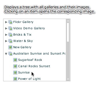
Element Pictorial Example:
See also
| Property | Defined by | ||
|---|---|---|---|
 | activeEffects : Array
The list of effects that are currently playing on the component,
as an Array of EffectInstance instances.
| UIComponent | |
| allowDragSelection : Boolean = false
A flag that indicates whether drag-selection is enabled.
| ListBase | |
| allowMultipleSelection : Boolean
A flag that indicates whether you can allow more than one item to be
selected at the same time.
| ListBase | |
| automationDelegate : Object
The delegate object that handles the automation-related functionality.
| UIComponent | |
| automationName : String
Name that can be used as an identifier for this object.
| UIComponent | |
| automationTabularData : Object
An implementation of the
IAutomationTabularData interface, which
can be used to retrieve the data. | UIComponent | |
| automationValue : Array
This value generally corresponds to the rendered appearance of the
object and should be usable for correlating the identifier with
the object as it appears visually within the application.
| UIComponent | |
| baselinePosition : Number
The y-coordinate of the baseline
of the first line of text of the component.
| UIComponent | |
| borderMetrics : EdgeMetrics
Returns an EdgeMetrics object that has four properties:
left, top, right,
and bottom. | ScrollControlBase | |
| cacheHeuristic : Boolean
Used by Flex to suggest bitmap caching for the object.
| UIComponent | |
| cachePolicy : String
Specifies the bitmap caching policy for this object.
| UIComponent | |
| className : String
The name of this instance's class, such as
"Button". | UIComponent | |
| columnCount : int
The number of columns to be displayed in a TileList control or items
in a HorizontalList control.
| ListBase | |
| columnWidth : Number
The width of the control's columns.
| ListBase | |
| contentMouseX : Number
Returns the x position of the mouse, in the content coordinate system.
| UIComponent | |
| contentMouseY : Number
Returns the y position of the mouse, in the content coordinate system.
| UIComponent | |
| currentLooperData : Object
When using this component as the child of a DataLooper element, this holds the current element's corresponding looping data.
| UIComponent | |
| currentState : String
The current view state of the component.
| UIComponent | |
| cursorManager : ICursorManager
Gets the CursorManager that controls the cursor for this component
and its peers.
| UIComponent | |
| data : Object
The item in the data provider this component should render when
this component is used as an item renderer or item editor.
| ListBase | |
| dataDescriptor : ITreeDataDescriptor
Returns the current ITreeDataDescriptor.
| Tree | |
| dataProvider : Object
An object that contains the data to be displayed.
| Tree | |
| dataTipField : String
Name of the field in the data provider items to display as the
data tip.
| ListBase | |
| dataTipFunction : Function
User-supplied function to run on each item to determine its dataTip.
| ListBase | |
| __default_folderIcon : Class [static]
The default folder icon which is used on the tree to represent each gallery.
| ImageTree | ||
| __default_leafIcon : Class [static]
The default leaf icon which is used on the tree to represent each slide in a gallery.
| ImageTree | ||
| descriptor : UIComponentDescriptor
Reference to the UIComponentDescriptor, if any, that was used
by the
createComponentFromDescriptor() method to create this
UIComponent instance. | UIComponent | |
| document : Object
A reference to the document object associated with this UIComponent.
| UIComponent | |
| doubleClickEnabled : Boolean
Specifies whether the UIComponent object receives
doubleClick events. | UIComponent | |
| dragEnabled : Boolean
A flag that indicates whether you can drag items out of
this control and drop them on other controls.
| ListBase | |
| dragMoveEnabled : Boolean
Indicates that items can be moved instead of just copied
from the Tree control as part of a drag-and-drop operation.
| Tree | |
| dropEnabled : Boolean
A flag that indicates whether dragged items can be dropped onto the
control.
| ListBase | |
| editable : Boolean = false
A flag that indicates whether or not the user can edit
items in the data provider.
| List | |
| editedItemPosition : Object
The column and row index of the item renderer for the
data provider item being edited, if any.
| List | |
| editedItemRenderer : IListItemRenderer
A reference to the item renderer
in the DataGrid control whose item is currently being edited.
| List | |
| editorDataField : String = "text"
The name of the property of the item editor that contains the new
data for the list item.
| List | |
| editorHeightOffset : Number = 0
The height of the item editor, in pixels, relative to the size of the
item renderer.
| List | |
| editorUsesEnterKey : Boolean = false
A flag that indicates whether the item editor uses Enter key.
| List | |
| editorWidthOffset : Number = 0
The width of the item editor, in pixels, relative to the size of the
item renderer.
| List | |
| editorXOffset : Number = 0
The x location of the upper-left corner of the item editor,
in pixels, relative to the upper-left corner of the item.
| List | |
| editorYOffset : Number = 0
The y location of the upper-left corner of the item editor,
in pixels, relative to the upper-left corner of the item.
| List | |
| enabled : Boolean
Whether the component can accept user interaction.
| UIComponent | |
| errorString : String
The text that will be displayed by a component's error tip when a
component is monitored by a Validator and validation fails.
| UIComponent | |
| explicitHeight : Number
Number that specifies the explicit height of the component,
in pixels, in the component's coordinates.
| UIComponent | |
| explicitMaxHeight : Number
Number that specifies the maximum height of the component,
in pixels, in the component's coordinates.
| UIComponent | |
| explicitMaxWidth : Number
Number that specifies the maximum width of the component,
in pixels, in the component's coordinates.
| UIComponent | |
| explicitMinHeight : Number
Number that specifies the minimum height of the component,
in pixels, in the component's coordinates.
| UIComponent | |
| explicitMinWidth : Number
Number that specifies the minimum width of the component,
in pixels, in the component's coordinates.
| UIComponent | |
| explicitWidth : Number
Number that specifies the explicit width of the component,
in pixels, in the component's coordinates.
| UIComponent | |
| firstVisibleItem : Object
The item that is currently displayed in the top row of the tree.
| Tree | |
| flexContextMenu : IFlexContextMenu
The context menu for this UIComponent.
| UIComponent | |
| focusEnabled : Boolean
Indicates whether the component can receive focus when tabbed to.
| UIComponent | |
| focusManager : IFocusManager
Gets the FocusManager that controls focus for this component
and its peers.
| UIComponent | |
| focusPane : Sprite
The focus pane associated with this object.
| UIComponent | |
| globalX : Number | UIComponent | |
| globalY : Number | UIComponent | |
| hasRoot : Boolean
Indicates that the current dataProvider has a root item; for example,
a single top node in a hierarchical structure.
| Tree | |
| height : Number
Number that specifies the height of the component, in pixels,
in the parent's coordinates.
| UIComponent | |
| horizontalScrollPolicy : String
A property that indicates whether the horizontal scroll
bar is always on, always off,
or automatically changes based on the parameters passed to the
setScrollBarProperties() method. | ScrollControlBase | |
| horizontalScrollPosition : Number
The offset into the content from the left edge.
| ScrollControlBase | |
| iconField : String
The name of the field in the data provider object that determines what to
display as the icon.
| ListBase | |
| iconFunction : Function
A user-supplied function to run on each item to determine its icon.
| ListBase | |
| id : String
ID of the component.
| UIComponent | |
| imeMode : String
Specifies the IME (input method editor) mode.
| List | |
| includeInLayout : Boolean
Specifies whether this component is included in the layout of the
parent container.
| UIComponent | |
| inheritingStyles : Object
The beginning of this component's chain of inheriting styles.
| UIComponent | |
| initialized : Boolean
A flag that determines if an object has been through all three phases
of layout: commitment, measurement, and layout (provided that any were required).
| UIComponent | |
| instanceIndex : int
The index of a repeated component.
| UIComponent | |
| instanceIndices : Array
An Array containing the indices required to reference
this UIComponent object from its parent document.
| UIComponent | |
| isDocument : Boolean
Determines whether this UIComponent instance is a document object,
that is, whether it is at the top of the hierarchy of a Flex
application, MXML component, or ActionScript component.
| UIComponent | |
| isPopUp : Boolean
Set to
true by the PopUpManager to indicate
that component has been popped up. | UIComponent | |
| itemEditor : IFactory
The class factory for the item editor to use for the control, if the
editable property is set to true. | List | |
| itemEditorInstance : IListItemRenderer
A reference to the currently active instance of the item editor,
if it exists.
| List | |
| itemIcons : Object
An object that specifies the icons for the items.
| Tree | |
| itemRenderer : IFactory
The custom item renderer for the control.
| ListBase | |
| labelField : String
The name of the field in the data provider items to display as the label.
| ListBase | |
| labelFunction : Function
A user-supplied function to run on each item to determine its label.
| ListBase | |
| listData : BaseListData
When a component is used as a drop-in item renderer or drop-in
item editor, Flex initializes the
listData property
of the component with the additional data from the list control. | ListBase | |
| liveScrolling : Boolean = true
A flag that indicates whether scrolling is live as the
scrollbar thumb is moved
or the view is not updated until the thumb is released.
| ScrollControlBase | |
| maxHeight : Number
Number that specifies the maximum height of the component,
in pixels, in the component's coordinates.
| UIComponent | |
| maxHorizontalScrollPosition : Number
The maximum value for the
maxHorizontalScrollPosition property for the Tree control. | Tree | |
| maxVerticalScrollPosition : Number
The maximum value for the
verticalScrollPosition property. | ScrollControlBase | |
| maxWidth : Number
Number that specifies the maximum width of the component,
in pixels, in the component's coordinates.
| UIComponent | |
| measuredHeight : Number
The default height of the component, in pixels.
| UIComponent | |
| measuredMinHeight : Number
The default minimum height of the component, in pixels.
| UIComponent | |
| measuredMinWidth : Number
The default minimum width of the component, in pixels.
| UIComponent | |
| measuredWidth : Number
The default width of the component, in pixels.
| UIComponent | |
| menuSelectionMode : Boolean = false
A flag that indicates whether menu-style selection
should be used.
| ListBase | |
| minHeight : Number
Number that specifies the minimum height of the component,
in pixels, in the component's coordinates.
| UIComponent | |
| minWidth : Number
Number that specifies the minimum width of the component,
in pixels, in the component's coordinates.
| UIComponent | |
| miscHolder : Object
A utility holder for any various properties
| UIComponent | |
| moduleFactory : IFlexModuleFactory
The moduleFactory that is used to create TextFields in the correct SWF context.
| UIComponent | |
| mouseFocusEnabled : Boolean
Whether you can receive focus when clicked on.
| UIComponent | |
| move_enableProtection : Boolean = false | UIComponent | |
| nestLevel : int
Depth of this object in the containment hierarchy.
| UIComponent | |
| nonInheritingStyles : Object
The beginning of this component's chain of non-inheriting styles.
| UIComponent | |
| nullItemRenderer : IFactory
The custom item renderer for the control.
| ListBase | |
| numAutomationChildren : int
The number of automation children this container has.
| UIComponent | |
| offscreenExtraRowsOrColumns : int
The target number of extra rows or columns of item renderers to be used
in the layout of the control.
| ListBase | |
| openItems : Object
The items that have been opened or set opened.
| Tree | |
| owner : DisplayObjectContainer
The owner of this UIComponent.
| UIComponent | |
| parent : DisplayObjectContainer
The parent container or component for this component.
| UIComponent | |
| parentApplication : Object
A reference to the Application object that contains this UIComponent
instance.
| UIComponent | |
| parentDocument : Object
A reference to the parent document object for this UIComponent.
| UIComponent | |
| percentHeight : Number
Number that specifies the height of a component as a percentage
of its parent's size.
| UIComponent | |
| percentWidth : Number
Number that specifies the width of a component as a percentage
of its parent's size.
| UIComponent | |
| processedDescriptors : Boolean
Set to
true after immediate or deferred child creation,
depending on which one happens. | UIComponent | |
| rendererIsEditor : Boolean = false
Specifies whether the item renderer is also an item
editor.
| List | |
| repeater : IRepeater
A reference to the Repeater object
in the parent document that produced this UIComponent.
| UIComponent | |
| repeaterIndex : int
The index of the item in the data provider
of the Repeater that produced this UIComponent.
| UIComponent | |
| repeaterIndices : Array
An Array containing the indices of the items in the data provider
of the Repeaters in the parent document that produced this UIComponent.
| UIComponent | |
| repeaters : Array
An Array containing references to the Repeater objects
in the parent document that produced this UIComponent.
| UIComponent | |
| rowCount : int
Number of rows to be displayed.
| ListBase | |
| rowHeight : Number
The height of the rows in pixels.
| ListBase | |
| scaleX : Number
Number that specifies the horizontal scaling factor.
| UIComponent | |
| scaleY : Number
Number that specifies the vertical scaling factor.
| UIComponent | |
| screen : Rectangle
Returns an object that contains the size and position of the base
drawing surface for this object.
| UIComponent | |
| scrollTipFunction : Function
A function that computes the string to be displayed as the ScrollTip.
| ScrollControlBase | |
| selectable : Boolean
A flag that indicates whether the list shows selected items
as selected.
| ListBase | |
| selectedIndex : int
The index in the data provider of the selected item.
| ListBase | |
| selectedIndices : Array
An array of indices in the data provider of the selected items.
| ListBase | |
| selectedItem : Object
A reference to the selected item in the data provider.
| ListBase | |
| selectedItems : Array
An array of references to the selected items in the data provider.
| ListBase | |
| setActualSize_enableProtection : Boolean = false | UIComponent | |
| setVisible_enableProtection : Boolean = true | UIComponent | |
| showDataTips : Boolean
A flag that indicates whether dataTips are displayed for text in the rows.
| ListBase | |
| showInAutomationHierarchy : Boolean
A flag that determines if an automation object
shows in the automation hierarchy.
| UIComponent | |
| showRoot : Boolean
Sets the visibility of the root item.
| Tree | |
| showScrollTips : Boolean = false
A flag that indicates whether a tooltip should appear
near the scroll thumb when it is being dragged.
| ScrollControlBase | |
| slideshow : FlashSlideshow
A reference to the main slideshow.
| ImageTree | ||
| states : Array
The view states that are defined for this component.
| UIComponent | |
| styleClassOverridesInline : Boolean = true
Specifies if class-specific styles (as defined by the
styleName property) override inline styles. | UIComponent | |
| styleDeclaration : CSSStyleDeclaration
Storage for the inline inheriting styles on this object.
| UIComponent | |
| styleName : Object
The class style used by this component.
| UIComponent | |
| systemManager : ISystemManager
Returns the SystemManager object used by this component.
| UIComponent | |
| toolTip : String
Text to display in the ToolTip.
| UIComponent | |
| transitions : Array
An Array of Transition objects, where each Transition object defines a
set of effects to play when a view state change occurs.
| UIComponent | |
| tweeningProperties : Array
Array of properties that are currently being tweened on this object.
| UIComponent | |
| uid : String
A unique identifier for the object.
| UIComponent | |
| updateCompletePendingFlag : Boolean
A flag that determines if an object has been through all three phases
of layout validation (provided that any were required).
| UIComponent | |
| validationSubField : String
Used by a validator to associate a subfield with this component.
| UIComponent | |
| value : Object
The selected item, or the data or label field of the selected item.
| ListBase | |
| variableRowHeight : Boolean
A flag that indicates whether the individual rows can have different
height.
| ListBase | |
| verticalScrollPolicy : String
A property that indicates whether the vertical scroll bar is always on, always off,
or automatically changes based on the parameters passed to the
setScrollBarProperties() method. | ScrollControlBase | |
| verticalScrollPosition : Number
The offset into the content from the top edge.
| ScrollControlBase | |
| viewMetrics : EdgeMetrics
An EdgeMetrics object taking into account the scroll bars,
if visible.
| ScrollControlBase | |
| visible : Boolean
Controls the visibility of this UIComponent.
| UIComponent | |
| visible_unprotected : Boolean
If setVisible_enableProtection is enabled, this allows access to determine what the pseudo-state is -- that is, what's been requested, regardless of any prevention of default behavior.
| UIComponent | |
| width : Number
Number that specifies the width of the component, in pixels,
in the parent's coordinates.
| UIComponent | |
| wordWrap : Boolean
A flag that indicates whether text in the row should be word wrapped.
| ListBase | |
| x : Number
Number that specifies the component's horizontal position,
in pixels, within its parent container.
| UIComponent | |
| xmlDescriptor : XML
For certain dynamically created elements, this represents the XML node used to create that element.
| UIComponent | |
| y : Number
Number that specifies the component's vertical position,
in pixels, within its parent container.
| UIComponent | |
| Method | Defined by | ||
|---|---|---|---|
| ImageTree | |||
|
addDataEffectItem(item:Object):void
Adds an item renderer if a data change effect is running.
| ListBase | |
|
calculateDropIndex(event:DragEvent = null):int
Returns the index where the dropped items should be added
to the drop target.
| ListBase | |
|
callLater(method:Function, args:Array = null):void
Queues a function to be called later.
| UIComponent | |
|
clearStyle(styleProp:String):void
Deletes a style property from this component instance.
| UIComponent | |
|
contentToGlobal(point:Point):Point
Converts a
Point object from content coordinates to global coordinates. | UIComponent | |
|
contentToLocal(point:Point):Point
Converts a
Point object from content to local coordinates. | UIComponent | |
|
createAutomationIDPart(child:IAutomationObject):Object
Returns a set of properties that identify the child within
this container.
| UIComponent | |
|
createItemEditor(colIndex:int, rowIndex:int):void
Creates the item editor for the item renderer at the
editedItemPosition using the editor
specified by the itemEditor property. | List | |
|
createItemRenderer(data:Object):IListItemRenderer
Get the appropriate renderer, using the default renderer if none is specified.
| List | |
|
createReferenceOnParentDocument(parentDocument:IFlexDisplayObject):void
Creates an
id reference to this IUIComponent object
on its parent document object. | UIComponent | |
|
deleteReferenceOnParentDocument(parentDocument:IFlexDisplayObject):void
Deletes the
id reference to this IUIComponent object
on its parent document object. | UIComponent | |
|
destroyItemEditor():void
Closes an item editor that is currently open on an item.
| List | |
|
Returns a UITextFormat object corresponding to the text styles
for this UIComponent.
| UIComponent | |
|
dispatchEvent(event:Event):Boolean
Dispatches an event into the event flow.
| UIComponent | |
|
drawFocus(isFocused:Boolean):void
| ImageTree | ||
|
drawRoundRect(x:Number, y:Number, w:Number, h:Number, r:Object = null, c:Object = null, alpha:Object = null, rot:Object = null, gradient:String = null, ratios:Array = null, hole:Object = null):void
Programatically draws a rectangle into this skin's Graphics object.
| UIComponent | |
|
effectFinished(effectInst:IEffectInstance):void
Called by the effect instance when it stops playing on the component.
| UIComponent | |
|
effectStarted(effectInst:IEffectInstance):void
Called by the effect instance when it starts playing on the component.
| UIComponent | |
|
endEffectsStarted():void
Ends all currently playing effects on the component.
| UIComponent | |
|
executeBindings(recurse:Boolean = false):void
Executes the data bindings into this UIComponent object.
| UIComponent | |
|
expandChildrenOf(item:Object, open:Boolean):void
Opens or closes all the tree items below the specified item.
| Tree | |
|
expandItem(item:Object, open:Boolean, animate:Boolean = false, dispatchEvent:Boolean = false, cause:Event = null):void
Opens or closes a branch item.
| Tree | |
|
findString(str:String):Boolean
Finds an item in the list based on a String,
and moves the selection to it.
| ListBase | |
|
finishPrint(obj:Object, target:IFlexDisplayObject):void
Called after printing is complete.
| UIComponent | |
|
getAutomationChildAt(index:int):IAutomationObject
Provides the automation object at the specified index.
| UIComponent | |
|
getClassStyleDeclarations():Array
Finds the type selectors for this UIComponent instance.
| UIComponent | |
|
getConstraintValue(constraintName:String):*
Returns a layout constraint value, which is the same as
getting the constraint style for this component.
| UIComponent | |
|
getDescendantByName(name:String):DisplayObject
Searches all children for the first child named with the passed value; returns that child, or null if not found.
| UIComponent | |
|
getDescendantsByName(name:String):Array
Searches all children for all children named with the passed value; returns an array with those children, or an empty array if none found.
| UIComponent | |
|
getExplicitOrMeasuredHeight():Number
A convenience method for determining whether to use the
explicit or measured height
| UIComponent | |
|
getExplicitOrMeasuredWidth():Number
A convenience method for determining whether to use the
explicit or measured width
| UIComponent | |
|
getFocus():InteractiveObject
Gets the object that currently has focus.
| UIComponent | |
|
getItemRendererFactory(data:Object):IFactory
Return the appropriate factory, using the default factory if none specified.
| ListBase | |
|
getParentItem(item:Object):*
Returns the known parent of a child item.
| Tree | |
|
getRendererSemanticValue(target:Object, semanticProperty:String):Object
Returns
true or false
to indicates whether the effect should play on the target. | ListBase | |
|
getRepeaterItem(whichRepeater:int = -1):Object
Returns the item in the
dataProvider that was used
by the specified Repeater to produce this Repeater, or
null if this Repeater isn't repeated. | UIComponent | |
|
getStyle(styleProp:String):*
Gets a style property that has been set anywhere in this
component's style lookup chain.
| UIComponent | |
|
getVisibleRect(targetParent:DisplayObject = null):Rectangle
MOVED OVER FROM SDK 3.2 UIComponent - Allows for popped-up alerts to be displayed correctly - NGR MOVED 11-20-08
| UIComponent | |
|
globalToContent(point:Point):Point
Converts a
Point object from global to content coordinates. | UIComponent | |
|
hideDropFeedback(event:DragEvent):void
Hides the drop indicator under the mouse pointer that indicates that a
drag and drop operation is allowed.
| ListBase | |
|
horizontalGradientMatrix(x:Number, y:Number, width:Number, height:Number):Matrix
Returns a box Matrix which can be passed to the
drawRoundRect() method
as the rot parameter when drawing a horizontal gradient. | UIComponent | |
|
indexToItemRenderer(index:int):IListItemRenderer
Get an item renderer for the index of an item in the data provider,
if one exists.
| ListBase | |
|
indicesToIndex(rowIndex:int, colIndex:int):int
Computes the offset into the data provider of the item
at colIndex, rowIndex.
| ListBase | |
|
initialize():void
Initializes the internal structure of this component.
| UIComponent | |
|
initializeRepeaterArrays(parent:IRepeaterClient):void
Initializes various properties which keep track of repeated instances
of this component.
| UIComponent | |
|
invalidateDisplayList():void
Marks a component so that its
updateDisplayList()
method gets called during a later screen update. | UIComponent | |
|
invalidateList():void
Refresh all rows on the next update.
| ListBase | |
|
invalidateProperties():void
Marks a component so that its
commitProperties()
method gets called during a later screen update. | UIComponent | |
|
invalidateSize():void
Marks a component so that its
measure()
method gets called during a later screen update. | UIComponent | |
|
isItemEditable(data:Object):Boolean
Determines if the item renderer for a data provider item
is editable.
| List | |
|
isItemHighlighted(data:Object):Boolean
Determines if the item renderer for a data provider item
is highlighted (is rolled over via the mouse or under the caret due to keyboard navigation).
| ListBase | |
|
isItemOpen(item:Object):Boolean
Returns
true if the specified item branch is open (is showing its children). | Tree | |
|
isItemSelectable(data:Object):Boolean
Determines if the item renderer for a data provider item
is selectable.
| ListBase | |
|
isItemSelected(data:Object):Boolean
Determines if the item renderer for a data provider item
is selected.
| ListBase | |
|
isItemVisible(item:Object):Boolean
Determines if an item is being displayed by a renderer.
| ListBase | |
|
itemRendererContains(renderer:IListItemRenderer, object:DisplayObject):Boolean
Determines whether a renderer contains (or owns) a display object.
| ListBase | |
|
itemRendererToIndex(itemRenderer:IListItemRenderer):int
Returns the index of the item in the data provider of the item
being rendered by this item renderer.
| ListBase | |
|
itemToDataTip(data:Object):String
Returns the dataTip string the renderer would display for the given
data object based on the dataTipField and dataTipFunction properties.
| ListBase | |
|
itemToIcon(data:Object):Class
Returns the class for an icon, if any, for a data item,
based on the iconField and iconFunction properties.
| ListBase | |
|
itemToItemRenderer(item:Object):IListItemRenderer
Returns the item renderer for a given item in the data provider,
if there is one.
| ListBase | |
|
itemToLabel(data:Object):String
Returns the string the renderer would display for the given data object
based on the labelField and labelFunction properties.
| ListBase | |
|
localToContent(point:Point):Point
Converts a
Point object from local to content coordinates. | UIComponent | |
|
measureHeightOfItems(index:int = -1, count:int = 0):Number
Measures a set of items from the data provider using the
current item renderer and returns the sum of the heights
of those items.
| ListBase | |
|
measureHTMLText(htmlText:String):TextLineMetrics
Measures the specified HTML text, which may contain HTML tags such
as
<font> and <b>,
assuming that it is displayed
in a single-line UITextField using a UITextFormat
determined by the styles of this UIComponent. | UIComponent | |
|
measureText(text:String):TextLineMetrics
Measures the specified text, assuming that it is displayed
in a single-line UITextField using a UITextFormat
determined by the styles of this UIComponent.
| UIComponent | |
|
measureWidthOfItems(index:int = -1, count:int = 0):Number
Measures a set of items from the data provider using
the current item renderer and returns the
maximum width found.
| ListBase | |
|
move(x:Number, y:Number):void
Moves the component to a specified position within its parent.
| UIComponent | |
|
move_unprotected(x:Number, y:Number):void
Same as move, but cannot be prevented via the protection_move event.
| UIComponent | |
|
notifyStyleChangeInChildren(styleProp:String, recursive:Boolean):void
Propagates style changes to the children.
| UIComponent | |
|
owns(child:DisplayObject):Boolean
Returns
true if the chain of owner properties
points from child to this UIComponent. | UIComponent | |
|
parentChanged(p:DisplayObjectContainer):void
Called by Flex when a UIComponent object is added to or removed from a parent.
| UIComponent | |
|
prepareToPrint(target:IFlexDisplayObject):Object
Prepares an IFlexDisplayObject for printing.
| UIComponent | |
|
regenerateStyleCache(recursive:Boolean):void
Builds or rebuilds the CSS style cache for this component
and, if the
recursive parameter is true,
for all descendants of this component as well. | UIComponent | |
|
registerEffects(effects:Array):void
For each effect event, registers the EffectManager
as one of the event listeners.
| UIComponent | |
|
removeDataEffectItem(item:Object):void
Removes an item renderer if a data change effect is running.
| ListBase | |
|
replayAutomatableEvent(event:Event):Boolean
Replays the specified event.
| UIComponent | |
|
resolveAutomationIDPart(criteria:Object):Array
Resolves a child by using the id provided.
| UIComponent | |
|
resumeBackgroundProcessing():void
[static]
Resumes the background processing of methods
queued by
callLater(), after a call to
suspendBackgroundProcessing(). | UIComponent | |
|
scrollToIndex(index:int):Boolean
Ensures that the data provider item at the given index is visible.
| ListBase | |
|
setActualSize(w:Number, h:Number):void
Sizes the object.
| UIComponent | |
|
setActualSize_unprotected(w:Number, h:Number):void
Same as setActualSize, but is not cancelable via the protection_size event.
| UIComponent | |
|
setConstraintValue(constraintName:String, value:*):void
Sets a layout constraint value, which is the same as
setting the constraint style for this component.
| UIComponent | |
|
setCurrentState(stateName:String, playTransition:Boolean = true):void
Set the current state.
| UIComponent | |
|
setFocus():void
| ImageTree | ||
|
setItemIcon(item:Object, iconID:Class, iconID2:Class):void
Sets the associated icon for the item.
| Tree | |
|
setStyle(styleProp:String, newValue:*):void
Sets a style property on this component instance.
| UIComponent | |
|
setVisible(value:Boolean, noEvent:Boolean = false):void
Called when the
visible property changes. | UIComponent | |
|
setVisible_unprotected(value:Boolean, noEvent:Boolean = false):void
Same as setVisible, but cannot be prevented.
| UIComponent | |
|
showDropFeedback(event:DragEvent):void
Displays a drop indicator under the mouse pointer to indicate that a
drag and drop operation is allowed and where the items will
be dropped.
| ListBase | |
|
styleChanged(styleProp:String):void
Detects changes to style properties.
| UIComponent | |
|
stylesInitialized():void
Flex calls the
stylesInitialized() method when
the styles for a component are first initialized. | UIComponent | |
|
suspendBackgroundProcessing():void
[static]
Blocks the background processing of methods
queued by
callLater(),
until resumeBackgroundProcessing() is called. | UIComponent | |
|
toString():String
Returns a string indicating the location of this object
within the hierarchy of DisplayObjects in the Application.
| FlexSprite | |
|
unconstrainRenderer(item:Object):void
Called by an
UnconstrainItemAction effect
as part of a data change effect if the item renderers corresponding
to certain data items need to move outside the normal positions
of item renderers in the control. | ListBase | |
|
validateDisplayList():void
Validates the position and size of children and draws other
visuals.
| UIComponent | |
|
validateNow():void
Validate and update the properties and layout of this object
and redraw it, if necessary.
| UIComponent | |
|
validateProperties():void
Used by layout logic to validate the properties of a component
by calling the
commitProperties() method. | UIComponent | |
|
validateSize(recursive:Boolean = false):void
Validates the measured size of the component
If the
LayoutManager.invalidateSize() method is called with
this ILayoutManagerClient, then the validateSize() method
is called when it's time to do measurements. | UIComponent | |
|
validationResultHandler(event:ValidationResultEvent):void
Handles both the
valid and invalid events from a
validator assigned to this component. | UIComponent | |
|
verticalGradientMatrix(x:Number, y:Number, width:Number, height:Number):Matrix
Returns a box Matrix which can be passed to
drawRoundRect()
as the rot parameter when drawing a vertical gradient. | UIComponent | |
| Method | Defined by | ||
|---|---|---|---|
|
addDragData(ds:Object):void
Adds the selected items to the DragSource object as part of a
drag-and-drop operation.
| ListBase | |
|
addToFreeItemRenderers(item:IListItemRenderer):void
Adds a renderer to the recycled renderer list,
making it invisible and cleaning up references to it.
| ListBase | |
|
addToRowArrays():void
Add a blank row to the beginning of the arrays that store references to the rows.
| ListBase | |
|
adjustFocusRect(obj:DisplayObject = null):void
Adjust the focus rectangle.
| UIComponent | |
|
adjustListContent(unscaledWidth:Number = -1, unscaledHeight:Number = -1):void
Called from the
updateDisplayList() method to adjust the size and position of
listContent. | ListBase | |
|
applySelectionEffect(indicator:Sprite, uid:String, itemRenderer:IListItemRenderer):void
Sets up the effect for applying the selection indicator.
| ListBase | |
|
attachOverlay():void
This is an internal method used by the Flex framework
to support the Dissolve effect.
| UIComponent | |
|
calculateDropIndicatorY(rowCount:Number, rowNum:int):Number
Calculates the y position of the drop indicator
when performing a drag-and-drop operation.
| ListBase | |
|
childrenCreated():void
Performs any final processing after child objects are created.
| UIComponent | |
|
clearCaretIndicator(indicator:Sprite, itemRenderer:IListItemRenderer):void
Clears the caret indicator into the given Sprite.
| ListBase | |
|
clearHighlightIndicator(indicator:Sprite, itemRenderer:IListItemRenderer):void
Clears the highlight indicator in the given Sprite.
| ListBase | |
|
clearIndicators():void
Removes all selection and highlight and caret indicators.
| ListBase | |
|
clearSelected(transition:Boolean = false):void
Clears the set of selected items and removes all graphics
depicting the selected state of those items.
| ListBase | |
|
clearVisibleData():void
Empty the visibleData hash table.
| ListBase | |
|
collectionChangeHandler(event:Event):void
Handles CollectionEvents dispatched from the data provider
as the data changes.
| ListBase | |
|
commitProperties():void
Calculates the column width and row height and number of rows and
columns based on whether properties like
columnCount
columnWidth, rowHeight and
rowCount were explicitly set. | ListBase | |
|
configureScrollBars():void
Configures the ScrollBars based on the number of rows and columns and
viewable rows and columns.
| ListBase | |
|
copyItemWithUID(item:Object):Object
Makes a deep copy of the object by calling the
ObjectUtil.copy() method, and replaces
the copy's uid property (if present) with a
new value by calling the UIDUtil.createUID() method. | ListBase | |
|
copySelectedItems(useDataField:Boolean = true):Array
Copies the selected items in the order that they were selected.
| ListBase | |
|
createBorder():void
Creates the border for this component.
| ScrollControlBase | |
|
createChildren():void
| ImageTree | ||
|
createInFontContext(classObj:Class):Object
Creates a new object using a context
based on the embedded font being used.
| UIComponent | |
|
createInModuleContext(moduleFactory:IFlexModuleFactory, className:String):Object
Creates the object using a given moduleFactory.
| UIComponent | |
|
destroyRow(i:int, numCols:int):void
Recycle a row that is no longer needed, and remove its indicators.
| ListBase | |
|
dragCompleteHandler(event:DragEvent):void
Handles
DragEvent.DRAG_COMPLETE events. | Tree | |
|
dragDropHandler(event:DragEvent):void
Handles
DragEvent.DRAG_DROP events. | Tree | |
|
dragEnterHandler(event:DragEvent):void
Handles
DragEvent.DRAG_ENTER events. | ListBase | |
|
dragExitHandler(event:DragEvent):void
Handles
DragEvent.DRAG_EXIT events. | ListBase | |
|
dragOverHandler(event:DragEvent):void
Handles
DragEvent.DRAG_OVER events. | ListBase | |
|
dragScroll():void
Interval function that scrolls the list up or down
if the mouse goes above or below the list.
| ListBase | |
|
dragStartHandler(event:DragEvent):void
The default handler for the
dragStart event. | ListBase | |
|
drawCaretIndicator(indicator:Sprite, x:Number, y:Number, width:Number, height:Number, color:uint, itemRenderer:IListItemRenderer):void
Draws the caret indicator into the given Sprite
at the position, width and height specified using the
color specified.
| ListBase | |
|
drawHighlightIndicator(indicator:Sprite, x:Number, y:Number, width:Number, height:Number, color:uint, itemRenderer:IListItemRenderer):void
Draws the highlight indicator into the given Sprite
at the position, width and height specified using the
color specified.
| ListBase | |
|
drawItem(item:IListItemRenderer, selected:Boolean = false, highlighted:Boolean = false, caret:Boolean = false, transition:Boolean = false):void
Draws the renderer with indicators
that it is highlighted, selected, or the caret.
| ListBase | |
|
drawRowBackground(s:Sprite, rowIndex:int, y:Number, height:Number, color:uint, dataIndex:int):void
Draws a row background
at the position and height specified.
| List | |
|
drawRowBackgrounds():void
Draws any alternating row colors, borders and backgrounds for the rows.
| ListBase | |
|
drawSelectionIndicator(indicator:Sprite, x:Number, y:Number, width:Number, height:Number, color:uint, itemRenderer:IListItemRenderer):void
Draws the selection indicator into the given Sprite
at the position, width and height specified using the
color specified.
| ListBase | |
|
endEdit(reason:String):Boolean
Stops the editing of an item in the data provider.
| List | |
|
findKey(eventCode:int):Boolean
Tries to find the next item in the data provider that
starts with the character in the
eventCode parameter. | ListBase | |
|
finishDataChangeEffect(event:EffectEvent):void
Cleans up after a data change effect has finished running
by restoring the original collection and iterator and removing
any cached values used by the effect.
| ListBase | |
|
finishKeySelection():void
Sets selected items based on the
caretIndex and
anchorIndex properties. | ListBase | |
|
focusInHandler(event:FocusEvent):void
The event handler called when a UIComponent object gets focus.
| UIComponent | |
|
focusOutHandler(event:FocusEvent):void
The event handler called when a UIComponent object loses focus.
| UIComponent | |
|
getReservedOrFreeItemRenderer(data:Object):IListItemRenderer
Retrieves an already-created item renderer not currently in use.
| ListBase | |
|
indexToColumn(index:int):int
The column for the data provider item at the given index.
| ListBase | |
|
indexToRow(index:int):int
The row for the data provider item at the given index.
| ListBase | |
|
initializationComplete():void
Finalizes the initialization of this component.
| UIComponent | |
|
initializeAccessibility():void
Initializes this component's accessibility code.
| UIComponent | |
|
initiateDataChangeEffect(unscaledWidth:Number, unscaledHeight:Number):void
Initiates a data change effect when there have been changes
in the data provider.
| ListBase | |
|
initListData(item:Object, treeListData:TreeListData):void
Initializes a TreeListData object that is used by the tree item renderer.
| Tree | |
|
isOurFocus(target:DisplayObject):Boolean
Typically overridden by components containing UITextField objects,
where the UITextField object gets focus.
| UIComponent | |
|
isRendererUnconstrained(item:Object):Boolean
Returns
true if an item renderer is no longer being positioned
by the list's layout algorithm while a data change effect is
running as a result of a call to the unconstrainRenderer() method. | ListBase | |
|
itemRendererToIndices(item:IListItemRenderer):Point
Returns a Point containing the columnIndex and rowIndex of an
item renderer.
| ListBase | |
|
itemToUID(data:Object):String
Determines the UID for a data provider item.
| ListBase | |
|
keyDownHandler(event:KeyboardEvent):void
The event handler called for a
keyDown event. | UIComponent | |
|
keyUpHandler(event:KeyboardEvent):void
The event handler called for a
keyUp event. | UIComponent | |
|
layoutChrome(unscaledWidth:Number, unscaledHeight:Number):void
Responds to size changes by setting the positions and sizes
of this control's borders.
| ScrollControlBase | |
|
layoutEditor(x:int, y:int, w:int, h:int):void
Positions the item editor instance at the suggested position
with the suggested dimensions.
| List | |
|
makeListData(data:Object, uid:String, rowNum:int):BaseListData
Creates a new TreeListData instance and populates the fields based on
the input data provider item.
| Tree | |
|
makeRowsAndColumns(left:Number, top:Number, right:Number, bottom:Number, firstColumn:int, firstRow:int, byCount:Boolean = false, rowsNeeded:uint = 0):Point
Make enough rows and columns to fill the area
described by left, top, right, bottom.
| ListBase | |
|
measure():void
Calculates the measured width and height of the component based
on the
rowCount,
columnCount, rowHeight and
columnWidth properties. | ListBase | |
|
mouseClickHandler(event:MouseEvent):void
Handles
MouseEvent.MOUSE_CLICK events from any mouse
targets contained in the list including the renderers. | ListBase | |
|
mouseDoubleClickHandler(event:MouseEvent):void
Handles
MouseEvent.MOUSE_DOUBLE_CLICK events from any
mouse targets contained in the list including the renderers. | ListBase | |
|
mouseDownHandler(event:MouseEvent):void
Handles
MouseEvent.MOUSE_DOWN events from any mouse
targets contained in the list including the renderers. | ListBase | |
|
mouseEventToItemRenderer(event:MouseEvent):IListItemRenderer
Determines which item renderer is under the mouse.
| ListBase | |
|
mouseMoveHandler(event:MouseEvent):void
Handles
MouseEvent.MOUSE_MOVE events from any mouse
targets contained in the list including the renderers. | ListBase | |
|
mouseOutHandler(event:MouseEvent):void
Handles
MouseEvent.MOUSE_OUT events from any mouse targets
contained in the list including the renderers. | ListBase | |
|
mouseOverHandler(event:MouseEvent):void
Handles
MouseEvent.MOUSE_OVER events from any mouse
targets contained in the list, including the renderers. | ListBase | |
|
mouseUpHandler(event:MouseEvent):void
Handles
MouseEvent.MOUSE_DOWN events from any mouse
targets contained in the list including the renderers. | ListBase | |
|
mouseWheelHandler(event:MouseEvent):void
Handles
mouseWheel events by changing scroll positions. | ListBase | |
|
moveIndicatorsHorizontally(uid:String, moveBlockDistance:Number):void
Move the selection and highlight indicators horizontally.
| ListBase | |
|
moveIndicatorsVertically(uid:String, moveBlockDistance:Number):void
Move the selection and highlight indicators vertically.
| ListBase | |
|
moveRowVertically(i:int, numCols:int, moveBlockDistance:Number):void
Move a row vertically, and update the rowInfo record.
| ListBase | |
|
moveSelectionHorizontally(code:uint, shiftKey:Boolean, ctrlKey:Boolean):void
Moves the selection in a horizontal direction in response
to the user selecting items using the left arrow or right arrow
keys and modifiers such as the Shift and Ctrl keys.
| ListBase | |
|
moveSelectionVertically(code:uint, shiftKey:Boolean, ctrlKey:Boolean):void
Moves the selection in a vertical direction in response
to the user selecting items using the up arrow or down arrow
Keys and modifiers such as the Shift and Ctrl keys.
| ListBase | |
|
prepareDataEffect(ce:CollectionEvent):void
Prepares the data effect for the collection event.
| ListBase | |
|
purgeItemRenderers():void
Called by the
updateDisplayList() method to remove existing item renderers
and clean up various caching structures when the renderer changes. | ListBase | |
|
reKeyVisibleData():void
Update the keys in the visibleData hash table.
| ListBase | |
|
removeFromRowArrays(i:int):void
Remove a row from the arrays that store references to the row.
| ListBase | |
|
removeIndicators(uid:String):void
Cleans up selection highlights and other associated graphics
for a given item in the data provider.
| ListBase | |
|
resourcesChanged():void
This method is called when a UIComponent is constructed,
and again whenever the ResourceManager dispatches
a
"change" Event to indicate
that the localized resources have changed in some way. | UIComponent | |
|
restoreRowArrays(modDeltaPos:int):void
Remove the requested number of rows from the beginning of the
arrays that store references to the rows.
| ListBase | |
|
roomForScrollBar(bar:ScrollBar, unscaledWidth:Number, unscaledHeight:Number):Boolean
Determines if there is enough space in this component to display
a given scrollbar.
| ScrollControlBase | |
|
scrollHandler(event:Event):void
Default event handler for the
scroll event. | ScrollControlBase | |
|
scrollHorizontally(pos:int, deltaPos:int, scrollUp:Boolean):void
Adjusts the renderers in response to a change
in scroll position.
| ListBase | |
|
scrollPositionToIndex(horizontalScrollPosition:int, verticalScrollPosition:int):int
Returns the data provider index for the item at the first visible
row and column for the given scroll positions.
| ListBase | |
|
scrollVertically(pos:int, deltaPos:int, scrollUp:Boolean):void
Adjusts the renderers in response to a change
in scroll position.
| ListBase | |
|
seekPendingFailureHandler(data:Object, info:ListBaseSeekPending):void
The default failure handler when a seek fails due to a page fault.
| ListBase | |
|
seekPendingResultHandler(data:Object, info:ListBaseSeekPending):void
The default result handler when a seek fails due to a page fault.
| ListBase | |
|
seekPositionSafely(index:int):Boolean
Seek to a position, and handle an ItemPendingError if necessary.
| ListBase | |
|
selectItem(item:IListItemRenderer, shiftKey:Boolean, ctrlKey:Boolean, transition:Boolean = true):Boolean
Updates the set of selected items given that the item renderer provided
was clicked by the mouse and the keyboard modifiers are in the given
state.
| ListBase | |
|
setRowCount(v:int):void
Sets the
rowCount property without causing
invalidation or setting the explicitRowCount
property, which permanently locks in the number of rows. | ListBase | |
|
setRowHeight(v:Number):void
Sets the
rowHeight property without causing invalidation or
setting of explicitRowHeight which
permanently locks in the height of the rows. | ListBase | |
|
setScrollBarProperties(totalColumns:int, visibleColumns:int, totalRows:int, visibleRows:int):void
Causes the ScrollControlBase to show or hide scrollbars based
on the parameters passed in.
| ScrollControlBase | |
|
shiftRow(oldIndex:int, newIndex:int, numCols:int, shiftItems:Boolean):void
Shift a row in the arrays that reference rows.
| ListBase | |
|
sumRowHeights(startRowIdx:int, endRowIdx:int):Number
Determine the height of the requested set of rows.
| ListBase | |
|
truncateRowArrays(numRows:int):void
Remove all remaining rows from the end of the
arrays that store references to the rows.
| ListBase | |
|
UIDToItemRenderer(uid:String):IListItemRenderer
Find an item renderer based on its UID if it is visible.
| ListBase | |
|
updateDisplayList(unscaledWidth:Number, unscaledHeight:Number):void
Adds or removes item renderers if the number of displayable items
changed.
| ListBase | |
|
updateList():void
Refreshes all rows.
| ListBase | |
| Style | Description | Defined by | ||
|---|---|---|---|---|
| Type: Array Format: Color CSS Inheritance: yes Colors for rows in an alternating pattern. | Tree | ||
| Type: Number CSS Inheritance: no Alpha level of the color defined by the backgroundColor
property, of the image or SWF file defined by the backgroundImage
style. | ScrollControlBase | ||
| Type: uint Format: Color CSS Inheritance: no Background color of a component. | ScrollControlBase | ||
| Type: uint Format: Color CSS Inheritance: yes Background color of the component when it is disabled. | ScrollControlBase | ||
| Type: Object Format: File CSS Inheritance: no Background image of a component. | ScrollControlBase | ||
| Type: String CSS Inheritance: no Scales the image specified by backgroundImage
to different percentage sizes. | ScrollControlBase | ||
| Type: String CSS Inheritance: no The vertical distance in pixels from the top edge of the content area to the control's baseline position. | UIComponent | ||
| Type: uint Format: Color CSS Inheritance: no Color of the border. | ScrollControlBase | ||
| Type: String CSS Inheritance: no Bounding box sides. | ScrollControlBase | ||
| Type: Class CSS Inheritance: no The border skin class of the component. | ScrollControlBase | ||
| Type: String CSS Inheritance: no Bounding box style. | ScrollControlBase | ||
| Type: Number Format: Length CSS Inheritance: no Bounding box thickness. | ScrollControlBase | ||
| Type: String CSS Inheritance: no The vertical distance in pixels from the lower edge of the component to the lower edge of its content area. | UIComponent | ||
| Type: Number CSS Inheritance: no The color brightness of the component. | UIComponent | ||
| Type: uint Format: Color CSS Inheritance: yes Color of text in the component, including the component label. | ScrollControlBase | ||
| Type: Number CSS Inheritance: no The color contrast of the component. | UIComponent | ||
| Type: Number Format: Length CSS Inheritance: no Radius of component corners. | ScrollControlBase | ||
| Type: Class Format: EmbeddedFile CSS Inheritance: no Specifies the default icon for a leaf item. | Tree | ||
| Type: Array Format: Color CSS Inheritance: yes Array of colors used in the Tree control, in descending order. | Tree | ||
|
disableAutoplayOnClick
| Type: Boolean CSS Inheritance: no Specifies if autoplay should be automatically disabled/paused when an item is jumped to via the ImageTree. If left on the default value ( true), autoplay will be paused whenever the user clicks on an item in the ImageTree. If they then wish to
resume autoplay, they will have to click on a PlayPauseButton element which you include in the layout.
The default value is true. | ImageTree | ||
| Type: uint Format: Color CSS Inheritance: yes Color of text in the component if it is disabled. | ScrollControlBase | ||
| Type: Class Format: EmbeddedFile CSS Inheritance: no Specifies the icon that is displayed next to a parent item that is closed so that its children are not displayed (the subtree is collapsed). | Tree | ||
| Type: Class Format: EmbeddedFile CSS Inheritance: no Specifies the icon that is displayed next to a parent item that is open so that its children are displayed. | Tree | ||
| Type: Class CSS Inheritance: no The skin to use to indicate where a dragged item can be dropped. | ListBase | ||
| Type: uint Format: Color CSS Inheritance: yes Color of the drop shadow. | ScrollControlBase | ||
| Type: Boolean CSS Inheritance: no Boolean property that specifies whether the component has a visible drop shadow. | ScrollControlBase | ||
|
enableGalleryJump
| Type: Boolean CSS Inheritance: no Specifies if selecting a gallery node in the tree will open the corresponding gallery, or if an image node must be selected for anything to happen. By default, the user must select an image item for a jump to occur. The default value is false. | ImageTree | ||
| Type: uint Format: Color CSS Inheritance: yes Color of the component highlight when validation fails. | UIComponent | ||
| Type: Number CSS Inheritance: no Specifies the alpha transparency value of the focus skin. | ListBase | ||
| Type: String CSS Inheritance: no Blend mode used by the focus rectangle. | UIComponent | ||
| Type: String CSS Inheritance: no Specifies which corners of the focus rectangle should be rounded. | ListBase | ||
| Type: Class CSS Inheritance: no Skin used to draw the focus rectangle. | UIComponent | ||
| Type: Number Format: Length CSS Inheritance: no Thickness, in pixels, of the focus rectangle outline. | UIComponent | ||
| Type: Class Format: EmbeddedFile CSS Inheritance: no Specifies the folder closed icon for a branch item of the tree. | Tree | ||
| Type: Class Format: EmbeddedFile CSS Inheritance: no Specifies the folder open icon for a branch item of the tree. | Tree | ||
| Type: String CSS Inheritance: yes Sets the antiAliasType property of internal TextFields. | ScrollControlBase | ||
| Type: String CSS Inheritance: yes Name of the font to use. | ScrollControlBase | ||
| Type: String CSS Inheritance: yes Sets the gridFitType property of internal TextFields that represent text in Flex controls. | ScrollControlBase | ||
| Type: Number CSS Inheritance: yes Sets the sharpness property of internal TextFields that represent text in Flex controls. | ScrollControlBase | ||
| Type: Number Format: Length CSS Inheritance: yes Height of the text, in pixels. | ScrollControlBase | ||
| Type: String CSS Inheritance: yes Determines whether the text is italic font. | ScrollControlBase | ||
| Type: Number CSS Inheritance: yes Sets the thickness property of internal TextFields that represent text in Flex controls. | ScrollControlBase | ||
| Type: String CSS Inheritance: yes Determines whether the text is boldface. | ScrollControlBase | ||
| Type: String CSS Inheritance: no The horizontal distance in pixels from the center of the component's content area to the center of the component. | UIComponent | ||
| Type: String CSS Inheritance: no Style name for horizontal scrollbar. | ScrollControlBase | ||
| Type: Number CSS Inheritance: no The color hue of the component. | UIComponent | ||
| Type: Number CSS Inheritance: no Indentation for each tree level, in pixels. | Tree | ||
| Type: Boolean CSS Inheritance: yes A Boolean value that indicates whether kerning is enabled ( true) or disabled (false). | ScrollControlBase | ||
| Type: Number Format: Length CSS Inheritance: yes Additional vertical space between lines of text. | ScrollControlBase | ||
| Type: String CSS Inheritance: no The horizontal distance in pixels from the left edge of the component's content area to the left edge of the component. | UIComponent | ||
| Type: Number CSS Inheritance: yes The number of additional pixels to appear between each character. | ScrollControlBase | ||
| Type: Number CSS Inheritance: no The opacity of the component. | UIComponent | ||
| Type: Number Format: Time CSS Inheritance: no Length of an open or close transition, in milliseconds. | Tree | ||
| Type: Function CSS Inheritance: no Easing function to control component tweening. | Tree | ||
| Type: Number Format: Length CSS Inheritance: no The number of pixels between the bottom of the row and the bottom of the renderer in the row. | ListBase | ||
| Type: Number Format: Length CSS Inheritance: no Number of pixels between the component's left border and the left edge of its content area. | Tree | ||
| Type: Number Format: Length CSS Inheritance: no Number of pixels between the component's right border and the right edge of its content area. | Tree | ||
| Type: Number Format: Length CSS Inheritance: no The number of pixels between the top of the row and the top of the renderer in the row. | ListBase | ||
|
resetDelay
| Type: Number Format: Time CSS Inheritance: no Specifies, in milliseconds, the period of inactivity required (following user interaction) before the element automatically scrolls to the page which contains the current slide's thumbnail. When there is no user interaction occurring, the Thumbnails element automatically displays the page which contains the current slide's thumb. However, if the user manually scrolls to a different page, there must be a period of inactivity before the Thumbnails element knows that it's OK to resume autoscrolling. The duration of this period of inactivity is specified by this parameter. The default value is5000. | ImageTree | ||
| Type: String CSS Inheritance: no The horizontal distance in pixels from the right edge of the component to the right edge of its content area. | UIComponent | ||
| Type: uint Format: Color CSS Inheritance: yes Color of the background when the user rolls over the link. | Tree | ||
| Type: Number CSS Inheritance: no The color saturation of the component. | UIComponent | ||
| Type: uint Format: Color CSS Inheritance: yes Color of the background when the user selects the link. | Tree | ||
| Type: uint Format: Color CSS Inheritance: yes Specifies the disabled color of a list item. | Tree | ||
| Type: Number Format: Time CSS Inheritance: no The duration of the selection effect. | ListBase | ||
| Type: Function CSS Inheritance: no Reference to an easingFunction function used for controlling programmatic tweening. | Tree | ||
| Type: String CSS Inheritance: no Direction of the drop shadow. | ScrollControlBase | ||
| Type: Number Format: Length CSS Inheritance: no Distance of the drop shadow. | ScrollControlBase | ||
| Type: String CSS Inheritance: yes Alignment of text within a container. | ScrollControlBase | ||
| Type: String CSS Inheritance: yes Determines whether the text is underlined. | ScrollControlBase | ||
| Type: Number Format: Length CSS Inheritance: yes Offset of first line of text from the left side of the container, in pixels. | ScrollControlBase | ||
| Type: uint Format: Color CSS Inheritance: yes Color of the text when the user rolls over a row. | Tree | ||
| Type: uint Format: Color CSS Inheritance: yes Color of the text when the user selects a row. | Tree | ||
| Type: uint Format: Color CSS Inheritance: yes Theme color of a component. | UIComponent | ||
| Type: String CSS Inheritance: no The vertical distance in pixels from the top edge of the control's content area to the top edge of the component. | UIComponent | ||
|
useParsedTitle
| Type: Boolean CSS Inheritance: no Specifies if the raw title should be parsed, replacing any replacement values. When the default is used ( false), the raw XML title value for each image is used. When set to true, any replacement values in each title are replaced, and the gallery
default caption is used if applicable. This option should only be enabled if you wish to use gallery-default captions and/or replacement values in the title(s) displayed in the ImageTree.
The default value is false. | ImageTree | ||
| Type: Boolean CSS Inheritance: no A flag that controls whether items are highlighted as the mouse rolls over them. | ListBase | ||
| Type: String CSS Inheritance: no The vertical alignment of a renderer in a row. | ListBase | ||
| Type: String CSS Inheritance: no The vertical distance in pixels from the center of the component's content area to the center of the component. | UIComponent | ||
| Type: String CSS Inheritance: no Style name for vertical scrollbar. | ScrollControlBase | ||
| __default_folderIcon | property |
public static var __default_folderIcon:ClassThe default folder icon which is used on the tree to represent each gallery.
See also
| __default_leafIcon | property |
public static var __default_leafIcon:ClassThe default leaf icon which is used on the tree to represent each slide in a gallery.
See also
| slideshow | property |
public var slideshow:FlashSlideshowA reference to the main slideshow.
| ImageTree | () | constructor |
public function ImageTree()
| createChildren | () | method |
protected override function createChildren():void
| drawFocus | () | method |
public override function drawFocus(isFocused:Boolean):voidParameters
isFocused:Boolean |
| setFocus | () | method |
public override function setFocus():void
 Hide Inherited Public Properties
 Show Inherited Public Properties